
I’m presenting this for those who look for patterns. I see it only as a curiosity—nothing more. I am not suggesting that future ENSO events will mimic those of the past, but…
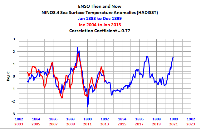
El Niño-Southern Oscillation indices are used to monitor the strength, frequency and duration of El Niño and La Niña events. One of the commonly used indices is the sea surface temperature anomalies of an area in the east-central equatorial Pacific called the NINO3.4 region (5S-5N, 170W-120W). A blogger recently advised me in a comment of a curious agreement in the NINO3.4 data for two periods separated by more than 100 years. Thanks, Bob. That is, the sea surface temperature anomalies of the NINO3.4 region for the period of January 2004 to March 2013 are quite similar to those from January 1883 to March 1892. Refer to Figure 1, which presents NINO3.4 anomaly data for the two periods, from the Kaplan reconstruction of sea surface temperatures. The agreement is reasonably strong for climate data. The two periods have a correlation coefficient of 0.77.

Figure 1
The following links include the same graphs using ERSST.v3b and HADISST reconstructions.
UPDATE: When considering those graphs, keep in mind that sea surface temperature sampling along the equatorial Pacific is rare before the opening of the Panama Canal in 1914. Sea surface temperature reconstructions in the NINO3.4 region are questionable in the 1800s. END UPDATE
You’ll note that I’ve extended the past data forward another 8 years. Someone was bound to ask me to do this, so there was no point in my presenting only the overlapping periods. Again, I’m not suggesting that future El Niño and La Niña events will coincide with the past. But…
Imagine what would happen IF (big if) we didn’t have another strong El Niño until 2017/18—four ENSO seasons from now—and that a multiyear La Niña event dominated the years until then: Global surface temperatures would likely remain flat for four more years. Global warming skeptics would be pleased, and climate scientists would be conjuring up more excuses for the lack of warming. If the response of the ocean heat content for the tropical Pacific was similar to past multiyear La Niña events, the tropical Pacific would likely warm to fuel the upcoming 2017/18 El Niño, and alarmists would point to that increase in ocean heat content as proof of human-induced global warming. In other words, little would change.
INTERESTED IN LEARNING MORE ABOUT THE EL NIÑO AND LA NIÑA AND THEIR LONG-TERM EFFECTS ON GLOBAL SEA SURFACE TEMPERATURES?
Why should you be interested? Sea surface temperature records indicate El Niño and La Niña events are responsible for the warming of global sea surface temperature anomalies over the past 30 years, not manmade greenhouse gases. I’ve searched sea surface temperature records for more than 4 years, and I’ve searched ocean heat content records for more than 3 years, and I can find no evidence of an anthropogenic greenhouse gas signal. That is, the data indicates the warming of the global oceans has been caused by Mother Nature, not anthropogenic greenhouse gases.
For a further discussion, see the essay (pdf) titled The Manmade Global Warming Challenge. (It’s 42MB, but it’s free and worth the download time.)
I’ve recently published my e-book (pdf) about the phenomena called El Niño and La Niña. It’s titled Who Turned on the Heat? with the subtitle The Unsuspected Global Warming Culprit, El Niño Southern Oscillation. It is intended for persons (with or without technical backgrounds) interested in learning about El Niño and La Niña events and in understanding the natural causes of the warming of our global oceans for the past 30 years. Because land surface air temperatures simply exaggerate the natural warming of the global oceans over annual and multidecadal time periods, the vast majority of the warming taking place on land is natural as well. The book is the product of years of research of the satellite-era sea surface temperature data that’s available to the public via the internet. It presents how the data accounts for its warming—and there are no indications the warming was caused by manmade greenhouse gases. None at all.
Who Turned on the Heat? was introduced in the blog post Everything You Ever Wanted to Know about El Niño and La Niña… …Well Just about Everything. The Updated Free Preview includes the Table of Contents; the Introduction; the beginning of Section 1, with the cartoon-like illustrations; the discussion About the Cover; and the Closing. The book was updated recently to correct a few typos.
Please buy a copy. (Credit/Debit Card through PayPal. You do NOT need to open a PayPal account.) Simply scroll down to the “Don’t Have a PayPal Account” purchase option. It’s only US$8.00.


Pingback: Imagine What Would Happen If We Didn’t Have A Strong El Niño For 4 More Years | Watts Up With That?
Reblogged this on CraigM350 and commented:
Again 1883 comes up. Hmm. Now to digeat.
I’m sure I’m not the only one who suspected before looking that the interval between the close-fit segments would be a multiple of 60 years.
I have studied the Nino3.4 data from 1856 to 2011 [Physics Letters A 376 (1011) p128-135) doi:10.1016/j.physleta.2011.10.042]
————————- Abstract—————-
It is shown that the central Pacific Ocean sea surface temperature data contains two components: NL, a low frequency signal that exhibits the familiar El Niño/La Niña phenomenon and NH, a high frequency signal of one-year period. From the analysis of these signals, one infers: (1) The existence of a forcing Fs of one-year period that is of solar origin; (2) The indices Nh and Nl are both phase locked to Fs; (3) Nh is phase locked directly to Fs while the phase locking of Nl is frequently to the 2nd or 3rd subharmonic of Fs. At least ten distinct subharmonic time segments are found since 1870. The beginning or end dates of these segments have a near one-to-one correspondence with the dates of the abrupt climate changes previously reported by Douglass [2010]. Limited predictability is possible.
———————- end abstract —————————–
My Fig 2a from 1870 to 1910 contains phase-locked segment #1 from 1885-1893 which I showed had a periodicity of 3-years.
My Fig 2e from 1990-2011 contains two phase-locked segments. # 9 and #10 that overlap the later segment (in red) shown in your post.
Considering that both of these segments contain oscillations at a mutiple of 12 months one could expect to find in a hundred years a separation where for short segments the maxima in the oscillations coincided and gave a high correlation coef.
My study on Nino3.4 since this publication leads me to believe that since 2009 the climate system is in a phase-locked state of period 3-years which is not what the blue plot shows after 1892.
Thus, what happened 100 years ago is not a predictof of what will happen after 2013.
N ote: El ninos correspond to a maximum in Nino3.4. The next maimum will be in 2016. So an El Nino cannot occur until 2016. And if the 3-year state is maintained, the next possibility is 2019.
David Douglass
Dept of Physics
University of Rochester.
Pingback: News of the Week for Apr. 28th, 2013 | The Political Hat
Hi Bob
your post caught my attention as Piers Corbyn says his weather prediction is based in part on a 60 year (approx) cycle. There are 121 years from 1883 to 2004, nearly 2 x 60.
So I attempted to reproduce you graphs and figures. I got a slightly higher correlation (perhaps I did something different or wrong) and I found another correlation with 1943-1952. 60 years after 1883 and 61 before 2004. yipee!
gory details here
jeremyshiers.com/blog/piers-corby-may-2013-do-sea-surface-temperature-records-support-his-method/
cheers
Jeremy
jeremyshiers, thanks. I’ll have look.
Regards
Looks the correlation may have slipped with the current ENSO phase going positive before 17/18. 🙂