
UPDATE: I finished writing this post and published it at my blog Climate Observations about the same time that Don Easterbrook’s post Cause of ‘the pause’ in global warming was published at WattsUpWithThat.
This post includes an overview of the mistakes people make when they attempt to use the Pacific Decadal Oscillation data as a metric for the dominant mode of variability in the Pacific Ocean. So it contradicts Easterbrook’s post. More detailed discussions of what the PDO data represents and what it doesn’t represent can be found in the posts here, here and here. If you for some reason would like to argue about it on this thread, please see my comments on the Easterbrook thread starting here.
# # #
The Nature article Climate Change: The Case of the Missing Heat by Jeff Tollefson has received a lot of attention at WattsUpWithThat and around the blogosphere. Much of Tollefson’s article was a simplified explanation of the findings of Trenberth and Fasullo (2013) An apparent hiatus in global warming? We’ve discussed that paper already. See the posts Trenberth and Fasullo Try to Keep the Fantasy Alive and More on Trenberth and Fasullo (2013) “An Apparent Hiatus in Global Warming?”
Anthony Watts was right to call attention to Tollefson’s article; it presented an argument and illustration that had been presented years ago by skeptics, an argument and illustration that had been dismissed by global warming enthusiasts. And Tollefson is linking it to Trenberth and Fasullo.
One point needs to be made right from the get go. As far as I could tell, no one interviewed for the Nature article claimed the hiatus in surface warming was not happening. That article is an attempt to explain the growing differences between the model simulations and measured global average surface temperatures. And the more I look at it, Tollefson appears a bit skeptical at times.
One problem with Tollefson’s article: it only discusses the hiatus in surface temperature warming. It does not address the absence of warming of the Pacific Ocean and North Atlantic to depths of 2000 meters, for the period of 2003 to 2012. See Figure 1. Only the South Atlantic and Indian Oceans show warming to depth. Figure 1 is from the post here.
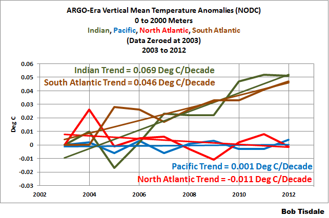
Figure 1
Manmade greenhouse gases cannot select which ocean basins they decide to warm.
And the Tollefson article, unfortunately, offers as much misinformation as information.
The first problem, as noted above, was the article does not address the “missing heat” in the depths of the Pacific over the last decade, and that is where the heat would have to be appearing if Trenberth and Fasullo (2013) were correct.
The second problem has to do with using Pacific Decadal Oscillation (PDO) data as a metric for the strength, frequency and duration of El Niño and La Niña events. It’s the wrong dataset.
El Niño and La Niña events are the primary focus of the article. Tollefson acknowledges this with his statement:
And here, the spotlight falls on the equatorial Pacific.
But then he presents Pacific Decadal Oscillation (PDO) data as the metric for El Niños and La Niñas. He’s likely taking his cue from Trenberth and Fasullo (2013) for that.
El Niño and La Niña events take place in the tropical Pacific, but the Pacific Decadal Oscillation dataset is an abstract form of sea surface temperature data derived from the extratropical North Pacific, not the tropical Pacific. See Figure 2.
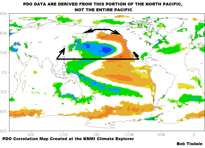
Figure 2
The PDO data basically represent how closely the spatial pattern of the sea surface temperature anomalies of the North Pacific (north of 20N) resembles the pattern created by ENSO events (where the spatial patterns are warmer in the east and cooler in the central and western North Pacific during El Niños, and cooler in the east and warmer in the central and western North Pacific during La Niñas). Because that spatial pattern of sea surface temperatures in the North Pacific is also impacted by sea level pressures (and their interrelated wind patterns), the Pacific Decadal Oscillation data are not a true representation of the frequency, magnitude and duration of El Niño and La Niña events.
For more information about what the PDO represents, and more importantly what it doesn’t represent, see the posts here, here and here.

Figure 3
The big surprise in the Nature article was the illustration comparing the Pacific Decadal Oscillation (PDO) data with the global surface temperatures titled “The Pacific’s Global Reach”. I’ve included it as my Figure 3. It compares the JISAO PDO data to global surface temperature anomalies. The text in the illustration clearly states:
During periods when the PDO index is positive and the eastern Pacific is warm, global temperatures have risen quickly. During spells when the PDO index is negative, the warming has stagnated.
Additionally, with respect to the illustration, the article reads:
An analysis of historical data buttressed these conclusions, showing that the cool phase of the PDO coincided with a few decades of cooler temperatures after the Second World War (see ‘The Pacific’s global reach’), and that the warm phase lined up with the sharp spike seen in global temperatures between 1976 and 1998 (ref. 4).
This, of course, strongly suggests that the warm phase of the PDO is responsible for part of the warming during the period from 1976 to 1998. If the PDO can stop the warming, then the PDO had to have contributed to the warming. That had been a skeptical argument for years. I can recall seeing similar graphs more than 5 years ago. In fact, it was so popular SkepticalScience wrote a post about it here back in 2008.
Unfortunately, there are no mechanisms through which the PDO (as defined by the JISAO dataset) can cause global surface temperatures to vary. The sea surface temperatures of the North Pacific north of 20N are inversely related to the PDO data.
Those mechanisms exist in the tropical Pacific and portray themselves as El Niños and La Niñas. Sea surface temperature-based indices for the strength, frequency and duration of El Niños and La Niñas do exist. In fact, Trenberth and Stepaniak (2001) Indices of El Niño Evolution (online edition here) recommended using the sea surface temperature anomalies of the NINO3.4 region of the equatorial Pacific (identified as N3.4 in the paper). See the illustration here for the location of the NINO3.4 region. Trenberth and Stepaniak (2001) used the HADISST dataset, with the base years of 1950-1979 for anomalies. Unfortunately, Trenberth and Stepaniak never really provided a scientific justification for using the base years of 1950 to 1979. So we would be better off using the entire term of the data (1923 to 2013) as the base years for the NINO3.4 sea surface temperature anomalies.
The NINO3.4 sea surface temperature data are realistic index for strength, frequency and duration of El Niño and La Niña events. So let’s look at the average NINO3.4 sea surface temperature anomalies for the two warming periods and the two hiatus periods. See Figure 4. We’ll use the periods defined by Trenberth and Fasullo (2013):
The monthly time series (Figure 8) readily reveals the multidecadal regimes of the PDO (given by the black line) with positive phases from 1923 to 1942 and 1976 to 1998, and negative phases from 1943 to 1976 and after 1999.
Curiously, the periods presented by Trenberth and Fasullo (2013) do not agree with those presented by Tollefson in his “The Pacific’s Global Reach” illustration. That aside, my Figure 4 shows that during the two warming periods of 1923 to 1942 and 1976 to 1998, the average sea surface temperature anomalies for the NINO3.4 region were well above zero. This means that El Niño events dominated that period. Global surface temperatures should warm during those periods because the tropical Pacific is releasing more heat than “normal” from the tropical Pacific and redistributing more warm water than “normal” to adjacent ocean basins. And during the two hiatus periods of 1943 to 1976 and 1999 to present, the average NINO3.4 sea surface temperature anomalies are below zero. That of course means the tropical Pacific is releasing less heat than “normal” and redistributing less warm water than “normal” to adjacent ocean basins. And during those periods global surface temperatures flattened or cooled slightly.
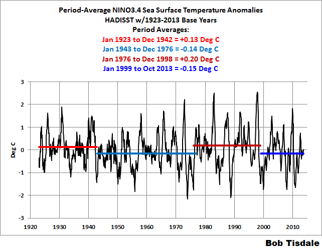
Figure 4
You may be asking yourself, why did Bob go through that exercise when it basically showed the same results as Tollefson’s PDO graph?
The NINO3.4 data are the correct dataset to use and the PDO is not. The PDO does not represent the timing, strength and duration of El Niño and La Niña events. It portrays an aftereffect of El Niño and La Niña events, combined with the influence of the sea level pressure of the North Pacific.
But now we have to consider that the NINO3.4 sea surface data only capture the effects of ENSO on a small region of the equatorial Pacific. They do not represent the processes of ENSO or their aftereffects. And in no way can NINO3.4 sea surface temperature anomalies account for the warm water that is left over from strong El Niño events, which is redistributed to adjacent ocean basins in their wakes.
MORE MISINFORMATION
The article states (my boldface):
Just before the hiatus took hold, that region had turned unusually warm during the El Niño of 1997–98, which fuelled extreme weather across the planet, from floods in Chile and California to droughts and wildfires in Mexico and Indonesia. But it ended just as quickly as it had begun, and by late 1998 cold waters — a mark of El Niño’s sister effect, La Niña — had returned to the eastern equatorial Pacific with a vengeance. More importantly, the entire eastern Pacific flipped into a cool state that has continued more or less to this day.
Entire eastern Pacific? The PDO data do not represent the “entire eastern Pacific”. If he’s thinking sea surface temperature anomalies, that’s also wrong. There have been a number of El Niño events since 1999. Those El Niño events occurred in 2002/03…and 2004/05…and 2006/07…and 2009/10. As a result, the average sea surface temperature anomalies [of the East Pacific], using NOAA’s standard base years 1971-2000 for their Reynolds OI.v2 data, for the period of January 1999 to December 2013 are +0.06 deg C, and that’s a far cry from “a cool state that has continued more or less to this day.” See Figure 5.
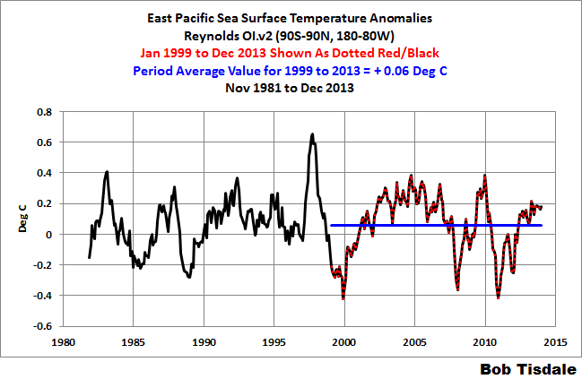
Figure 5
MODEL NONSENSE
The article reads:
Second, many researchers have found the opposite pattern in simulations with full climate models, which factor in the suite of atmospheric and oceanic interactions beyond the equatorial Pacific. These tend to reveal a trend towards more El Niño-like conditions as a result of global warming.
Climate models don’t simulate ENSO properly, so this is irrelevant. See Guilyardi, et al. (2009) “Understanding El Niño in Ocean-Atmosphere General Circulation Models: Progress and Challenges” and Bellenger, et al. (2013): “ENSO Representation in Climate Models: From CMIP3 to CMIP5.” Preprint copy is here.
THINGS OVERLOOKED
The following was written for the post Comments on Stefan Rahmstorf’s Post at RealClimate “What ocean heating reveals about global warming”. The discussion applies here as well. I’ve changed the Figure numbers and made a few minor revisions for this post.
In the left-hand graph of Figure 6, we can see that the sea surface temperatures of the East Pacific have warmed little, if at all, over nearly the past 32 years…since the start of the Reynolds OI.v2 sea surface temperature dataset in November 1981. The East Pacific (90S-90N, 180-80W) covers about 33% of the surface of the global oceans. The papers presented by Jeff Tollefson do not address this lack of warming and climate models do not simulate it.

Figure 6
The same hold true for what’s illustrated in the right-hand graph, and they are the sea surface temperature anomalies of the South Atlantic, Indian and West Pacific oceans. The coordinates are listed in the title block. They cover more than 50% of the surface of the global oceans. We can see a number of things in the sea surface temperature data for the South Atlantic, Indian and West Pacific oceans: (1) their long-term warming depends on the El Niño events of 1986/87/88 and 1997/98 (and possibly the El Niño of 2009/10); (2) they do not cool proportionally during the transition to the trailing La Niñas of 1988/89 and 1998-01; but (3) they do cool slightly over the decade-long periods between the El Niño events of 1986/87/88 and 1997/98 and between the 1997/98 and 2009/10 El Niños.
For an introductory discussion of the natural warming of the global oceans refer to the illustrated essay “The Manmade Global Warming Challenge” (42MB).
The sea surface temperatures of the North Atlantic are governed by another mode of natural variability called the Atlantic Multidecadal Oscillation or AMO, which has been overlooked by Jeff Tollefson. The AMO is the reason why the sea surface temperatures there warmed at a much higher rate than the rest of the global oceans from the mid-1970s to the early-2000s. But the sea surface temperature data for the North Atlantic indicate the AMO may have already peaked. See Figure 7. If history repeats itself, and there is no reason to believe it will not, then the sea surface temperatures of the North Atlantic will show no warming and actually cool for a few more decades, assuming the Atlantic Multidecadal Oscillation has, in fact, peaked.
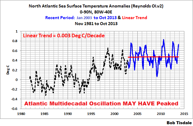
Figure 7
Note: For further information about the Atlantic Multidecadal Oscillation, see NOAA’s AOML (Atlantic Oceanographic and Meteorological Laboratory) Frequently Asked Questions webpage here, and my blog post here and my introduction to the Atlantic Multidecadal Oscillation here.
CLOSING
The article by Jeff Tollefson suggests the climate science community may be moving in the right direction—that’s a big MAY BE.
But they’ll have to return to basics: ENSO is fueled by sunlight. And for that reference, as I’ve presented numerous times before, we have Trenberth et al. (2002) Evolution of El Niño–Southern Oscillation and global atmospheric surface temperatures:
The negative feedback between SST and surface fluxes can be interpreted as showing the importance of the discharge of heat during El Niño events and of the recharge of heat during La Niña events. Relatively clear skies in the central and eastern tropical Pacific allow solar radiation to enter the ocean, apparently offsetting the below normal SSTs, but the heat is carried away by Ekman drift, ocean currents, and adjustments through ocean Rossby and Kelvin waves, and the heat is stored in the western Pacific tropics. This is not simply a rearrangement of the ocean heat, but also a restoration of heat in the ocean.
In other words, the stronger trade winds reduce cloud cover, which, in turn, allows more sunlight to warm the tropical Pacific. So, if the stronger trade winds are causing more warm water to be stacked up in the western tropical Pacific, it’s an increase in sunlight that’s fueling it. This was discussed in much more detail under the heading of DOWNWARD SHORTWAVE RADIATION VERSUS DOWNWARD LONGWAVE RADIATION DURING LA NIÑA EVENTS in the post Open Letter to the Royal Meteorological Society Regarding Dr. Trenberth’s Article “Has Global Warming Stalled?”


For your Figure 7, that should be January 2003 and not 2013.
Thanks, Werner. Fixed it, kinda.
Now a nice summary article: How The Pacific Controls Its Own Insolation.
Bob
You seem to agree with Don Easterbrook that there is a close correlation between the PDO index and the global mean surface temperature record (despite doubts about detail of a couple of the graphs). Is that correct?
Accepting that correlation is not causation, the GMST could be driven by the trade winds, reduced cloud or whatever unknown factor ultimately drives ENSO’s frequency and intensity. But Don sees the PDO as the (intermediate) cause of ENSO patterns and you see ENSO patterns as the cause of the PDO. How can we know which view is right?
Australis says: “How can we know which view is right?”
Zhang et al.
(1999)[oops that should read 1997] was the first paper to determine and define the PDO. They identified the PDO as a response to ENSO.Click to access zwb1997.pdf
In Zhang et al (1997), the PDO was identified as “NP”, and they use Cold Tongue Index sea surface temperature anomalies (CT) as an El Niño-Southern Oscillation (ENSO) index. Zhang et al (1997) note:
“Figure 7 shows the cross-correlation function between CT and each of the other time series in Fig. 5. The lag is barely perceptible for TP and G and it increases to about a season for G – TP and NP, confirming that on the interannual timescale the remote features in the patterns shown in Fig. 6 are occurring in response to the ENSO cycle rather than as an integral part of it…”
Phrased differently, the PDO (NP) is an aftereffect of ENSO. One might conclude that Easterbrook’s assumptions are wrong when the paper that identified the PDO disagrees with Easterbrook.
See also Newman et al (2004):
Click to access newman2003.pdf
The first sentence of the Conclusions of Newman et al (2004) reads:
“The PDO is dependent upon ENSO on all timescales.”
Both papers confirm that the PDO is an after effect of ENSO.
Those papers were also presented in the first PDO link I provided:
Regards
This needs to be posted on WUWT to gain a greater readership.
Okay, let’s accept that the PDO index occurs in response to ENSO rather than the other way about.
But ENSO apparently has cool (La Nina dominating) periods of 30-odd years followed by warm periods (El Nino dominating) of 30-odd years and and the ‘flip’ from one phase to the other shows up in the PDO index. If so, then a PDO phase-change might still be the best available indicator (not cause) of forthcoming ENSO-driven global temperatures?
Australis, because the PDO is also influenced by sea level pressure it does not represent ENSO.
Additionally, the PDO is negatively correlated with land surface temperatures in the Northern Hemipshere:
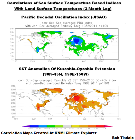
And that makes it a lousy proxy for what you’re trying to present.
Those maps are from the post here:
Pingback: Scientists explore causes of the warming pause, perhaps the most important research of the decade | Fabius Maximus
Bob, while a agree with you about cause and effect, it is not worth the time you have put into it. The PDO is a fine metric for the global situation even though it has nothing to do with cause. I believe the PDO is the after effect of the process that drives ENSO as you have stated previously so there is a link between them. And, the PDO is also a simple index to use when discussing the topic with others where too much detail is unwanted.
BTW, I don’t know if you saw my remark at WUWT about ENSO being controlled by the MOC speed. This is the view put forward by Dr. William Gray. Essentially, the MOC speed drives ENSO variability which drives the PDO. I suspect the AMO is also part of this picture. Unfortunately, I do not know of any data that measures the MOC speed which makes these claims impossible to verify.
Thanks Bob, a very good article.
It is important to have clear visions of ENSO and PDO, you have them and share them.
This study is flying around the twitter sphere, propelled by the usual suspects. http://www.nature.com/nclimate/journal/vaop/ncurrent/full/nclimate2100.html
Perhaps B.T. Would like to comment
Bob.
Enjoy your new career. I hope it is full of learning.
http://www.smh.com.au/environment/climate-change/major-el-nino-events-likely-to-double-in-next-century-20140119-312sy.html
Andrew, Cai et al (2013) is contradicted by Ray & Giese (2012) “Historical changes in El Niño and La Niña characteristics in an ocean reanalysis”.
http://www.agu.org/pubs/crossref/2012/2012JC008031.shtml
The Ray & Giese (2012) abstract ends:
“Overall, there is no evidence that there are changes in the strength, frequency, duration, location or direction of propagation of El Niño and La Niña anomalies caused by global warming during the period from 1871 to 2008.”
Additionally, Cai et al (2013) claims to present “climate model evidence”, but climate models can’t simulate ENSO.
Thank you. Models have become security blankets for so many
Andrew, also see the following post.
Regards
nevket240, thanks for the link to the SydneyMorningHerald about Cai et al (2013).
Regards
Cheers. Even Trenberth has criticised the study. http://hockeyschtick.blogspot.co.uk/2014/01/alarmist-becomes-skeptic-on-climate.html
Looking at Figure 3, reproduced here, all I see is that the PDO index and the global surface temperature anomaly are anti-correlated from about 1988 to about 2005, since the PDO index has a decreasing trend from the early 1980 on. In contrast to that, the PDO index seems to be positively correlated with the global surface temperature between about 1920 and 1942. Thus, how is this supposed to work? At some times an increasing PDO index (= transition from negative pattern to positive pattern) is supposed to cause global warming, and at other times a decreasing PDO index (=transition from positive pattern to negative pattern) is supposed to cause global warming, according to convenience?
As for the alleged hiatus (in the meaning auf “pause”) after 1998. If there was supposedly surface warming hiatus after 1998 why are the temperature trends of all the three surface data sets larger than 0.25 K/decade between 1992 and 2006, inclusively?
GISTEMP: +0.286 K/decade
NOAA: +0.264 K/decade
HADCRUT4: +0.276 K/decade
And why are all the surface temperature trends positive, starting from 1998 to present, even though the period starts with a very strong El Nino and has been dominated by La Ninas in recent years?
GISTEMP: +0.064 K/decade
NOAA: +0.04 K/decade
HADCRUT4: +0.042 K/decade
And why are all the surface temperature trends positive for the most recent 15 years?
GISTEMP: +0.093 K/decade
NOAA: +0.066 K/decade
HADCRUT4: +0.074 K/decade
I don’t see any hiatus. A slowdown in recent years, yes, which I would mostly attribute to a combination of the downward phase of solar cycle 23 and a transition from El Nino conditions to a dominance of La Ninas in recent years. My prediction: We won’t have to wait too long for a new annual surface temperature record since the start of the instrumental measurements. It likely will happen with the next El Nino or shortly after. The last one was in 2010, so the next one will soon be overdue. Global warming continues (except there is a major volcanic eruption, killer asteroid or nuclear war). Everything else would be a suprise to me, and I would have to think about where I have been wrong, regarding my understanding how the Earth system works. I am going to go with the evidence.
As for the Nature opinion piece by Jeff Tollefson. I find it disappointing that the editors and science writers of the journal Nature have started to embrace the unscientific arguments by the AGW-“skeptics”, regarding the alleged “hiatus”.
Jan P Perlwitz, I see you’ve used 15 years for your trend analysis, Jan, starting at the beginning of a 3-year La Nina. And of course the period from 2007 to present has been dominated by La Ninas; that’s the point. You no longer have the benefit of a string of strong El Nino events, which drove up surface temperatures, something the climate science community has never accounted for, something that I’ve been noting for more than 5 years.
With respect to Figure 3, take it up with Jeff Tollefson.
Have a nice day, Jan.
Bob, I am not a particular fan of using only 15 years for trend analyses of the global surface temperature. But AGW-“Skeptics” base their claims about the alleged hiatus on trends from such short time intervals. Moving the 15-year window by just a year can change the result quite a bit. The 15-year trends oscillate quite a lot around the average. This indicates that any trend analysis of the global surface temperature over such a short time interval doesn’t really provide a robust result yet.
Having said this, if El Nino can’t be blamed for the positive trend estimate since 1999, what made the global surface temperature increase anyhow? I am still searching for the alleged hiatus in the data.
Jan, I don’t understand why you’re arguing. We’re seeing more and more papers trying to explain the halt or slowdown in global warming. And those papers have been published for a couple of years. Are you saying that your brethren are wasting taxpayer dollars studying something that doesn’t exist?
Further, you and I well know that the Arctic is the last stronghold of warming–that polar amplified warming has persisted for a few years beyond the cessation of warming for the rest of the globe. Without the Arctic, the trends you presented drop considerably. Looks to me like your argument is based on warming that continues to occur in a region that represents about 5% of the surface of the globe–an area where there are few actual measurements.
Additionally, climate models cannot explain why the surface temperatures of the largest ocean basin on this planet haven’t warmed in 20 years. For Pacific sea surface temperatures (60S-65N, 120E-80W), the start year is restricted by the aftereffects of the eruption of Mount Pinatubo. And we can look at the sea surface temperatures for the East Pacific (90S-90N, 180-80W). That region covers about 33% of the surface of the global oceans, and its surface temperatures show little warming since the start of the Reynolds OI.v2 data 32 years ago. And the models cannot explain why the surface temperatures of the Southern Ocean have cooled over the past 32 years.
Would you like me to continue? If so, you’ll have to wait till I get back from work.
See ya.
Jan: Using 15 years trends sort of makes sense if you consider that there is a strong (aprox) 60 year cycle to the data for GST.
http://www.woodfortrees.org/plot/hadcrut4gl/plot/hadcrut4gl/mean:180/mean:149/mean:123/plot/hadcrut4gl/mean:720
Pingback: The case of the missing heat | Climate Etc.
Jan, if you consider the previous 30 years instead of 15, your own models (volcanic and solar only) show expected linear trend warming of approx 0.09C per decade due to recovery from El Chichon and Pinatubo absent any GHG forcing. IIRC since observed warming in GISS is only about 0.17C per decade over the last 30 years this leaves a residual trend of 0.08C per decade in GISS observations not accounted for by volcanoes and solar according to your own models.
Layman Lurker,
And how did you calculate that 0.09 deg. C of the temperature trend over the recent 30 years were due to a recovery from the two volcanoes? Pinatubo happened after the start of the recent 30 year period. What is the physics supposed to be behind this so that the volcano effect could contribute to a warming trend over the recent 30 years? How are volcano eruptions supposed to cause a warming? Everything else equal, volcanoes like Pinatubo emit a huge amount of aerosols into the stratosphere, which reflect solar radiation back to space, which makes the global temperature drop shortly after the eruption. Then the global temperature assymptotically returns to the values before the eruption, with the removal of the aerosols from the stratosphere. This is the recovery. There is no net warming trend coming from this over the whole period, if it includes both the eruption and the recovery. If you have a string of volcano eruptions happening sufficiently close to each other before full recovery, one even could see a longer lasting cooling trend.
El Chichon is different, since the eruption happened before the start of the recent 30 year period. That excludes the drop in the temperature from the time period, but includes part of the recovery.
But what about the recent 40 years? This includes both the eruption of El Chichon with temperature drop and recovery from the drop. The same argument applies here as the one for Pinatubo. The temperature trend for the recent 40 years is still about 0.17 deg C/Dekade, anyhow.
I have to restrain myself. Only one post a day at maximum. This is going to take a while.
Jan Perlwitz:
The trend in your example is accounted for in your own models by the recovery from Pinatubo. I have plotted GISS Model E2-H (Volcanic and Solar only) Ensemble Mean along with the trend of ~0.27C per decade.
Jan Perlwitz:
Jan, this is your own GISS model E2-H ensemble mean (volcanic and solar only runs) over the 30 year span from 1983 to 2012 along with the plotted OLS trend.
I should mention that I used code posted up by Troy Masters here to create a mean time series of the GISS E2-H natural forcings only runs.
Here is Hadcrut4 plotted along side the mean series of GISS E2-H since 1992 and the corresponding OLS trendlines. For comparison purposes, I offset Hadcrut4 to equate the series mean to the mean in the model series for the same time period. When one subtracts the model mean series from Hadcrut4 observations, the residuals look remarkably like ENSO3.4 (offset and scaled to standardize wrt the “residual” series).
Jan: As you don’t like short term trends and I hate linear trends of any form (I regard them as ‘Tangents to the Curve’ = ‘Flat Earther’ thinking) how about using a simple near Gaussian filter to demonstrate the periodicity of the temperature signal as I showed above?
I had the color references mixed up in my graph above comparing Hadcrut4 to GISS E2-H since 1992. Fixed version here.
Pingback: Ocean heat content uncertainties | Climate Etc.
Pingback: Perlwitz before Swine? | Bob Tisdale – Climate Observations
Pingback: Open Letter to Kevin Trenberth – NCAR | Bob Tisdale – Climate Observations
Pingback: Open Letter to Kevin Trenberth – NCAR | Watts Up With That?
Pingback: An Odd Mix of Reality and Misinformation from the Climate Science Community on England et al. (2014) | Bob Tisdale – Climate Observations
Pingback: An Odd Mix of Reality and Misinformation from the Climate Science Community on England et al. (2014) | Watts Up With That?