
Trenberth and Fasullo published a paper “An Apparent Hiatus in Global Warming?” last week in the new online journal Earth’s Future. Judith Curry briefly introduced the paper in her December 7, 2013 post Week in review (Thanks, Judith.)
From the last sentence of the abstract, Trenberth and Fasullo (2013) argues that:
Global warming has not stopped; it is merely manifested in different ways.
CHERRY PICKING
Midway through the paper, Trenberth and Fasullo (2013) begin a paragraph with:
Deniers of climate change often cherry-pick points on time series and seize on the El Niño warm year of 1998 as the start of the hiatus in global mean temperature rise (Figure 6).
But then Trenberth and Fasullo (2013) turn around and cherry pick the end year of the “hiatus” in their Figure 4 (shown below as my Figure 1). In it they attempt to show the similarities in global surface temperatures between two recent 12-year periods. The data that stretches from 1982 to 1993 has been shifted upwards by 0.32 deg C to align the two periods.

Figure 1
First, anyone looking at their Figure 4 can see that the period of 1982 to 1993 has a much higher warming rate than 1997 to 2008, even without considering the cooling impacts of the eruptions of El Chichon and Mount Pinatubo during that earlier time period. In fact, the warming rate of the period of 1982 to 1993 is more than twice the rate for the period of 1997-2008. See Figure 2.

Figure 2
The Trenberth and Fasullo “cherry picking” is with their end dates, of course. They ended the recent data period in 2008, while the halt in global warming has continued for 5 more years, through year-to-date 2013. Trenberth and Fasullo (2013) would not have wanted to present the two time periods extending for the additional five years, because the early time period would end in 1998, which was impacted by the 1997/98 El Niño. See Figure 3. The warming rate of the period of 1982 to 1998 is almost 5 times higher than the rate from 1997 to year-to-date 2013 (which runs through October 2013).

Figure 3
Provided solely as a reference, Trenberth used 2001 as the start of the halt in global warming in his article for the Royal Meteorological Society earlier this year titled Has Global Warming Stalled? If we delete the first 4 years of data in Trenberth and Fasullo’s Figure 4 and add on the trailing five years, we can see that there has been no warming of global surface temperatures from 2001 to year-to-date 2013, while there was considerable warming during the period of 1986 to 1998. See my Figure 4.

Figure 4
Trenberth and Fasullo look rather foolish by accusing “deniers” of cherry-picking and then turning around and cherry-picking the end date of their comparison in their Figure 4.
THE IMPACTS OF ENSO
Trenberth and Fasullo (2013), like many others, misrepresent the impacts of ENSO on the global surface temperature record. They write:
The biggest fluctuations in global mean surface temperature have been identified with ENSO [e.g., Trenberth et al., 2002]. Figure 6 presents the global mean surface temperature as a 12 month running mean of anomalies after 1970 and it reveals that a linear trend is actually a pretty good fit. The huge warming in 1998 from the 1997 to 1998 El Niño is evident, and to emphasize the relationships between the interannual variability and ENSO, the duration of each El Niño and La Niña event, as given by NOAA’s Oceanic Niño Index (ONI), is also marked on the figure along with the actual time series of the Niño3.4 SSTs on which the ONI is based. The latter indicates the magnitude of each event. The relationship between ENSO and global mean temperatures is well established [Trenberth et al., 2002] and has been used by several studies to linearly “remove” the ENSO effects using linear regression [Lean and Rind, 2008, 2009; Foster and Rahmstorf , 2011]. These studies show that ENSO accounts for short-term fluctuations in global surface temperature with a range of up to 0.39 deg C and a regression of global mean temperature on the Nino3.4 index gives values of 0.1 deg C per standard deviation with a 3 month lag [Trenberth et al., 2002]. Once ENSO is removed, the residual global mean temperature time series is remarkably linear after 1970, with no evidence of a hiatus, highlighting the role of natural variability in the global mean temperatures.
The Trenberth and Fasullo (2013) Figure 6 is presented as my Figure 5.

Figure 5
But in Trenberth et al. (2002) Evolution of El Niño–Southern Oscillation and global atmospheric surface temperatures, referenced in the quote above, they caution (my boldface):
The main tool used in this study is correlation and regression analysis that, through least squares fitting, tends to emphasize the larger events. This seems appropriate as it is in those events that the signal is clearly larger than the noise. Moreover, the method properly weights each event (unlike many composite analyses). Although it is possible to use regression to eliminate the linear portion of the global mean temperature signal associated with ENSO, the processes that contribute regionally to the global mean differ considerably, and the linear approach likely leaves an ENSO residual.
Examples of those ENSO residuals are plainly visible in Figure 5 from Trenberth and Fasullo (2013). I’ve added a few notes to cell a (global land+sea surface temperatures) of that illustration in my Figure 6.

Figure 6
Figure 6 is a Hovmoller diagram that shows global surface temperature anomalies from 1979 through mid-2011. It is another way to present a time series of global surface temperature anomalies, and it is quite revealing. The x-axis (horizontal axis) is time, starting in 1979. The y-axis (vertical axis) is latitude, with the South Pole at the bottom, the equator at 0 deg latitude, and the North Pole at the top. The temperature anomalies at given times and latitudes are provided by the colors, with blues being negative anomalies and reds positive temperature anomalies.
The two red boxes capture the impacts, on the tropics, of the 1986/87/88 and 1997/98 El Niño events and the La Niñas that trailed them. Tropical surface temperatures warmed during the El Niños and cooled during the La Niñas. The two blue boxes surround the impacts of those El Niño and La Niña events on the mid-latitudes (20N-65N) of the Northern Hemisphere. It’s plainly obvious that the surface temperatures there did not cool proportionally during the 1988/89 and 1998-01 La Niñas. In this example, because the mid-latitudes of the Northern Hemisphere do not cool proportionally during those two La Niñas, the surface temperatures there effectively shift upwards. It is, therefore, impossible to remove the long-term impacts of the preceding El Niño events from the surface temperature record using the methods from Lean and Rind (2008) & (2009) and Foster and Rahmstorf (2011). We have discussed this in numerous posts over recent years, including:
- Rahmstorf et al (2012) Insist on Prolonging a Myth about El Niño and La Niña (WattsUpWithThat cross post is here.)
- Revised Post – On Foster and Rahmstorf (2011) (WattsUpWithThat cross post is here.)
- Regression Analyses Do Not Capture The Multiyear Aftereffects Of Significant El Nino Events (WattsUpWithThat cross post is here.) It links Lean and Rind (2008).
Briefly, there is warm water left over from the strong El Niño events of 1986/87/88 and 1997/98. That warm water collects in the North Pacific, in an area east of Japan known as the Kuroshio-Oyashio Extension and causes a secondary El Niño warming there. That secondary warming occurs during the trailing La Niñas and prevents the surface temperatures of the mid-latitudes of the Northern Hemisphere from cooling proportionally during those La Niñas. For yet another discussion of this, refer to The ENSO-Related Variations In Kuroshio-Oyashio Extension (KOE) SST Anomalies And Their Impact On Northern Hemisphere Temperatures.
Note: The 1986/87/88 and 1997/98 El Niño events, and the failure of global surface temperatures to cool proportionally during the trailing La Niñas, are the causes of two of the “big jumps” Trenberth referred to in his Royal Meteorological Society article Has Global Warming Stalled? I discussed this in my post Open Letter to the Royal Meteorological Society Regarding Dr. Trenberth’s Article “Has Global Warming Stalled?”
And I discussed the natural warming of the global oceans in minute detail in my book Who Turned on the Heat? An overview of the natural warming of the global oceans can also be found in my illustrated essay “The Manmade Global Warming Challenge” (42MB).
If the Hovmoller diagram in Figure 6 looks familiar, RSS presents a similar illustration using their Lower Troposphere Temperature (TLT) anomalies. Similar ENSO residuals and the similar upward shifts in the lower troposphere temperature anomalies were discussed 4 ½ years ago in the post RSS MSU TLT Time-Latitude Plots… …Show Climate Responses That Cannot Be Easily Illustrated With Time-Series Graphs Alone.
As long as the climate science community continues to misrepresent the impacts of ENSO on the global surface temperature record, they will continue to fool themselves, and mislead the public, about the causes of global warming.
THE UNDERLYING ASSUMPTION BEHIND THE PAPER IS FLAWED
The abstract of Trenberth and Fasullo (2013) begins:
Global warming first became evident beyond the bounds of natural variability in the 1970s, but increases in global mean surface temperatures have stalled in the 2000s. Increases in atmospheric greenhouse gases, notably carbon dioxide, create an energy imbalance at the top-of-atmosphere (TOA) even as the planet warms to adjust to this imbalance, which is estimated to be 0.5-1Wm-2 over the 2000s.
To show how flawed that assumption is, we can compare global surface temperature anomalies to climate model simulations during the two warming periods since the start of the 20th Century. See Figure 7. The data in Figure 7 is the NCDC global (land+ocean) surface temperature data in annual form, from 1880 to year-to-date 2013. It’s the same data presented by Trenberth and Fasullo (2013) in their Figure 1. And the models presented are the multi-model ensemble mean of the simulations of global surface temperatures for the same period, using the models stored in the CMIP5 archive. As you’ll recall, the climate models in the CMIP5 archive were used by the IPCC for their 5th Assessment Report (AR5). The model outputs are available through the KNMI Climate Explorer, specifically the Monthly CMIP5 scenario runs webpage. (Notes: We discussed the use of the model mean here, and we discussed the start and end years of the early and late warming under the heading Introduction in the post IPCC Still Delusional about Carbon Dioxide.) Even though the warming of global surface temperatures has halted in recent years, we’re extending the recent warming period to 2013 because the models say surface temperatures should have continued to warm, if they were warmed by the ever-growing emissions of manmade greenhouse gases.

Figure 7
If (BIG IF) “Increases in atmospheric greenhouse gases, notably carbon dioxide…” were responsible for global warming, as Trenberth and Fasullo claimed, then the warming rate during the late warming period (1975 to YTD 2013) should have been more than 3.5 times faster than the trend of the early warming period (1914-1945). To contradict the models, the data show similar warming rates during the early and late warming periods.
Looking at the models and data during the early warming period, the data show that global surface temperatures warmed about 2.4 times faster than the rate simulated by the models. This indicates that global surface temperatures are capable of warming without being forced to do so by “Increases in atmospheric greenhouse gases, notably carbon dioxide…”
As I note in the summary of Chapter 4.4 of my book Climate Models Fail:
The fact that the models simulated the warming better during the more recent warming period does not mean that manmade greenhouse gases caused that warming — it simply reveals that the modelers managed to tune their models to perform better for the more recent warming period.
The climate models cannot simulate the observed rate of warming during the early warming period (1914-1945), which warmed at about the same rate as the recent warming period (1975-2012). This illustrates that global surface temperatures can warm without being forced — unlike climate models which must be driven by the natural and anthropogenic forcings used as inputs. And the similarities between the observed warming rates during the early and late warming periods indicate that the much higher anthropogenic forcings during the late warming period had little impact on the rate at which observed temperatures warmed.
In other words, the climate models and data do not support the hypothesis of anthropogenic forcing-driven global warming; they contradict it.
The world portrayed by all those number-crunching climate models is a fantasy world — with little or no relationship to the real world.
Let’s take this even further:
Trenberth and Fasullo are both from the National Center for Atmospheric Research (NCAR). The climate model submitted by NCAR to the CMIP5 archive for use in the IPCC’s 5th Assessment Report is their CCSM4. The six ensemble members of the CCSM4 simulations of global surface temperatures (with historic and RCP6.0 forcings) are also available through the KNMI Climate Explorer. The performance of the NCAR CCSM4 models, when simulating global surface temperatures, is even worse than the multi-model mean shown above. See Figure 8.

Figure 8
If “Increases in atmospheric greenhouse gases, notably carbon dioxide…” were responsible for global warming, then the warming rate during the late warming period (1975 to YTD 2013) should have been more than 4 times faster than the trend of the early warming period (1914-1945), yet the data show similar warming rates during the two warming periods.
Additionally, the CCSM4 overestimated the warming during the late warming period (1975 to YTD 2013) by 55%, while underestimating the warming during the early warming period by a wide margin.
The NCAR CCSM4 model also does not support the hypothesis that manmade greenhouse gases are responsible for the warming since the mid-1970s.
TRENBERTH AND FASULLO CONFUSE TEMPERATURE DIFFERENCE AND TREND
My Figure 9 is Figure 9 from Trenberth and Fasullo (2013). It presents a map of the difference in average temperature anomalies for the period of 1976-1998 and the average temperature anomalies for the period of 1999 to 2012, throughout the globe, using GISS Land-Ocean Temperature Index (LOTI) data. That is, the average surface temperature anomalies for the period of 1976-1998 have been subtracted from the average surface temperature anomalies for the period of 1999-2012.

Figure 9
Trenberth and Fasullo (2013) write (my boldface):
If we now examine the hiatus period of 1999–2012 and compare it to the time when global warming really took off from 1976 to 1998 (Figure 9), the negative PDO pattern emerges very strongly throughout the Pacific although warming prevails in the Atlantic and Indian Oceans and on land. In other words, it is the central and eastern Pacific more than anywhere else that has not warmed in the past decade or so. In spite of some cold European winters, Europe does not standout in Figure 9 and instead is a warm region. The AMO is positive (Figure 7) and is revealed in Figure 9 to be part of a wider warming.
But Trenberth and Fasullo (2013) cannot state that “it is the central and eastern Pacific more than anywhere else that has not warmed in the past decade or so” by subtracting the average temperatures of 1976-1998 from the average temperatures from 1999-2012. That shows the temperature differences for the two periods, not whether it has “warmed in the past decade or so”. To determine if “the central and eastern Pacific more than anywhere else that has not warmed in the past decade or so” they need to perform a trend analysis for the “past decade or so.”
To help show the difference between temperature trends and temperature differences, see Figure 10. Trenberth and Fasullo (2013) are presenting the temperature difference between 1976-1998 and 1999-2012 and suggesting it represents the trend, and it does not.

Figure 10
Figure 11 presents trend maps for the period of 1999 to 2012, using GISS and NCDC global land+sea surface temperature products in the top two cells. And as a reference, the bottom two cells present the trends based on the HADISST and Reynolds OI.v2 sea surface temperature data, which are satellite enhanced.

Figure 11 (Click to enlarge)
As we can see, the actual trends for the period of 1999 to 2012 do not support Trenberth and Fasullo’s statement that “the central and eastern Pacific more than anywhere else that has not warmed in the past decade or so”. Much of the globe has not warmed for the period of 1999 to 2012.
Trenberth and Fasullo also present similar differences, using an ocean heat content reanalysis. See their Figure 12 (not provided in this post).
As an afterthought, I recalled that GISS allows users to create trend maps at their website. See the webpage here. The trend maps in Figure 11, above, were created at the KNMI Climate Explorer, and they illustrate the trends with a “P value < 10%”, meaning they have a significance of at least 90% (see their help page here). I have no idea what the significance of the trends are shown by GISS, but Figure 11b also shows the trends for the period of 1999-2012. They also do not support Trenberth and Fasullo’s statement that “the central and eastern Pacific more than anywhere else that has not warmed in the past decade or so”.
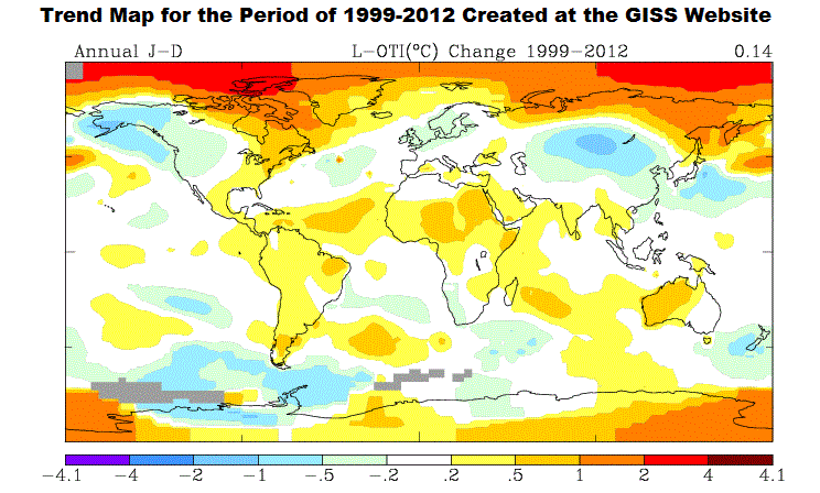
Figure 11b
THE PDO DID IT
Trenberth and Fasullo (2013) are using the Pacific Decadal Oscillation (PDO) index as a proxy for the strength, frequency and duration of El Niño and La Niña events during their discussions under the heading of “3.4 Decadal Variability”. I’ve added a note to their Figure 8 in my Figure 12, to show where the PDO index is derived from.

Figure 12
The PDO does not represent the sea surface temperature anomalies of the North Pacific, north of 20N. The PDO is an abstract portrayal of it. A positive PDO index value basically represents how closely the spatial pattern (warm in the east and cool in the central and western extratropical North Pacific) there resembles the spatial pattern caused by El Niño events. A similar but opposite pattern (cool in the east and warm in the central and western extratropical North Pacific) is also created by La Niña events and it provides a negative PDO value. Because the spatial pattern in the North Pacific is also strongly impacted by wind patterns (and the interrelated sea level pressures) there, the PDO has a slightly different pattern in time (decadal variability) than one sees with an ENSO (El Niño-Southern Oscillation) index.
Trenberth and Fasullo are presenting the fact that El Niño events dominated the period of 1976 through 1998, and La Niñas dominated from 1999 to 2012. We can show this very simply with the sea surface temperature anomalies of the NINO3.4 region of the equatorial Pacific (5S-5N, 170W-120W). See Figure 13. The sea surface temperature anomalies of the NINO3.4 region are a commonly used index of the strength, frequency and duration of El Niño and La Niña events. The large upward spikes show the response of the sea surface temperatures of that region to El Niño events, and the downward spikes (and multiyear troughs) capture the effects of La Niña events.

Figure 13
Note: The base years of 1950 to 1979 are based on those selected in Trenberth (1997) The Definition of El Niño.
As shown in Figure 13, the average NINO3.4 sea surface temperature anomaly for 1976 to 1998 is almost +0.3 deg C, indicating that El Niño events dominated that period. And from 1999 to 2012, the average NINO3.4 sea surface temperature anomaly is slightly negative, indicating that La Niña events were slightly stronger than El Niño events in more recent years.
During El Niño events, trade winds in the western tropical Pacific reverse, and in the eastern tropical Pacific, the trade winds are weaker than “normal” and sometimes reverse, depending on the strength and location of the El Niño. During La Niña events, the trade winds are stronger than normal.
The bottom line: Trenberth and Fasullo are arguing that, from the abstract:
For the past decade, more than 30% of the heat has apparently penetrated below 700m depth that is traceable to changes in surface winds mainly over the Pacific in association with a switch to a negative phase of the Pacific Decadal Oscillation (PDO) in 1999.
In other words, Trenberth and Fasullo (2013) are claiming that global warming is continuing after 1999, but we’re not seeing it at the surface, because the stronger-than-normal trade winds are piling up the warm water in the western Pacific.
However, it appears Trenberth has forgotten his ENSO (El Niño-Southern Oscillation) basics. In the 2002 paper Evolution of El Niño–Southern Oscillation and global atmospheric surface temperatures, paragraph 57, Trenberth and the others write (my boldface):
The negative feedback between SST and surface fluxes can be interpreted as showing the importance of the discharge of heat during El Niño events and of the recharge of heat during La Niña events. Relatively clear skies in the central and eastern tropical Pacific allow solar radiation to enter the ocean, apparently offsetting the below normal SSTs, but the heat is carried away by Ekman drift, ocean currents, and adjustments through ocean Rossby and Kelvin waves, and the heat is stored in the western Pacific tropics. This is not simply a rearrangement of the ocean heat, but also a restoration of heat in the ocean.
In other words, the stronger trade winds reduce cloud cover, which, in turn, allows more sunlight to warm the tropical Pacific. So, if the stronger trade winds are causing more warm water to be stacked up in the western tropical Pacific, it’s an increase in sunlight that’s fueling it. This was discussed in much more detail under the heading of DOWNWARD SHORTWAVE RADIATION VERSUS DOWNWARD LONGWAVE RADIATION DURING LA NIÑA EVENTS in the post Open Letter to the Royal Meteorological Society Regarding Dr. Trenberth’s Article “Has Global Warming Stalled?”
Also discussed in that post: the other major problem with the presentation of ocean heat content in Trenberth and Fasullo (2013) is they are using the ORAS4 reanalysis and not ocean heat content data. The ORAS4 reanalysis is the product of the European Centre for Medium-Range Weather Forecasts (ECMWF). Trenberth and Fasullo (2013) are presenting that reanalysis as gospel, but ECMWF cautions (See their webpage here):
Disclaimer. There is large uncertainty in the ocean reanalysis products (especially in the transports), difficult to quantify. These web pages are aimed at the research community. Any outstanding climate feature should be investigated futher (sic) and not taken as truth.
This was the same reanalysis used by Trenberth in the Balmaseda et al (2013) paper Distinctive climate signals in reanalysis of global ocean heat content, of which he was co-author. And Trenberth and Fasullo (2013) are presenting similar arguments. We’ve already addressed Balmaseda et al (2013) in past posts so there is no reason to rehash them again here. See:
- Trenberth Still Searching for Missing Heat (The WattsUpWithThat cross post is here.)
- More on Trenberth’s Missing Heat (The WattsUpWithThat cross post is here.)
- Ocean Heat Content (0 to 2000 Meters) – Why Aren’t Northern Hemisphere Oceans Warming During the ARGO Era? (The WattsUpWithThat cross post is here.)
- Even More about Trenberth’s Missing Heat – An Eye Opening Comment by Roger Pielke Sr. (The WattsUpWithThat cross post is here.)
- Multidecadal Variations and Sea Surface Temperature Reconstructions(The WattsUpWithThat cross post is here.)
- Open Letter to the Royal Meteorological Society Regarding Dr. Trenberth’s Article “Has Global Warming Stalled?”(The WattsUpWithThat cross post is here.)
And for more information on the problems with ocean heat content data, see the posts:
- Is Ocean Heat Content Data All It’s Stacked Up to Be?(The WattsUpWithThat cross post is here.)
- NODC’s Pentadal Ocean Heat Content (0 to 2000m) Creates Warming That Doesn’t Exist in the Annual Data – A Lot of Warming(The WattsUpWithThat cross post is here.)
- A Different Perspective on Trenberth’s Missing Heat: The Warming of the Global Oceans (0 to 2000 Meters) in Deg C(The WattsUpWithThat cross post is here.)
- Rough Estimate of the Annual Changes in Ocean Temperatures from 700 to 2000 Meters Based on NODC Data(The WattsUpWithThat cross post is here.)
- AMAZING: The IPCC May Have Provided Realistic Presentations of Ocean Heat Content Source Data(The WattsUpWithThat cross post is here.)
CLOSING
Trenberth and Fasullo (2013) is just another example of the climate science community continuing to attempt to convince (fool) themselves, and the public, that the hypothesis of human-induced global warming is not faulty in light of the halt in global warming. However:
- Sea surface temperature data during the satellite era (Reynolds OI.v2 data) do not support it.
- Ocean heat content data (NODC data for the depth of 0-700 meters) do not support it.
- Climate models (CMIP3 and CMIP5 generations) do not support it.
Someday the climate science community will stop trying to fool themselves (and the public) and accept that the hypothesis of human-induced global warming is fatally flawed. But I don’t expect that to occur in my lifetime.


Reblogged this on leclinton and commented:
Bob this is assume
Hello I am reading a book by Arno Arrak (What warming?) who is claiming that the only global warming after 1979 is a result of the super El Nino 1998 and the following la Nina. This is based on atmospheric satelite temperatur measurments. His opinion is that the surface temp measurements are fake and manipulated and that all other El Ninos/La Ninas after 1979 are just oscillations that cancel each other out. What is your opinion?
try50, my opinion is that Arno Arrak has a very limited understanding of El Nino and La Nina processes. Over the years, I have had to correct his misinformation numerous times at WattsUpWithThat. In the past, he has had a nasty habit of stating that I’m wrong in comments at WUWT. My understandings of ENSO are supported by ocean heat content data, sea surface temperature data, lower troposphere temperature data, trade wind strength and direction data, ocean current data, warm water volume data, depth-averaged temperature data, downward shortwave radiation (sunlight) data, downward longwave (infrared) radiation data, sea level data, cloud amount data, precipitation data, etc. Arno Arrak cannot make a similar claim because much of what he states is not supported by data.
In addition to the 1997/98 El Nino, the 1986/87/88 El Nino also caused an upward shift in the sea surface temperatures for about 2/3rds of the global oceans. And the 2009/10 El Nino may have caused a minor upward shift. See my illustrated essay “The Manmade Global Warming Challenge”:
Click to access the-manmade-global-warming-challenge.pdf
There are biases in the land surface air temperature record, from land use changes, poor station siting, urban heat island effect, etc., but those biases do not exist in the sea surface temperature record.
Regards
Bob, based on your figure 6, the halt/hiatus/pause in global temperatures begins right when the trailing La Ninas fail to cool the northern mid and higher latitudes. Prior to that when they were cooling quite well, the global mean temperature was rising overall. Can you comment on this situation where “excess” heat (relative to 1980) in the system appears to be preventing even more being acquired? Is there increased albedo after 1997 that would be preventing the SWR energy from entering the oceans to a greater degree than inhibiting the LWR going out?
Gary says: “Bob, based on your figure 6, the halt/hiatus/pause in global temperatures begins right when the trailing La Ninas fail to cool the northern mid and higher latitudes.”
2001 is a good year to start the recent halt.
Gary says: “Prior to that when they were cooling quite well, the global mean temperature was rising overall.”
There was also a shorter hiatus after the 1986/87/88 El Niño, but the eruption of Mount Pinatubo makes it difficult to see. Prior to that, there was the upward shift in response to the 1976 Pacific Climate Shift.
Gary says: “Can you comment on this situation where “excess” heat (relative to 1980) in the system appears to be preventing even more being acquired?”
I’m not sure I follow you on this. After strong El Niño events (1986/87/88, 1997/98, and 2009/10), sea surface temperatures appear to simply to acquire a new “setpoint”, at which they’re relatively happy. The warming of ocean heat content is a product of coupled ocean-atmosphere processes more than anything else.
Regards
Pingback: More on Trenberth and Fasullo (2013) “An Apparent Hiatus in Global Warming?” | Bob Tisdale – Climate Observations
Pingback: More on Trenberth and Fasullo (2013) “An Apparent Hiatus in Global Warming?” | Watts Up With That?
Pingback: If Manmade Greenhouse Gases Are Responsible for the Warming of the Global Oceans… | Bob Tisdale – Climate Observations
Pingback: If Manmade Greenhouse Gases Are Responsible for the Warming of the Global Oceans… | Watts Up With That?
Pingback: Comments on the Nature Article “Climate Change: The Case of the Missing Heat” | Bob Tisdale – Climate Observations
Pingback: Comments on the Nature Article “Climate Change: The Case of the Missing Heat” | Watts Up With That?
Pingback: Open Letter to Kevin Trenberth – NCAR | Bob Tisdale – Climate Observations
Pingback: Open Letter to Kevin Trenberth – NCAR | Watts Up With That?