
INITIAL NOTES
Note 1: The NOAA NOMADS servers are still off line. NOAA replied to my email inquiry and advised that the NOMADS website will be down for an extended time period and there were no estimates for when they would be returned to service.
Note 2: Because the NOMADS servers are off line, I’ve downloaded the Reynolds OI.v2 data from the KNMI Climate Explorer, using the base years of 1981-2010. The updated base years help to reduce the seasonal components in the ocean-basin subsets—they don’t eliminate those seasonal components, but they reduce them.
Note 3: We discussed the reasons for the elevated sea surface temperatures in the post On The Recent Record-High Global Sea Surface Temperatures – The Wheres and Whys.
MONTHLY SEA SURFACE TEMPERATURE ANOMALY MAP
The following is a Global map of Reynolds OI.v2 Sea Surface Temperature (SST) anomalies for September 2014. It was downloaded from the KNMI Climate Explorer. The contour range was set to -3.0 to +3.0 deg C.

September 2014 Sea Surface Temperature (SST) Anomalies Map
(Global SST Anomaly = +0.285 deg C)
MONTHLY GLOBAL OVERVIEW
Global Sea Surface Temperature anomalies dropped last month, a decrease of about +0.02 deg C from August to September. There was a very small increase in the Northern Hemisphere, which was countered by the larger decrease in the Southern Hemisphere. Only two ocean basins showed warming, the North Atlantic and the Southern Ocean. The monthly Global Sea Surface Temperature anomalies are presently at +0.285 deg C, referenced to the WMO-preferred base years of 1981 to 2010.

(1)Global Sea Surface Temperature Anomalies
Monthly Change = -0.016 deg C
THE EQUATORIAL PACIFIC
The NINO3.4 Sea Surface Temperature anomalies for September 2014 are just below the +0.5 deg C threshold of El Nino conditions. They are presently at +0.44 deg C, having risen, about +0.245 deg C, in the last month.
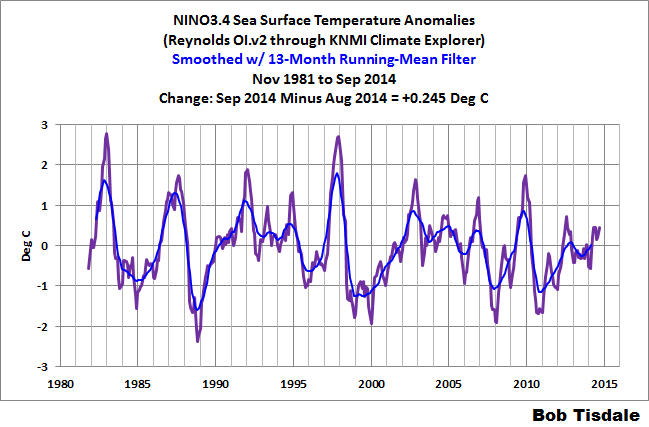
(2) NINO3.4 Sea Surface Temperature Anomalies
(5S-5N, 170W-120W)
Monthly Change = +0.245 deg C
####################################
The sea surface temperature anomalies for the NINO3.4 region in the eastern equatorial Pacific (5S-5N, 170E-120E) are a commonly used index for the strength, frequency and duration of El Niño and La Nina events. We keep an eye on the sea surface temperatures there because El Niño and La Niña events are the primary cause of the yearly variations in global sea surface temperatures AND they are the primary cause of the long-term warming of global sea surface temperatures over the past 30 years. See the discussion of the East Pacific versus the Rest-of-the-World that follows. We present NINO3.4 sea surface temperature anomalies in monthly and weekly formats in these updates.
Also see the weekly data toward the end of the post.
THE EAST PACIFIC VERSUS THE REST OF THE WORLD
NOTE: This section of the updates was revised a few months ago. We discussed the reasons for the changes in the post Changes to the Monthly Sea Surface Temperature Anomaly Updates.
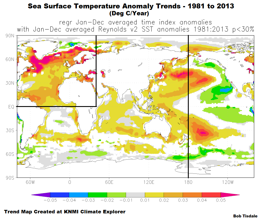
For years, we have shown and discussed that the surfaces of the global oceans have not warmed uniformly during the satellite era of sea surface temperature data. In fact, some portions of the global oceans have cooled during that 3+ decade period. One simply has to look at a trend map for the period of 1982 to 2013 to see where the ocean surfaces have warmed and where they have not. Yet the climate science community has not addressed this. See the post Maybe the IPCC’s Modelers Should Try to Simulate Earth’s Oceans.
The North Atlantic (data illustrated later in the post) has had the greatest warming over the past 3+ decades, but the reason for this is widely known. The North Atlantic has an additional mode of natural variability called the Atlantic Multidecadal Oscillation. If you’re not familiar with the Atlantic Multidecadal Oscillation see the NOAA Frequently Asked Questions About the Atlantic Multidecadal Oscillation (AMO) webpage and the posts An Introduction To ENSO, AMO, and PDO — Part 2 and Multidecadal Variations and Sea Surface Temperature Reconstructions. As a result of the Atlantic Multidecadal Oscillation, the surface of the North Atlantic warmed at a rate that was more than twice the rate of the surface of the rest of the global oceans. See the trend comparison graph here.
The East Pacific Ocean also stands out in the trend map above. Some portions of its surfaces warmed and others cooled. It comes as no surprise then that the linear trend of the East Pacific (90S-90N, 180-80W) Sea Surface Temperature anomalies since the start of the Reynolds OI.v2 dataset is so low. With the El Nino conditions in the eastern tropical Pacific, it has acquired a slight positive trend, but it’s still far below the approximate +0.15 deg C/decade warming rate predicted by the CMIP5 climate models. Please see Figure 19 in the post Maybe the IPCC’s Modelers Should Try to Simulate Earth’s Oceans. (Note that the region also includes portions of the Arctic and Southern Oceans.) That is, there has been little to no warming of the sea surfaces of the East Pacific (from pole to pole) in 32 years. The East Pacific is not a small region. It represents about 33% of the surface area of the global oceans. The East Pacific linear trend varies very slightly with each monthly update. But it doesn’t vary greatly between El Niño and La Niña events.
Notice how there appears to have been a strong El Niño event this year in the East Pacific data, while there has only been a small off season event so far this year. Note also how there appears to have been a shift in the data in 2013. Refer again to the post On The Recent Record-High Global Sea Surface Temperatures – The Wheres and Whys. The other ocean basins, thankfully, are not responding as if there has been an El Niño.

(3) East Pacific Sea Surface Temperature (SST) Anomalies
(90S-90N, 180-80W)
####################################
That leaves the largest region of the trend map, which includes the South Atlantic, the Indian and West Pacific Oceans, with the corresponding portions of the Arctic and Southern Oceans. Sea surface temperatures there warmed in very clear steps, in response to the significant 1986/87/88 and 1997/98 El Niño/La Niña events. It also appears as though the sea surface temperature anomalies of this dataset have made another upward shift in response to the 2009/10 El Niño and 2010/11 La Niña events. I further described the ENSO-related processes that cause these upward steps in the recent post Answer to the Question Posed at Climate Etc.: By What Mechanism Does an El Niño Contribute to Global Warming?
Again, as you’ll note, the data for the South Atlantic, Indian and West Pacific Oceans do not show anything unusual this year. (And as you’ll see later, the North Atlantic is presently showing the “normal” range of seasonal variations.) The big surge is in the East Pacific, the eastern North Pacific to be specific.

(4) Sea Surface Temperature Anomalies For The South Atlantic-Indian-West Pacific Oceans
(Weighted Average of 0-90N, 40E-180 @ 27.9% And 90S-0, 80W-180 @72.1%)
####################################
The periods used for the average temperature anomalies for the South Atlantic-Indian-West Pacific subset between the significant El Niño events of 1982/83, 1986/87/88, 1997/98, and 2009/10 are determined as follows. Using the original NOAA Oceanic Nino Index (ONI) for the official months of those El Niño events, I shifted (lagged) those El Niño periods by six months to accommodate the lag between NINO3.4 SST anomalies and the response of the South Atlantic-Indian-West Pacific Oceans, then deleted the South Atlantic-Indian-West Pacific data that corresponds to those significant El Niño events. I then averaged the South Atlantic-Indian-West Pacific Oceans sea surface temperature anomalies between those El Niño-related gaps.
The “Nov 2010 to Present” average varies with each update.
The Sea Surface Temperature anomalies of the East Pacific Ocean, or approximately 33% of the surface area of the global oceans, have shown little to no long-term warming since 1982 based on the linear trend. And between upward shifts, the Sea Surface Temperature anomalies for the South Atlantic-Indian-West Pacific subset (about 52.5% of the global ocean surface area) remain relatively flat, though they actually cool slightly. Anthropogenic forcings are said to be responsible for most of the rise in global surface temperatures over this period, but the Sea Surface Temperature anomaly graphs of those regions discussed above prompt a two-part question: Since 1982, what anthropogenic global warming processes would overlook the sea surface temperatures of 33% of the global oceans and have an impact on the other 52% but only during the months of the significant El Niño events of 1986/87/88, 1997/98 and 2009/10?
They were also discussed in great detail in my recently published book Who Turned on the Heat? The Unsuspected Global Warming Culprit, El Niño-Southern Oscillation. The Free Preview includes the Table of Contents; the Introduction; the beginning of Section 1, with the cartoon-like illustrations; the discussion About the Cover; and the Closing. Also see the blog post Everything You Every Wanted to Know about El Niño and La Niña… for an overview. It’s now sale priced at US$5.00. Please click here to buy a copy. (Paypal or Credit/Debit Card. You do not need to open a PayPal account.)
STANDARD NOTE ABOUT THE DATA
The MONTHLY graphs illustrate raw monthly OI.v2 sea surface temperature anomaly data from November 1981 to September 2014, as it is presented by the KNMI Climate Explorer linked at the end of the post. While NOAA uses the base years of 1971-2000 for this dataset, those base years cannot be used at the KNMI Climate Explorer because they extend before the actual data. (NOAA had created a special climatology for the Reynolds OI.v2 data.) I’ve referenced the data to the period of 1981 to 2010, which is actually 1982 to 2010 for most months. And I’ve added a 13-month running-average filter to smooth out the seasonal variations.
MONTHLY INDIVIDUAL OCEAN AND HEMISPHERIC SEA SURFACE TEMPERATURE UPDATES
 (5) Northern Hemisphere Sea Surface Temperature (SST) Anomalies
Monthly Change = +0.004 deg C
####################################

(6) Southern Hemisphere Sea Surface Temperature (SST) Anomalies
Monthly Change = -0.031 deg C
####################################

(7) North Atlantic Sea Surface Temperature (SST) Anomalies
(0 to 70N, 80W to 0)
Monthly Change = +0.016 deg C
####################################

(8) South Atlantic Sea Surface Temperature (SST) Anomalies
(0 to 60S, 70W to 20E)
Monthly Change = -0.070 deg C
####################################

(9) Pacific Sea Surface Temperature (SST) Anomalies
(60S to 65N, 120E to 80W)
Monthly Change = -0.011 Deg C
####################################

(10) North Pacific Sea Surface Temperature (SST) Anomalies
(0 to 65N, 100E to 90W)
Monthly Change = -0.002 Deg C
####################################

(11) South Pacific Sea Surface Temperature (SST) Anomalies
(0 to 60S, 120E to 70W)
Monthly Change = -0.009 deg C
####################################
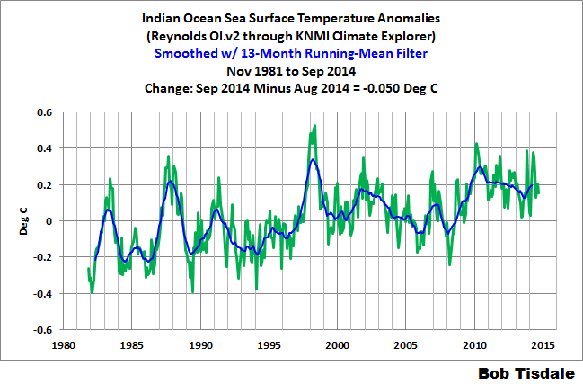
(12) Indian Ocean Sea Surface Temperature (SST) Anomalies
(60S to 30N, 20E to 120E)
Monthly Change = -0.050 deg C
####################################

(13) Arctic Ocean Sea Surface Temperature (SST) Anomalies
(65N to 90N)
Monthly Change = -0.089 deg C
####################################

(14) Southern Ocean Sea Surface Temperature (SST) Anomalies
(90S-60S)
Monthly Change = +0.034 deg C
####################################
WEEKLY SEA SURFACE TEMPERATURE ANOMALIES
Weekly NINO3.4 sea surface temperature anomalies are responding to the second (but much weaker) downwelling Kelvin wave this year.
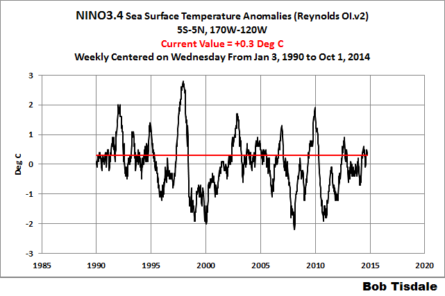
(15) Weekly NINO3.4 Sea Surface Temperature (SST) Anomalies
Note: With the NOMADS servers off line, I’ve used the weekly NINO3.4 data available from the NOAA/CPC Monthly Atmospheric & SST Indices webpage, specifically the data here. They do not provide the global data on a weekly basis, so I can’t present it. Sorry.
####################################
INTERESTED IN LEARNING MORE ABOUT HOW AND WHY THE GLOBAL OCEANS INDICATE THEY’VE WARMED NATURALLY?
Why should you be interested? The hypothesis of manmade global warming depends on manmade greenhouse gases being the cause of the recent warming. But the sea surface temperature record indicates El Niño and La Niña events are responsible for the warming of global sea surface temperature anomalies over the past 32 years, not manmade greenhouse gases. Scroll back up to the discussion of the East Pacific versus the Rest of the World. I’ve searched sea surface temperature records for more than 4 years, and I can find no evidence of an anthropogenic greenhouse gas signal. That is, the warming of the global oceans has been caused by Mother Nature, not anthropogenic greenhouse gases.
I’ve recently published my e-book (pdf) about the phenomena called El Niño and La Niña. It’s titled Who Turned on the Heat? with the subtitle The Unsuspected Global Warming Culprit, El Niño Southern Oscillation. It is intended for persons (with or without technical backgrounds) interested in learning about El Niño and La Niña events and in understanding the natural causes of the warming of our global oceans for the past 30 years. Because land surface air temperatures simply exaggerate the natural warming of the global oceans over annual and multidecadal time periods, the vast majority of the warming taking place on land is natural as well. The book is the product of years of research of the satellite-era sea surface temperature data that’s available to the public via the internet. It presents how the data accounts for its warming—and there are no indications the warming was caused by manmade greenhouse gases. None at all.
Who Turned on the Heat? was introduced in the blog post Everything You Ever Wanted to Know about El Niño and La Niña… …Well Just about Everything. The Free Preview includes the Table of Contents; the Introduction; the beginning of Section 1, with the cartoon-like illustrations; the discussion About the Cover; and the Closing.
Please buy a copy. (Paypal or Credit/Debit Card). You do not need to have a PayPal account. Simply scroll down to the “Don’t Have a PayPal Account” purchase option. It’s now sale priced at US$5.00.
SOURCES
The monthly Sea Surface Temperature (SST) anomaly data used in this post are available from the KNMI Climate Explorer.


I paid $10 a few months back and it was worth it then 😉
Thanks for the update Bob, and the explanation. I wonder when they will head down again?
Thanks for the kind words, Keitho. I suspect it might take a strong ENSO event to break that hot spot in the North Pacific. Due to the process of re-emergence, that hotspot could show up again next year.
Cheers
If increased evaporation is happening (if the air above is colder than the first few inches of the ocean’s surface), we are losing that store of ocean heat. It has been around for a long time, riding the currents that flow both on top and under the ocean’s surface. Where did the warmth come from? Has to be solar insolation under clear skies and clear ocean, and for an extended period of time around the central equatorial latitudes where insolation would hit at relatively perpendicular angles and penetrate deeply.
Under clear sky/ocean equatorial conditions solar insolation penetrates deeply. Otherwise clouds and other forms of aerosols reflect it away. Same conditions happen when the top few meters of the oceans are clouded with reflective particulate organic and inorganic matter. But under clear conditions, these warmed masses of below the surface water would then eventually find their way to the poles and pool up there, especially the Arctic pole. Not so much the Antarctic pole. There the warm equatorial waters catch a ride on the circumpolar current. At the Arctic they pile up in the North Pacific and North Atlantic land masses. Some of it sinks and begins a long slow ride on the ocean bottom currents, and some invade into the Arctic circle, eating away at sea ice. A lot of it evaporates and rides the jet stream, setting up weather pattern variations.
Pure speculation: If this happened to a great degree and a large pool of warm water parked itself in the North Pacific for a significant period of time (IE decades), the atmosphere would set up a semi-permanent large blocking high pressure system over the pool, causing significant invasions of arctic air to flow South into the North American middle belt as a semi-permanent large low pressure system that would appear as an encroaching change to Arctic conditions. hmmmmmm.
We are currently in a positive PNA phase though it is stepping downward. Temperature-wise the Climate Prediction Center says this about the positive phase:
“The positive phase of the PNA pattern is associated with above-average temperatures over western Canada and the extreme western United States, and below-average temperatures across the south-central and southeastern U.S..”
http://www.cpc.ncep.noaa.gov/data/teledoc/pna.shtml
The last ENSO weekly update demonstrates this very pattern. Scroll down to power point 31.
Click to access enso_evolution-status-fcsts-web.pdf
Pingback: John Cook Says Record Antarctic Ice Is Due To Warmer Southern Ocean | NOT A LOT OF PEOPLE KNOW THAT
Pingback: Antarctic Temperature Trends | NOT A LOT OF PEOPLE KNOW THAT
Pingback: John Cook’s claim of a ‘warmer southern ocean’ is proven wrong | Watts Up With That?
Bob I note that the Southern Ocean SST graphic is labelled 90S – 60 S have you masked the land area?.
Kevin, thanks for asking. There is no land area in a sea surface temperature dataset. It only includes ocean grids.
Interesting site Mr. Tisdale. I am not formally educated in the fields of atmospheric science, meteorology, solar physics (as the sun is a major forcing function of the earth’s weather/climate), but it is ironic I passed by your website. I have been observing the earth’s sea surface temperature anomaly via the UNISYS website for at least the past 10 years. The UNISYS site also allows access to weekly archived data dating back to the middle of 1999. Of recent note, since September 22, 2014, both the western Pacific and the central Atlantic oceans in the northern hemisphere have begun to develop significant regions of negative sea surface temperature anomalies of which I have not observed since I started observing the UNISYS data. On the other hand, the recently (so far as I became knowledgeable) offered NOAA daily sea surface anomaly (NCEP SST) graphical data not only does not indicate even moderate negative anomalies, but rather slightly positive anomalies where the UNISYS data indicates significant negative anomalies. I am curious as to whether you are knowledgeable of the base data period (Smith & Reynolds?) UNISYS applies versuse the base data the NOAA NCEP SST data applies to establish their anomaly values? If you are not familiar with the UNISYS data, and I do not know if urls are blocked but I will offer the link to their graphical data:
http://weather.unisys.com/surface/sfc_daily.php?plot=ssa&inv=0&t=cur
By the way, please note the significant cooling that has rapidly taken place over the past month. Also, if you note at the lower left-hand corner of the web page the heading “ARCHIVE” where the link “Archive of Image” is located. That link will direct you to the UNISYS “SST” link where weekly graphical images of the sea surface temperature anomaly are available back to June 7, 1999.
And for the NOAA NCEP SST Anomaly graphical data:
http://polar.ncep.noaa.gov/sst/rtg_high_res/
Please note the significant difference with respect to the UNISYS data.
I greatly appreciate your time and consideration regarding my post matter. I will check in later this week to see if you’ve offered a reply. Thanks.
Hi Douglas P. Unfortunately, I have no idea what years Unisys use as base years for anomalies. And for some reason, NOAA is using the 61-90 base period, which helps give them a warm appearance.
There are a few things that are giving the Unisys maps a cool or cold appearance. The Unisys color scale is shifted toward cool colors, with light blues representing slightly positive anomalies, while NOAA uses white at and near zero. It’s also impossible to read the Unisys color scale now, which doesn’t help. Notice also how the latitudes on the Unisys maps are not linear, while on the NOAA map they are. I believe Unisys are using a Mercator projection, which exaggerates the mid-to-high latitudes with respect to the tropics.