
UPDATE (April 6, 2014): I’ve added a link to a follow-up post about the cause of the observed C-shaped warming pattern in the Pacific.
# # #
The climate models stored in the CMIP5 archive are supposed to be simulations of Earth’s climate, but the simulated sea surface temperatures of the models used by the IPCC for their 5th Assessment Report are definitely not of this planet. 70% of the Earth is covered by oceans, seas and lakes. Because the models show no skill at being able to simulate the rates of warming and cooling of the surfaces of the global oceans over the past 32+ years, and because the models show no skill at being able to reproduce the spatial patterns of that warming and cooling, all of which drive temperature and precipitation patterns on land, then any and all projections of future climate are based on modeled worlds that have no similarity to the real world. In other words, climate model projections are meaningless.
This post will serve as the model-data comparison for satellite-era sea surface temperature anomalies for this year. This is an expanded version. It provides a couple of answers for why the models perform so poorly when attempting to simulate the surface temperatures of the global oceans.
PRELIMINARY INFORMATION
The Reynolds OI.v2 sea surface temperature anomalies through the NOAA NOMADS website are referenced to the base years of 1971-2000, even though the data only runs from November 1981 to February 2013. The same base years are used for the model outputs.
The climate models presented in this post are those stored in the CMIP5 archive, which was used by the IPCC for their 5th Assessment Report (AR5). The CMIP5 climate model outputs of sea surface temperature are available through the KNMI Climate Explorer, specifically through their Monthly CMIP5 scenario runs webpage, under the heading of Ocean, ice and upper air variables. Sea surface temperature is identified as “TOS” (temperature ocean surface). For consistency, the “CMIP5 mean” and the RCP6.0 scenario are being used. The RCP6.0 scenario is the closest to scenario A1B used for the CMIP3 models (used by the IPCC for the 4th Assessment Report). And once again we’re using the model mean because it represents the forced component of the climate models; that is, if the forcings used by the climate models were what caused the surfaces of the oceans to warm, the model mean best represents how the ocean surfaces would warm in response to those forcings. For a further discussion, see the post On the Use of the Multi-Model Mean.
The data as suggested above are the Reynolds OI.v2 satellite-enhanced sea surface temperature anomalies, which are available through the NOAA NOMADS website here.
The model-data comparisons in this post run from the November 1981 start of the Reynolds OI.v2 data to February 2014, more than 32 years.
The linear trends in the graphs are as calculated by EXCEL. And the trend maps were produced at the KNMI Climate Explorer.
TREND MAPS
Figure 1 presents maps of the modeled and observed warming and cooling rates of the surfaces of the global oceans for the period of 1982 to 2013. The color-coded contour levels are presented in deg C/year. The model mean is presented in the left-hand map and the observed warming rates are presented in the right-hand one. There are no similarities between the spatial patterns of the modeled and observed trends. The models show the greatest warming near the equator, while in the real world, the greatest warming has occurred at mid and high latitudes. The North Atlantic in the real world warmed at the highest rate. That warming of the North Atlantic is associated with the Atlantic Multidecadal Oscillation.
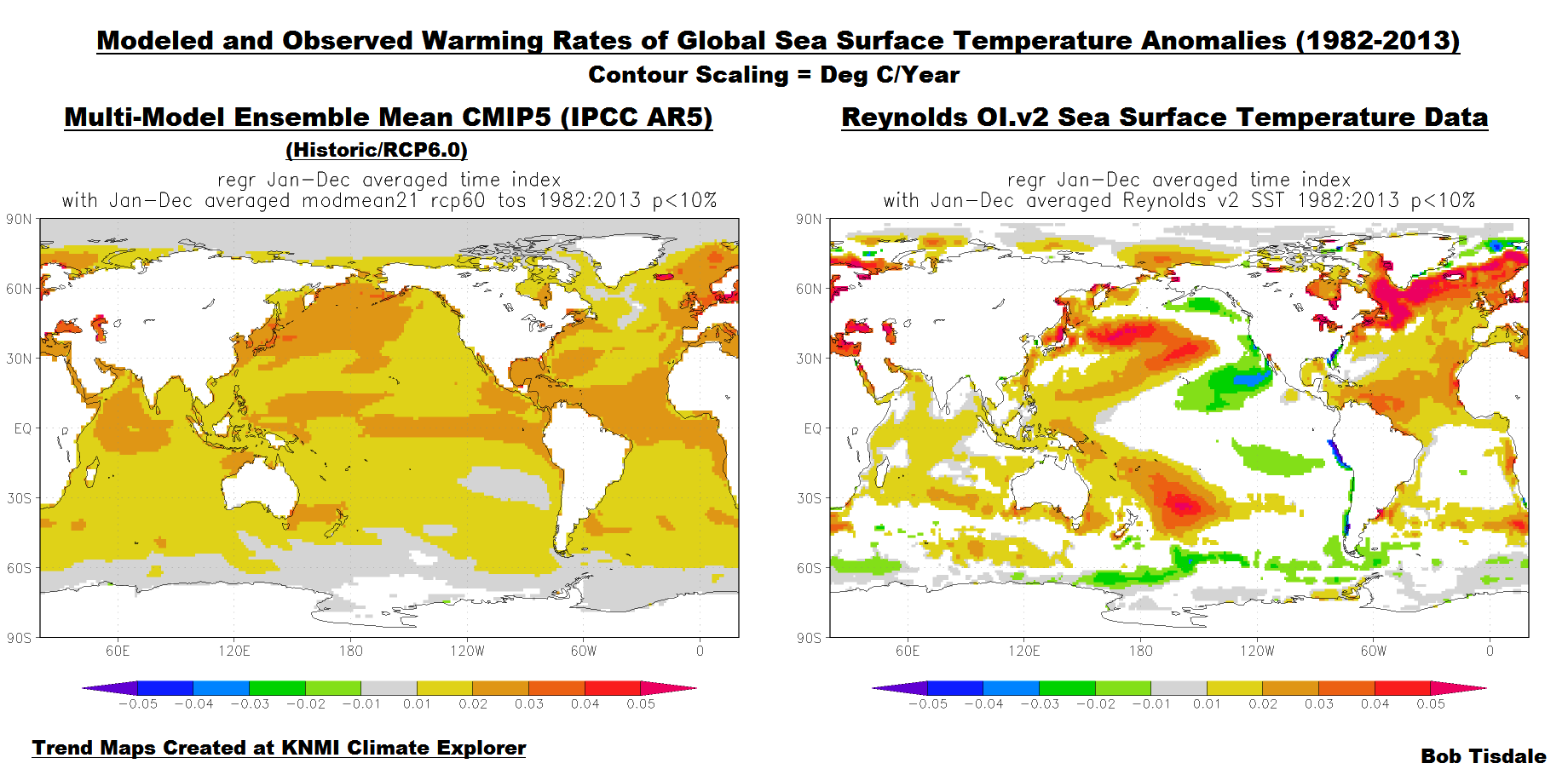
Figure 1
The model mean does not present that additional warming in the North Atlantic, which indicates that the recent additional warming of the North Atlantic has occurred naturally; that is, the Atlantic Multidecadal Oscillation is not a process forced by factors that are used to make the oceans warm in the models. We’ll discuss and illustrate this later in this post.
The observed C-shaped pattern of warming in the Pacific is the result of the dominance of El Niño events during this period. El Niño events release sunlight-produced warm water from below the surface of the western tropical Pacific. That warm water temporarily floods into the eastern tropical Pacific, primarily along the equator, during El Niño events. At the end of the El Niños, the leftover warm water is driven west by the renewed trade winds and by other ocean processes. The leftover warm water collects in the Kuroshio-Oyashio Extension (east of Japan) and along the South Pacific Convergence Zone (east of Australia and New Zealand). As a result of that process, the observed sea surface temperatures of the East Pacific Ocean (from the dateline to Panama) and of the tropical Pacific (24S-24N, 120E-80W) show little to no warming in over 32 years. Because the climate models do not properly simulate El Niño and La Niña events, they do not create the spatial pattern of warming and no warming in the Pacific. Keep in mind, the Pacific Ocean covers more of the surface of the Earth than all of the continental land masses combined, and the modelers show no skill at simulating how and where or why the surface of the Pacific Ocean warmed.
UPDATE: See the follow-up post El Niño Residuals Cause the C-Shaped Warming Pattern in the Pacific for a further discussion.
[End of Update]
The spatial patterns of the warming of the ocean surfaces dictate the spatial patterns of warming of the surface air temperatures over land, and those sea surface temperature spatial patterns contribute to the precipitation patterns on the continents. Because the climate models cannot simulate the spatial patterns of the warming of sea surface temperatures, one wonders how the modelers expect to properly simulate the warming of land surface air temperatures or the precipitation that occurs there.
GLOBAL TIME-SERIES
Figure 2 presents the model-data comparison for global satellite-era sea surface temperature anomalies. The data show the oceans warmed at a rate of 0.08 deg C/decade for the last 32+ years, but the models indicate they should have warmed at twice that rate if they were warmed by manmade greenhouse gases.
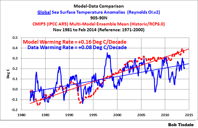
Figure 2
Phrased another way, manmade greenhouse gases in the climate models were expected to warm the surfaces of the global oceans at a rate of 0.16 deg C/decade for the past 32+ years, but the observed warming was only 0.08 deg C/decade. That’s an atrocious modeling effort. Now consider that this time period includes naturally occurring upswings in the surface temperatures of the North Atlantic and North Pacific (see the post here) and you’ll begin to understand the full extent of the model failings.
We could end the post on those notes, but let’s examine the models in more detail to see how else they fail.
TRENDS ON A ZONAL-MEAN (LATITUDE-AVERAGE) BASIS PER OCEAN BASIN
Figures 3, 4 and 5 are model-data trend comparisons of sea surface temperature anomalies for the Pacific, Atlantic, and Indian Oceans, respectively. But they aren’t time-series graphs. Looking from left to right along the horizontal (x) axis, “-90” represents the South Pole, “0” the equator, and the North Pole is at “90”. The units of the vertical (y) axis are degrees C per decade—based on the calculated linear trends. Each data point represents the linear trend (warming or cooling rate) in degrees C per decade for a 5 degree latitude band, where, for example, the data point at -82.5 (82.5S) latitude represents the linear trend of the high latitudes of the Southern Ocean surrounding Antarctica (85S-80S). The data points representing the trends then work northward in 5 degree increments through each of the ocean basins (80S-75S, then 75S-70S, then 70S-65S, and so on) using the longitudes for each ocean basin. The average temperatures of latitude bands are called the “zonal mean” temperatures by climate scientists; thus the use of that term in the title blocks.
Figure 3 shows the observed and modeled sea surface temperature trends for the Pacific Ocean (longitudes of 125E-90W) on a zonal-mean basis. At and near the equator, observed sea surface temperatures cooled since January 1982. And the highest observed warming in both hemispheres occurred at the mid-latitudes in the Pacific. The models, unfortunately, do not create that spatial pattern. The models show much more warming in the tropics than observed. The models also overestimate the warming at the high latitudes of the North Pacific and they show warming in the Pacific portion of the Southern Ocean, while the observations show cooling there over the past 32+ years.
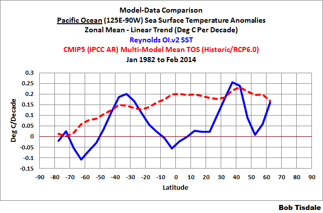
Figure 3
How can climate scientists/modelers hope to simulate the patterns of warming on land when they can’t simulate the warming patterns of the largest ocean on this planet?
What causes the mid-latitudes to warm, while the tropics show little warming?
Short answer: El Niño and La Niña processes.
Longer answer: The observed warming trends at mid-latitudes, with no warming near the equator, suggest warm water was distributed poleward in both hemispheres by ocean currents. That happens in the Pacific when El Niño events dominate, which was the case during this period. That is, a period during which El Niño events dominate causes the additional distribution of warm water toward the mid-latitudes. Refer to Figure 4, which is a comparison of Pacific trends on a zonal-mean basis for the periods of 1944 to 1975 and 1976 to 2011. It’s Figure 8-32 from my ebook Who Turned on the Heat? From 1944 to 1975, El Nino and La Niña events were more evenly matched, but slightly weighted toward La Niña. During that period, less naturally (sunlight) created warm water was released from below the surface of the tropical Pacific by El Niños and distributed toward the poles. But from 1976-2011, El Niño events dominated, so more warm tropical waters were distributed from below the surface of the tropical Pacific to the mid-latitudes. I’ve highlighted the differences between the two periods.
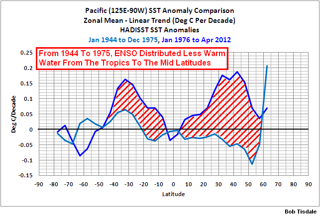
Figure 4
Figure 5 shows the modeled and observed trends in sea surface temperature anomalies for the Atlantic Ocean (longitudes 70W-20E) from Jan 1982 to February 2013. The models overestimate the warming in the South Atlantic and underestimate it North Atlantic, especially towards the high latitudes. In fact, the models show just about the same warming trends from 40S to 70N—that is, the models show the Atlantic Ocean should have warmed at about 0.15 to 0.2 deg C/decade for the last 32+ years for the latitudes of 40S to 70N—while the observed trends change greatly over those latitudes. Again, how can the climate scientists/modelers hope to create the warming patterns on adjoining land masses when they can’t simulate the warming pattern of the Atlantic?
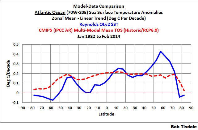
Figure 5
The last of the trend graphs on a zonal-mean basis is for the Indian Ocean, Figure 6. The models, basically, show way too much warming at most latitudes.
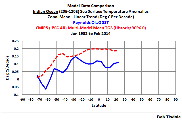
Figure 6
TIME SERIES – TROPICAL AND EXTRATROPICAL SEA SURFACE TEMPERATURE
In the past model-data comparisons of satellite-era sea surface temperatures (see the posts here and here), I’ve compared the data and model outputs for the Northern and Southern Hemispheres. For this post, I’ve divided the global data into three subsets: the tropical oceans (24S-24N), and the extratropical oceans of the Northern Hemisphere (24N-90N) and the Southern Hemisphere (90S-24S).
The reason: In June of 2013, Roy Spencer presented model-data comparisons of the warming of the tropical mid-troposphere prepared by John Christy. See Roy’s posts EPIC FAIL: 73 Climate Models vs. Observations for Tropical Tropospheric Temperature and STILL Epic Fail: 73 Climate Models vs. Measurements, Running 5-Year Means. The models grossly overestimated the warming rates of the mid-troposphere there. So I thought it would be worthwhile, since the tropical oceans (24S-24N) cover 76% of the tropics and about 46% of the global oceans, to confirm that the models also grossly overestimate the warming of sea surface temperatures of the tropical oceans.
It should come as no surprise that the models did overestimate the warming of the sea surface temperatures of the tropical oceans over the past 32+ years. See Figure 7. In fact, the models overestimated the warming by a wide margin. The data indicate the sea surface temperatures of the tropical oceans warmed at a not-very-alarming rate of 0.06 deg C/decade, while the models indicate that, if the surfaces of the tropical oceans were warmed by manmade greenhouse gases, they should have warmed at 3 times that rate, at 0.19 deg C/decade. For 46% of the surface of the global oceans (about 33% of the surface of the planet), the models tripled the observed warming rate.
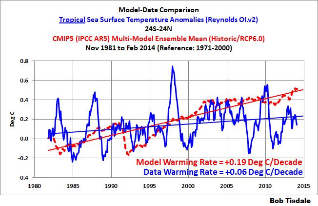
Figure 7
For the extratropical oceans of the Southern Hemisphere (90S-24S), Figure 8, the observed warming rate is also extremely low at 0.06 deg C/decade. On the other hand, the climate models indicate that if manmade greenhouse gases were responsible for the warming of sea surface temperatures in this region, the oceans should have warmed at a rate of 0.12 deg C/decade, effectively, doubling that observed trend. The extratropical oceans of the Southern Hemisphere cover about 33% of the surface of the global oceans (about 23% of the surface of the planet) and the models double the rate of warming.
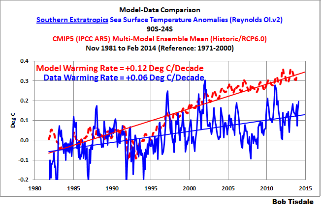
Figure 8
And the climate models seem to get the warming rate of sea surface temperatures just about right for the smallest portion of the global oceans, the extratropical Northern Hemisphere (24N-90N). See Figure 9. The extratropical oceans of the Northern Hemisphere cover only about 21% of the surface of the global oceans (about 15% of the surface of the Earth).
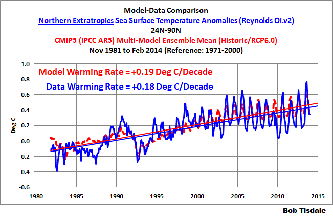
Figure 9
Unfortunately for the modelers, they underestimated the warming of the surface of the extratropical North Atlantic (Figure 10), and overestimated the warming in the extratropical North Pacific (Figure 11), though the differences are not bad compared to what we’ve seen elsewhere.
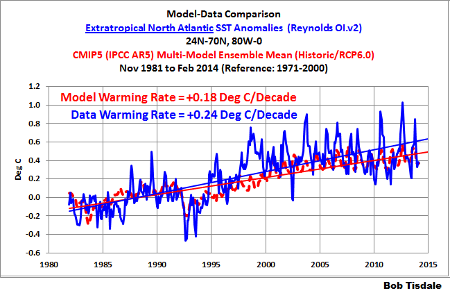
Figure 10
# # # # # # #
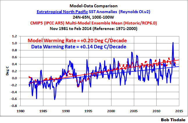
Figure 11
TIME SERIES – ATLANTIC OCEAN
Figure 12 presents the model-data comparison of the sea surface temperature anomalies for the Atlantic Ocean. They do a reasonable job here. The modeled warming rate is slightly more than the observations. In fact, of the three major ocean basins, the models perform best in the Atlantic.
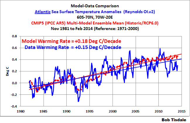
Figure 12
But the models accomplish it incorrectly. They underestimate the warming of the North Atlantic (Figure 13) by a little, but overestimate the warming of sea surface temperatures in the South Atlantic (Figure 14) by a huge margin.
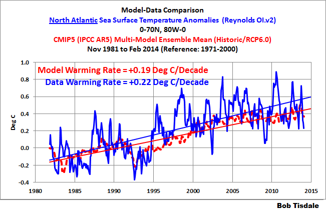
Figure 13
# # # # # # #
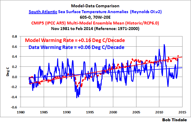
Figure 14
TIME SERIES – PACIFIC OCEAN
Figure 15 is the model-data comparison for the sea surface temperatures of the largest ocean on our planet, the Pacific. The models more than double (almost triple) the warming rate for the surface of the Pacific Ocean.
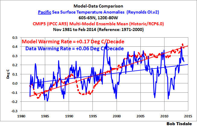
Figure 15
The models perform poorly in the North Pacific (Figure 16) and in the South Pacific (Figure 17), more than doubling the observed warming rates.
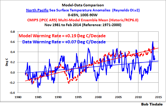
Figure 16
# # # # # # #
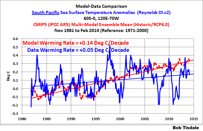
Figure 17
Let’s confirm a few things that were blatantly obvious in the trend maps in Figure 1.
The model-data comparison for the tropical Pacific (24S-24N, 120E-80W) is shown in Figure 18. The surface of the tropical Pacific shows basically no warming in 32+ years. According to the models, if manmade greenhouse gases were responsible for the warming of the surface of the global oceans, the tropical Pacific should have warmed at a rate of 0.18 deg C/decade, but the tropical Pacific hasn’t warmed.
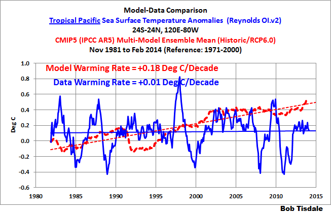
Figure 18
The last of the Pacific subsets is the East Pacific, Figure 19. For this comparison, I’ve extended the coordinates into the Southern and Arctic Oceans. With the coordinates of 90S-90N, 180-80W, the East Pacific covers about 33% of the surface of the global oceans. It too, basically, shows no warming in 32+ years. This contradicts the models, which indicate that the surface of the East Pacific should have warmed at a rate of about 0.15 deg C/decade…if they were warmed by manmade greenhouse gases.
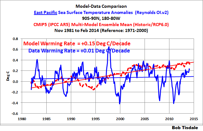
Figure 19
Not too mysteriously, manmade greenhouse gases have had little impact on two (overlapping) portions of the largest ocean on the planet.
TIME SERIES – INDIAN OCEAN
The models also performed poorly at simulating the warming rate of the sea surface temperatures of the Indian Ocean, Figure 20. The models almost double the warming rate there.
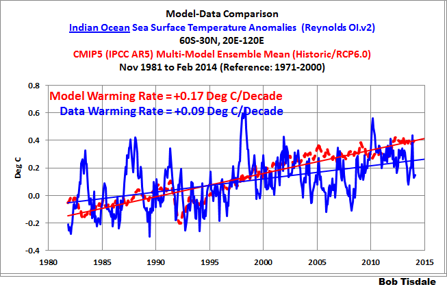
Figure 20
TIME SERIES – POLAR OCEANS
Figure 21 is the model-data comparison of the sea surface temperatures of the Arctic Ocean. The models captured the warming rate of the Arctic Ocean sea surface temperatures reasonably well.
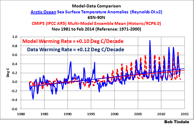
Figure 21
At the other end of the globe, the models failed miserably. The models indicate that the surface of the Southern Ocean (Figure 22) should have warmed over the past 32+ years, but the sea surface temperatures there cooled in that time.
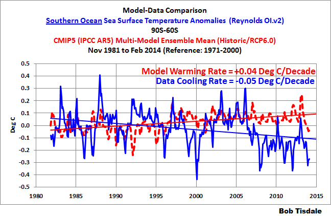
Figure 22
TABLE
Table 1 presents the observed and modeled linear trends for the sea surface temperature subsets presented in the post, for the period of November 1981 to February 2014. I’ve also included the differences between the modeled and observed trends and the differences as a percentage of the observed trends. [Difference as a Percentage of Observed = ((Model Trend – Obs. Trend)/Obs. Trend)*100]. Click on Table 1 for a full-sized version.
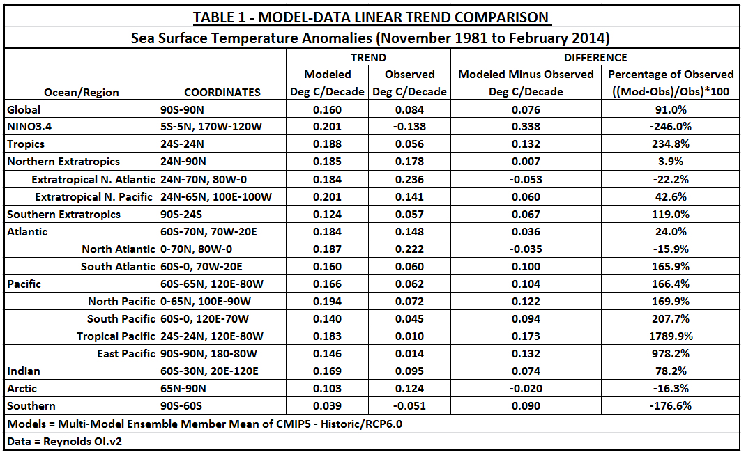
Table 1
MODELERS’ FOCUS
The models perform best in the extratropical oceans of the Northern Hemisphere, in the North Atlantic and in the Arctic Ocean. The modelers’ focus is pretty obvious. They’ve tried to get the models to simulate the warming of the Arctic Ocean so that they could melt sea ice, and they’ve tried to better capture the warming of sea surface temperatures at latitudes with the most land (extratropical Northern Hemisphere. See the graph here.) so that they could better simulate the Northern Hemisphere land surface air temperature anomalies, which would also be necessary if they wanted to melt Arctic sea ice. Figures 23 and 24 confirm a part of that.
Figures 23 and 24 are model-data comparisons of land surface air temperature anomalies from November 1981 to December 2013. Again, we’re using the multi-model ensemble mean of the climate models stored in the CMIP5 archive. And for the data, they’re the Berkeley Earth Surface Temperature (land surface air temperature) anomalies. Both are referenced to the period of 1961-1990 for anomalies. The models perform very well at simulating the warming rate of the land surface air temperatures in the Northern Hemisphere (Figure 23), but overestimate the warming of land surface air temperatures in the Southern Hemisphere by a wide margin (Figure 24).
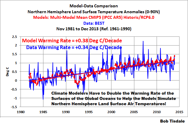
Figure 23
# # # # # # #
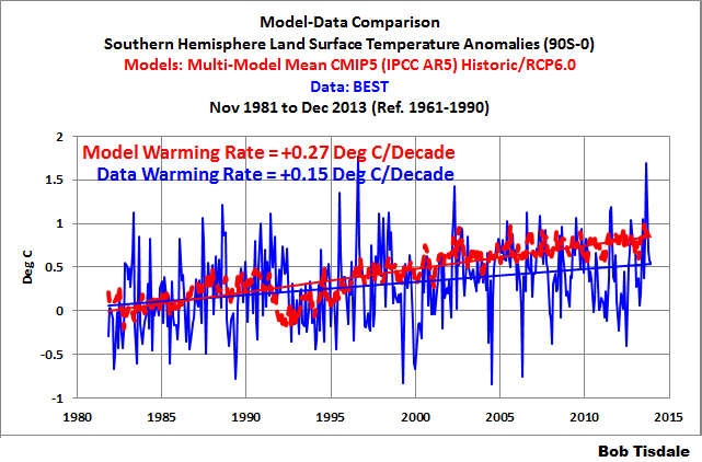
Figure 24
THE ATLANTIC MULTIDECADAL OSCILLATION IS NOT A FORCED COMPONENT OF THE CLIMATE MODELS
The North Atlantic has an additional mode of natural variability called the Atlantic Multidecadal Oscillation. We’ve discussed it in numerous posts over the past few years. (See the posts under the category of Atlantic Multidecadal Oscillation here.) If you’re not familiar with the Atlantic Multidecadal Oscillation see the NOAA Frequently Asked Questions About the Atlantic Multidecadal Oscillation (AMO) webpage and the posts:
- An Introduction To ENSO, AMO, and PDO — Part 2
- Multidecadal Variations and Sea Surface Temperature Reconstructions
Over some multidecadal periods, the sea surface temperatures of the North Atlantic warm faster than the rest of the global oceans, and during other multidecadal periods, the North Atlantic sea surface temperatures warm slower than the rest of the global oceans and can cool dramatically. For the period of November 1981 to February 2014, the sea surface temperatures of the North Atlantic were on one of their naturally occurring upswings.
In the real world, the sea surface temperatures of the North Atlantic warmed naturally at a much faster rate than the rest of the global oceans. See Figure 25. To determine the data for the rest of the global oceans, it was assumed that the North Atlantic represents 11.5% of the surface of the global oceans, and the scaled North Atlantic data was then subtracted from the global data. (For the percentage, see the NOAA GCDC webpage here.) As shown, the sea surface temperatures of the North Atlantic warmed at a rate that was more than 3.5 times faster than surface of the rest of the global oceans.
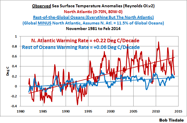
Figure 25
But in the modeled world, where they likely try to account for the additional warming of North Atlantic by jockeying aerosols around the globe, the modeled sea surface temperatures of the North Atlantic warmed at a rate that was only slightly higher than the rest of the global oceans. See Figure 26.
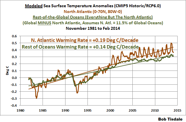
Figure 26
(I’ll try to head off an argument: The title of Booth et al. (2012) Aerosols implicated as a prime driver of twentieth-century North Atlantic climate variability explains their findings. Refer to the discussion of Booth et al. (2012) under the heading of ON THE HADGEM2-ES AMO SIMULATION in the post here. The HADGEM2-ES model used by Booth et al. (2012) does a pretty poor job of simulating the AMO as shown in the illustration here from that post. Booth et al. also failed to account for a couple of other factors that drive the Atlantic Multidecadal Oscillation.)
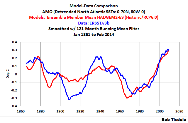
There are a number of ways to present the Atlantic Multidecadal Oscillation. The NOAA ESRL simply detrends the North Atlantic sea surface temperature anomalies. That’s the most common way. Another way: Trenberth and Shea (2006) subtracted global sea surface temperature anomalies, excluding the polar oceans (60S-60N), from sea surface temperature anomalies of the North Atlantic (0-60N, 80W-0). That method accounts for the additional variability of the North Atlantic data above the variations in the global data. Unfortunately, the North Atlantic is included in the global data so they’re subtracting a portion of the North Atlantic from itself, and that becomes a problem in the early part of the data. Sea surface temperature data sampling is best in the North Atlantic, especially in the 1800s and early 1900s, so a greater portion of the global data is from the North Atlantic then.
Ideally, because we’re interested in the additional variations of the North Atlantic sea surface temperatures above and beyond the rest of the global oceans, those are the two datasets that should be used to determine the Atlantic Multidecadal Oscillation. That is, the Atlantic Multidecadal Oscillation should be calculated as the North Atlantic data minus the data for the rest of the global oceans. Again, for long-term evaluation, it presents the problem when there is little source data for the rest of the global oceans (in the early part of the datasets), but at least we’re not subtracting a portion of the North Atlantic data from the North Atlantic data.
So, based on that discussion, the modeled and observed satellite-era Atlantic Multidecadal Oscillation (AMO) data are shown in Figure 27, where the short-term AMO is determined by subtracting the data (and model outputs) for the rest of the global oceans from the North Atlantic data (and model outputs). And once again, the data (and model outputs) for the rest of the global oceans were determined by subtracting the scaled North Atlantic data (and model outputs) from the global value (the same method for the rest of the global oceans shown in Figures 25 and 26). As shown in Figure 27, the models do not capture the additional natural warming of the North Atlantic associated with the Atlantic Multidecadal Oscillation.
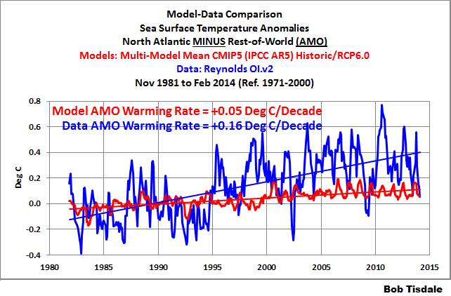
Figure 27
If the model-mean had produced the observed differences in the warming rates of the North Atlantic and rest of the global oceans, then we would have to conclude that the Atlantic Multidecadal Oscillation was a forced component of the models. Because the model mean does not show the great difference in warming rates, the additional variability of the North Atlantic has to be caused by naturally occurring factors that are not used force the operation of the models. Thus the heading for this section: The Atlantic Multidecadal Oscillation is Not a Forced Component of the Climate Models.
Now, the climate science community acknowledges the importance of the Atlantic Multidecadal Oscillation. The climate scientists who run the blog RealClimate note on their Atlantic Multidecadal Oscillation webpage:
A multidecadal (50-80 year timescale) pattern of North Atlantic ocean-atmosphere variability whose existence has been argued for based on statistical analyses of observational and proxy climate data, and coupled Atmosphere-Ocean General Circulation Model (“AOGCM”) simulations. This pattern is believed to describe some of the observed early 20th century (1920s-1930s) high-latitude Northern Hemisphere warming and some, but not all, of the high-latitude warming observed in the late 20th century. The term was introduced in a summary by Kerr (2000) of a study by Delworth and Mann (2000).
Yet the climate models used by the IPCC for their 5th Assessment Report cannot simulate the additional warming of the North Atlantic, as shown in Figure 27. As a result, they have to more than double the warming rate for the rest of the global oceans. See Figure 28.
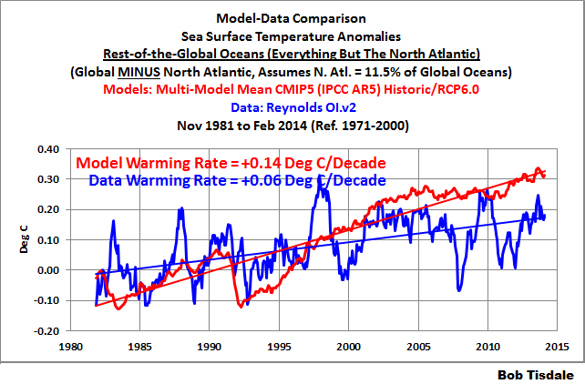
Figure 28
CLOSING
Ponder than for a moment.
Because the models do not properly simulate the naturally occurring additional warming of the North Atlantic, which only covers 11.5% of the surface of the global oceans, the modelers had to more than double the warming rate for the other 88.5% of the global oceans, in order to bring the North Atlantic into line.
As discussed and illustrated in this post, there are two naturally occurring, coupled ocean-atmosphere processes that the models obviously fail to simulate properly:
- El Niño and La Niña Processes
- Atlantic Multidecadal Oscillation Processes
Because the models fail to properly simulate those naturally occurring processes, they have to double the observed rate of warming of the surfaces of the global oceans in order to properly simulate the warming rate of land surface air temperatures in the Northern Hemisphere and to melt Arctic sea ice.
The climate science community somehow believes their science is settled…or at least we’ve been led to believe it’s settled. But the climate scientists who contribute to the IPCC are no closer to being able to discern man’s fingerprint on climate than they were in their first report back in 1990. That is a sad reality that they refuse to accept. Or maybe the scientists understand it, and it’s the politicians, those who fund climate science and steer its course, those who are ultimately responsible for its failings, who refuse to accept that climate science has been stymied by its focus on the assumed effects of manmade greenhouse gases…without understanding of the fundamental roles of natural variability.
ADDITIONAL READING
This post presented evidence that the hypothesis of human-induced global warming is flawed, because the models that serve as the foundation for the hypothesis are flawed…fatally flawed. Further, as we’ve been illustrating and discussing for more than 5 years, ocean heat content data and satellite-era sea surface temperature data both indicate that natural processes are responsible for the warming of the oceans, at the surface and to depth. An overview of this can be found in my illustrated essay “The Manmade Global Warming Challenge” (42mb). Much more detail about the natural warming of the global oceans can be found in my ebook Who Turned on the Heat? – The Unsuspected Global Warming Culprit: El Niño-Southern Oscillation. See the post here for an introduction to Who Turned on the Heat?
This post presented how poorly climate models simulate sea surface temperatures during the satellite era. Climate models also do not simulate land surface air temperatures properly in many parts of the globe. They do not simulate precipitation well. Climate models also do not properly simulate long-term variations in global surface temperatures. And there are numerous peer-reviewed papers and journal letters by climate scientists that present many other flaws in climate models. These flaws are collected in my ebook Climate Models Fail. See the post here for an additional overview.
And if you enjoyed this post or learned something from it, I would very thankful for a contribution to my tip jar.
With my new job, work on my next book is progressing slowly. The new working title is Fundamentals and Failings of Human-Induced Global Warming. I’ve written and produced illustrations for about 20-25% of it so far. An expanded version of this post will appear in it.


Thanks Bob, it is great to have it laid out so clearly.
You might be interested in:
http://insurancenewsnet.com/oarticle/2014/01/30/tracking-pulses-of-the-madden-julian-oscillation-a-453168.html#.UzWdsahLWXs
“An internationally cooperative field campaign was operated in 2011-12 (see sidebar on participating pro- grams) to investigate physical processes of the MJO in the central equatorial IO, with components in the tropical western Pacific and intervening Maritime Continent area. With advanced observing technology, this field campaign . . .”
Thanks, John.
Regards
In the observed portion of Figure 1, doesn’t the observed warming rate vary greatly with the state of ENSO at the (arbitrary) beginning an ending dates. The model output is an average of many runs that aren’t initialized to any particular state nor end in any particular state. So I would expect to see the dramatic difference you show between models and observations even if the models were “perfect”.
A fairer test would be to pick a model that this supposed to be good at representing El Nino and pick a start date in that model output with an El Nino index that matches that of your 1982 start date for observations. Then find an end date about 30 years later that matches the ENSO conditions at your observations at the end of 2013. Since you are converting your data into warming rate, rather than total warming, the number of years of model data used doesn’t have to be exactly the same as the number of years of observations.
Frank says: In the observed portion of Figure 1, doesn’t the observed warming rate vary greatly with the state of ENSO at the (arbitrary) beginning an ending dates.”
Nope. First, the “C-shaped pattern” in the Pacific is NOT dependent on an El Niño start year and La Niña end year. The following is a trend map starting in 1984 (a La Niña year beginning and end) and ending in 2010 (an El Niño decay year). It has a “C-shaped pattern” in the Pacific:

Or maybe you’d prefer starting in 1984 (the same La Niña year) and ending in 2009 (an El Niño formation year). The “C-shaped pattern” in the Pacific is still there:

The “C-shaped pattern” in the Pacific is dependent on the upward shifts in the sea surface temperatures of the western Pacific associated with the release of warm water from the 1986/87/88 and the 1997/98 El Niños that is then redistributed during the 1988/89 and the 1998-01 La Niñas. ENSO basics.
Second, the start and end data are not “arbitrary”. The Reynolds OI.v2 dataset starts in November 1981 and ends in February 2014. I’ve presented the annual trends from 1982 to 2013, the full term of the dataset when looked at on an annual basis.
Frank says: “A fairer test would be to pick a model that this supposed to be good at representing El Niño…”
I presented the model mean because it represents the forced component of the models.
And there are no climate models that simulate ENSO properly, so I can’t simply select a model that is “supposed to be good at representing El Niño”.
From Joe Bastardi’s Saturday summary.
http://www.weatherbell.com/saturday-summary-march-15-2014
Suggest a difference between warm and cold PDO El ninos. Would you concur???
mwhite, first, there are a number of studies about the evolution of El Nino events before and after 1976, which would tie indirectly to the PDO, but I’ve never seen one presenting atmospherically-driven versus ocean-driven El Ninos.
Second, Joe mentioned something about El Ninos lasting longer (20-22 months long) during a warm PDO. The longest El Nino, the 1986/87/88 El Nino (warm PDO) lasted only 19 months, according to to the ONI Index.
http://www.cpc.ncep.noaa.gov/products/analysis_monitoring/ensostuff/ensoyears.shtml
Would they consider the 1968/69/70 El Nino a cool PDO El Nino? It lasted for 18 months. Those stats sound odd to be,
Third, Joe also mentioned something about this El Nino was an atmospherically driven El Nino because there wasn’t a large amount of warm water involved, so something to that effect. The data contradicts him on that one:
http://www.cpc.ncep.noaa.gov/products/analysis_monitoring/enso_update/wkxzteq.shtml
That’s a chunk of warm water.
Regards
Pingback: cyclones are an environmental benefit … | pindanpost
Pingback: El Niño Residuals Cause the C-Shaped Warming Pattern in the Pacific | Bob Tisdale – Climate Observations
Pingback: El Niño Residuals Cause the C-Shaped Warming Pattern in the Pacific | Watts Up With That?
Bob: Thanks for your clear reply. I do hope that you don’t take legitimate questions personally and recognize that answering them occasional strengthens your work.
Given all of the weather phenomena linked to changes in ENSO, I assumed that the pattern of warming would vary with starting and stopping dates. Thanks for taking the time to show me this assumption isn’t correct.
Pingback: The 2014/15 El Niño – Part 2 – The Alarmist Misinformation (BS) Begins | Bob Tisdale – Climate Observations
Pingback: The 2014/15 El Niño – Part 2 – The Alarmist Misinformation (BS) Begins | Watts Up With That?
Pingback: Your chance to predict future El Niño headlines | Watts Up With That?
Pingback: The 2014/15 El Niño – Part 5 – The Relationship Between the PDO and ENSO | Bob Tisdale – Climate Observations
Pingback: The 2014/15 El Niño – Part 5 – The Relationship Between the PDO and ENSO | Watts Up With That?
Pingback: A Different Perspective of Global Warming | Bob Tisdale – Climate Observations
Pingback: A Different Perspective of Global Warming | Watts Up With That?
Pingback: A Different Perspective of Global Warming | Watts Up With That?
Pingback: The 2014/15 El Niño – Part 10 – June 2014 Update – Still Waiting for the Feedbacks | Bob Tisdale – Climate Observations
Pingback: The 2014/15 El Niño – Part 10 – June 2014 Update – Still Waiting for the Feedbacks | Watts Up With That?
Pingback: May 2014 Sea Surface Temperature (SST) Anomaly Update | Bob Tisdale – Climate Observations
Pingback: June 2014 Sea Surface Temperature (SST) Anomaly Update | Bob Tisdale – Climate Observations
Pingback: July 2014 Sea Surface Temperature (SST) Anomaly Update | Bob Tisdale – Climate Observations
Pingback: August 2014 Sea Surface Temperature (SST) Anomaly Update | Bob Tisdale – Climate Observations
Pingback: September 2014 Sea Surface Temperature (SST) Anomaly Update | Bob Tisdale – Climate Observations
Pingback: There is a Wide Range in the ARGO-Era Warming (and Cooling) Rates of the Oceans to Depths of 2000 Meters | Bob Tisdale – Climate Observations
Pingback: With ARGO, There is a Wide Range Warming (and Cooling) Rates of the Oceans to Depths of 2000 Meters | Watts Up With That?
Pingback: December 2014 Sea Surface Temperature (SST) Anomaly Update | Bob Tisdale – Climate Observations
Pingback: Alarmists Bizarrely Claim “Just what AGW predicts” about the Record High Global Sea Surface Temperatures | Bob Tisdale – Climate Observations
Pingback: Alarmists Bizarrely Claim “Just what AGW predicts” about the Record High Global Sea Surface Temperatures in 2014 * The New World
Pingback: Climate Models vs Real World Data | US Issues
Pingback: Open Letter to U.S. Senators Ted Cruz, James Inhofe and Marco Rubio | Bob Tisdale – Climate Observations
Pingback: Open Letter to U.S. Senators Ted Cruz, James Inhofe and Marco Rubio | Watts Up With That?
Pingback: What Animals Are Likely to Go Extinct First Due to Climate Change? | Bob Tisdale – Climate Observations
Pingback: What Animals Are Likely to Go Extinct First Due to Climate Change? | Watts Up With That?
Pingback: What Animals Are Likely to Go Extinct First Due to Climate Change? | I World New
Pingback: June 2016 Sea Surface Temperature (SST) Anomaly Update | Bob Tisdale – Climate Observations
Pingback: July 2016 Sea Surface Temperature (SST) Anomaly Update | Bob Tisdale – Climate Observations
Pingback: August 2016 Sea Surface Temperature (SST) Anomaly Update | Bob Tisdale – Climate Observations
Pingback: September 2016 Sea Surface Temperature (SST) Anomaly Update | Bob Tisdale – Climate Observations
Pingback: October 2016 Sea Surface Temperature (SST) Anomaly Update | Bob Tisdale – Climate Observations
Pingback: November 2016 Sea Surface Temperature (SST) Anomaly Update | Bob Tisdale – Climate Observations
Pingback: December 2016 Sea Surface Temperature (SST) Anomaly Update | Bob Tisdale – Climate Observations