
Yesterday, NOAA published its weekly update of the sea surface temperature data for the NINO regions (data here), and because the sea surface temperature anomalies for “a key region” of the equatorial Pacific (the NINO3.4 region) exceeded the weekly values in 1997, alarmists from around the world are claiming the 2015/16 El Niño is the strongest ever, exceeding the strength of the 1997/98 El Niño. Example: the LA Times headline reads El Niño temperatures in Pacific Ocean break 25-year record. The article by Rong-Dong Lin II and Roxanna Xia begins:
Temperatures in a key location of the Pacific Ocean are now hotter than they ever were in the record 1997 El Niño.
There are numerous other articles with the same underlying alarmism, including:
- The Washington Post: By one measure, this wicked El Niño is the strongest ever recorded: What it means
- Mashable: The 2015 El Niño just crossed into record territory
- UN News Centre: El Niño on track to be among worst ever, but world better prepared for fallout – UN
- Ars Technica: El Niño reaches record level for a single week period
- BBC News: ‘High impacts’ from globally stronger El Nino
- The Weather Channel: Strenthening [sic] El Niño Will Be Strongest on Record, WMO Says
The articles are focused on the sea surface temperature anomalies of the NINO3.4 region, which is bordered by the coordinates of 5S-5N, 170W-120W. See Figure 1. But as shown, the NINO3.4 region is only one of 4 often-used NINO regions.

Figure 1
The NINO3.4 region was created because it was better correlated to the “core of the ENSO phenomenon” than other NINO regions. See Barnston et al. (1996) Documentation of a highly ENSO‐Related SST Region in the Equatorial Pacific: Research Note. In other words, the NINO3.4 region better reflected the typical El Niño and La Niña.
But it will be obvious to you that the NINO3.4 region does not capture the full strength of the 1997/98 El Niño! Why? Because the 1997/98 El Niño was not at its strongest in the central Pacific. The 1997/98 El Niño was an East Pacific El Niño, and it was strongest east of the NINO3.4 region. The 1997/98 El Niño was unlike any El Niño that had been studied by Barnston et al. (1996). And the current El Niño is also unlike the one in 1997/98.
ALL THE HUBBUB IS ABOUT THE NINO3.4 REGION SEA SURFACE TEMPERATURE ANOMALIES
Figure 2 compares the evolutions of the weekly NINO3.4 sea surface temperature anomalies for the years 1997 and 2015. The sea surface temperature anomalies in this east-central region are obviously higher in 2015 than they were in 1997. So from that one metric, the alarmists are claiming the El Niño in 2015 is strongest ever.

Figure 2
Unfortunately, NOAA does not provide the uncertainties associated with that data.
BUT THE 1997/98 EL NIÑO EXCEEDED THE GOINGS-ON IN 2015 EAST OF THE NINO3.4 REGION
Figure 3 includes the evolutions of the 1997 and 2015 sea surface temperature anomalies for the NINO3 and NINO1+2 regions, which are east of the NINO3.4 region. In 2015, sea surface temperatures in these eastern-most regions have not reached the values seen in 1997.

Figure 3
The farther east an El Niño is taking place, the greater impact it has on “normal” global weather patterns.
WHICH EL NIÑO LOOKS STRONGER TO YOU?
Figure 4 includes Hovmoller diagrams of equatorial sea surface temperature anomalies for the 1997 and year-to-date 2015 from the NOAA GODAS website. I’ve highlighted the longitudes of the NINO3.4 region on both Hovmollers.
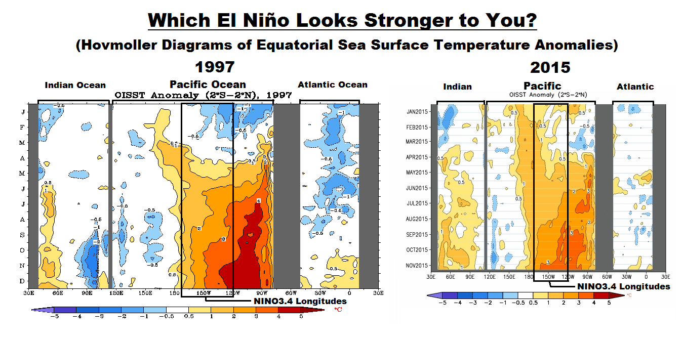
Figure 4
The vertical (y) axis in the Hovmollers is time with the Januarys at the top and Decembers at the bottom. The horizontal (x) axis is longitude, so, moving from left to right in each of the Hovmoller diagrams, we’re going from west to east…with the Indian Ocean in the left-hand portion, the Pacific in the center and the Atlantic in the right-hand portion. We’re interested in the Pacific. The data are color-coded according to the scales below the Hovmollers. (Sorry about the different sizes of the Hovmollers, but somewhere along the line NOAA GODAS changed them, but they are scaled, color-coded, the same.)
In 1997, sea surface temperature anomalies east of the NINO3.4 region had reached 4.0 deg C as early as June, but we have yet to see those levels in 2015.
THE DATA PRESENTED IS NOT BASED ON THE “OFFICIAL” SEA SURFACE TEMPERATURE DATASET USED BY NOAA TO DEFINE EL NIÑO EVENTS
The data presented above and discussed in the linked articles are based on NOAA’s Optimum Interpolation sea surface temperature dataset (a.k.a. Reynolds OI.v2). However, NOAA uses their “pause buster” ERSST.v4 sea surface temperature data for their “official” Oceanic NINO Index. And as you can see there, this El Niño is running well behind the 1997/98 El Niño. Also see Figure 5, which was presented in the November 12, 2015 blog post by Emily Becker November El Niño update: It’s a small world at the NOAA ENSO Blog.
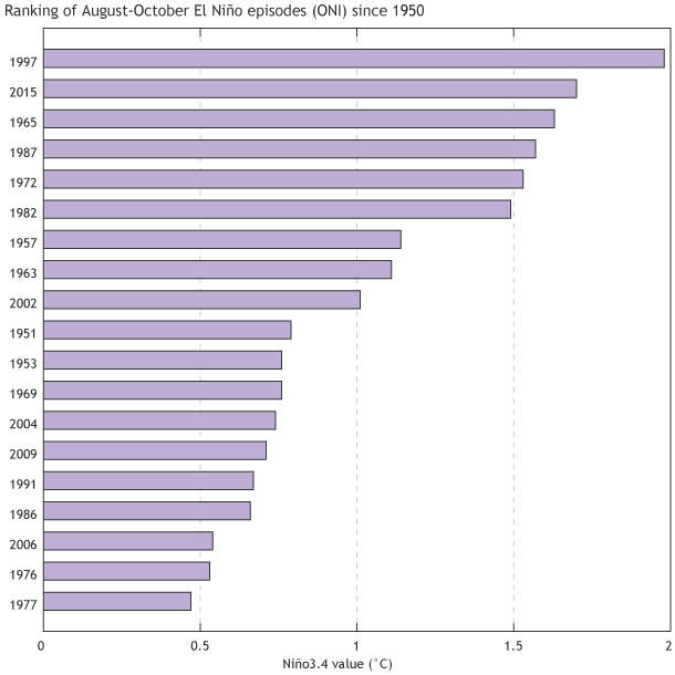
Figure 5 (Source here.)
Their caption reads:
Ranking of August-October average sea surface temperature departures from the mean for all El Niño episodes since 1950. This measurement, the Oceanic Niño Index, uses ERSSTv4 data. Figure by climate.gov, data from CPC.
And their introduction to it reads:
First, a quick update on the recent El Niño indicators
The average anomaly in the Niño3.4 region during August-October of this year was 1.7°C, second to the same period in 1997 (1).
CLOSING
Please do not misinterpret what I’ve presented in this post. I am not saying that the 2015/16 El Niño is not a strong event. By all measures, we are in the midst of a strong El Niño. I’ll provide a full ENSO update next week.
-However-
Contrary to all of the alarmism, the 2015/16 El Niño is simply is not as strong as the 1997/98 El Niño based on the sea surface temperature anomalies of the eastern Pacific, east of the NINO3.4 region.
FOR THOSE NEW TO DISCUSSIONS OF EL NIÑO EVENTS
I discussed in detail the naturally occurring and naturally fueled processes that cause El Niño events (and their long-term aftereffects) in Chapter 3.7 of my recently published free ebook On Global Warming and the Illusion of Control (25 MB). For those wanting even more detail, see my earlier ebook Who Turned on the Heat? – The Unsuspected Global Warming Culprit: El Niño-Southern Oscillation.


Reblogged this on WeatherAction News and commented:
Thanks for a great update Bob 🙂
The simple answer to that is – no not yet.
https://xmetman.wordpress.com/2015/11/07/latest-el-nino-still-only-3rd-strongest/
Very interesting. Thanks, Bob.
Thanks as always Bob. Your articles are most informative and easy to read, a decent skill set indeed.
I am left wondering how much the Warm Blob affected this El Nino. Did its migration southward make the regions 1, 2 and 3.4 any warmer than they would have been, and if so by how much?
Hi Keitho. It’s impossible for me to say if and by how much The Blob and the California/Baja hotspot impacted sea surface temperatures in those regions. But, when we consider the equatorial Pacific, shouldn’t we think upwelling there as the primary source?
When we look at the UAH, RSS in particular for 97 98 we see the bump in temperature rise. Have you graphed how this bump is timed in relation to the Nino indicators of the time, to see the time delay between the Nino indicator and the temperature. When I look at current UAH and RSS data I can see no significance temperature rise. At least nothing resembling the 97 98 bump. Id be interested to see the current El Niño ploted with UAH and RSS, to compare with the 97 98 El Niño plotted with UAH and RSS.
Oh for sure Bob, the upwelling is huge by comparison to the Blob. I was just being curious as to whether you had any thoughts about it.
Pingback: Is the Current El Niño Stronger Than the One in 1997/98? | ajmarciniak
nzrobin, the major response of the global TLT data did not occur until December 1997.

Bob,
Thanks you for this timely and useful report!
It’s worth mentioning that ERSSTv4 has been a low outlier wrt estimating this El Nino’s intensity for the last several months. Based on data from 10 datasets (ERSSTv4, ERSSTv3b, COBE SST, HADISST, Kaplan’s Extended SSTv2, IOCADSv2.5, NCEP R1, CDAS, HADSST3, & OISSTv2, I’m currently working on the COBE SST2 & Hadley EN4 data & the 20th Century reanalysis products are only available through 2011-12), it is currently providing the second lowest estimate of the Oceanic Nino Index, only beating the unadjusted IOCADSv2.5 dataset. This isn’t surprising consider that ERSSTv4 adjusted their SST data to ships/ERI, ERSSTv4 also doesn’t directly integrate real-time satellite data into its analysis & fails to utilize OI which is used in some way, shape, or form by the majority of SST datasets.
Here are the ASO ONI values calculated using the CPC’s methodology for the 10 aforementioned datasets, (HADISST has only updated thru JJA)
OISSTv2: +2.19C (used the 1986-2015 base period here because the first full year of data wasn’t available until 1982 partially as consequence of AVHRR & the differences in ONI are subtle at best amongst 1981-2010 & 1986-2015 base periods)
COBE SST: +2.19C. This value is a record for this dataset (ONI is available from 1905-2015), surpassing 1997 for ASO (+2.11C)
CDAS 1: +2.14C (daily data is available through tropicaltibits.com). This value ties 1997 for ASO (+2.14)
NCEP R1: +2.11C, this value is a record for this dataset, beating 1997 for ASO (+2.09)
Kaplan’s Extended SSTv2: +2.11C, this value is a record for this dataset (ONI available from 1870-2015), beating the record set jointly by 1877 & 1997 for ASO (+2.05C)
HADSST3: +1.89C. This value is the 2nd highest on record for this dataset in ASO, falling well short of 1997 (+2.23)
ERSSTv3b: +1.78C This value is the 2nd highest on record for this dataset in ASO, (ONI is available from 1895-present), a good ways below 1997. (+2.06C)
ERSSTv4: +1.70C. This value is 4th highest on record for this dataset in ASO (ONI is available from 1870-present). 1877 absolutely crushed 1997-98 in this dataset, w/ ONI hitting mind-boggling levels (+2.41C), 1997-98 was second w/ the ONI @ +1.98C, 1902-03 third @ +1.89C.
IOCADSv2.5: +1.63C. This value is the 2nd highest observed for this dataset in ASO, underneath 1997’s record of +1.92….
Through JJA, HADISST’s latest ONI value of +1.57C was a record for that dataset, just barely eclipsing 1997 (+1.56C) (ONI is available from 1885-present)
Webberweather53, thanks. For my next ENSO update, I’m preparing a series of graphs similar to Figure 2 with the monthly SST data from a couple of datasets.
Cheers.
Sure thing. BTW, COBE SST was recently added to the ESRL WRIT page. I’m currently extracting the COBE SST2 data through GCOS via Matlab.
http://www.esrl.noaa.gov/psd/cgi-bin/data/testdap/timeseries.pl
http://www.esrl.noaa.gov/psd/cgi-bin/gcos_wgsp/printpage.pl
Thanks for the graph Bob, and apologies that it has taken a few days for me to come back and say thank you. However that wasn’t what I intended, so I’ll try to explain what I meant again … and I hope I am not annoying you too much.
I was wondering how the Nino indicators 1+2, 3 and 3.4 graphs looked when plotted with UAH and/or RSS for the 97/98 El Niño. Then I thought it might be instructive to compare that graph with the equivalent (developing) graph for the 15/16 El Niño under way now. I wondering if the indicators are acting in similar way, with a similar delay between the Nino indicators and satellite temperatures.
The current model forecasts imply that this El Nino either has peaked or will in the Nov – Jan quarter. No “super monster” or “Godzilla”. But exactly as NOAA predicted: “this El Niño could rank among the top three strongest episodes as measured by the 3-month SST departures in the Niño 3.4 region going back to 1950.”
The IRI/CPC “plume” showing the forecasts of the major models (posted today): http://iri.columbia.edu/our-expertise/climate/forecasts/enso/current/?enso_tab=enso-sst_table
They show the Nino3.4 temperature anomaly as 2.5 in October. The average of dynamic models predict 2.6 in Nov-Jan, then rapid fall. Statistical models predict 2.5 in Nov-Jan, then a rapid fall.
Pingback: Update on the El Niño: Gaia challenges the climate activists | Fabius Maximus website
Pingback: The Differences between Sea Surface Temperature Datasets Prevent Us from Knowing Which El Niño Was Strongest According NINO3.4 Region Temperature Data | Bob Tisdale – Climate Observations
Pingback: The Differences between Sea Surface Temperature Datasets Prevent Us from Knowing Which El Niño Was Strongest According NINO3.4 Region Temperature Data | Watts Up With That?
Very nice, Bob. Different indices tell different stories. The Hovmoller diagram tells a more complete story. The important question is: “What will the Impact of this El Nino be?” Which index shows the strongest correlation with GMST? Or rainfall in the Western US, where it is desperately needed? Or the droughts in Australia and Indonesia? The Nino 4 Index might be the most informative for drought in these areas is proximity is important. The Nino 1.2 Index might be important if the westward extent of perturbation is important. I might be on the latter.
In any case, debates about the quantitative strength of El Nino are fairly meaningless any idea of what they imply outside the central and eastern equatorial Pacific.
Pingback: The Differences between Sea Surface Temperature Datasets Prevent Us from Knowing Which El Niño Was Strongest According NINO3.4 Region Temperature Data | Daily Green World
Pingback: November 2015 Sea Surface Temperature (SST) Anomaly Update | Bob Tisdale – Climate Observations
Pingback: December 2015 ENSO Update – Shouldn’t Be Long Now Until the El Niño Starts to Decay | Bob Tisdale – Climate Observations
Pingback: December 2015 ENSO Update – Shouldn’t Be Long Now Until the El Niño Starts to Decay | Watts Up With That?
Pingback: December 2015 Sea Surface Temperature (SST) Anomaly Update | Bob Tisdale – Climate Observations
Pingback: January 2016 ENSO Update – It Appears the El Niño Has Peaked | Bob Tisdale – Climate Observations
Pingback: January 2016 ENSO Update – It Appears the El Niño Has Peaked | Watts Up With That?
Pingback: January 2016 ENSO Update – It Appears the El Niño Has Peaked | Watts Up With That?
Pingback: January 2016 Sea Surface Temperature (SST) Anomaly Update | Bob Tisdale – Climate Observations
Pingback: February 2016 Sea Surface Temperature (SST) Anomaly Update | Bob Tisdale – Climate Observations
Pingback: March 2016 Sea Surface Temperature (SST) Anomaly Update | Bob Tisdale – Climate Observations
Pingback: April 2016 Sea Surface Temperature (SST) Anomaly Update | Bob Tisdale – Climate Observations
Pingback: June 2016 Sea Surface Temperature (SST) Anomaly Update | Bob Tisdale – Climate Observations
Pingback: July 2016 Sea Surface Temperature (SST) Anomaly Update | Bob Tisdale – Climate Observations
Pingback: August 2016 Sea Surface Temperature (SST) Anomaly Update | Bob Tisdale – Climate Observations
Pingback: September 2016 Sea Surface Temperature (SST) Anomaly Update | Bob Tisdale – Climate Observations
Pingback: October 2016 Sea Surface Temperature (SST) Anomaly Update | Bob Tisdale – Climate Observations