
OVERVIEW
This is the second part of a two-part series. There are, however, two versions of part 1. The first part was originally published as On the SkepticalScience Post “Pielke Sr. Misinforms High School Students”, which was, obviously, a response to the SkepticalScience post Pielke Sr. Misinforms High School Students. That version was also cross posted at WattsUpWithThat asTisdale schools the website “Skeptical Science” on CO2 obsession, where there is at least one comment from a blogger who regularly comments at SkepticalScience. The second version of the post (Do Observations And Climate Models Confirm Or Contradict The Hypothesis of Anthropogenic Global Warming? – Part 1) was freed of all references to the SkepticalScience post, leaving the discussions and comparisons of observed global surface temperatures over the 20th Century and of those hindcast by the climate models used by the Intergovernmental Panel on Climate Change (IPCC) in their 4thAssessment Report (AR4).
INTRODUCTION
The closing comments of the first part of this series read:
The IPCC, in AR4, acknowledges that there were two epochs when global surface temperatures rose during the 20th Century and that they were separated by an epoch when global temperatures were flat, or declined slightly. Yet the forced component of the models the IPCC elected to use in their hindcast discussions rose at a rate that is only one-third the observed rate during the early warming period. This illustrates one of the many failings of the IPCC’s climate models, but it also indicates a number of other inconsistencies with the hypothesis that anthropogenic forcings are the dominant cause of the rise in global surface temperatures over the 20th Century. The failure of the models to hindcast the early rise in global surface temperatures also illustrates that global surface temperatures are capable of varying without natural and anthropogenic forcings. Additionally, since the observed trends of the early and late warming periods during the 20th Century are nearly identical, and since the trend of the forced component of the models is nearly three times greater during the latter warming period than during the early warming period, the data also indicate that the additional anthropogenic forcings that caused the additional trend in the models during the latter warming period had little to no impact on the rate at which observed temperatures rose during the two warming periods. In other words, the climate models do not support the hypothesis of anthropogenic forcing-driven global warming; they contradict it.
In this post, using the “ENSO fit” and “volcano fit” data from Thompson et al (2009), the observations and the model mean data are adjusted to determine if there was any impact of volcanic aerosols and El Niño and La Niña events on the trend comparisons during the four epochs (two warming, two cooling) of the 20thCentury. In another set of comparisons, the HADCRUT observations are replaced with the mean of HADCRUT3, GISS LOTI, and NCDC land-plus-ocean surface temperature anomaly datasets, just to assure readers the disparities between the models and the observations are not a function of the HADCRUT surface temperature observations dataset that was selected by the IPCC. And model projections and observations for global sea surface temperature (SST) anomalies will be compared, but the comparisons are extended back to 1880 to also see if the forced component of the models matches the significant drop in global sea surface temperatures from 1880 to 1910. For these comparisons, the average SST anomalies of five datasets (HADISST, HADSST2, HADSST3, ERSST.v3b, and Kaplan) are used.
But there are two other topics to be discussed before addressing those.
CLARIFICATION ON THE USE OF THE MODEL MEAN
Part 1 provided the following discussion on the use of the mean of the climate model ensemble members.
HHHHHHHHHHHHHHHHHHHHHHHHHHHHHHHHHHH
The first quote is from a comment made by Gavin Schmidt (climatologist and climate modeler at the NASA Goddard Institute for Space Studies—GISS) on the thread of the RealClimate post Decadal predictions. At comment 49, dated 30 Sep 2009 at 6:18 AM, a blogger posed the question, “If a single simulation is not a good predictor of reality how can the average of many simulations, each of which is a poor predictor of reality, be a better predictor, or indeed claim to have any residual of reality?” Gavin Schmidt replied:
“Any single realisation can be thought of as being made up of two components – a forced signal and a random realisation of the internal variability (‘noise’). By definition the random component will uncorrelated across different realisations and when you average together many examples you get the forced component (i.e. the ensemble mean).”
That quote from Gavin Schmidt will serve as the basis for our use of the IPCC multi-model ensemble mean in the linear trend comparisons that follow the IPCC quotes. As I noted in my recent video The IPCC Says… Part 1 (A Discussion About Attribution), in the slide headed by “What The Multi-Model Mean Represents”, Basically, the Multi-Model (Ensemble) Mean is the IPCC’s best guess estimate of the modeled response to the natural and anthropogenic forcings. In other words, as it pertains to this post, the IPCC model mean represents the (naturally and anthropogenically) forced component of the climate model hindcasts. (Hopefully, this preliminary discussion will suppress the comments by those who feel individual models runs need to be considered.)
HHHHHHHHHHHHHHHHHHHHHHHHHHHH
Gavin Schmidt’s use of the word noise resulted in a number of discussions on the thread of the cross post at WattsUpWithThat. There blogger Philip Bradley provided a quote from the National Center for Atmospheric Research (NCAR) Geographic Information Systems (GIS) Climate Change Scenarios webpage. The quote also appears on the NCAR GIS Climate Change Scenarios FAQ webpage:
“Climate models are an imperfect representation of the earth’s climate system and climate modelers employ a technique called ensembling to capture the range of possible climate states. A climate model run ensemble consists of two or more climate model runs made with the exact same climate model, using the exact same boundary forcings, where the only difference between the runs is the initial conditions. An individual simulation within a climate model run ensemble is referred to as an ensemble member. The different initial conditions result in different simulations for each of the ensemble members due to the nonlinearity of the climate model system. Essentially, the earth’s climate can be considered to be a special ensemble that consists of only one member. Averaging over a multi-member ensemble of model climate runs gives a measure of the average model response to the forcings imposed on the model. Unless you are interested in a particular ensemble member where the initial conditions make a difference in your work, averaging of several ensemble members will give you best representation of a scenario.”
So, Gavin Schmidt basically used “noise” in place of “variations of the individual ensemble members ‘due to the nonlinearity of the climate model system’”. Noise is much quicker to write. Gavin also used “realisation” instead of “ensemble member”.
In summary, by averaging of all of the ensemble members of the numerous climate models available to them, the IPCC presented what they believe to be the “best representation of a scenario,” as created by the natural and anthropogenic forcings that served as input to the climate models. And again, as it relates to this post, the multi-model ensemble mean represents the (naturally and anthropogenically) forced component of the climate model hindcasts of the 20thCentury.
NOTE ABOUT BASE YEARS
The base years for anomalies of 1901 to 1950 are still being used. Those were the base years selected by the IPCC for their Figure 9.5 in AR4.
A MORE BASIC DESCRIPTION OF WHY THE INSTRUMENT TEMPERATURE RECORD AND CLIMATE MODELS CONTRADICT THE HYPOTHESIS OF ANTHROPOGENIC GLOBAL WARMING
In part 1, we established that the IPCC accepts that Global Surface Temperatures rose during two periods in the 20thCentury, from 1917 to 1944, and from 1976 to 2000. The two periods were separated by a period when global surface temperatures remained relatively flat or dropped slightly, from 1944 to 1976. The IPCC in AR4 used the Hadley Centre’s HADCRUT3 global surface temperature data in their comparisons with the model hindcasts. During the two warming periods, the instrument-based observations of global surface temperatures rose at the same rate, Figure 1, at approximately 0.175 deg C per Decade.

Figure 1
Climate Models, on the other hand, do not recreate the rate at which global surface temperatures rose during the early warming period. They do well during the late 20th Century warming period, but not the early one. Why? Because Climate Models use what are called forcings as inputs in order to recreate (hindcast) the global surface temperatures during the 20th Century. The climate models attempt to simulate many climate-related processes, as they are programmed, in response to those forcings, and one of the outputs is global surface temperature. Figure 2, as an example, shows the effective radiative forcings employed by the Goddard Institute of Space Studies (GISS) for its climate model simulations. Refer to the Forcing in GISS Climate Model webpage.

Figure 2
GISS also provides the datathat represents the Global Mean Net Forcing of all of those individual forcings. Shown again as an example in Figure 3, there is a significant difference in the trends of the forcings during the early and late warming periods. (Note: GISS has updated the forcing data recently, so the data may have been slightly different when the simulations were performed for CMIP3 and the IPCC’s AR4.)

Figure 3
The GISS Model-ER is one of the many climate models submitted to the archive called CMIP3 from which the IPCC drew its climate simulations for AR4. Figure 4 shows the individual ensemble members and the ensemble mean for the GISS Model-ER global surface temperature hindcasts of the 20thCentury. Basically, GISS ran their climate model 9 times with the climate forcings shown above and those model runs generated the 9 global surface temperature anomaly curves illustrated by the ensemble members. Also shown are the trends of the GISS Model-ER ensemble mean during the early and late warming periods. The difference between the trends of the model ensemble mean during the early and late warming period is not as great as it was for the forcings, but the trend of the ensemble mean (the forced component of the GISS Model-ER) during the late warming period is about twice the trend for the early warming period. According to observations, however, Figure 1, they should be the same.

Figure 4
For their global surface temperature comparisons in Chapter 9 of AR4, the IPCC included the ensemble members from 11 more climate models in its model mean. And as illustrated in Figure 5, there is a significant disparity between the trends of the model mean during the early warming period and the late warming period. The ensemble mean during the late warming period warmed at a rate that is about 2.9 times faster than the trend of the early warming period—but they should be the same.

Figure 5
So in summary, for our examples, the net forcings of the GISS climate models rose at a rate that was approximately 3.8 times higher during the late warming period than it was during early warming period, as shown in Figure 3. And let’s assume, still for the sake of example, that the model forcings for the other models were similar to those used by GISS. Then the increased trend in the forcings during the late warming period, Figure 5, caused the model mean to warm almost 2.9 times faster in the late warming period than during the early warming period. But in the observed, instrument-based data, Figure 1, global surface temperatures during the early and late warming periods warmed at the same rate. This clearly indicates that, while the trends of the models during the early and late warming periods are dictated by the natural and anthropogenic forcings that serve as inputs to them, the rates at which observed temperatures rose are not dictated by the forcings. And as discussed in part 1, under the heading of ON THE IPCC’S CONSENSUS (OR LACK THEREOF) ABOUT WHAT CAUSED THE EARLY 20th CENTURY WARMING, the IPCC failed to provide a suitable explanation for why the models failed to rise at the proper rate during the early warming period. The bottom line: the differences between the modeled and the observed rises in global surface temperatures during the two warming periods acknowledged by the IPCC actually contradicts the hypothesis of anthropogenic global warming.
ENSO- AND VOLCANO-ADJUSTED OBSERVATIONS AND MODEL MEAN GLOBAL SURFACE TEMPERATURE DATA
I’ve provided this discussion in case there are any anthropogenic global warming proponents who are thinking the additional wiggles in the instrument data caused by the El Niño and La Niña events are causing the disparity between the models and observations during the early warming period. I’m not sure why anyone would think that would be the case, but let’s take a look anyway. We’ll also adjust both datasets for the effects of the volcanic aerosols, and we’ll be adjusting the model and observation-based datasets for the volcanoes by the same amount. To make the El Niño-Southern Oscillation (ENSO) and volcanic aerosol adjustments, we’ll use the “ENSO fit” and “Volcano fit” datasets from the Thompson et al (2008) paper “Identifying signatures of natural climate variability in time series of global-mean surface temperature: Methodology and Insights.”Thompson et al (2009) used HADCRUT3 global surface temperature anomalies, just like the IPCC in AR4, so that’s not a concern. Thompson et al (2009) described their methods as:
“The impacts of ENSO and volcanic eruptions on global-mean temperature are estimated using a simple thermodynamic model of the global atmospheric-oceanic mixed layer response to anomalous heating. In the case of ENSO, the heating is assumed to be proportional to the sea surface temperature anomalies over the eastern Pacific; in the case of volcanic eruptions, the heating is assumed to be proportional to the stratospheric aerosol loading.”
The Thompson et al method assumes global temperatures respond proportionally to ENSO, but even though we understand this to be wrong, we’ll use the data they supplied. (More on why this is wrong later in this post.) Thompson et al (2009) were kind enough to provide data along with their paper. The instructions for use and links to the data are here.
During the late warming period, Figure 6, and the mid-century “flat temperature” period, Figure 7, the trends of the volcano-adjusted Multi-Model Ensemble Mean (the forced component of the models) are reasonably close to the trends of the ENSO- and volcano-adjusted observed global surface temperature anomaly data. During the late warming period, Figure 6, the models slightly underestimate the warming, and during the mid-century “flat temperature” period, Figure 7, the models slightly overestimate the warming. However, as with the other datasets presented in Part 1, the most significant differences show up in the early warming period and the early “flat temperature” period. The trend of the ENSO- and volcano-adjusted global surface temperature anomalies during the early warming period, Figure 8, are about 3.3 times higher than the trend of the volcano-adjusted model data. And during the early “flat temperature” period, Figure 9, the trend of the observation-based data is slightly negative, while the model mean shows a significant positive trend.
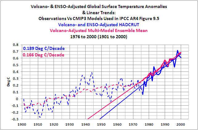
Figure 6
HHHHHHHHHHHHHHHHHHHHHHHHHHHHHHHHHHHHH

Figure 7
HHHHHHHHHHHHHHHHHHHHHHHHHHHHHHHHHHHHH
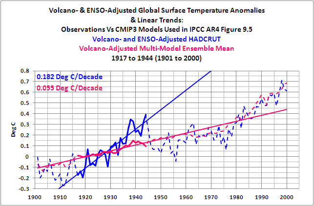
Figure 8
HHHHHHHHHHHHHHHHHHHHHHHHHHHHHHHHHHHHH
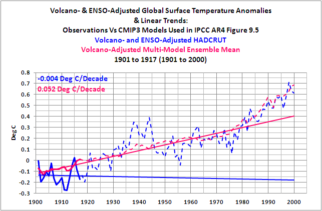
Figure 9
HHHHHHHHHHHHHHHHHHHHHHHHHHHHHHHHHHHHH
Adjusting the data for ENSO events and volcanic eruptions does not help to cure the ills of the climate models.
USING THE AVERAGE OF GISS, HADLEY CENTRE, AND NCDC GLOBAL SURFACE TEMPERATURE ANOMALY DATA
The IPCC chose to use HADCRUT3 Global Surface Temperature anomaly data for their comparison graph of observational data and model outputs in Chapter 9 of AR4. If we were to replace the HADCRUT3 data with the average of HADCRUT3, GISS Land-Ocean Temperature Index (LOTI) and NCDC Land+Ocean Temperature anomalies, would the model mean better agree with the observations? The trends of the late warming and mid-century “flat temperature” epochs still agree well, and trends of the early warming and early “flat temperature” periods still disagree, as illustrated in Figures 10 through 13.
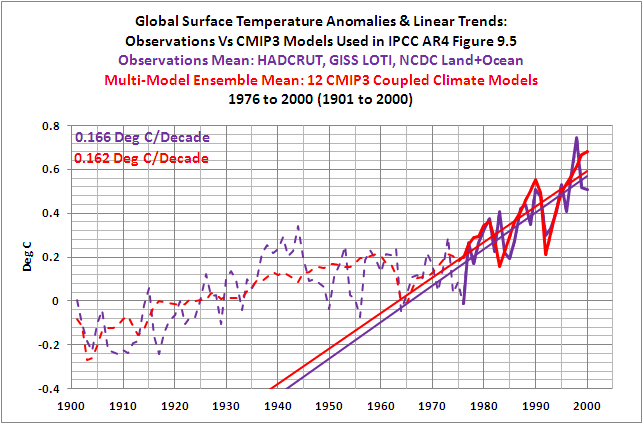
Figure 10
HHHHHHHHHHHHHHHHHHHHHHHHHHHHHHHHHHHHH

Figure 11
HHHHHHHHHHHHHHHHHHHHHHHHHHHHHHHHHHHHH

Figure 12
HHHHHHHHHHHHHHHHHHHHHHHHHHHHHHHHHHHHH

Figure 13
HHHHHHHHHHHHHHHHHHHHHHHHHHHHHHHHHHHHH
So the failure of the models is not dependent on the HADCRUT data.
SEA SURFACE TEMPERATURES – THE EARLY DIP AND REBOUND
When I first started to present Sea Surface Temperature anomaly data at my blog, I used the now obsolete ERSST.v2 data, which was available at that time through the NOAA NOMADS website. What I always found interesting was the significant dip from the 1870s to about 1910, Figure 14, and then the rebound from about 1910 to the early 1940s. Global Sea Surface Temperature Anomalies in the late 1800s were comparable to those during the mid 20thCentury “flat temperature” period.

Figure 14
NOTE: I wrote a post about that dip and reboundback in November 2008. The only reason I refer to it now is to call your attention to the first blogger to leave a comment on that thread. That’s John Cook of SkepticalScience. His explanations about the dip and rebound didn’t work then, and they don’t work now. But back to this post…
That dip and rebound exists to some extent in all current Sea Surface Temperature anomaly datasets, more so in the ERSST.v3b and HADSST2 datasets, and less so in the HADSST3, HADISST, and Kaplan datasets. Refer to Figure 15.

Figure 15
So how well do the model mean of the forcing-driven climate models compare with the long-term variations in Global Sea Surface Temperature anomalies? We’ll use the average of the long-term Sea Surface Temperature datasets that are available through the KNMI Climate Explorer, excluding the obsolete ERSST.v2. The datasets included are ERSST.v3b, HADISST, HADSST2, HADSST3, and Kaplan. And you will note in the graphs that the number of models has decreased from 12 to 11. TOS (Sea Surface Temperature) data for the MRI CGCM 2.3.2 was not available through the KNMI Climate Explorer. This reduces the ensemble members by 5 or about 10%, which should have little impact on these results, as you shall see. And you’ll also note that the years of the changeover from cooling to warming epochs and vice versa are different with the sea surface temperature data. The changeover years are 1910 (instead of 1917), 1944, and 1975 (instead of 1976).
As one would expect, the forced component of the models (the model mean) does a reasonable job of hindcasting the trend in sea surface temperatures during the late warming period, Figure 16, and also during the mid-century “flat temperature” period, Figure 17. The trend of the model mean during the early warming period, Figure 18, however, is only about 33% of the observed trend in the mean of the global surface temperature anomaly datasets. That failing is similar to the land-plus-sea surface temperature data. And then there’s the early cooling period, the dip of the dip and rebound, Figure 19. The model mean shows a slight warming during that period, while the observed Sea Surface Temperature anomaly mean has a significant negative trend. Yet another failing of the models.

Figure 16
HHHHHHHHHHHHHHHHHHHHHHHHHHHHHHHHHHHHH

Figure 17
HHHHHHHHHHHHHHHHHHHHHHHHHHHHHHHHHHHHH
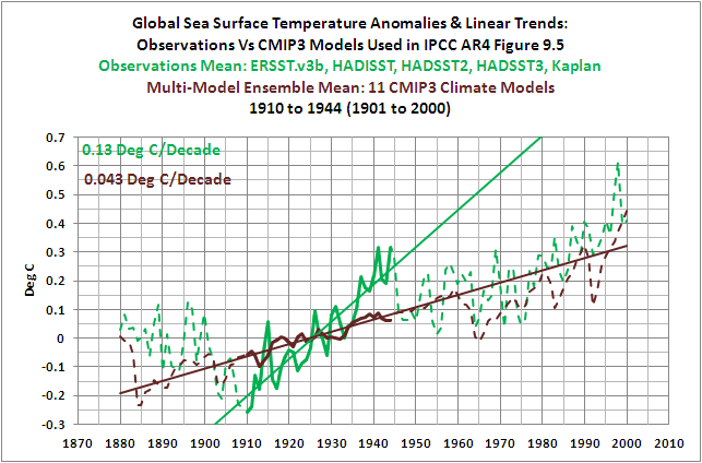
Figure 18
HHHHHHHHHHHHHHHHHHHHHHHHHHHHHHHHHHHHH

Figure 19
HHHHHHHHHHHHHHHHHHHHHHHHHHHHHHHHHHHHH
THE IMPACT OF THE 1945 DISCONTINUITY CORRECTION
If you were to scroll up to the Sea Surface Temperature dataset comparison, Figure 15, you’ll note how the HADSST3 data is the only Sea Surface Temperature anomaly dataset that has been corrected for the 1945 discontinuity, which was presented in the previously linked paper Thompson et al (2009). Raising the Sea Surface Temperature anomalies during the initial years of the mid-century flat temperature period has a significant impact on the observed linear trend for that epoch. And as one would expect, the trend of the model mean no longer comes close to agreeing with the HADSST3 data during the mid-century “flat temperature” period, because the observed temperature anomalies are no longer flat, as illustrated in Figure 20.

Figure 20
ENSO INDICES DO NOT REPRESENT THE PROCESS OF ENSO
Earlier in the post I noted that Thompson et al (2009) had assumed global temperatures respond proportionally to ENSO, and that that assumption was wrong. I have been illustrating that fact in numerous ways in dozens of posts over the past (almost) three years. The most recent discussions appeared in the following two-part series that I wrote at an introductory level:
ENSO Indices Do Not Represent The Process Of ENSO Or Its Impact On Global Temperature
AND:
DO OBSERVATIONS AND CLIMATE MODELS CONFIRM OR CONTRADICT THE HYPOTHESIS OF ANTHROPOGENIC GLOBAL WARMING?
Just in case you missed the obvious answer to the title question of this two-part post, the answer is they contradict the hypothesis of anthropogenic global warming. The climate models presented by the IPCC in AR4 show how global surface temperatures should have risen during the 20th Century if surface temperatures were driven by natural and by anthropogenic forcings. As illustrated in Figure 5, the climate models show that surface temperatures during the late 20th Century warming period, from 1976 to 2000, should have risen at a rate that was approximately 2.9 higher than the rate at which they warmed during the early warming period of 1917 to 1944. But, as shown in Figure 1, the observed rates at which global temperatures rose during the two warming periods of the 20thCentury were the same, at approximately 0.175 deg C/decade.
CLOSING
In this post we illustrated that…
1. regardless of whether we adjust global surface temperature data for ENSO and volcanic aerosols,
2. regardless of whether we use the global surface temperature dataset presented by the IPCC in AR4 (HADCRUT3) or use the average of the GISS, Hadley Centre, and NCDC datasets, and
3. regardless of whether we examine global land-plus-sea surface temperature data or only global sea surface temperature data
…the model mean (the forced component) of the coupled ocean-atmosphere climate models selected by the IPCC for presentation in their 4thAssessment Report CANNOT reproduce:
1. the rate at which global surface temperatures fell during the early 20thCentury “flat temperature” period, or
2. the rate at which global surface temperatures warmed during the early 20thCentury warming period.
The model mean (the forced component) of those same climate models CANNOT reproduce the rate at which global surface temperatures fell during the mid-20thCentury “flat temperature” period if the Sea Surface Temperature data during that period have been corrected for the “1945 discontinuity” discussed in the paper Thompson et al (2009).
As illustrated and discussed in parts 1 and 2 of this post, global surface temperatures can obviously warm and cool over multidecadal time periods at rates that are far different than the forced component of the climate models used by the IPCC. This indicates that those variations in global surface temperature, which can last for 2 or 3 decades, or longer, are not dependent on the forcings that were prepared solely to make the climate models operate. What then is the purpose of using those same models, based on assumed future forcings, to project climate decades and centuries out into the future? The forcings-driven climate models have shown no skill whatsoever at replicating the past, so why is it assumed they would be useful when projecting the future?
ABOUT: Bob Tisdale – Climate Observations
SOURCES
NOTE: The Royal Netherlands Meteorological Institute (KNMI) recent revised the security settings of their Climate Explorer website. You will likely have to log in or registerto use it. For basic information on the use of this valuable tool, refer to the post Very Basic Introduction To The KNMI Climate Explorer.
The sea surface temperature and combined land+sea surface temperature datasets are found at the Monthly observationswebpage of the KNMI Climate Explorer, and the model data is found at their Monthly CMIP3+ scenario runswebpage.
For the Global HADSST2 data, I used the data available through the UK Met Office website, specifically the annual global time-series data that is found at this webpage, then changed the base years for the anomalies to 1901-1950.


Bob,
Global Warming or cooling is only concern is for our survival and creature comforts.
Temperatures do not create climate. Temperatures are an after effect of many processes currently in play that science has not looked at due to it NOT being a temperature measurement.
Velocity and motion are very high in creating our current circulation with forward solar velocity and many, many other parameters in play that science is not considering as it is NOT a temperature data.
Joe’s World: I understand that temperature is not the only metric of global climate, but it is the most commonly referred to metric. And I also understand that climate models do more than create temperature hindcasts and projections. Regardless, how does your comment pertain to the inability of the models to recreate the global surface temperature record of the 20th Century? That’s what’s being discussed on this thread.
That which cannot be answered will be ignored, or at the very least picked at in miniscule fashion (for example, what the meaning of is is, or ought to be, on every other Wednesday) by tiny minds. When you challenge that which is “settled” science you often hear only silence. (SarcOff) Though I’m personally of the opinion that you have dealt the psyence of Anthropogenic Global Warming a terrible blow, and that they are feverishly doing a lot of reprogramming and data tweaking, I think you have served the Science of Climatology very well indeed. No doubt the world’s forecasting programs will improve to better hind cast 20th Century climate changes and you will deserve a great deal of the credit. The squeaky wheel still gets the grease. Thank you for being a “pain in the ass” to the Illuminati for all of us who have no voice in the Great Climate Debate.
Thanks for this highly illuminating expose of the subject. So if the modelers change the inputs and get the models to fit reality will those adjustments indicate that the anthropogenic CO2 component forcing in the model is negligible? Thence the IPCC premise is false.
Kevin Hearle, climate modelers have been trying for decades to reproduce the variations in global surface temperature anomalies with little success. Also, they would have to justify the changes in the forcings, and there have been changes in the forcings since these models were run. Take solar for example. As discussed in part 1, there has been a significant reduction to the contribution of any long-term component in Total Solar Irradiance. This further hurts the modelers efforts during the first half of the 20th Century.
Bob,
Very few people actually discusses any area outside of temperature data.
As far as current scientists are concerned, temperatures are the driver and NOT the passenger of our planets existence. In a very small window of time line to the whole vast time of 4.5 billion years.
The velocity mapping I created was to show how every point on our planet is unique, yet scientists created a planet in a laboratory that does not conform to the motion of an orb.
A great many mistakes at from scientists conclusions that do not include vast areas.
An example is the shifting of our axis. An absolute impossibility as that would mean shifting of our core. Yet many times scientists will say an effect shifted the axis.
Now if they said our shell on the surface shifted over the planets axis, that would be a more correct statement!
Joe’s World: Again, your comment is off topic. Feel free to find another blog that discusses the shift in axis and velocity mapping. This blog is not it.
Check this out. I thought you would enjoy these. Hilarious.
These are funny as hell.
Al Gore in Global Horsesh#t. Part 1
http://goanimate.com/movie/0oM8NpeWAq28/1
Al Gore in Global Horsesh#t. Part 2
http://goanimate.com/movie/0K63D5X0_FEg/1
Between a Barrack and a Hard Place.
http://goanimate.com/movie/07WCzD1eAtH4/1
Enjoy. D
Bob,
Does your models take into account that circulation is opposite of each other in the different hemispheres?
Does it understand that the smaller planet shape and size is very much like a going downhill?
The water vapor of cloud cover does. This is why 90% off the worlds freshwater is trapped in the upper latitudes.
Pingback: It Really Should Go Without Saying, BUT… | Bob Tisdale – Climate Observations
Pingback: IPCC Models Versus Sea Surface Temperature Observations During The Recent Warming Period | Bob Tisdale – Climate Observations
Pingback: Tisdale on IPCC Models Versus Sea Surface Temperature Observations During The Recent Warming Period | Watts Up With That?
Pingback: CMIP3 Models Versus 20th Century Land Surface Temperature Anomalies | Bob Tisdale – Climate Observations
Pingback: ON THE IPCC’s UNDUE CONFIDENCE IN COUPLED OCEAN-ATMOSPHERE CLIMATE MODELS – A SUMMARY OF RECENT POSTS | Bob Tisdale – Climate Observations
Pingback: On The IPCC’s Undue Confidence In Coupled Ocean-Atmosphere Climate Models – A Summary Of Recent Posts | Watts Up With That?
Pingback: Preview of CMIP5/IPCC AR5 Global Surface Temperature Simulations and the HadCRUT4 Dataset | Bob Tisdale – Climate Observations
Pingback: Preview of CMIP5/IPCC AR5 Global Surface Temperature Simulations and the HadCRUT4 Dataset | Watts Up With That?
Pingback: IPCC Models vs Observations – Land Surface Temperature Anomalies for the Last 30 Years on a Regional Basis | Bob Tisdale – Climate Observations
Pingback: IPCC Models vs Observations – Land Surface Temperature Anomalies for the Last 30 Years on a Regional Basis | Watts Up With That?
Pingback: What Do Observed Sea Surface Temperature Anomalies and Climate Models Have In Common Over The Past 17 Years? | Bob Tisdale – Climate Observations
Pingback: Tisdale on the “17 year itch” – Yes, there is a Santer clause | Watts Up With That?
Pingback: An Unsent Memo to James Hansen | Bob Tisdale – Climate Observations
Pingback: Tisdale: An Unsent Memo to James Hansen | Watts Up With That?
Pingback: ScientificAmerican Headline: Warming Oceans Means Seafood Menu Changes | Bob Tisdale – Climate Observations
Pingback: The NAO seafood oscillation | Watts Up With That?
Pingback: Blog Memo to John Hockenberry Regarding PBS Report “Climate of Doubt” | Bob Tisdale – Climate Observations
Pingback: Blog Memo to John Hockenberry Regarding PBS Report “Climate of Doubt” | Watts Up With That?
Pingback: Model-Data Precipitation Comparison: CMIP5 (IPCC AR5) Model Simulations versus Satellite-Era Observations | Bob Tisdale – Climate Observations
Pingback: CMIP5 (IPCC AR5) Climate Models: Modeled Relationship between Marine Air Temperature and Sea Surface Temperature Is Backwards | Bob Tisdale – Climate Observations
Pingback: Another Model Fail – | Watts Up With That?
Pingback: CMIP5 Model-Data Comparison: Satellite-Era Sea Surface Temperature Anomalies | Bob Tisdale – Climate Observations
Pingback: CMIP5 Model-Data Comparison: Satellite-Era Sea Surface Temperature Anomalies | Watts Up With That?
Pingback: Blog Memo to Lead Authors of NCADAC Climate Assessment Report | Bob Tisdale – Climate Observations
Pingback: Blog Memo to Lead Authors of NCADAC Climate Assessment Report | Watts Up With That?