
In numerous past posts, we’ve compared observed surface temperature data to the simulations of it by the climate models used by the Intergovernmental Panel on Climate Change (IPCC) for their 4th (2007) and 5th (upcoming) assessment reports. Refer to the examples here, here, here and here. The climate models showed no skill at being able to simulate past global or regional temperatures. This of course should lead persons to question the IPCC projections of future global warming. If the models can’t simulate the past, there’s no reason to believe their projections. And we’ve also discussed that there is no evidence that manmade greenhouse gases were responsible for the warming of global sea surface temperatures over the past 31 years (the satellite era of sea surface temperature data) or for the warming of ocean heat content data since 1955. See Parts 1 and 2 of the video series The Natural Warming of the Global Oceans.
In this post, we’ll be looking at the satellite-era precipitation on global and regional bases. The observations-based dataset is NOAA’s CAMS-OPI. It is a merged dataset based on ground-based rain gauge observations from the Climate Anomaly Monitoring System (CAMS) and based on satellite rainfall estimates from the Outgoing Longwave Radiation (OLR) Precipitation Index (OPI). It has global (pole to pole) coverage, with a resolution of 2.5 X 2.5 deg longitude and latitude. The dataset runs from January 1979 to present. We’ll compare those observations to the multi-model ensemble mean of the precipitation simulations from climate models stored in the CMIP5 archive. That’s the archive used by the IPCC for its upcoming 5th Assessment Report. I’ve used the RCP6.0 scenario outputs, which are very similar to the SRES A1B scenario that was well-cited in past IPCC reports. The CAMS-OPI precipitation data and the outputs of the climate model simulations of precipitation are available through the KNMI Climate Explorer.
We’ll also divide the global precipitation data into three subsets to show how strongly El Niño-Southern Oscillation (ENSO)—a.k.a. El Niño and La Niña events—impacts precipitation on a regional basis.
And what processes are climate modelers still unable to simulate? That’s right, ENSO. There is something else, though, with a strong influence on global precipitation—as you shall see.
MODELED SURFACE TEMPERATURE VERSUS PRECIPITATION
Figure 1 is a time-series graph that compares the multi-model mean of the simulations of global surface air temperature and precipitation from January 1979 to November 2012. The temperature data has been scaled by a factor of 0.05 for easier visual comparison. The models simulate that manmade greenhouse gases cause global surface air temperatures to warm AND global precipitation to increase. The dips and rebounds associated with volcanic eruptions of El Chichon in 1982 and Mount Pinatubo in 1991 stand out like sore thumbs in both the modeled temperature and the precipitation. All in all, it would seem to be a fair guess that the modelers are assuming that global precipitation will increase as temperatures increase.
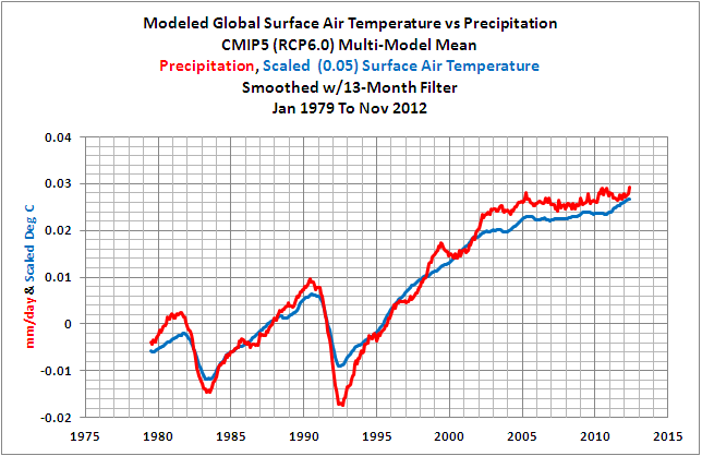
Figure 1
MODEL-DATA PRECIPITATION COMPARISON – GLOBAL
In the real world, based on the linear trend, the CAMS-OPI precipitation data shows that global precipitation has decreased since 1979. See Figure 2. All global temperature metrics show surface temperatures and lower troposphere temperatures have warmed over that period, but, contrary to the modelers’ assumptions, global precipitation has decreased—not increased.

Figure 2
ENSO IS THE PRIMARY CAUSE OF GLOBAL PRECIPITATION VARIABILITY
Looking at the data in Figure 2, it’s tough to imagine that El Niños and La Niñas (formally known as El Nino-Southern Oscillation or ENSO events) are the primary causes of the year-to-year variations in global precipitation. I’ve divided the global precipitation data into subsets based on the following correlation map, Figure 3. In the map, global precipitation is correlated with a commonly used index for the timing, strength and duration of El Niño and La Niña events (NINO3.4 region sea surface temperature anomalies). Tropical precipitation has a very strong negative correlation with that ENSO index in the East Indian and West Pacific region, so I’ve isolated that region, from pole to pole (90S-90N, 80E-150E). There’s a very strong positive correlation with the ENSO index in the central tropical Pacific, so I’ve captured it with the coordinates of 90S-90N, 80E-150E. As opposed to breaking the rest of the data down into more subsets, I’ve simply grouped the East Pacific, Atlantic and West Indian into one region (90S-90N, 150W-80E). For the most part, this large area displays a positive correlation with the ENSO index, but it’s not as strong as the other two regions.

Figure 3
NOTE: While the subsets in the following graphs are identified by oceans, the data also includes the land precipitation within the coordinates. In other words, the East Indian and West Pacific region includes precipitation data for Australia, a chunk of Asia and the corresponding portion of Antarctica. Likewise, the East Pacific, Atlantic and West Indian region includes the precipitation data for the Americas, Africa, Europe, western Asia and its portion of Antarctica. The Central Pacific region captures New Zealand, Alaska, and small portions of Siberia and Antarctica. As you can see in the map, there are different correlations within the regions; that is, I am not representing that the precipitation within each region varies in unison—I’m simply trying to capture the major variations by using these subsets.
Figure 4 compares the precipitation anomalies for the three regions. I’ve provided this graph to give you an idea of the relative magnitudes of the variations.

Figure 4
The East Indian-West Pacific region (90S-90N, 80E-150E) precipitation anomalies are compared to scaled NINO3.4 region (5S-5N, 170W-120W) sea surface temperature anomalies in Figure 5. The NINO3.4 sea surface temperature anomalies are a commonly used index for the strength, frequency, and duration of El Niño and La Niña events. The precipitation data is very volatile, exhibiting what some people would call lots of noise, so both datasets have been smoothed with 13-month running-average filters. The NINO3.4 data has also been scaled to bring its variations into line with the precipitation data, and it has also been inverted to better show the inverse relationship between the two datasets. As you can see, when the sea surface temperatures of our ENSO index warm, indicating an El Niño is taking place, the East Indian-West Pacific region precipitation drops, and vice versa. The reason for that is well understood. During an El Niño, surface and subsurface warm water from the tropical East Indian-West Pacific region spreads across the central and eastern tropical Pacific. The convection, cloud cover and precipitation (that normally exist in the tropical portion of the East Indian-West Pacific region) accompany the warm water to the east. The precipitation in the East Indian-West Pacific region then drops as a result. All in all, the East Indian-West Pacific region precipitation is clearly inversely related to the ENSO index.

Figure 5
The Central Pacific region precipitation is compared to another scaled ENSO index in Figure 6. The ENSO index in this comparison is also sea surface temperature based, but I’ve used NINO4 region data. It’s not used as often as NINO3.4 data but it’s available for comparisons such as this. The NINO4 region (5S-5N, 160E-150W) is west of the NINO3.4 region. The longitudes for the NINO4 region are similar to those I’ve used for the Central Pacific precipitation data (150E-150W). While there are occasional differences between the precipitation data and the ENSO index, the Central Pacific region precipitation mimics that ENSO index (that has been scaled but not inverted). In other words, El Niño and La Niña events are the primary causes in variations in Central Pacific region precipitation.

Figure 6
We’ve returned to scaled (but this time it’s not inverted) NINO3.4 data for the next comparison, with the precipitation data for the East Pacific-Atlantic-West Indian region. See Figure 7. The precipitation here does a reasonable job of mimicking the ENSO index until the decay of the 1997/98 El Niño. Then precipitation changes tack and increases during the 1998-01 La Niña. Not long after the end of that La Niña, in 2002 or 2003, precipitation in the East Pacific-Atlantic-West Indian region suddenly takes a significant drop and actually shifts downward. Why?

Figure 7
I’ve never seen that shift discussed anywhere—then again, I don’t often study precipitation data. I checked to see if it could be attributed to the Indian Ocean Dipole, but that data didn’t seem to fit.
REGIONAL MODEL-DATA COMPARISONS
For those interested, Figures 8 to 10 compare the regional precipitation data to the multi-model mean of the simulations prepared for the IPCC’s upcoming 5th Assessment Report (AR5).
For the East Indian-West Pacific region, which also includes Australia, a chunk of Asia and a portion of Antarctica, the models have simulated little change in precipitation over the past 34 years, Figure 8. But the precipitation in this region has increased.

Figure 8
The Central Pacific region also includes New Zealand, Alaska, and small portions of Siberia and Antarctica. See Figure 9. The climate models show a significant increase in precipitation in this region while the data indicates precipitation decreased.

Figure 9
Last, Figure 10, the Americas, Africa, Europe, western Asia and the portion of Antarctica are included in the East Pacific-Atlantic-West Indian data. Climate models once again show precipitation should be increasing significantly with the rise in manmade greenhouse gases, but the data shows a decline in precipitation.

Figure 10
Like surface temperatures, the climate models exhibit no skill at being able to simulate precipitation throughout the globe.
ON THE USE OF THE MODEL MEAN
We’ve published numerous posts that include model-data comparisons. If history repeats itself, proponents of manmade global warming will complain in comments that I’ve only presented the model mean in the above graphs and not the full ensemble. In an effort to suppress their need to complain once again, I’ve borrowed parts of the discussion from the post Blog Memo to John Hockenberry Regarding PBS Report “Climate of Doubt”.
The model mean provides the best representation of the manmade greenhouse gas-driven scenario—not the individual model runs, which contain noise created by the models. For this, I’ll provide two references:
The first is a comment made by Gavin Schmidt (climatologist and climate modeler at the NASA Goddard Institute for Space Studies—GISS). He is one of the contributors to the website RealClimate. The following quotes are from the thread of the RealClimate post Decadal predictions. At comment 49, dated 30 Sep 2009 at 6:18 AM, a blogger posed this question:
If a single simulation is not a good predictor of reality how can the average of many simulations, each of which is a poor predictor of reality, be a better predictor, or indeed claim to have any residual of reality?
Gavin Schmidt replied:
Any single realisation can be thought of as being made up of two components – a forced signal and a random realisation of the internal variability (‘noise’). By definition the random component will uncorrelated across different realisations and when you average together many examples you get the forced component (i.e. the ensemble mean).
To paraphrase Gavin Schmidt, we’re not interested in the random component (noise) inherent in the individual simulations; we’re interested in the forced component, which represents the modeler’s best guess of the effects of manmade greenhouse gases on the variable being simulated.
The second reference is a similar statement by the National Center for Atmospheric Research (NCAR). I’ve quoted the following in numerous blog posts and in my recently published ebook. Sometime over the past few months, NCAR elected to remove that educational webpage from its website. Luckily the Wayback Machine has a copy. NCAR wrote on that FAQ webpage that had been part of an introductory discussion about climate models (my boldface):
Averaging over a multi-member ensemble of model climate runs gives a measure of the average model response to the forcings imposed on the model. Unless you are interested in a particular ensemble member where the initial conditions make a difference in your work, averaging of several ensemble members will give you best representation of a scenario.
In summary, we are not interested in the models’ internally created noise, and we are not interested in the results of individual responses of ensemble members to initial conditions. So, in the graphs, we exclude the visual noise of the individual ensemble members and present only the model mean, because the model mean is the best representation of how the models are programmed and tuned to respond to manmade greenhouse gases.
CLOSING
Three primary conclusions from this model-data comparison:
1. The climate models prepared for the upcoming 5th Assessment Report show no skill whatsoever at being able to simulate satellite-era precipitation on global or regional bases. The models simulate an increase in precipitation globally over the past 34 years, but global precipitation decreased. In other words, the modelers have wrongly assumed that increases in manmade greenhouse gases will result in more global precipitation.
2. The primary causes of year-to-year variations in global precipitation are El Niños and La Niñas—there’s nothing surprising about that. Until the time that the IPCC’s climate models are able to replicate the ENSO processes and the regional teleconnections of El Niños and La Niñas, climate model projections will have no value.
3. There are additional factors that can cause significant multiyear shifts in regional precipitation. Until the time that climate modelers can anticipate those factors, their projections will have little value.
SOURCE
The precipitation data and model outputs are available to the public through the KNMI Climate Explorer.
SHAMELESS PLUG – INTERESTED IN LEARNING MORE ABOUT THE EL NIÑO AND LA NIÑA AND THEIR LONG-TERM EFFECTS ON GLOBAL SEA SURFACE TEMPERATURES?
As shown in this post, El Niño and La Niña events are the primary causes of regional precipitation variability throughout the globe. (The ENSO-related comparison graphs in this post are new. They were not presented in my book discussed in this section.)
Also, sea surface temperature records indicate El Niño and La Niña events are responsible for the warming of global sea surface temperature anomalies over the past 30 years, not manmade greenhouse gases. I’ve searched sea surface temperature records for more than 4 years, and I can find no evidence of an anthropogenic greenhouse gas signal. That is, the warming of the global oceans has been caused by Mother Nature, not anthropogenic greenhouse gases.
I’ve recently published my e-book (pdf) about the phenomena called El Niño and La Niña. It’s titled Who Turned on the Heat? with the subtitle The Unsuspected Global Warming Culprit, El Niño Southern Oscillation. It is intended for persons (with or without technical backgrounds) interested in learning about El Niño and La Niña events and in understanding the natural causes of the warming of our global oceans for the past 30 years. Because land surface air temperatures simply exaggerate the natural warming of the global oceans over annual and multidecadal time periods, the vast majority of the warming taking place on land is natural as well. The book is the product of years of research of the satellite-era sea surface temperature data that’s available to the public via the internet. It presents how the data accounts for its warming—and there are no indications the warming was caused by manmade greenhouse gases. None at all.
Who Turned on the Heat?was introduced in the blog post Everything You Ever Wanted to Know about El Niño and La Niña… …Well Just about Everything. The Free Preview includes the Table of Contents; the Introduction; the beginning of Section 1, with the cartoon-like illustrations; the discussion About the Cover; and the Closing. The book was updated recently to correct a few typos.
Please buy a copy. Credit/Debit Card through PayPal. You do NOT need to open a PayPal account. Simply scroll down to the “Don’t Have a PayPal Account” purchase option. It’s only US$8.00.
VIDEOS
For those who’d like a more detailed preview of Who Turned on the Heat?, see Parts 1 and 2 of the video series The Natural Warming of the Global Oceans. You may also be interested in the video Dear President Obama: A Video Memo about Climate Change.


Very interesting as usual Bob. AR5 is going to struggle to counter the real evidence that is increasingly becoming available in may areas of the draft report. Question If you leave out the areas of Antartica and the Arctic say south and north of the Antarctic – Arctic circles is the correlation even stronger? The reason for asking this is that it would seem that the climate patterns in these areas have very strong drivers besides ENSO.
Kevin: Sorry for the delay in getting back to you. I just checked the curves of the three subsets using the latitudes of 60S-60N. They’re slightly exaggerated versions of the data that are shown in the graphs above with the latitudes of 90S-90N. They’re so close that, if I were to recreate Figures 5,6 & 7 using 60S-60N for the latitudes, we’d be hard pressed to tell the differences with the others.
Regards
Bob, the curves in Fig 6 seem to go out of phase in 2000 and perhaps only came into phase in 1982 Perhaps there’s some other factor at work? Maybe the East Pacific-Atlantic-West Indian region areal coverage is too large and is mixing signals from the different basis so that you get this divergence between precipitation and NINO 3.4 SST anomalies. Fig 2 shows strikingly different hemispheric patterns that could be involved. Very curious.
Gary, agreed–very curious.
There was also an apparent shift in hemispheric sea level pressure in the early 2000s.

Also curious.
The bottom line, though, is that climate modelers have no apparent idea of what causes global precipitation to vary.
I would say that both the precipitation and pressure changes are associated with the PDO shift. Thw records start as the PDO shifts from negative (low precipitation, low SH pressure) to the positive PDO conditions (high precipitation, low SH pressure.) The early 2000s change is back to the negative PDO state. Unless the is enough data previous to 1979 to confirm this, we will have to wait another quarter century to find out if this is right.
Pingback: Satellite-Era Model-Data Precipitation Comparison for the UK and US | Bob Tisdale – Climate Observations
Pingback: Paleoclima metafisico, pioveva di più ma faceva meno caldo | Climatemonitor
Pingback: CMIP5 (IPCC AR5) Climate Models: Modeled Relationship between Marine Air Temperature and Sea Surface Temperature Is Backwards | Bob Tisdale – Climate Observations
Pingback: Another Model Fail – | Watts Up With That?
Pingback: CMIP5 Model-Data Comparison: Satellite-Era Sea Surface Temperature Anomalies | Bob Tisdale – Climate Observations
Pingback: CMIP5 Model-Data Comparison: Satellite-Era Sea Surface Temperature Anomalies | Watts Up With That?
Pingback: Blog Memo to Lead Authors of NCADAC Climate Assessment Report | Bob Tisdale – Climate Observations
Pingback: Blog Memo to Lead Authors of NCADAC Climate Assessment Report | Watts Up With That?
Bob,
How do you square you result with that of Wentz in Science (2007). Wentz concluded that there was an increase in precipitation associated with the warming, and that the models were only able to represent less than one third to one half of it. His results that the models under represented the acceleration of the hydrological cycle, i.e., a negative feedback, were considered recently confirmed in a study of freshening of sea water:
http://www.sciencemag.org/content/336/6080/455.abstract
Martin, I’m not sure why you’re calling them my results. I plotted data. The CAMS-OPI precipitation data disagrees with the papers you’ve linked. Not me. The source of the data is here:
http://climexp.knmi.nl/selectfield_obs.cgi?someone@somewhere
Maybe you should ask Wentz and the others why their papers disagree with the data.
Regards
“For research purposes, we refer users to the GPCP and CMAP products which are more quality-controlled and use both IR and microwave-based satellite estimates of precipitation.” http://www.cpc.ncep.noaa.gov/products/global_precip/html/wpage.cams_opi.html
“The trend from the reconstructed ocean precipitation is 0.04 mm day−1 over 100a (100 years) and is about twice that of the mean of all models”
http://onlinelibrary.wiley.com/doi/10.1002/jgrd.50212/abstract
Martin: Why did you provide the second link? It includes reconstructed precipitation data since 1900, where I’ve provided satellite- and rain gauge-based data, since 1979.
Bob, I provided the second line as another confirmation that the precipitation is increasing in the observations than in the models.
I don’t know why the CAMS-OPI is wouldn’t show the same trends. They appear to be sacrificing quality assurance for speed, but that shouldn’t introduce a bias. But it appears that even the “data” are reconstructions.
Martin: I’ll also provide another satellite-based observations dataset (not a reconstruction) to confirm the decline in global precipitation.
The NOAA GPCP v2.2 Global Precipitation Anomalies since 1979.

NOAA’s description of the satellite and rain gauge based GPCP v2.2 data is here:
http://www.esrl.noaa.gov/psd/data/gridded/data.gpcp.html
Regards
Pingback: The Sun Was in My Eyes – Was It More Likely Over the Past 3-Plus Decades? | Bob Tisdale – Climate Observations
Pingback: The Sun Was in My Eyes – Was It More Likely Over the Past 3-Plus Decades? | Watts Up With That?
Pingback: Model-Data Comparison with Trend Maps: CMIP5 (IPCC AR5) Models vs New GISS Land-Ocean Temperature Index | Bob Tisdale – Climate Observations
Pingback: Model-Data Comparison with Trend Maps: CMIP5 (IPCC AR5) Models vs New GISS Land-Ocean Temperature Index | Watts Up With That?
Pingback: 73 CO2 AGW Climate Models Are An Epic Fail! | Power To The People
Pingback: Model-Data Comparison: Hemispheric Sea Ice Area | Bob Tisdale – Climate Observations
Pingback: Model-Data Comparison: Hemispheric Sea Ice Area | Watts Up With That?
Pingback: Ten Reasons Why the Man-Made Global Warming Theory is Wrong. | Sovereign Independent UK
Pingback: Model-Data Comparison: Daily Maximum and Minimum Temperatures and Diurnal Temperature Range (DTR) | Bob Tisdale – Climate Observations
Pingback: Model-Data Comparison: Daily Maximum and Minimum Temperatures and Diurnal Temperature Range (DTR) | Watts Up With That?
Pingback: Meehl et al (2013) Are Also Looking for Trenberth’s Missing Heat | Bob Tisdale – Climate Observations
Pingback: Meehl et al (2013) Are Also Looking for Trenberth’s Missing Heat | Watts Up With That?
Pingback: Model-Data Comparison: Alaska Land Surface Air Temperatures | Bob Tisdale – Climate Observations
Pingback: Model-Data Comparison: Alaska Land Surface Air Temperature Anomaliess | Watts Up With That?
Pingback: Model-Data Comparison: Australia Land Surface Air Temperatures & Anomalies | Bob Tisdale – Climate Observations
Pingback: Model-Data Comparison: Australia Land Surface Air Temperatures & Anomalies | Watts Up With That?
Pingback: Models Fail: Scandinavian Land Surface Air Temperature Anomalies | Bob Tisdale – Climate Observations
Pingback: Models Fail: Scandinavian Land Surface Air Temperature Anomalies | Watts Up With That?
Pingback: Models Fail: Greenland and Iceland Land Surface Air Temperature Anomalies | Bob Tisdale – Climate Observations
Pingback: Models Fail: Global Land Precipitation & Global Ocean Precipitation | Bob Tisdale – Climate Observations
Pingback: Models Fail: Global Land Precipitation & Global Ocean Precipitation | Watts Up With That?
Pingback: Part 1 – Comments on the UKMO Report about “The Recent Pause in Global Warming” | Bob Tisdale – Climate Observations
Pingback: Part 1 – Comments on the UKMO Report about “The Recent Pause in Global Warming” | Watts Up With That?
Pingback: Open Letter to Lewis Black and George Clooney | Bob Tisdale – Climate Observations
Pingback: Open Letter to Lewis Black and George Clooney | Watts Up With That?
Pingback: Open Letter to Jon Stewart – The Daily Show | Bob Tisdale – Climate Observations
Pingback: Open Letter to Jon Stewart – The Daily Show | Watts Up With That?
Pingback: A Lead Author of IPCC AR5 Downplays Importance of Climate Models | Bob Tisdale – Climate Observations
Pingback: A Lead Author of IPCC AR5 Downplays Importance of Climate Models | Watts Up With That?
Pingback: California Drought – A Novel Statistical Analysis of Unrealistic Climate Models and of a Reanalysis That Should Not Be Equated with Reality | Bob Tisdale – Climate Observations
Pingback: California Drought – A Novel Statistical Analysis of Unrealistic Climate Models and of a Reanalysis That Should Not Be Equated with Reality | Watts Up With That?
Pingback: On the Elusive Absolute Global Mean Surface Temperature – A Model-Data Comparison | Bob Tisdale – Climate Observations
Pingback: On the Elusive Absolute Global Mean Surface Temperature – A Model-Data Comparison | Watts Up With That?
Pingback: Open Letter to U.S. Senators Ted Cruz, James Inhofe and Marco Rubio | Bob Tisdale – Climate Observations
Pingback: Open Letter to U.S. Senators Ted Cruz, James Inhofe and Marco Rubio | Watts Up With That?
Pingback: What Animals Are Likely to Go Extinct First Due to Climate Change? | Bob Tisdale – Climate Observations
Pingback: What Animals Are Likely to Go Extinct First Due to Climate Change? | Watts Up With That?