
UPDATE: Corrected a few typos. One appeared in Figure 1, which I corrected and replaced. Thanks to Werner Brozek for finding them.
As we’ve seen in numerous model-data comparisons, there are few similarities between modeled and observed surface temperatures and precipitation. See here, here, here, here, and here for examples. We’ve compared satellite-era sea surface temperature to model outputs in past posts (examples here, here and here), but we used model outputs from climate models stored in the CMIP3 archive, which was prepared for the 2007 4th Assessment Report from the IPCC. In this post, we’re using the outputs of newer CMIP5 models, prepared for the IPCC’s upcoming 5th Assessment Report. Scenario RCP6.0 for the CMIP5 models is presented because it most closely matches the climate forcings of the scenario called SRES A1B, which was widely cited in the past.
Preliminary Note: We’re looking at the multi-model ensemble mean (the average of all of the individual simulations in the respective archives) because the model mean is the best representation of how the models are programmed and tuned to respond to manmade greenhouse gases. Phrased another way, if the sea surface temperatures were warmed by greenhouse gases, the multi-model mean presents how those sea surface temperatures would have warmed, according to the models. That’s what we’re interested in seeing. More on this later.
A QUICK LOOK AT THE DIFFERENCE BETWEEN CMIP3 AND CMIP5 OUTPUTS
In general, the multi-model mean of the CMIP5 simulations of global sea surface temperature anomalies have a slightly higher linear trend than the CMIP3 models. See Figure 1. The CMIP5 models have a stronger and more prolonged dip in response to the eruption of Mount Pinatubo in 1991. They also have a curious additional warming from 2000 to 2010 that almost appears to be an over-response, a kind of excessive rebound, from that volcano.

Figure 1
Two notes: First, now consider that the observed trend in global sea surface temperature anomalies is almost half the trend shown by the CMIP5 models. That’s a major difference, suggesting that researchers haven’t yet figured out how and why sea surface temperatures warm.
Second, when looking at the sea surface temperature outputs of climate models, keep in mind that different radiative forcings have different impacts on the oceans. First, let’s discuss downward shortwave radiation. It’s also known as visible sunlight and penetrating solar radiation, the latter because sunlight penetrates the oceans to depths of 100 meters, decreasing in strength with depth. The dips and rebounds seen in Figure 1, beginning in 1991, are caused by the sun-blocking aerosols spewed into the stratosphere during the explosive volcanic eruption of Mount Pinatubo. They are related to downward shortwave radiation. Downward shortwave radiation from the sun is not to be confused with downward longwave radiation, infrared radiation, from manmade greenhouse gases. Infrared radiation can only penetrate the top few millimeters of the ocean, and that’s where evaporation takes place, leading some oceanographers and physicists to believe that the increases in manmade greenhouse gases could not have caused the oceans to warm. The data supports that. In summary, the observed and modeled sea surface temperatures both show dips in responses to volcanic eruptions, which are responses to decreases in sunlight, but that doesn’t mean the modelers are correct in their assumptions that infrared radiation from greenhouse gases caused the warming of sea surface temperatures.
OCEAN BASIN TREND COMPARISONS ON A ZONAL-MEAN (LATITUDINAL) BASIS
Figures 2, 3 and 4 are model-data trend comparisons of sea surface temperature anomalies for the Pacific, Atlantic and Indian Oceans, respectively. But they aren’t time-series graphs. Looking from left to right along the horizontal (x) axis, “-90” represents the South Pole, “0” the equator, and the North Pole is at “90”. The units of the vertical (y) axis are degrees C per decade—based on the calculated linear trend. Each data point represents the linear trend in degrees C per decade for a 5 degree latitude band, where, for example, the data point at -82.5 (82.5S) latitude represents the linear trend of the latitudes of 85S-80S. The data points representing the trends then work northward in 5 degree increments, 80S-75S, 75S-70S, and so on, using the same longitudes. The average temperatures of latitude bands are called the “zonal mean” temperatures by climate scientists, hence the use of that term in the title blocks.
Figure 2 shows the observed and modeled sea surface temperature trends for the Pacific Ocean (longitudes of 125E-90W) on a zonal-mean basis. At and near the equator, observed sea surface temperatures cooled since November 1981, the start of the dataset. And the highest observed warming in both hemispheres occurred at the mid-latitudes of the Pacific.
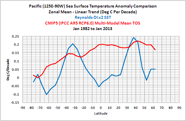
Figure 2
The observed warming trends at mid-latitudes, with no warming near the equator, suggest that warm water was distributed poleward by ocean currents. In the Pacific, that happens when El Niño events dominate, which was the case during this period, causing the excessive distribution of warm water toward those latitudes. Refer to this comparison of Pacific trends on a zonal-mean basis for the periods of 1944 to 1975 and 1976 to 2011. It’s Figure 8-32 from my ebook Who Turned on the Heat? From 1944 to 1975, El Nino and La Niña events were more evenly matched, but slightly weighted toward La Niña. During that period, less warm water was released from the tropical Pacific by El Niños and distributed toward the poles. But from 1976-2011, El Niño events dominated, so more warm tropical waters were distributed to the mid-latitudes.
In looking at the unrealistic trends presented by the models, consider that climate models do not simulate the processes of El Niño and La Niña properly. See the discussion of Guilyardi et al (2009) here.
To overcome those failings, the sea surface temperatures in climate models have to be forced by greenhouse gases to create very high warming trends in the tropics, where observations show little warming. Now consider that the Pacific Ocean stretches almost halfway around the globe at the equator and you’ll understand the magnitude of those failings.
Sunlight is intense in the tropics, and logically the sea surface temperatures (absolute) are warmest there. (That linked illustration is Figure 2.5 from Who Turned on the Heat?) And because sunlight is less intense at the poles, the sea surface temperatures are cold at high latitudes, to the point where the sea surface freezes at the poles. It almost appears as though the climate models show significant warming in the tropical Pacific over the past 31 years because the sea surface temperatures (absolute) are warm there.
Again on a zonal-mean basis, Figure 3 shows the modeled and observed trends in sea surface temperature anomalies for the Atlantic Ocean (longitudes 70W-20E). The models overestimate the warming in the South Atlantic and underestimate it North Atlantic, especially towards the high latitudes. In fact, the models show just about the same warming trends from 40S to 70N, while the trends of the observations change greatly over those latitudes.

Figure 3
The last trend comparison on a zonal-mean basis is for the Indian Ocean (20E-120E), Figure 4. Basically, the models show too much warming at most latitudes.

Figure 4
GLOBAL TIME–SERIES MODEL-DATA COMPARISON
Note: The base period for anomalies is 1971-2000, the standard at the NOAA NOMADS website for the Reynolds OI.v2 data.
For the rest of the model-data comparisons in this post, we’re resorting to standard time-series graphs for the monthly anomalies, with time in years as the x-axis and sea surface temperature anomalies in deg C as the y-axis.
As illustrated in Figure 5, the models inidicate that if greenhouse gases warmed sea surface temperatures, they should have warmed globally at a rate that’s almost twice the observed warming. In the Northern Hemisphere, Figure 6, the sea surface temperatures warmed faster due to multidecadal variations in the North Atlantic and North Pacific (Figure 10 from this post), so the models are exploiting the natural variations to acquire a better match. But the sea surface temperatures in the Southern Hemisphere warmed at a much lower rate, Figure 7, so the disparity there is much greater. Apparently, the modelers still have no idea how to simulate the warming of the oceans. This will be even more obvious in individual ocean basins that follow.

Figure 5 – Global

Figure 6 – Northern Hemisphere

Figure 7 – Southern Hemisphere
OCEAN BASINS AND OTHER SUBSETS
The following graphs present the comparisons for the individual ocean basins per hemisphere, and a couple of subsets related to El Niño-Southern Oscillation. They’re being provided without commentary. The coordinates are listed in the title blocks of the graphs.

Figure 8 – NINO3.4 Region

Figure 9 – East Pacific

Figure 10 – North Atlantic

Figure 11 – South Atlantic

Figure 12 – Pacific

Figure 13 – North Pacific
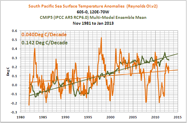
Figure 14 – South Pacific

Figure 15 – Indian

Figure 16 – Arctic

Figure 17 – Southern
MODEL-DATA TREND COMPARISON TABLE
Table 1 presents the observed and modeled linear trends for the sea surface temperature subsets presented in the post, for the period of November 1981 to January 2012 2013. I’ve also included the differences between the modeled and observed trends and the differences as a percentage of the observed trends. [Difference as a Percentage of Observed = ((Model Trend – Obs. Trend)/Obs. Trend)*100]. Click on Table 1 for a full-sized version.

Table 1
CLOSING
About 70% of the planet Earth is covered by water: oceans, seas and lakes. As illustrated in this post, the manmade greenhouse gas-forced component (the multi-model mean) of the climate models prepared for the IPCC’s upcoming 5th Assessment Report shows no similarity to the warming of the sea surface temperatures exhibited by those oceans over the past 31 years. In other words, the models show no skill at being able to simulate the sea surface temperatures of the global oceans for the past 3+ decades—and since the start of the 20th Century, that’s the period when climate models perform at their best.
One of the biggest problems facing the climate science community is the fact that ocean heat content and satellite-era sea surface temperatures indicate the oceans warmed naturally. This was illustrated and discussed in detail in my essay titled “The Manmade Global Warming Challenge”. The introductory blog post is here and it can be downloaded here (42MB). This was also presented in my 2-part YouTube video series titled “The Natural Warming of the Global Oceans”. YouTube links: Part 1 and Part 2. And it was illustrated and discussed, in minute detail, in my ebook Who Turned on the Heat? which was introduced in the blog post “Everything Your Ever Wanted to Know about El Niño and La Niña”. Who Turned on the Heat? is available for sale only in pdf form here. Price US$8.00. Note: There’s no need to open a PayPal account. Simply scroll down to the “Don’t Have a PayPal Account” purchase option.
ON THE USE OF THE MODEL MEAN
We’ve published numerous posts that include model-data comparisons. If history repeats itself, proponents of manmade global warming will complain in comments that I’ve only presented the model mean in the above graphs and not the full ensemble. In an effort to suppress their need to complain once again, I’ve borrowed parts of the discussion from the post Blog Memo to John Hockenberry Regarding PBS Report “Climate of Doubt”.
The model mean provides the best representation of the manmade greenhouse gas-driven scenario—not the individual model runs, which contain noise created by the models. For this, I’ll provide two references:
The first is a comment made by Gavin Schmidt (climatologist and climate modeler at the NASA Goddard Institute for Space Studies—GISS). He is one of the contributors to the website RealClimate. The following quotes are from the thread of the RealClimate post Decadal predictions. At comment 49, dated 30 Sep 2009 at 6:18 AM, a blogger posed this question:
If a single simulation is not a good predictor of reality how can the average of many simulations, each of which is a poor predictor of reality, be a better predictor, or indeed claim to have any residual of reality?
Gavin Schmidt replied with a general discussion of models:
Any single realisation can be thought of as being made up of two components – a forced signal and a random realisation of the internal variability (‘noise’). By definition the random component will uncorrelated across different realisations and when you average together many examples you get the forced component (i.e. the ensemble mean).
To paraphrase Gavin Schmidt, we’re not interested in the random component (noise) inherent in the individual simulations; we’re interested in the forced component, which represents the modeler’s best guess of the effects of manmade greenhouse gases on the variable being simulated.
The quote by Gavin Schmidt is supported by a similar statement from the National Center for Atmospheric Research (NCAR). I’ve quoted the following in numerous blog posts and in my recently published ebook. Sometime over the past few months, NCAR elected to remove that educational webpage from its website. Luckily the Wayback Machine has a copy. NCAR wrote on that FAQ webpage that had been part of an introductory discussion about climate models (my boldface):
Averaging over a multi-member ensemble of model climate runs gives a measure of the average model response to the forcings imposed on the model. Unless you are interested in a particular ensemble member where the initial conditions make a difference in your work, averaging of several ensemble members will give you best representation of a scenario.
In summary, we are definitely not interested in the models’ internally created noise, and we are not interested in the results of individual responses of ensemble members to initial conditions. So, in the graphs, we exclude the visual noise of the individual ensemble members and present only the model mean, because the model mean is the best representation of how the models are programmed and tuned to respond to manmade greenhouse gases.
SOURCES
The Reynolds Optimally Interpolated Sea Surface Temperature Data are available through the NOAA National Operational Model Archive & Distribution System (NOMADS) website.
http://nomad3.ncep.noaa.gov/cgi-bin/pdisp_sst.sh
The CMIP5 Sea Surface Temperature simulation outputs (identified as TOS, assumedly for Temperature of the Ocean Surface) are available through the KNMI Climate Explorer Monthly CMIP5 scenario runs webpage.


I know you are very interested in the mechanics behind ENSO. Have you taken a look at the relationship between SST anomalies in Southern Ocean around the beginning of the year to the following winter’s ENSO mode? There seems to be a fairly good negative correlation between the sudden dips and spikes at the beginning of a calendar year and the ENSO mode the following winter. Some obvious exceptions: 1995/96/97. But could the failure of ENSO to respond to the cooling of the southern ocean in 1996/97 just led to the unusually large El Nino in 1997/98? As in, most of the time, the southern ocean/ENSO connection connects the following year.. but when it doesn’t, it could mean an even bigger event the next year? It happened again in 2005/06/07.. what should have been a La Nina in 2006/07 was actually a weak/moderate El Nino… but then the 2007/08 event was significant in that it was largely ocean driven rather than through the atmsopheric SOI. It’s something worth looking at. And if my suspicions are correct, there’s a good chance La Nina will be making a return for winter 2013/14.
I should clarify: The southern ocean showed a cool spike in early 1996. By my theory, it would mean an El Nino in 1996/97… but even as the southern ocean was quite warm in early 1997, neutral ENSO conditions prevailed.. but by spring 1997, a massive El Nino event was imminent (starting earlier than most El Nino events). After the warm spike in 2005/06 failed to mean La Nina in 2006/07… that El Nino collapsed unusually early and then as the summer wore on, an upwelling driven la Nina formed.
Bryan S: Thanks. I’ll have to take a more detailed look at the relationship you’re describing.
It’s unfortunate that we don’t have long-term data for the Southern Ocean, to determine the frequency and magnitude of any multidecadal variations there–and their influence on the tropical Pacific.
Pingback: Blog Memo to Lead Authors of NCADAC Climate Assessment Report | Bob Tisdale – Climate Observations
Pingback: Blog Memo to Lead Authors of NCADAC Climate Assessment Report | Watts Up With That?
Pingback: The Sun Was in My Eyes – Was It More Likely Over the Past 3-Plus Decades? | Bob Tisdale – Climate Observations
Pingback: The Sun Was in My Eyes – Was It More Likely Over the Past 3-Plus Decades? | Watts Up With That?
Pingback: Model-Data Comparison with Trend Maps: CMIP5 (IPCC AR5) Models vs New GISS Land-Ocean Temperature Index | Bob Tisdale – Climate Observations
Pingback: Model-Data Comparison with Trend Maps: CMIP5 (IPCC AR5) Models vs New GISS Land-Ocean Temperature Index | Watts Up With That?
Bob
Thanks for exposing such little skill.
Part of the poor performance is likely due to chaotic variation due to few runs. May I recommend:
Overcoming Chaotic Behavior of Climate Models
S. Fred Singer, SEPP July 2011
David L. Hagen, thanks for the link.
Regards
Pingback: On Holland and Bruyère (2013) “Recent Intense Hurricane Response to Global Climate Change” | Bob Tisdale – Climate Observations
Pingback: On Holland and Bruyère (2013) “Recent Intense Hurricane Response to Global Climate Change” | Watts Up With That?
Pingback: Provaci ancora Sandy | Climatemonitor
Pingback: La jella delle Hawaii | Climatemonitor
Pingback: Introduction to the Hadley Centre’s HadCRUH Specific Humidity Dataset | Bob Tisdale – Climate Observations
Pingback: Introduction to the Hadley Centre’s HadCRUH Specific Humidity Dataset | Watts Up With That?
Pingback: 73 CO2 AGW Climate Models Are An Epic Fail! | Power To The People
Pingback: May 2013 Sea Surface Temperature (SST) Anomaly Update | Watts Up With That?
Pingback: Model-Data Comparison: Hemispheric Sea Ice Area | Bob Tisdale – Climate Observations
Pingback: Model-Data Comparison: Hemispheric Sea Ice Area | Watts Up With That?
Pingback: I Don’t Like Being Called A Liar, Fabricator or Data Manipulator | Bob Tisdale – Climate Observations
Pingback: Ten Reasons Why the Man-Made Global Warming Theory is Wrong. | Sovereign Independent UK
Pingback: Model-Data Comparison: Daily Maximum and Minimum Temperatures and Diurnal Temperature Range (DTR) | Bob Tisdale – Climate Observations
Pingback: Model-Data Comparison: Daily Maximum and Minimum Temperatures and Diurnal Temperature Range (DTR) | Watts Up With That?
Pingback: Meehl et al (2013) Are Also Looking for Trenberth’s Missing Heat | Bob Tisdale – Climate Observations
Pingback: Meehl et al (2013) Are Also Looking for Trenberth’s Missing Heat | Watts Up With That?
Pingback: Model-Data Comparison: Alaska Land Surface Air Temperatures | Bob Tisdale – Climate Observations
Pingback: Model-Data Comparison: Alaska Land Surface Air Temperature Anomaliess | Watts Up With That?
Pingback: Model-Data Comparison: Australia Land Surface Air Temperatures & Anomalies | Bob Tisdale – Climate Observations
Pingback: Model-Data Comparison: Australia Land Surface Air Temperatures & Anomalies | Watts Up With That?
Pingback: Models Fail: Scandinavian Land Surface Air Temperature Anomalies | Bob Tisdale – Climate Observations
Pingback: Models Fail: Scandinavian Land Surface Air Temperature Anomalies | Watts Up With That?
Pingback: Models Fail: Greenland and Iceland Land Surface Air Temperature Anomalies | Bob Tisdale – Climate Observations
Pingback: Models Fail: Global Land Precipitation & Global Ocean Precipitation | Bob Tisdale – Climate Observations
Pingback: Sea Surface Temperature Anomalies of Tropical Storm Chantal’s Forecasted Storm Track | Bob Tisdale – Climate Observations
Pingback: Sea Surface Temperature Anomalies of Tropical Storm Chantal’s Forecasted Storm Track | Watts Up With That?
Pingback: Models Fail: Global Land Precipitation & Global Ocean Precipitation | Watts Up With That?
Pingback: Part 1 – Comments on the UKMO Report about “The Recent Pause in Global Warming” | Bob Tisdale – Climate Observations
Pingback: Part 1 – Comments on the UKMO Report about “The Recent Pause in Global Warming” | Watts Up With That?
Pingback: Open Letter to Lewis Black and George Clooney | Bob Tisdale – Climate Observations
Pingback: Open Letter to Lewis Black and George Clooney | Watts Up With That?
Pingback: Questions Policymakers Should Be Asking Climate Scientists Who Receive Government Funding | Bob Tisdale – Climate Observations
Pingback: Questions Policymakers Should Be Asking Climate Scientists Who Receive Government Funding | Watts Up With That?
Pingback: Open Letter to Jon Stewart – The Daily Show | Bob Tisdale – Climate Observations
Pingback: Open Letter to Jon Stewart – The Daily Show | Watts Up With That?
Pingback: Quick Comments on England et al. (2014) | Bob Tisdale – Climate Observations
Pingback: El Niño and La Niña Basics: Introduction to the Pacific Trade Winds | Bob Tisdale – Climate Observations
Pingback: El Niño and La Niña Basics: Introduction to the Pacific Trade Winds | Watts Up With That?
Pingback: An Odd Mix of Reality and Misinformation from the Climate Science Community on England et al. (2014) | Bob Tisdale – Climate Observations
Pingback: An Odd Mix of Reality and Misinformation from the Climate Science Community on England et al. (2014) | Watts Up With That?
Pingback: On Chylek et al (2014) – The Atlantic Multidecadal Oscillation as a Dominant Factor of Oceanic Influence on Climate | Bob Tisdale – Climate Observations
Pingback: On Chylek et al (2014) – The Atlantic Multidecadal Oscillation as a Dominant Factor of Oceanic Influence on Climate | Watts Up With That?
Pingback: Maybe the IPCC’s Modelers Should Try to Simulate Earth’s Oceans | Bob Tisdale – Climate Observations
Pingback: Maybe the IPCC’s Modelers Should Try to Simulate Earth’s Oceans | Watts Up With That?
Pingback: El Niño indiano | Climatemonitor
Pingback: ¿El fin de “la pausa”? Y, el calentamiento global perdido … por los siete mares. | PlazaMoyua.com
Pingback: ¿El fin de "la pausa"? Y, el calentamiento global perdido ... por los siete mares. - Desde el exilio
Pingback: California Drought – A Novel Statistical Analysis of Unrealistic Climate Models and of a Reanalysis That Should Not Be Equated with Reality | Bob Tisdale – Climate Observations
Pingback: California Drought – A Novel Statistical Analysis of Unrealistic Climate Models and of a Reanalysis That Should Not Be Equated with Reality | Watts Up With That?
Pingback: On the Elusive Absolute Global Mean Surface Temperature – A Model-Data Comparison | Bob Tisdale – Climate Observations
Pingback: On the Elusive Absolute Global Mean Surface Temperature – A Model-Data Comparison | Watts Up With That?