
[UPDATE: I corrected the dates in the title blocks of Figures 10 and 11. My thanks to blogger Bob.moe for finding the typos.]
England et al. (2014) Recent intensification of wind-driven circulation in the Pacific and the ongoing warming hiatus continues to receive attention, and with it comes basic questions for many people about trade winds. NBC News has an article by John Roach with the title Global Warming Pause? The Answer Is Blowing Into the Wind. And the team from RealClimate have agreed and disagreed with England et al. (2014) in their post Going with the wind. We’ve already discussed England et al. (2014) in the post here, and we’ll discuss that NBC News article and the RealClimate post in an upcoming one.
For this post, we’re going to concentrate on why the trade winds blow and why they’ve grown stronger in recent years. This is an “introduction to” post. It is not intended to confirm or contradict the findings of England et al. (2014). It is intended to illustrate that the trade winds of the tropical Pacific depend on the sea surface temperatures there and vice versa. It might be considered an add-on to (a reinforcement of) the post An Illustrated Introduction to the Basic Processes that Drive El Niño and La Niña Events.
This post also includes a good number of model-data comparisons. And as we’ve seen before, when illustrating Pacific sea surface temperature data, model-data comparisons never put the models in a good light. Then again, I’m trying to think of any circumstance in which the models performed well. Hmm. I can’t think of any. None. Nada. Zip.
WHY THE TRADE WINDS BLOW
The following is a basic introduction to the trade winds. For it, I’m going to borrow a portion of my book Who Turned on the Heat? for the first portion. (I’ve updated the Figure numbers for this post):
[START OF PARTIAL REPRINT OF WHO TURNED ON THE HEAT?]
Trade winds are the prevailing surface winds in the tropics. They’re called easterlies because they blow primarily from east to west. In the Northern Hemisphere, the trade winds travel from the northeast to the southwest, and they travel from southeast to northwest in the Southern Hemisphere.
The trade winds blow because the surface temperature is warmer near the equator than it is at higher latitudes. Refer to Figure 1 for the annual 2011 zonal-mean sea surface temperatures for the Pacific Ocean.

Figure 1
Warm, moist air rises near the equator. This upward motion draws replacement surface air from the north in the Northern Hemisphere and from the south in the Southern Hemisphere. In other words, the air at the surface is being drawn toward the equator due to the updraft there. In turn, the equatorward surface winds need to be replaced, and that cool, dry air is drawn down from higher altitudes at about 30N and 30S. Upper winds traveling poleward from the equator complete the circuit. That circuit is called a Hadley Cell. See Figure 2. Because the Earth is rotating, the equatorward surface winds are deflected toward the west by the Coriolis force.

Figure 2
We can explain the Hadley Circulation another way, if you prefer. We’ll start again near the equator where warm, moist air rises. It travels poleward at an altitude of 10 to 15 kilometers (32,800 to 45,800 feet) losing heat and moisture along the way. The cooler, dryer air then drops back toward the surface in the subtropics at about 30N and 30S. The surface winds then complete the circulation pattern. If the Earth was not rotating, the tropical surface winds would be out of the north in the Northern Hemisphere and out of the south in the Southern Hemisphere. Because the Earth is rotating, however, the tropical surface winds—the trade winds—are deflected toward the west.
The prevailing tropical winds are, therefore, from east to west. They blow across the surface of the tropical Pacific Ocean, dragging the surface waters along with them. There are two surface currents as a result, traveling from east to west, one per hemisphere. They are logically called the North and South Pacific Equatorial Currents. There is a smaller surface current flowing between them that returns some of the water back to the east and it’s called the Equatorial Countercurrent. See Figure 3.
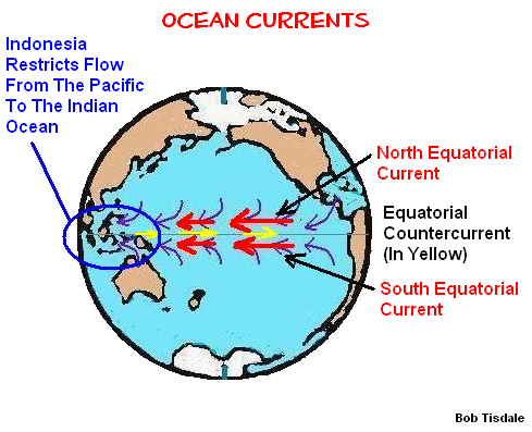
Figure 3
The Equatorial Currents carry the waters across the tropical Pacific. Then they encounter Indonesia, which restricts continued flow to the west. Some of the water is carried through all of the islands to the Indian Ocean by a surface current called the Indonesian Throughflow. As noted above, a little of the water is carried east by the Equatorial Countercurrent. The rest of the water is carried poleward. The overall systems of rotating ocean currents in the Northern and Southern Hemispheres are known as gyres. Gyres exist in all ocean basins. The ones in Figure 4 are called the North Pacific Gyre and the South Pacific Gyre.
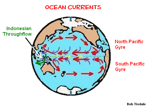
Figure 4
The NASA Ocean Motion website is a great resource for entry-level discussions of ocean currents. Refer to their Home and Wind Driven Surface Currents: Equatorial Currents Background web pages. Take a tour; there’s lots of interesting information there.
[END OF PARTIAL REPRINT OF WHO TURNED ON THE HEAT?]
SEA LEVEL PRESSURE DIFFERENCES AND THE SOUTHERN OSCILLATION INDEX
Because the trade winds are blowing across the tropical Pacific from east to west, the sea surface temperatures (not anomalies) in the eastern tropical Pacific are much cooler than they are in the west. The trade winds draw cool water from below the surface of the eastern tropical Pacific in a process called upwelling. Sunlight warms the water as it travels from east to west. The sunlight-warmed water travels almost halfway around the globe before it runs into the land masses of Indonesia and Australia. The warm water stacks up there. If this part of the discussion is new to you, please refer to the post An Illustrated Introduction to the Basic Processes that Drive El Niño and La Niña Events.
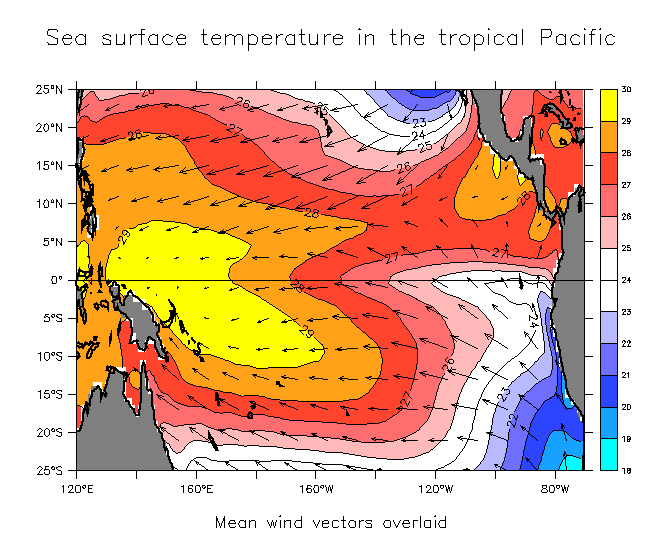
Because the water is warm in the western tropical Pacific, a lot of evaporation takes place there and the warm, moist air rises. This creates an area of low sea level pressure in the western tropical Pacific. Because the water is cooler in the eastern tropical Pacific, cool, dry air falls in that region, creating an area of high sea level pressure. The surface winds (the trade winds) blow from the region with high sea level pressure (eastern tropical Pacific) to the area with low sea level pressure (western tropical Pacific). See Figure 5.
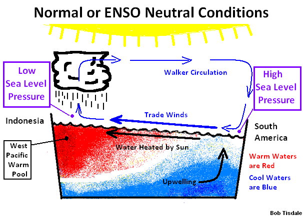
Figure 5
The following is a reprint of a portion of Chapter 4.3 ENSO Indices from Who Turned on the Heat? In fact, Figure 5 (above) is borrowed from that chapter.
[START OF PARTIAL REPRINT FROM WHO TURNED ON THE HEAT?]
The Southern Oscillation Index, or SOI, is a way to portray the atmospheric component of El Niño and La Niña events. It represents the difference in Sea Level Pressure between Darwin, Australia and the South Pacific island of Tahiti. The term Southern Oscillation was coined by Sir Gilbert Walker in the 1920s. Yes, that’s the same Walker as in “Walker Circulation” or “Walker cells”. He was the first researcher to note that the surface air pressures in Tahiti and Darwin, Australia opposed one another; that is, when sea level pressure in Tahiti was high, the sea level pressure in Darwin was normally low, and vice versa.
Let’s discuss the trade winds again for a moment. The trade winds are blowing from east to west when the surface air pressure in the east (Tahiti) is higher than in the west (Darwin). See Figure 5 (above). When the pressure difference between Tahiti and Darwin grows, the trade winds are stronger, and that’s an indication of a La Niña event.
[Addition for this post: Conversely, when the sea level pressures drop in Tahiti and rise in Darwin, that’s an indication an El Niño is taking place.]
The Australian Bureau of Meteorology (BOM) is one of the suppliers of Southern Oscillation Index data. They use a traditional method of presentation, which they explain here. Basically—maybe not so basically—the data is calculated by subtracting the sea level pressure in Darwin from the sea level pressure in Tahiti. Then they determine the anomalies using the method described in Chapter 2.8. Here’s where the not-so-basically part comes in. The anomalies for that month are divided by the standard deviation, to standardize or normalize the data. After that, they multiply the data by 10. Whew! For those interested, there’s a somewhat-simple-to-understand explanation of standard deviation here.
Now that that’s out of the way, let’s compare the Southern Oscillation index data to the NINO3.4 sea surface temperature anomalies we’ve been using as an ENSO index. See Figure 6. Because the Southern Oscillation index data is multiplied by 10 as part of its calculation, we’ll need to scale the NINO3.4 sea surface temperature anomalies. A factor of 10 works. The Southern Oscillation index data is noisy, so the two datasets were smoothed with 13-month running-average filters. It’s very easy to see the inverse relationship between the two datasets. Equatorial Pacific sea surface temperature warm and cool during the evolution and decay of an El Niño, and Southern Oscillation index data dips and rebounds. The opposite holds true during a La Niña. There are some minor differences. For example, the Southern Oscillation index data shows the 1982/83 El Niño was stronger than the one in 1997/98, while the NINO3.4 sea surface temperature anomalies show them the other way around. Notice also, there doesn’t appear to be a La Niña event after the 1982/83 El Niño using the Southern Oscillation index, but one is present in the NINO3.4 data. Other than those and some others minor differences, the two datasets do mimic one another, but inversely.
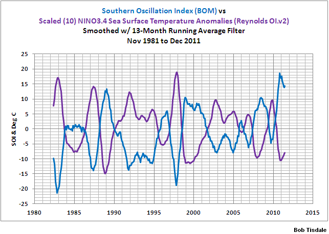
Figure 6
According to the BOM, La Niña events are sustained positive Southern Oscillation Index values in excess of +8 and El Niño events are sustained negative values in excess of -8. In that discussion at the BOM website, however, the Southern Oscillation Index data is being presented as a 30-day running average, so you can’t apply those values to Figure 4-16, which has been smoothed with a 13-month running-average filter.
[END OF PARTIAL REPRINT FROM WHO TURNED ON THE HEAT?]
POSITIVE FEEDBACK
As discussed above, the trade winds blowing across the tropical Pacific are part of Walker Circulation. The trade winds cause the temperature difference between the eastern and western tropical Pacific. But the temperature difference between the eastern and western tropical Pacific also cause the trade winds to blow. The temperature difference and the strength of the trade winds are interdependent…with positive feedback. That is, the temperature difference and the strength of the trade winds reinforce one another. That positive feedback was introduced by Bjerknes.
(And what fundamental feedback in the tropical Pacific are climate models still unable to simulate correctly? That’s right: Bjerknes feedback. See Bellenger et al (2013).)
THE CHICKEN OR THE EGG
NOAA’s Bill Kessler describes the chicken-and-egg relationship between the trade winds and the sea surface temperatures of the tropical Pacific in his ENSO FAQ webpage:
This sets up the coupled ocean-atmosphere interaction in the tropical Pacific in which the winds determine the water temperature but the water temperature also determines the winds, in a chicken and egg situation. In this system, we can start a description at any point in the cycle. For example, we observe that there is cool water in the east and warm in the west (see the figure “Mean SST and winds in the tropical Pacific”). The winds blow towards the warm water, since that heats the atmosphere and makes the air rise, then other air flows in to fill the gap. (These are the trade winds, that the Spanish used to sail from their colonies in South America to the Philippines). Because of the force of the trades, sea level at Indonesia is about 1/2 meter higher than at Peru. At the same time the trade winds act on the ocean as well. The westward winds along the equator push the warm water (heated by the sun) off to the west, drawing up the thermocline and exposing the cooler water underneath in the east. This upwelling cools the eastern surface water, and we have returned to the starting place of the description.
A QUICK LOOK AT AN ENSO INDEX REVEALS A CHANGE IN THE DOMINATION OF EL NIÑO EVENTS
Figure 7 presents a commonly used index for the strength, frequency and duration of El Niño and La Niña events. It is a graph of the sea surface temperature anomalies of the NINO3.4 region. I’ve also highlighted NOAA’s official El Niño (red) and La Niña (blue) events, based on their Oceanic NINO Index (but the data in the graph are not from the Oceanic NINO Index). And as we can see, there were a series of strong and long El Niño events from 1982 through 1998: the 1982/83, the 1986/87/88 and the 1997/98 El Niños. Although the series of El Niños in the first half of the 1990s are now considered independent events, Trenberth and Hoar proclaimed them as one long event in their 1996 paper The 1990-1995 El Niño-Southern Oscillation Event: Longest on record. The El Niño events since 1998 have not been as strong, and the frequency of La Niña events has increased.
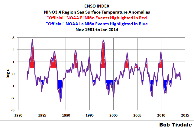
Figure 7
Because trade winds are weak during El Niños and strong during La Niñas, the change in the frequencies of El Niño and La Niña events indicate the trade wind should have increased during that time…and they have, and they also caused…
THE GROWING TEMPERATURE DIFFERENCE BETWEEN THE EASTERN AND WESTERN TROPICAL PACIFIC
Before we present the sea surface temperature anomaly differences between the eastern and western tropical Pacific, let’s first look at the sea surface temperature anomalies for the entire tropical Pacific. See Figure 8. The data are the satellite-enhanced sea surface temperature data (Reynolds OI.v2) for the coordinates of 20S-20N, 120E-80W. The models are represented by the average of all the simulations of sea surface temperature anomalies for that region from the climate models prepared for the IPCC’s 5th Assessment Report. See the post here for the reasons we use the average of the model outputs; a.k.a. the model mean. (The base years for anomalies are the NOAA standard for the Reynolds OI.v2 data: 1971-2000.) The sea surface temperature data for the tropical Pacific show that the surface of the tropical Pacific has not warmed over the past 32+ years—the full term of the Reynolds OI.v2 sea surface temperature data. On the other hand, climate models indicate that, if the surface temperatures of the tropical Pacific were warmed by manmade greenhouse gases, they should have warmed more than 0.6 deg C (or about 1.1 deg F). The models have a big problem with how they simulate surface temperatures of the tropical Pacific, but we already knew that. (See Figure 2 from the post CMIP5 Model-Data Comparison: Satellite-Era Sea Surface Temperature Anomalies.)

Figure 8
Figure 9 presents the sea surface temperature anomalies of the eastern and western tropical Pacific. The coordinates used are listed in the title block, but, basically, I’ve divided the data for the tropical Pacific at the dateline. Although the sea surface temperatures of the tropical Pacific as a whole have not warmed in 32+ years (see Figure 8), the sea surface temperature anomalies of the western tropical Pacific have warmed and, in the eastern tropical Pacific, they’ve cooled.

Figure 9
WHAT CAUSED THE SEA SURFACE TEMPERATURES OF THE WESTERN TROPICAL PACIFIC TO WARM?
We would have to conclude that stronger trade winds (associated with the changes in the frequencies of El Niño and La Niña events) contributed to the warming of the western tropical Pacific based on our earlier discussions. But the data for that region also indicate there was an upward shift in the sea surface temperatures of the western tropical Pacific in 1995. See Figure 10. Based on the period-average temperature anomalies before and after 1995 (the blue lines), the sea surface temperatures of the western tropical Pacific shifted upwards about 0.3 deg C in 1995.
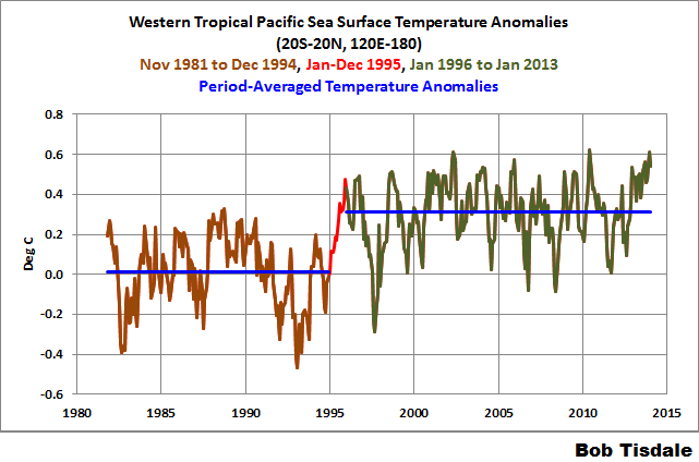
Figure 10
If we now overlay the East Pacific data onto that color-coded graph, we can see that the upward shift occurred during the transition from the 1994/95 El Niño to the 1995/96 La Niña. See Figure 11.
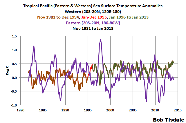
Figure 11
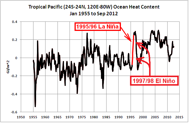
As you’ll recall from past discussions, there was a similarly timed warming of the ocean heat content of the tropical Pacific about 1995. All of the warm water for the 1997/98 “super” El Niño was created during the 1995/96 La Niña. See Figure 22 of the post Is Ocean Heat Content Data All It’s Stacked Up to Be? Refer also to the post La Niña – The Underappreciated Portion of ENSO.
WHAT CAUSED THE SEA SURFACE TEMPERATURES OF THE EASTERN TROPICAL PACIFIC TO COOL?
Again, based on our earlier discussions, we would have to think that stronger trade winds (associated with the changes in the frequencies of El Niño and La Niña events) contributed to the cooling of the eastern tropical Pacific, through an increase in the upwelling of cool waters from below the surface of the eastern equatorial Pacific.
The eastern boundary currents of the North and South Pacific feed water to the eastern tropical Pacific. In the North Pacific, that current is the California Current, and in the South Pacific, it’s the Humboldt Current. For Figure 12, I used the extratropical coordinates of 20N-45N, 135W-105W for the California Current and 50S-20S, 90W-70W for the Humboldt Current. They both show that the waters feeding the eastern tropical Pacific have also cooled over the past 32+ years. (I’ve also included the warming estimated by the climate models, for those interested.) Then again, the El Niño- and La Niña-related processes taking place in the eastern tropical Pacific have a strong impact on the sea surface temperatures of the eastern boundary currents of the North and South Pacific (except in the climate models, apparently, which still cannot simulate basic El Niño and La Niña processes and their aftereffects).

Figure 12
THE TEMPERATURE ANOMALY DIFFERENCE BETWEEN THE EASTERN AND WESTERN TROPICAL PACIFIC
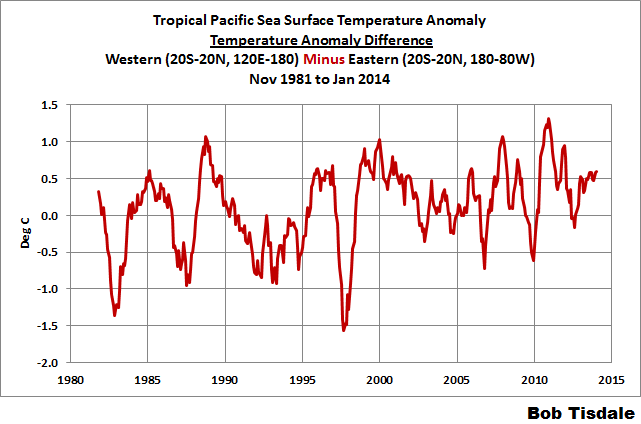
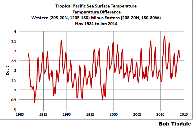
Figure 13 presents the difference between the Eastern Tropical Pacific (20S-20N, 180-80W) and the Western Tropical Pacific (20S-20N, 120E-180) sea surface temperature anomalies, with the Eastern data subtracted from the Western data. It’s very obvious that the temperature difference has increased as a result of the stronger trade winds—which are caused by the changes in the frequencies of El Niño and La Niña events.

Figure 13
For those interested, the temperature (not anomaly) difference is presented in the graph here.
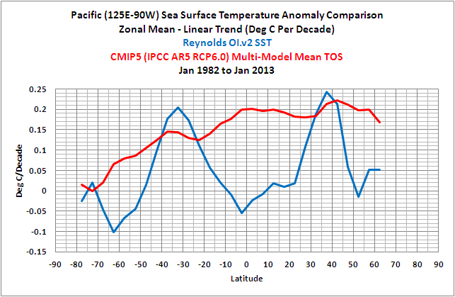
Did the climate models used by the IPCC for their 5th Assessment Report capture this ENSO-related change in the temperature difference between the eastern and western tropical Pacific? Of course not. See Figure 14.
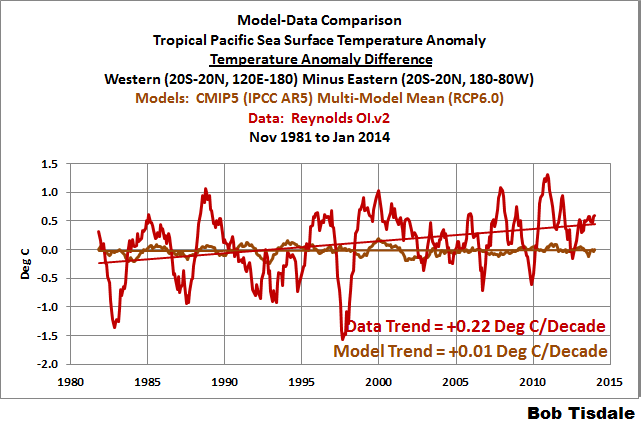
Figure 14
Climate models have no value at determining why the temperature difference between the eastern and western tropical Pacific has grown, because the models still cannot simulate the basic processes that cause El Niño and La Niña events.
We’ve presented the temperature difference between the eastern and western tropical Pacific, so let’s take a look at the trade wind indices. Because the temperature difference and the trade winds are coupled, the curve of the trade wind data should be similar to that of the temperature difference.
THE NOAA TRADE WIND INDICES
The NOAA Monthly Atmospheric & SST Indices webpage present numerous El Niño/La Niña-related indices, including trade winds for the equatorial Pacific. The trade wind indices are for the equatorial Pacific (5S-5N) at 850mb (which is an altitude of about 5000 feet, about 1500 meters). These indices are based on a reanalysis, which is a computer model that uses data as inputs, so we have to keep that in mind. NOAA provides indices for the:
- Western Equatorial Pacific (5S-5N, 135E-180): data here.
- Central Equatorial Pacific (5S-5N, 170W-140W): data here.
- Eastern Equatorial Pacific (5S-5N, 135W-120W): data here.
Figure 15 presents the indices in their “raw” monthly form, not as anomalies. Also included are trend lines. We can see that the trade winds (according to the reanalysis) have grown stronger in the western and eastern tropical Pacific, but have weakened in the eastern equatorial Pacific.
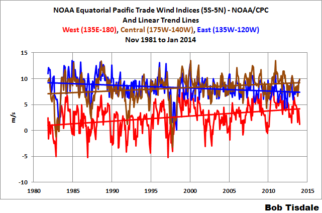
Figure 15
In Figure 16, I’ve smoothed the data with 12-month running-average filters to help show the El Niño- and La Niña-related variations. To further help with that, I’ve also included NINO3.4 sea surface temperature anomalies (the ENSO index shown in Figure 7). During El Niños, the trade winds slow (weaken), and during La Niñas, the trade winds increase (strengthen).
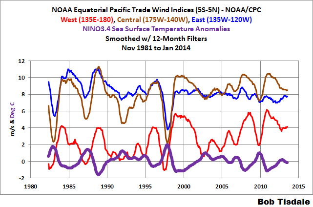
Figure 16
Unfortunately, NOAA does not provide a trade wind index for the entire equatorial Pacific, so we’ll have to create one. That’s relatively easy. We’ll use a weighted-average of the individual indices, based on the longitudes they cover: West (47%), Central (37%) and East (16%). Figure 17 presents the result. The trade winds have increased for the equatorial Pacific, just as we would expect, with the transition from a period when El Niño events dominated.
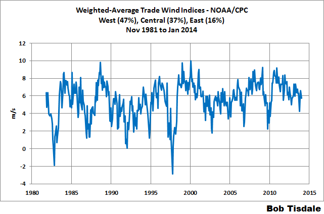
Figure 17
TRADE WINDS VERSUS THE TEMPERATURE ANOMALY DIFFERENCE BETWEEN THE EAST AND WEST TROPICAL PACIFIC
Animation 1 compares the weighted-average of the trade wind indices to the temperature anomaly difference between the eastern and western tropical Pacific.
Animation 1
The curves are very similar. Now consider that:
- The trade wind indices are for the equatorial Pacific and they’re based on a reanalysis, not data, and,
- The temperature difference is for the tropical Pacific and I simply selected the dateline for the dividing point. (See the update after Figure 18.)
How similar are the curves? For Figure 18, I’ve converted the data to annual averages, made the two datasets anomalies with 1982 to 2013 as the base years, and then standardized each dataset by dividing it by its standard deviation. The correlation coefficient is 0.93, and as a reference, 1.0 means they are perfectly correlated.
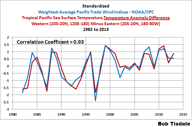
Figure 18
[UPDATE: In anticipation of some “what if” questions: If we change the dividing point for the eastern and western tropical Pacific to 165E for the sea surface temperature data, we can increase the correlation with the weighted trade wind index to 0.95. Additionally, if we then confine the sea surface temperature data to the equatorial Pacific (like the trade wind indices), the curve changes slightly, but the correlation is the same at 0.95. However, the intent of this exercise was not to try to find the best correlation; the intent was to show an interrelationship between the trade winds and the sea surface temperatures of the tropical Pacific. And I believe we’ve done that.]
And for those interested, I’ve added the annual BOM Southern Oscillation Index (SOI) data to the comparison in Figure 19, following the same procedure to normalize the SOI data. Obviously, the strengths of the trade winds and the temperature difference between the eastern and western tropical Pacific and the sea level pressure difference between the Darwin Australia and Tahiti (both located in the tropical South Pacific off the equator in the Southern Hemisphere) are all interdependent.
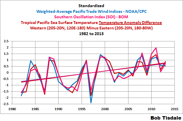
Figure 19
CLOSING
Hopefully, this introduction to trade winds will help persons understand why those winds occur in the tropical Pacific…and why they vary. And hopefully it will help provide a background for those who are interested in learning the basic processes that drive El Niño and La Niña events. Additionally, when someone uses the phrase “coupled ocean-atmosphere process”, hopefully you’ll think of this post as an example.
Once again, the climate models used by the IPCC for their 5th Assessment Report are shown to have no basis in reality and, in this instance, provide no help in determining why the trade winds have changed recently and how they might change in the future.


Very nicely done, Bob
Thanks Bob.
Thanks, Bob. A very good post.
Again, natural causes dominate the climate.
Thanks Bob. There’s so much to learn and you make it easy ….
Great explanations again. Nice to see that you still have some time to spend making these concepts clear and understandable. I would be interested to hear what Dr Mathew English has to say in response to this information and your explanation for why the GCMs fail. Might be a bit difficult for him I guess.
Thank-you so much for this. Since this is a post on the basics, I presume I can ask basic curiosity questions.
Your post is very specific to Pacific ENSO, but I presume a similar process is happening in the Atlantic, correct? To what degree does the Atlantic process contribute to the trade winds etc? I would presume most of the sunlight warmed water would stack up in the Gulf of Mexico and be trapped there, or maybe it is split better and runs both up and down South America? It there a big enough temperature gradient between the warm waters of the western Atlantic, the short land mass between oceans, into the cooler waters of the eastern Pacific to detect any kind of wind acceleration as it crosses into the Pacific? What are the possible interactions and implications if one ocean body is in a El Nino (warming phase) and the other is in a La Nina (cool phase) or any variation thereof?
chuckarama: I haven’t really studied the Atlantic NINO, since it is so small, so I can’t answer your specific questions.
The Atlantic NINO, while it does exist, is a much smaller mode of variability. See the FAQ # 19 from NOAA’s Bill Kessler for a preliminary discussion:
http://faculty.washington.edu/kessler/occasionally-asked-questions.html#q19
There are a number of papers discussing and describing it, but they are grossly outnumbered by the papers about ENSO in the Pacific. See Xie and Carton (2004) for an example. According to it, sea surface temperatures in the tropical North Atlantic are dominated by the North Atlantic Oscillation and by ENSO, through teleconnections:
Click to access Xie_Carton.pdf
Bob,
Why do you think the La Nina causes strengthening trade winds? Even though the eastern temperatures drop. I have an idea, but I would like to hear your views first.
Jerry
Jerry: The entire post is an explanation of why the trade winds strengthened.
Pingback: An Odd Mix of Reality and Misinformation from the Climate Science Community on England et al. (2014) | Bob Tisdale – Climate Observations
Pingback: An Odd Mix of Reality and Misinformation from the Climate Science Community on England et al. (2014) | Watts Up With That?
Bob, I have looked at Roy Spencer’s global temperature data (1979 – 2013) using statistical process control methods and have determined all of the change in global temperature is normal or common cause variability EXCEPT the period from 1995 to 2000. Whatever happened in these years to shift the temperature is the cause of all of the warming since 1979. When I look at your SST data and the shifting taking place in this period it seems that the ENSO pattern is the culprit. Can it be this simple?
PS – I have looked at some other global temperature data-sets for this period and they all display a similar pattern.
Jack Kelly: Refer to the following post that plainly shows the ENSO-induced upward shifts in TLT anomalies:
Regards
Thanks Bob. The article was very informative. All of your analyses are excellent.
Pingback: The 2014/15 El Niño – Part 5 – The Relationship Between the PDO and ENSO | Bob Tisdale – Climate Observations
Pingback: The 2014/15 El Niño – Part 5 – The Relationship Between the PDO and ENSO | Watts Up With That?
Pingback: The 2014/15 El Niño – Part 7 – May 2014 Update and What Should Happen Next | Bob Tisdale – Climate Observations
Pingback: The 2014/15 El Niño – Part 7 – May 2014 Update and What Should Happen Next | Watts Up With That?
Pingback: The 2014/15 El Niño – Part 8 – The Southern Oscillation Indices | Bob Tisdale – Climate Observations
Pingback: The 2014/15 El Niño – Part 8 – The Southern Oscillation Indices | Watts Up With That?
Thanks again Bob for your your series of presentations, and emphasis on data. The interrelationship between the trade winds and the sea surface temperatures of the tropical Pacific is background information required for thinking about climate. The coupled ocean-atmosphere process is one more feedback process that makes climate so fascinating (and impossible to model successfully). The difference between your presentations and the concensus fearmongering -model projection- alarmism is the difference between lucid and lurid.
Pingback: The 2014/15 El Niño – Part 9 – Kevin Trenberth is Looking Forward to Another “Big Jump” | Bob Tisdale – Climate Observations
Pingback: The 2014/15 El Niño – Part 9 – Kevin Trenberth is Looking Forward to Another “Big Jump” | Watts Up With That?
Pingback: The 2014/15 El Niño – Part 10 – June 2014 Update – Still Waiting for the Feedbacks | Bob Tisdale – Climate Observations
Pingback: The 2014/15 El Niño – Part 10 – June 2014 Update – Still Waiting for the Feedbacks | Watts Up With That?
Pingback: The 2014/15 El Niño – Part 11 – Is the El Niño Dying? | Bob Tisdale – Climate Observations
Pingback: The 2014/15 El Niño – Part 11 – Is the El Niño Dying? | Watts Up With That?
I am disappointed that you niño 3.4 without defining it. You could have used this illustration:
http://www.cpc.ncep.noaa.gov/products/analysis_monitoring/ensostuff/nino_regions.shtml
When you talk about Darwin and Tahiti you are talking about Niño 4 correct? So are you saying that Tahiti is the dividing line, correct? So a high in Tahiti causes and a low in Darwin causes wind to blow from Tahiti to Darwin. I will look for your book in the library but I will not buy it because you have skipped basic knowledge in you article here.
CC Squid says: “When you talk about Darwin and Tahiti you are talking about Niño 4 correct?”
Nope. The NINO4 region is bordered by the coordinates of 5S-5N, 160E-150W. Darwin, Australia is off the equator and much farther to the west (12S, 130E), while Tahiti is farther from the equator and in the eastern tropical Pacific (18S, 149W).
CC Squid says: “I am disappointed that you niño 3.4 without defining it.”
My apologies.
Regards
Pingback: The 2014/15 El Niño – Part 12 – July 2014 Update – The Feedbacks Need to Kick in Soon | Bob Tisdale – Climate Observations
Pingback: The 2014/15 El Niño – Part 12 – July 2014 Update – The Feedbacks Need to Kick in Soon | Watts Up With That?
Pingback: The 2014/15 El Niño – Part 13 – More Mixed Signals | Bob Tisdale – Climate Observations
Pingback: The 2014/15 El Niño – Part 13 – More Mixed Signals | Watts Up With That?
Pingback: The 2014/15 El Niño – Part 14 – Warm Water Recirculated? | Bob Tisdale – Climate Observations
Pingback: The 2014/15 El Niño – Part 14 – Warm Water Recirculated? | Watts Up With That?
Pingback: The 2014/15 El Niño – Part 15 – August 2014 Update – An El Niño Mulligan? | Bob Tisdale – Climate Observations
Pingback: The 2014/15 El Niño – Part 15 – August 2014 Update – An El Niño Mulligan? | Watts Up With That?
Pingback: The 2014 15 El Niño – Part 15 – September 2014 Update – Still Seeing Mixed Signals | Bob Tisdale – Climate Observations
Pingback: The 2014 15 El Niño – Part 15 – September 2014 Update – Still Seeing Mixed Signals | Watts Up With That?
Pingback: The 2014/15 El Niño – Part 18 – October 2014 Update – One Last Chance? | Bob Tisdale – Climate Observations
Pingback: The 2014/15 El Niño – Part 18 – October 2014 Update – One Last Chance? | Watts Up With That?
Pingback: The 2014 15 El Niño – Part 19 – Is an El Niño Already Taking Place? | Bob Tisdale – Climate Observations
Pingback: The 2014/15 El Niño – Part 19 – Is an El Niño Already Taking Place? | Watts Up With That?
Pingback: The 2014/15 El Niño – November Update – The Little El Niño That Shoulda’-Woulda’-Coulda’ | Bob Tisdale – Climate Observations
Pingback: The 2014/15 El Niño – Part 20 – November Update – The Little El Niño That Shoulda’-Woulda’-Coulda’ | Watts Up With That?
Pingback: March 2015 ENSO Update – Will the 2014/15 El Niño Become the 2014/15/16 El Niño? | Watts Up With That?
Pingback: March 2015 ENSO Update – Will the 2014/15 El Niño Become the 2014/15/16 El Niño? | I World New
Pingback: May 2015 ENSO Update – Australia’s BOM and the JMA Declare an El Niño and With Them Comes the Typical Nonsense from an Expert Source | Watts Up With That?
Pingback: June 2015 ENSO Update – Tropical Pacific Approaching the Threshold of a Strong El Niño | Watts Up With That?
Pingback: July 2015 ENSO Update – Tropical Pacific at the Threshold of a Strong El Niño | Watts Up With That?
Pingback: August 2015 ENSO Update – Another Westerly Wind Burst in Late July Should Help El Niño Evolve | Watts Up With That?
Pingback: September 2015 ENSO Update – Sea Surface Temperatures Continue to Rise in the Central Equatorial Pacific | Watts Up With That?
Pingback: October 2015 ENSO Update – Comparisons with the Other Satellite-Era Multiyear El Niño | Watts Up With That?
Pingback: October 2015 ENSO Update – Comparisons with the Other Satellite-Era Multiyear El Niño | Daily Green World
Pingback: El Nino: how does it impact UK winter weather? « Reigate Grammar School Weather Station
Pingback: December 2015 ENSO Update – Shouldn’t Be Long Now Until the El Niño Starts to Decay | Watts Up With That?
Pingback: January 2016 ENSO Update – It Appears the El Niño Has Peaked | Watts Up With That?
Pingback: March 2016 ENSO Update – We’ll Have to Keep an Eye on the Pocket of Warm Water South of the Equator | Watts Up With That?
Pingback: April 2016 ENSO Update – La Niña Alerts Issued for Later This Year and NINO1+2 SSTa Are Near Zero Deg C | Watts Up With That?
Pingback: May 2016 ENSO Update – The 2015/16 El Niño Has Reached Its End | Watts Up With That?