
We’ve already discussed Cowtan and Way’s infilling of HADCRUT4 data in the post On Cowtan and Way (2013) “Coverage bias in the HadCRUT4 temperature series and its impact on recent temperature trends”. The paper is available here. In that earlier post, I presented the following graph and noted:
If we compare the HADCRUT4 data to the CMIP5 models (historic and RCP6.0) for the period of 1997 to 2012, Figure 1, we can see that the models over-estimate the warming from 65S to 65N (the vast majority of the planet) and underestimate the warming at the poles. Therefore, if the Cowtan and Way (2013) data are increasing the warming in the Arctic, they are creating a greater divergence from the models there, but failing to reduce the differences between the models and data where the models overestimate the warming.

Figure 1
(I changed the above Figure number for this post. It was Figure 9 in the earlier post.)
The Cowtan and Way (2013) data do increase the warming at the poles and exaggerate the failings in the models there, while doing little to explain the hiatus in the non-polar regions, which make up about 90% of the planet.
Note: For those not familiar with the type of graph shown in Figure 1: It illustrates the warming and cooling rates of the HADCRUT4 data, and the average of the CMIP5 (IPCC AR5) climate runs for the period of January 1997 to December 2012…the hiatus period. The vertical axis (y-axis) is scaled in deg C/decade, so we’re showing the warming and cooling rates (that is, the trends). The horizontal axis (x-axis) is scaled in latitude, so the South Pole is to the left at -90 (90S) and North Pole is to the right at 90 (90N). From 1997 to 2012, the HADCRUT4 data show the very slow warming rates (and cooling at some latitudes) extending from the mid-latitudes of the Southern Hemisphere to the mid-latitudes of the Northern Hemisphere. Both poles continue to show warming, however. On the other hand, the models do not show the lack of warming in the non-polar regions during this period. That is, they do not capture the hiatus, the pause, the halt, the cessation of global warming in the non-polar regions. And the models underestimate the warming at the poles, especially in the Arctic, and that means the models do not properly simulate polar amplification. But we already knew the models cannot simulate polar amplification—we discussed and illustrated that failing in the posts here and here.
Back to the Cowtan and Way (2013) data:
In the earlier post, I had not presented warming rates (or lack thereof) for the Cowtan and Way data on a zonal-mean (latitude-average) basis (like Figure 1)because their data is not available on a gridded basis in an easy-to-use format. However, blogger Nick Stokes made the effort to determine those trends for the Cowtan and Way “hybrid” version, for the period 1997 to 2012. (Just what we’re looking for.) See Nick’s post Cowtan and Way trends. Nick was also very kind and he listed the trends in a table. (Thanks, Nick.)
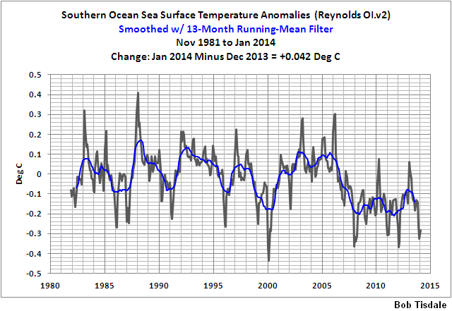
Figure 2 presents the trends of the Cowtan and Way “hybrid” data (courtesy of Nick Stokes) versus the trends of the multi-model mean of the climate models used by the IPCC for their 5th Assessment Report (AR5), for the period of 1997-2012. I’ve also included the HADCRUT4 trends as a reference (dashed lines), because they’re the basis for the Cowtan and Way data. The Cowtan and Way infilling make the models perform worse at the poles, and they had performed very badly with the HADCRUT4 data without the “help” of Cowtan and Way. And the Cowtan and Way infilling did little to eliminate the hiatus in the non-polar regions. Most notably, Cowtan and Way reduced, but did not eliminate, the cooling taking place in the Southern Ocean surrounding Antarctica, a place where sea ice has been expanding in recent decades…and where sea surface temperatures have been cooling.
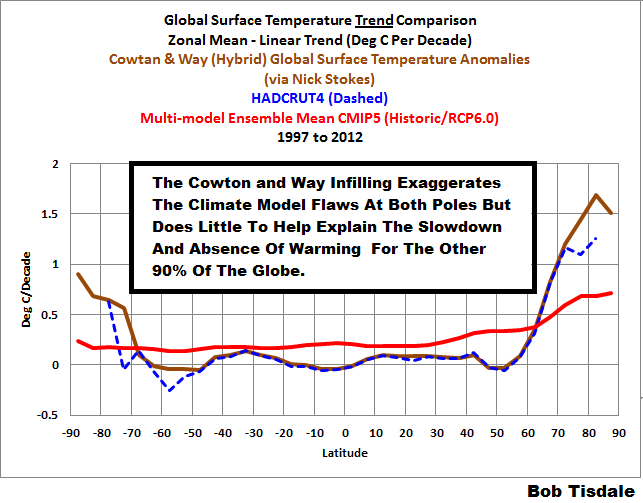
Figure 2
CLOSING
The Cowtan and Way (2013) revisions to the HADCRUT4 data do nothing to explain the absence of warming that is occurring in the non-polar regions during the hiatus period. Those non-polar regions cover about 90% of the planet and it’s there that climate models cannot explain the slowdown and absence of warming. The Cowtan and Way revisions also exaggerate the warming at the poles which further undermines the current generation of climate models, because the models are unable to explain the observed warming at the poles. That is, the models are still not capable of properly simulating polar amplification.
Those who promote the Cowtan and Way (2013) revisions to the HADCRUT4 data don’t understand where the hiatus is taking place and they don’t understand the model failings at simulating polar amplification—or—they are intentionally being misleading.
SOURCES
The HADCRUT4 data and the climate model outputs are available through the KNMI Climate Explorer.


It would be interesting and perhaps informative to see the Figure 2 plotted in an “equal area” zonal plot. By that, I mean that the x-axis spacing is sin(latitude). This would make the x-axis distance filled by each latitude band proportional to the area in that latitude band. This type of plot would further emphasize the spikes in trends near the north and south poles.
charliexyz, wouldn’t it be better to weight the trends by latitude? That would deemphasize the poles, which would be appropriate since they do represent so little of the globe.
I agree that it would be better to weight the graph of trends by the area at each latitude, by making the spacing of the x-axis proportional to the area at each latitude.
That’s what I think would happen if you plotted the trends for each latitude band at the x-axis position corresponding to sin(latitude). The 90S trend gets plotted at -1 on x axis (along with a -90 label). The equator trend gets plotted at 0 on the x-axis. 90N trend gets plotted at +1 on the X-axis
Doing this should make the distance between S90 and S80 (and N80 to N90) the smallest spacing between 10 degree bands. The x-axis spacing between 10South and the equator (or equator and 10N) is the largest, and then the plot gets compressed in the x-axis again as it heads towards 90 North.
In this sort of “area normalized” plot the global average trend would be the average of the area under the curve of the plot.
I think was are saying the same thing, but just using different words.
Pingback: An Odd Mix of Reality and Misinformation from the Climate Science Community on England et al. (2014) | Bob Tisdale – Climate Observations
Pingback: An Odd Mix of Reality and Misinformation from the Climate Science Community on England et al. (2014) | Watts Up With That?
Pingback: New Paper Confirms the Hiatus Is Not Occurring at the Poles, Undermining the Efforts of Cowtan and Way | Bob Tisdale – Climate Observations
Pingback: New Paper Confirms the Hiatus Is Not Occurring at the Poles, Undermining the Efforts of Cowtan and Way | Watts Up With That?