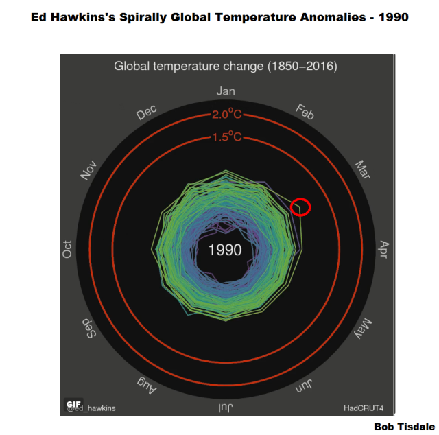
Eric Worrall’s post Making Global Warming Scarier at WattsUpWithThat included an animation of global surface temperature anomalies from Ed Hawkins of the University of Reading. [Thanks, Eric.] I’ve included the gif edition as my Animation 1, which is available from Ed Hawkins’s post Spiralling global temperatures at his blog ClimateLabBook. (The post is archived here.)
Animation 1
Ed Hawkins’s animation infills the data spirally as time progresses. He describes that animation:
The animated spiral presents global temperature change in a visually appealing and straightforward way. The pace of change is immediately obvious, especially over the past few decades. The relationship between current global temperatures and the internationally discussed target limits are also clear without much complex interpretation needed.
Curiously, Ed Hawkins doesn’t explain the changes in color. They appear to be time related, not temperature related.
BUT DOES THAT DATA PRESENTATION DEFEAT ITS PURPOSE?
Something caught my eye on the first viewing of the animation. See Figure 1. Did others notice the same thing?
Figure 1
I’ve highlighted the March 1878 anomaly in Figure 1.
Watching the animation on the first pass, I waited and waited and waited some more for those February, March and April 1878 values to be exceeded. And I was still waiting more than 100 years later on the animation. See Figure 2.
Figure 2
As shown in Figure 3, it wasn’t until 1990 that the March and April 1878 values were surpassed.
Figure 3
Did Ed Hawkins really want to draw everyone’s attention to that curiosity? See the summation in Figure 4.
Figure 4 (Click to enlarge.)
It’s simply an easy-to-overlook (statistically insignificant) blip in a time-series graph. See Figure 5.
Figure 5
Maybe the long-term trend of the time-series graph (about +0.05 deg C/decade or about +0.5 deg C/century) was too low for Ed Hawkins?
It shows up as a multi-year blip when the data are smoothed with a 61-month running-mean filter…basically the same as the 5-year running mean filter used by GISS and Berkeley Earth. See Figure 6.
Figure 6
Now Ed Hawkins has introduced that 1878 blip to people who may normally have not noticed it before…especially when GISS and NOAA conveniently begin their data two years after it in 1880.
CLOSING QUESTIONS
Will most people see those February, March and April temperature anomalies from 1878 sitting there unsurpassed for over 100 years, my Figures 1 and 2 ?
What will they think when they see it?
Will it help them to continue to dismiss global warming as a problem?
Will it make skeptics out of others, when they see it?
Or will Ed Hawkins’s graph have the impact he desires?


Was there a whopper El Nino in 1877-1878? Seems like there must have been. Followed by an equally impressive La Nina.
How big a ENSO 3.4 value and water volume would it have taken to make a global temp anomaly that wouldn’t be exceeded for 110 years of 0.5 C/century warming?
joelobryan, thanks for reminding me. I’ll address your question in an update.
Bob,
I clicked over from Wattsupwiththat–thanks for providing the link to your article.
I haven’t figured out what is so freaking “scary” about this animation. I’ve seen dust bunnies hiding under my looms that are scarier than that. But this? Multicolored spirals coming at you reminds me of Tempest rather than Freddy Kruger. So in answer to your question–Ed Hawkin’s graph has missed the mark (pardon the pun as it does look like a dartboard) completely. If he thinks spirals are scary the man must live under a rock.
Good spot Bob. Interesting indeed. Yes very convenient GISS ect start in 1880.
The models cannot produce an 1878 temp like that with CO2, so it had to go, along with the MWP LIA 1940s heat and 70s cooling, anything the models cant replicate is revised into oblivion
Not nearly as impressive, actually a bit ho hum, in the 21st century if just the Southern Hemisphere. And up to now there’s been no 2015/16 El Nino spike in the SH i.e. the NH skews the global mean rendering it somewhat meaningless. Also contrary to Schmidt and Rahmstorf (see Carbon Breif interview) and Sherwood, Foster, Mann et al who have claimed the NH-only GL mean El Nino spike for AGW. Adds the “scary” factor to Hawkin’s graph at the end as per Stephen Schneider’s “scary scenarios” of course.
WFT not up to date but for illustration:
HadCRUT4 NH vs SH from 1950 (1950 chosen to coincide with IPCC attribution)
http://woodfortrees.org/plot/hadcrut4nh/from:1950/plot/hadcrut4sh/from:1950
Also instructive is 5 yr means over the complete series:
HadCRUT NH SST and NH LOT vs SH SST and SH LOT
http://woodfortrees.org/plot/hadsst3nh/mean:60/plot/hadsst3sh/mean:60/plot/hadcrut4nh/mean:60/plot/hadcrut4sh/mean:60
SH temperature just tracks sea temperature. Land and CO2 have no effect whatsoever (the sun heats the ocean).
Not so in the NH. Both LOT and SST are entirely different profiles and divergent (CO2 is rampant over land apparently).
I call this the “global average illusion”. Works well on the gullible and ignorant.
Reblogged this on Climate Collections.
The spiral conveniently ends in March 2016 for Hadcrut which is a record high March and makes it look as if anomalies are spiraling out of control. But if they did it for the satellites to April, then April 2016 cuts below April 1998 and looks less scary. Of course, it could only start in 1978 then.
The blips are certainly interesting, but fixating on them and magnifying them ignores the answer to the question you pose. The animation allows one to clearly see both blips and trends, allowing one to access various pieces of information in a useful way. However, when one is interested in trends over longer periods of time, the animation indicates the blips you point out as blips. It shows where the temperature spends most of its time over different epochs (moving outward and spending increasing amounts of time in outer temperature annuli). It shows the long term trend … and it show blips as what they are … blips: very interesting but blips nevertheless.