I really enjoyed this.
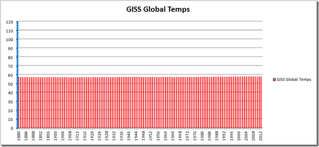
Imagine that each red line is a line from a
mercury
alcohol thermometer which goes from 0 to 120° F as many thermometers do, except they typically go lower, often at about -40°F.
So each red line on this graph represents an annual temp as a thermometer would display it. The source is the GISS data.
Yep, the earth is burning up. Running a fever!!! Quick someone give it an aspirin!!! We should tax ourselves into oblivion because of this.


…about the most damning visual aid there is
I made the following, quantitative observation in a comment on the Steven Goddard site 3 weeks ago:
And according to that graph, they are as certain of hemispheric mean temperature in 1000 AD as they are in the modern “measurements”. The cleanness of that graph–the closely-cropped variations from year to year (like a well-tended lawn), for over a thousand years (predating the very foundation of modern science, not to mention the technological inventions allowing accurate physical measurements, by about 600 years)–literally shouts out to me that it is a convenient fiction, calling for a belief in the tree-ring fairies, and other proxies they used. The best that any honest and competent scientist could make of that graph is that the global temperature (as indicated by these northern hemisphere temperatures) must be very stable, varying by no more than about 0.5 degree from the long-term mean, over the last 1,000 years. How you get from that to runaway global warming is just a matter of hysterical delusion and political tyranny–and there is only one way known, in the history of Man, to burn away such a mass delusion, at least for a time (before it starts to grow back, in a century or two, or three, under the right conditions of scientific neglect, economic class division, and human prejudice): war (leading to unification behind new religions/philosophies of “the shared human condition”). There is no valid climate science and no competent climate scientists (TM).
————————-
Your graph brings out the “well-tended lawn” nicely…
Thanks, Paul. Your graph is very scary!
What is even scarier, is that now the “scientific” consensus is saying that man-made global warming causes global cooling.
“This is the age of miracles and wonders”, Paul Simon.
This nicely illustrates the tyranny of the y-axis scale.
Plot in deg K and it will be even less dramatic.
And I thought all of these various temperature graphs looked better on log/log scaling – also because nature tend to logarithmic responcses to stimuli.
I suggested somewhere else that the range for plotting global temperatures should be the highest and lowest temperature recorded in Yakutsk. From -84 to 101°F or -64 to 38°C