
INITIAL QUESTION
Once upon a time, the NCDC published its monthly global land+ocean surface temperature anomaly data around the 15th of the month. They have recently relaxed the dates of their monthly global state of the climate updates. The NCDC are now showing on the webpage here that they will be publishing their monthly global updates around the 22nd of each month. Because GISS is still updating their data around the 15th of the month, it seems like old news when I wait a week for the NCDC data before publishing these updates.
So the question is, should I publish this monthly update about the 15th of each month, updating only the GISS data for the most current month, and with the NCDC and HADCRUT4 updates included, but their data lagging one month? That way the update would be little more timely, but the NCDC and HADCRUT4 data would not be current, lagging a month. All three datasets mimic one another. Since January 1979, the monthly GISS data correlate with both the NCDC and HADCRUT4 data with a correlation coefficient of 0.96. So if the GISS data warm one month, we can expect the NCDC and HADCRUT4 data to do so as well.
Back to your regularly scheduled update:
Initial Notes: This post contains graphs of running trends in global surface temperature anomalies for periods of 13+ and 16+ years using HADCRUT4 global (land+ocean) surface temperature data. They indicate that we have not seen a warming halt (based on 13 years+ trends) this long since the late-1970s or a warming slowdown (based on 16-years+ trends) since about 1980.
Much of the following text is boilerplate. It is intended for those new to the presentation of global surface temperature anomaly data.
Most of the update graphs in the following start in 1979. That’s a commonly used start year for global temperature products because many of the satellite-based temperature datasets start then.
We discussed why the three suppliers use different base years for anomalies in the post Why Aren’t Global Surface Temperature Data Produced in Absolute Form?
GISS LAND OCEAN TEMPERATURE INDEX (LOTI)
Introduction: The GISS Land Ocean Temperature Index (LOTI) data is a product of the Goddard Institute for Space Studies. Starting with their January 2013 update, GISS LOTI uses NCDC ERSST.v3b sea surface temperature data. The impact of the recent change in sea surface temperature datasets is discussed here. GISS adjusts GHCN and other land surface temperature data via a number of methods and infills missing data using 1200km smoothing. Refer to the GISS description here. Unlike the UK Met Office and NCDC products, GISS masks sea surface temperature data at the poles where seasonal sea ice exists, and they extend land surface temperature data out over the oceans in those locations. Refer to the discussions here and here. GISS uses the base years of 1951-1980 as the reference period for anomalies. The data source is here.
Update: The March 2014 GISS global temperature anomaly is +0.70 deg C. It warmed (an increase of about 0.25 deg C) since February 2014.

Figure 1 – GISS Land-Ocean Temperature Index
NCDC GLOBAL SURFACE TEMPERATURE ANOMALIES
Introduction: The NOAA Global (Land and Ocean) Surface Temperature Anomaly dataset is a product of the National Climatic Data Center (NCDC). NCDC merges their Extended Reconstructed Sea Surface Temperature version 3b (ERSST.v3b) with the Global Historical Climatology Network-Monthly (GHCN-M) version 3.2.0 for land surface air temperatures. NOAA infills missing data for both land and sea surface temperature datasets using methods presented in Smith et al (2008). Keep in mind, when reading Smith et al (2008), that the NCDC removed the satellite-based sea surface temperature data because it changed the annual global temperature rankings. Since most of Smith et al (2008) was about the satellite-based data and the benefits of incorporating it into the reconstruction, one might consider that the NCDC temperature product is no longer supported by a peer-reviewed paper.
The NCDC data source is usually here. NCDC uses 1901 to 2000 for the base years for anomalies. (Note: the NCDC has been slow with updating the normal data source webpage, so I’ve used the value listed on their State of the Climate Report for this month.)
Update: The March 2014 NCDC global land plus sea surface temperature anomaly was +0.71 deg C. See Figure 2. It rebounded considerably (an increase of -0.30 deg C) since February 2014.

Figure 2 – NCDC Global (Land and Ocean) Surface Temperature Anomalies
UK MET OFFICE HADCRUT4 (LAGS ONE MONTH)
Introduction: The UK Met Office HADCRUT4 dataset merges CRUTEM4 land-surface air temperature dataset and the HadSST3 sea-surface temperature (SST) dataset. CRUTEM4 is the product of the combined efforts of the Met Office Hadley Centre and the Climatic Research Unit at the University of East Anglia. And HadSST3 is a product of the Hadley Centre. Unlike the GISS and NCDC products, missing data is not infilled in the HADCRUT4 product. That is, if a 5-deg latitude by 5-deg longitude grid does not have a temperature anomaly value in a given month, it is not included in the global average value of HADCRUT4. The HADCRUT4 dataset is described in the Morice et al (2012) paper here. The CRUTEM4 data is described in Jones et al (2012) here. And the HadSST3 data is presented in the 2-part Kennedy et al (2012) paper here and here. The UKMO uses the base years of 1961-1990 for anomalies. The data source is here.
Update (Lags One Month): The February 2013 HADCRUT4 global temperature anomaly is +0.30 deg C. See Figure 3. It plummeted (about +0.21 deg C) since January 2014, as the other two datasets did in February. But both of the other datasets showed a rebound in March.

Figure 3 – HADCRUT4
13-YEARS+ (158-MONTH) RUNNING TRENDS
As noted in my post Open Letter to the Royal Meteorological Society Regarding Dr. Trenberth’s Article “Has Global Warming Stalled?”, Kevin Trenberth of NCAR presented 10-year period-averaged temperatures in his article for the Royal Meteorological Society. He was attempting to show that the recent halt in global warming since 2001 was not unusual. Kevin Trenberth conveniently overlooked the fact that, based on his selected start year of 2001, the halt at that time had lasted 12+ years, not 10.
The period from January 2001 to February 2014 is now 158-months long—more than 13 years. Refer to the following graph of running 158-month trends from January 1880 to February 2014, using the HADCRUT4 global temperature anomaly product.
An explanation of what’s being presented in Figure 4: The last data point in the graph is the linear trend (in deg C per decade) from January 2001 to February 2014. It is basically zero. That, of course, indicates global surface temperatures have not warmed during the most recent 158-month period. Working back in time, the data point immediately before the last one represents the linear trend for the 158-month period of December 2000 to January 2013, and the data point before it shows the trend in deg C per decade for November 2000 to December 2013, and so on.

Figure 4 – 158-Month Linear Trends
The highest recent rate of warming based on its linear trend occurred during the 158-month period that ended about 2004, but warming trends have dropped drastically since then. There was a similar drop in the 1940s, and as you’ll recall, global surface temperatures remained relatively flat from the mid-1940s to the mid-1970s. Also note that the late-1970s was the last time there had been a 158-month period without global warming—before recently.
16-YEARS+ (201-Month+) RUNNING TRENDS
In his RMS article, Kevin Trenberth also conveniently overlooked the fact that the discussions about the warming halt are now for a time period of about 16 years, not 10 years—ever since David Rose’s DailyMail article titled “Global warming stopped 16 years ago, reveals Met Office report quietly released… and here is the chart to prove it”. In my response to Trenberth’s article, I updated David Rose’s graph, noting that surface temperatures in April 2013 were basically the same as they were in June 1997. We’ll use June 1997 as the start month for the running 16-year+ trends. The period is now 201-months long. The following graph is similar to the one above, except that it’s presenting running trends for 201-month periods.

Figure 5 – 201-Month Linear Trends
The last time global surface temperatures warmed at this low a rate for a 201-month period was about 1980. Also note that the sharp decline is similar to the drop in the 1940s, and, again, as you’ll recall, global surface temperatures remained relatively flat from the mid-1940s to the mid-1970s.
The most widely used metric of global warming—global surface temperatures—indicates that the rate of global warming has slowed drastically and that the duration of the halt in global warming is unusual during a period when global surface temperatures are allegedly being warmed from the hypothetical impacts of manmade greenhouse gases.
A NOTE ABOUT THE RUNNING-TREND GRAPHS
There is very little difference in the end point trends of 13+ year and 16+ year running trends if HADCRUT4 or NCDC or GISS data are used. The major difference in the graphs is with the HADCRUT4 data and it can be seen in a graph of the 13+ year trends. I suspect this is caused by the updates to the HADSST3 data that have not been applied to the ERSST.v3b sea surface temperature data used by GISS and NCDC.
COMPARISONS
The GISS, HADCRUT4 and NCDC global surface temperature anomalies are compared in the next three time-series graphs. Figure 6 compares the three global surface temperature anomaly products starting in 1979. Again, due to the timing of this post, the HADCRUT4 data lags the GISS and NCDC products by a month. The graph also includes the linear trends. Because the three datasets share common source data, (GISS and NCDC also use the same sea surface temperature data) it should come as no surprise that they are so similar. For those wanting a closer look at the more recent wiggles and trends, Figure 7 starts in 1998, which was the start year used by von Storch et al (2013) Can climate models explain the recent stagnation in global warming? They, of course found that the CMIP3 (IPCC AR4) and CMIP5 (IPCC AR5) models could NOT explain the recent halt in warming.
Figure 8 starts in 2001 which was the year Kevin Trenberth chose for the start of the warming halt in his RMS article mentioned and linked earlier. Because the suppliers all use different base years for calculating anomalies, I’ve referenced them to a common 30-year period: 1981 to 2010. Referring to their discussion under FAQ 9 here, according to NOAA:
This period is used in order to comply with a recommended World Meteorological Organization (WMO) Policy, which suggests using the latest decade for the 30-year average.

Figure 6 – Comparison Starting in 1979
###########

Figure 7 – Comparison Starting in 1998
###########

Figure 8 – Comparison Starting in 2001
AVERAGE
Figure 9 presents the average of the GISS, HADCRUT and NCDC land plus sea surface temperature anomaly products. Again because the HADCRUT4 data lags one month in this update, the most current average only includes the GISS and NCDC products.

Figure 9 – Average of Global Land+Sea Surface Temperature Anomaly Products
The flatness of the data since 2001 is very obvious, as is the fact that surface temperatures have rarely risen above those created by the 1997/98 El Niño. There is a very simple reason for this: the 1997/98 El Niño released enough sunlight-created warm water from beneath the surface of the tropical Pacific to permanently raise the temperature of about 66% of the surface of the global oceans by almost 0.2 deg C. Sea surface temperatures for that portion of the global oceans remained relatively flat until the El Niño of 2009/10, when the surface temperatures of the portion of the global oceans shifted slightly higher again. Prior to that, it was the 1986/87/88 El Niño that caused surface temperatures to shift upwards. If these naturally occurring upward shifts in surface temperatures are new to you, please see the illustrated essay “The Manmade Global Warming Challenge” (42mb) for an introduction.
MONTHLY SEA SURFACE TEMPERATURE UPDATE
The most recent sea surface temperature update can be found here. The satellite-enhanced sea surface temperature data (Reynolds OI.2) are presented in global, hemispheric and ocean-basin bases.
The most recent weekly data, presented in yesterday’s mid-April update, show that NINO3.4 sea surface temperature anomalies have not reached the threshold of an El Niño.


The IPCC has been projecting a 0.15° to 0.30°C decadal rise in global temperatures since AR1 (update published in 1992, 22 years ago). In AR4 (using data from computer models up to 2004) they projected a 0.2°C decadal rise, plus an extra 0.1°C if CO2 continued to rise. As indicated above, direct observation has documented that the decadal rate has been more in the order of 0.04° to 0.06°C for the past 16 years, and that includes the 1998 super El Niño. It would be interesting for arguments’ sake to plot out the observed data against the IPCC projections beginning with the date of the first draft of AR1 (1990), rather than the beginning of the satellite era (1979). It would be a direct test of the IPCC’s accuracy in predicting decadal change.
Pingback: These items caught my eye – 24 April 2014 | grumpydenier
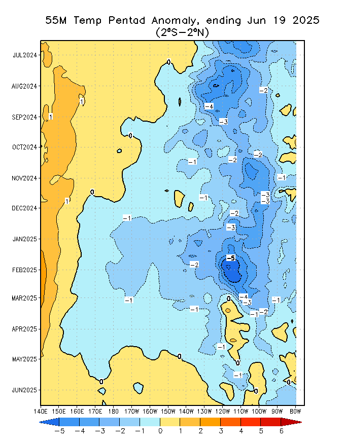
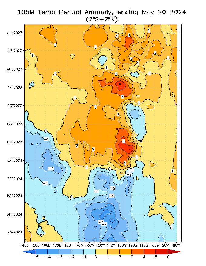
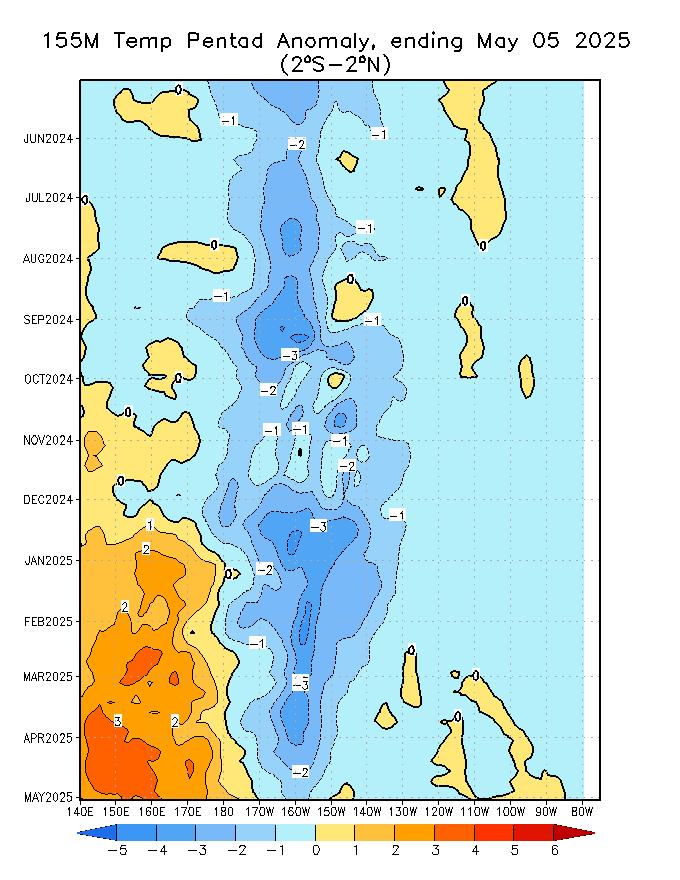
Have you noticed from WUWT that the Sea Level Anomalies are directly over the Temperature Anomalies? I realize that the temperature anomalies may appear in discrete places because they are different depths, but there appears to be upwelling not associated with the Kelvin wave.
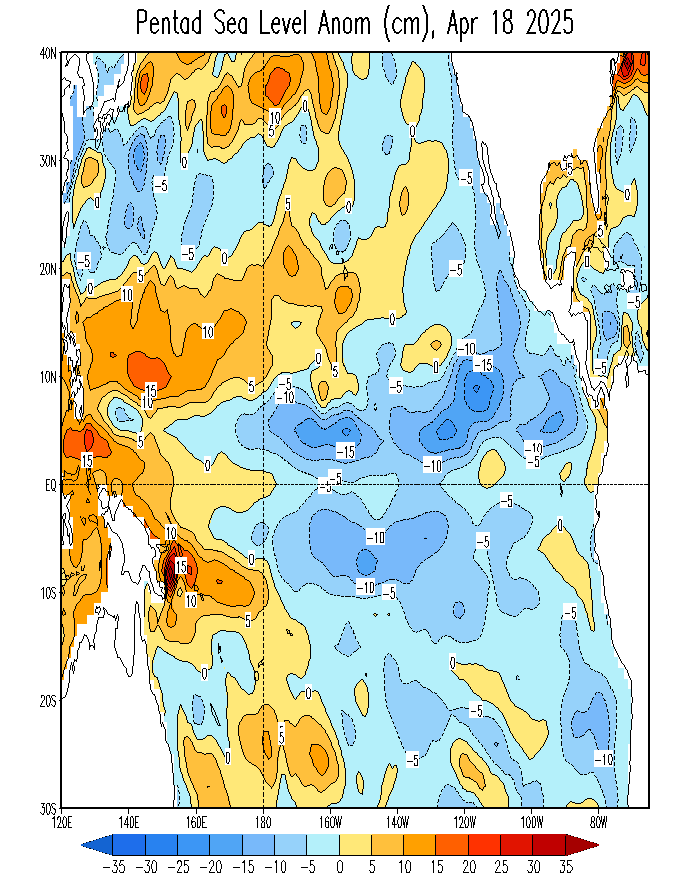
Sea Level Anomalies
55M Temperature Anomaly
105M Temperature Anomaly
155M Temperature Anomaly
Retired Engineer John: Sorry to say, I’ve never studied those Hovmollers before. They’re all for the latitudes of 2S-2N, but I don’t recall ever seeing corresponding cross-section views for those latitudes. The cross sections I’ve seen are for 5S-5N and they do not appear to agree with those Hovmollers.
Regards