
This post provides an update of the data for the three primary suppliers of global land+ocean surface temperature data—GISS through February 2015 and HADCRUT4 and NCDC through January 2015—and of the two suppliers of satellite-based lower troposphere temperature data (RSS and UAH) through February 2015.
INITIAL NOTES:
For discussions of the annual GISS and NCDC data for 2014, see the posts:
- Does the Uptick in Global Surface Temperatures in 2014 Help the Growing Difference between Climate Models and Reality?
- On the Biases Caused by Omissions in the 2014 NOAA State of the Climate Report
GISS LOTI surface data, and the two lower troposphere temperature datasets are for the most recent month. The HADCRUT4 and NCDC data lag one month.
This post contains graphs of running trends in global surface temperature anomalies for periods of 14+ and 17+ years using GISS global (land+ocean) surface temperature data. They indicate that we have not seen a warming slowdown (based on 14+ year trends) this long since the late-1970s or a warming slowdown (based on 17+ year trends) since about 1980.
Much of the following text is boilerplate. It is intended for those new to the presentation of global surface temperature anomaly data.
Most of the update graphs start in 1979. That’s a commonly used start year for global temperature products because many of the satellite-based temperature datasets start then.
We discussed why the three suppliers of surface temperature data use different base years for anomalies in the post Why Aren’t Global Surface Temperature Data Produced in Absolute Form?
But first, let’s illustrate how badly the climate models used by the IPCC simulate global surface temperatures in light of the recent slowdown in global surface warming.
MODEL-DATA DIFFERENCE
Considering the uptick in surface temperatures this year (discussions linked above), government agencies that supply global surface temperature products have been touting record high combined global land and ocean surface temperatures. Alarmists happily ignore the fact that it is easy to have record high global temperatures in the midst of a hiatus or slowdown in global warming, and they have been using the recent record highs to draw attention away from the growing difference between observed global surface temperatures and the IPCC climate model-based projections of them.
There are a number of ways to present how poorly climate models simulate global surface temperatures. Normally they are compared in a time-series graph. See the example here. In that example, GISS Land-Ocean Temperature Index (LOTI) data are compared to the multi-model mean of the climate models stored in the CMIP5 archive, which was used by the IPCC for their 5th Assessment Report. The data and model outputs have been smoothed with 61-month filters to reduce the monthly variations.
Another way to show how poorly climate models perform is to subtract the data from the average of the model outputs (model mean). We first presented and discussed this method using global surface temperatures in absolute form. (See the post On the Elusive Absolute Global Mean Surface Temperature – A Model-Data Comparison.) The graph below shows a model-data difference using anomalies, where the data are represented by GISS global Land-Ocean Temperature Index (LOTI) and the model simulations of global surface temperature are represented by the multi-model mean of the models stored in the CMIP5 archive. To assure that the base years used for anomalies did not bias the graph, the full term of the data (1880 to 2013) were used as the reference period.
In this example, we’re illustrating the model-data differences in the monthly surface temperature anomalies. Also included in red is the difference smoothed with a 61-month running mean filter.

Figure 00 – Model-Data Difference
The greatest difference between models and data occurs in the 1880s. The difference decreases drastically from the 1880s and switches signs by the 1910s. The reason: the models do not properly simulate the observed cooling that takes place at that time. Because the models failed to properly simulate the cooling from the 1880s to the 1910s, they also failed to properly simulate the warming that took place from the 1910s until 1940. That explains the long-term decrease in the difference during that period and the switching of signs in the difference once again. The difference cycles back and forth nearer to a zero difference until the 1990s, indicating the models are tracking observations better (relatively) during that period. And from the 1990s to present, because of the slowdown in warming, the difference has increased to greatest value since about 1910…where the difference indicates the models are showing too much warming.
It’s very easy to see the recent record-high global surface temperatures have had a tiny impact on the difference between models and observations.
See the post On the Use of the Multi-Model Mean for a discussion of its use in model-data comparisons.
GISS LAND OCEAN TEMPERATURE INDEX (LOTI)
Introduction: The GISS Land Ocean Temperature Index (LOTI) data is a product of the Goddard Institute for Space Studies. Starting with their February 2013 update, GISS LOTI uses NCDC ERSST.v3b sea surface temperature data. The impact of the recent change in sea surface temperature datasets is discussed here. GISS adjusts GHCN and other land surface temperature data via a number of methods and infills missing data using 1200km smoothing. Refer to the GISS description here. Unlike the UK Met Office and NCDC products, GISS masks sea surface temperature data at the poles where seasonal sea ice exists, and they extend land surface temperature data out over the oceans in those locations. Refer to the discussions here and here. GISS uses the base years of 1951-1980 as the reference period for anomalies. The data source is here.
Update: The February 2015 GISS global temperature anomaly is +0.79 deg C. It increased (about +0.04 deg C) since January 2015.
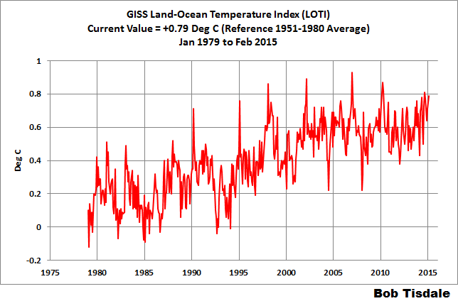
Figure 1 – GISS Land-Ocean Temperature Index
Note: There have been recent changes to the GISS land-ocean temperature index data. They have a noticeable impact on the short-term (1998 to present) trend as discussed in the post GISS Tweaks the Short-Term Global Temperature Trend Upwards. The causes of the changes are unclear at present, but they likely impacted the 2014 rankings.
NCDC GLOBAL SURFACE TEMPERATURE ANOMALIES (LAGS ONE MONTH)
Introduction: The NOAA Global (Land and Ocean) Surface Temperature Anomaly dataset is a product of the National Climatic Data Center (NCDC). NCDC merges their Extended Reconstructed Sea Surface Temperature version 3b (ERSST.v3b) with the Global Historical Climatology Network-Monthly (GHCN-M) version 3.2.0 for land surface air temperatures. NOAA infills missing data for both land and sea surface temperature datasets using methods presented in Smith et al (2008). Keep in mind, when reading Smith et al (2008), that the NCDC removed the satellite-based sea surface temperature data because it changed the annual global temperature rankings. Since most of Smith et al (2008) was about the satellite-based data and the benefits of incorporating it into the reconstruction, one might consider that the NCDC temperature product is no longer supported by a peer-reviewed paper.
The NCDC data source is through their Global Surface Temperature Anomalies webpage. Click on the link to Anomalies and Index Data.)
Update (Lags One Month): The January 2015 NCDC global land plus sea surface temperature anomaly was +0.77 deg C. See Figure 2. It dropped a very small amount (a decrease of -0.01 deg C) since December 2014.
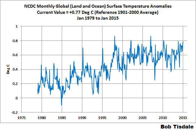
Figure 2 – NCDC Global (Land and Ocean) Surface Temperature Anomalies
UK MET OFFICE HADCRUT4 (LAGS ONE MONTH)
Introduction: The UK Met Office HADCRUT4 dataset merges CRUTEM4 land-surface air temperature dataset and the HadSST3 sea-surface temperature (SST) dataset. CRUTEM4 is the product of the combined efforts of the Met Office Hadley Centre and the Climatic Research Unit at the University of East Anglia. And HadSST3 is a product of the Hadley Centre. Unlike the GISS and NCDC products, missing data is not infilled in the HADCRUT4 product. That is, if a 5-deg latitude by 5-deg longitude grid does not have a temperature anomaly value in a given month, it is not included in the global average value of HADCRUT4. The HADCRUT4 dataset is described in the Morice et al (2012) paper here. The CRUTEM4 data is described in Jones et al (2012) here. And the HadSST3 data is presented in the 2-part Kennedy et al (2012) paper here and here. The UKMO uses the base years of 1961-1990 for anomalies. The data source is here.
Update (Lags One Month): The January 2015 HADCRUT4 global temperature anomaly is +0.69 deg C. See Figure 3. It rose (about +0.06 deg C) since December 2014.
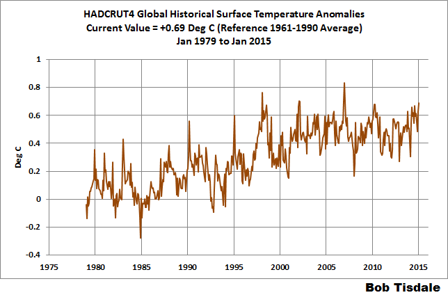
Figure 3 – HADCRUT4
UAH LOWER TROPOSPHERE TEMPERATURE ANOMALY DATA (UAH TLT)
Special sensors (microwave sounding units) aboard satellites have orbited the Earth since the late 1970s, allowing scientists to calculate the temperatures of the atmosphere at various heights above sea level. The level nearest to the surface of the Earth is the lower troposphere. The lower troposphere temperature data include the altitudes of zero to about 12,500 meters, but are most heavily weighted to the altitudes of less than 3000 meters. See the left-hand cell of the illustration here. The lower troposphere temperature data are calculated from a series of satellites with overlapping operation periods, not from a single satellite. The monthly UAH lower troposphere temperature data is the product of the Earth System Science Center of the University of Alabama in Huntsville (UAH). UAH provides the data broken down into numerous subsets. See the webpage here. The UAH lower troposphere temperature data are supported by Christy et al. (2000) MSU Tropospheric Temperatures: Dataset Construction and Radiosonde Comparisons. Additionally, Dr. Roy Spencer of UAH presents at his blog the monthly UAH TLT data updates a few days before the release at the UAH website. Those posts are also cross posted at WattsUpWithThat. UAH uses the base years of 1981-2010 for anomalies. The UAH lower troposphere temperature data are for the latitudes of 85S to 85N, which represent more than 99% of the surface of the globe.
Update: The February 2015 UAH lower troposphere temperature anomaly is +0.30 deg C. It dropped (a decrease of about -0.06 deg C) since January 2015.
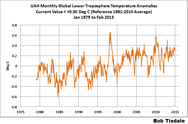
Figure 4 – UAH Lower Troposphere Temperature (TLT) Anomaly Data
RSS LOWER TROPOSPHERE TEMPERATURE ANOMALY DATA (RSS TLT)
Like the UAH lower troposphere temperature data, Remote Sensing Systems (RSS) calculates lower troposphere temperature anomalies from microwave sounding units aboard a series of NOAA satellites. RSS describes their data at the Upper Air Temperature webpage. The RSS data are supported by Mears and Wentz (2009) Construction of the Remote Sensing Systems V3.2 Atmospheric Temperature Records from the MSU and AMSU Microwave Sounders. RSS also presents their lower troposphere temperature data in various subsets. The land+ocean TLT data are here. Curiously, on that webpage, RSS lists the data as extending from 82.5S to 82.5N, while on their Upper Air Temperature webpage linked above, they state:
We do not provide monthly means poleward of 82.5 degrees (or south of 70S for TLT) due to difficulties in merging measurements in these regions.
Also see the RSS MSU & AMSU Time Series Trend Browse Tool. RSS uses the base years of 1979 to 1998 for anomalies.
Update: The February 2015 RSS lower troposphere temperature anomaly is +0.33 deg C. It dropped (a decrease of about -0.04 deg C) since January 2015.
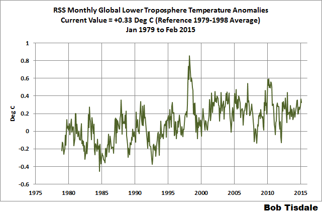
Figure 5 – RSS Lower Troposphere Temperature (TLT) Anomaly Data
A QUICK NOTE ABOUT THE DIFFERENCE BETWEEN RSS AND UAH TLT DATA
There is a noticeable difference between the RSS and UAH lower troposphere temperature anomaly data. Dr. Roy Spencer discussed this in his November 2011 blog post On the Divergence Between the UAH and RSS Global Temperature Records. In summary, John Christy and Roy Spencer believe the divergence is caused by the use of data from different satellites. UAH has used the NASA Aqua AMSU satellite in recent years, while as Dr. Spencer writes:
…RSS is still using the old NOAA-15 satellite which has a decaying orbit, to which they are then applying a diurnal cycle drift correction based upon a climate model, which does not quite match reality.
I updated the graphs in Roy Spencer’s post in On the Differences and Similarities between Global Surface Temperature and Lower Troposphere Temperature Anomaly Datasets.
While the two lower troposphere temperature datasets are different in recent years, UAH believes their data are correct, and, likewise, RSS believes their TLT data are correct. Does the UAH data have a warming bias in recent years or does the RSS data have cooling bias? Until the two suppliers can account for and agree on the differences, both are available for presentation.
Roy Spencer has recently updated his discussion on the RSS and UAH differences in the post Why Do Different Satellite Datasets Produce Different Global Temperature Trends?
Also, in the recent blog post, Roy Spencer has advised that the UAH lower troposphere Version 6 will be released soon and that it will reduce the difference between the UAH and RSS data.
14-YEARS+ (170-MONTH) RUNNING TRENDS
As noted in my post Open Letter to the Royal Meteorological Society Regarding Dr. Trenberth’s Article “Has Global Warming Stalled?”, Kevin Trenberth of NCAR presented 10-year period-averaged temperatures in his article for the Royal Meteorological Society. He was attempting to show that the recent halt in global warming since 2001 was not unusual. Kevin Trenberth conveniently overlooked the fact that, based on his selected start year of 2001, the halt at that time had lasted 12+ years, not 10.
The period from February 2001 to November 2014 is now 170-months long—14 years. Refer to the following graph of running 170-month trends from February 1880 to November 2014, using the GISS LOTI global temperature anomaly product.
An explanation of what’s being presented in Figure 6: The last data point in the graph is the linear trend (in deg C per decade) from January 2001 to February 2015. It is extremely low (about +0.04 deg C/Decade). That, of course, indicates global surface temperatures have not warmed to any great extent during the most recent 170-month period. Working back in time, the data point immediately before the last one represents the linear trend for the 170-month period of December 2000 to January 2015, and the data point before it shows the trend in deg C per decade for November 2000 to December 2014, and so on.

Figure 6 – 170-Month Linear Trends
The highest recent rate of warming based on its linear trend occurred during the 170-month period that ended about 2004 2006, but warming trends have dropped drastically since then. There was a similar drop in the 1940s, and as you’ll recall, global surface temperatures remained relatively flat from the mid-1940s to the mid-1970s. Also note that the mid-1970s was the last time there had been a 170-month period with a global warming rate that low—before recently.
17-YEARS+ (213-Month) RUNNING TRENDS
In his RMS article, Kevin Trenberth also conveniently overlooked the fact that the discussions about the warming halt are now for a time period of about 16 years, not 10 years—ever since David Rose’s DailyMail article titled “Global warming stopped 16 years ago, reveals Met Office report quietly released… and here is the chart to prove it”. In my response to Trenberth’s article, I updated David Rose’s graph, noting that surface temperatures in April 2013 were basically the same as they were in November 1997. We’ll use November 1997 as the start month for the running 17-year trends. The period is now 213-months long. The following graph is similar to the one above, except that it’s presenting running trends for 213-month periods.

Figure 7 – 213-Month Linear Trends
The last time global surfaces warmed at this low a rate for a 213-month period was about 1980. Also note that the sharp decline is similar to the drop in the 1940s, and, again, as you’ll recall, global surface temperatures remained relatively flat from the mid-1940s to the mid-1970s.
The most widely used metric of global warming—global surface temperatures—indicates that the rate of global warming has slowed drastically and that the duration of the slowdown in global warming is unusual during a period when global surface temperatures are allegedly being warmed from the hypothetical impacts of manmade greenhouse gases.
COMPARISONS
The GISS, HADCRUT4 and NCDC global surface temperature anomalies and the RSS and UAH lower troposphere temperature anomalies are compared in the next three time-series graphs. Figure 8 compares the five global temperature anomaly products starting in 1979. Again, due to the timing of this post, the HADCRUT4 and NCDC data lag the UAH, RSS and GISS products by a month. The graph also includes the linear trends. Because the three surface temperature datasets share common source data, (GISS and NCDC also use the same sea surface temperature data) it should come as no surprise that they are so similar. For those wanting a closer look at the more recent wiggles and trends, Figure 9 starts in 1998, which was the start year used by von Storch et al (2013) Can climate models explain the recent stagnation in global warming? They, of course, found that the CMIP3 (IPCC AR4) and CMIP5 (IPCC AR5) models could NOT explain the recent halt in warming.
Figure 10 starts in 2001, which was the year Kevin Trenberth chose for the start of the warming halt in his RMS article Has Global Warming Stalled?
Because the suppliers all use different base years for calculating anomalies, I’ve referenced them to a common 30-year period: 1981 to 2010. Referring to their discussion under FAQ 9 here, according to NOAA:
This period is used in order to comply with a recommended World Meteorological Organization (WMO) Policy, which suggests using the latest decade for the 30-year average.

Figure 8 – Comparison Starting in 1979
###########

Figure 9 – Comparison Starting in 1998
###########

Figure 10 – Comparison Starting in 2001
For those who want to get a rough idea of the impacts of the adjustments to the GISS and HADCRUT4 warming rates, refer to the July update—a month before those adjustments took effect.
AVERAGE
Figure 11 presents the average of the GISS, HADCRUT and NCDC land plus sea surface temperature anomaly products and the average of the RSS and UAH lower troposphere temperature data. Again because the HADCRUT4 and NCDC data lag one month in this update, the most current average only includes the GISS product.

Figure 11 – Average of Global Land+Sea Surface Temperature Anomaly Products
The flatness of the data since 2001 is very obvious, as is the fact that surface temperatures have rarely risen above those created by the 1997/98 El Niño in the surface temperature data. There is a very simple reason for this: the 1997/98 El Niño released enough sunlight-created warm water from beneath the surface of the tropical Pacific to raise the temperature of about 66% of the surface of the global oceans by almost 0.2 deg C. Sea surface temperatures for that portion of the global oceans remained relatively flat, dropping slowly throughout most of that region, until the El Niño of 2009/10, when the surface temperatures of that portion of the global oceans shifted slightly higher again. Prior to that, it was the 1986/87/88 El Niño that caused surface temperatures to shift upwards. If these naturally occurring upward shifts in surface temperatures are new to you, please see the illustrated essay “The Manmade Global Warming Challenge” (42mb) for an introduction.
MONTHLY SEA SURFACE TEMPERATURE UPDATE
The most recent sea surface temperature update can be found here. The satellite-enhanced sea surface temperature data (Reynolds OI.2) are presented in global, hemispheric and ocean-basin bases. We discussed the recent record-high global sea surface temperatures and the reasons for them in the post On The Recent Record-High Global Sea Surface Temperatures – The Wheres and Whys.


Pingback: February 2015 Global Surface (Land+Ocean) and Lower Troposphere Temperature Anomaly & Model-Data Difference Update - Perot Report
Have you mined this data source? Everything on one site. I looked through the registered user profile choices and it includes independent research and affiliation.
https://climatedataguide.ucar.edu/climate-data
Hi Pamela. Thanks for the link. Unfortunately, many of the datasets are not furnished in an easy-to-use format.
Cheers.
Thanks, Bob. This is a wide look at the data.
No wonder the global warming proponents decide to call it “climate change”, a “hockey stick” mirage: Nothing was changing until we made it change.
Bob, ran across an old comment of yours, saying that the NCEP RTG-High resolution SST analysis was a reanalysis. (http://wattsupwiththat.com/2014/10/12/september-2014-global-surface-landocean-and-lower-troposphere-temperature-anomaly-update/ down in the comments).
This is not correct. The RTG is an analysis, actually pretty similar in procedure to the Reynolds OIv2 quarter degree that you mention/use. The main difference is not analysis versus reanalysis, but that the RTG’s purpose is to produce the best current estimate of SST for use by weather prediction, while the OIv2 is aimed towards climate purposes.
Hi Bob, have you looked at the Vance & Tas Van Ommen research (Law Dome Salt concentration) which, If I read correctly, suggests that el nino’s were less frequent following the MWP and that this reversed towards the end of the LIA?
Robert Grumbine, thanks for the insight.
warofthewolds, I recall taking a peak at the paper. I don’t pay much attention to paleoclimatological reconstructions.
Cheers.
thanks Bob, probably a wise move. Thought you might have found it interesting since the salt concentration curve mirrors (roughly) the reconstructed temps and is apparently strongly linked to ENSO. Don’t which way round that would be. ie. warmer temps=more el nino or more el nino= warmer temps. Anyway – just a thought.
Pingback: A Couple of Notes about NOAA’s RTG (Real-Time Global) Sea Surface Temperature Data | Bob Tisdale – Climate Observations
Pingback: 25 Years of Monitoring Global Temperatures from Satellites and an Interview with Christy and Spencer of UAH | Bob Tisdale – Climate Observations
Pingback: 25 Years of Monitoring Global Temperatures from Satellites and an Interview with Christy and Spencer of UAH | Watts Up With That?
Pingback: 25 Years of Monitoring Global Temperatures from Satellites and an Interview with Christy and Spencer of UAH | I World New
Pingback: February 2015 Global Surface (Land+Ocean) and Lower Troposphere Temperature Anomaly & Model-Data Difference Update | US Issues