
[Update: Corrected a few typos in the paragraph before Figure 4. My thanks to rogerknights.]
I hadn’t read the NOAA State of the Climate (SOTC) Report for 2014 when I prepared the post Does the Uptick in Global Surface Temperatures in 2014 Help the Growing Difference between Climate Models and Reality? (WattsUpWithThat cross post is here.) I simply presented data and climate model outputs in that post.
The following are a few observations about the annual NOAA report. NOAA biased their report by omitting key discussions. First an introduction.
THE 2014 GLOBAL HIGHLIGHTS OF THE NOAA SOTC REPORT
With respect to surface temperatures, the Global Highlights of the NOAA State of the Climate report reads (my boldface):
Global Highlights
- The year 2014 was the warmest year across global land and ocean surfaces since records began in 1880. The annually-averaged temperature was 0.69°C (1.24°F) above the 20th century average of 13.9°C (57.0°F), easily breaking the previous records of 2005 and 2010 by 0.04°C (0.07°F). This also marks the 38th consecutive year (since 1977) that the yearly global temperature was above average. Including 2014, 9 of the 10 warmest years in the 135-year period of record have occurred in the 21st 1998 currently ranks as the fourth warmest year on record
- The 2014 global average ocean temperature was also record high, at 0.57°C (1.03°F) above the 20th century average of 16.1°C (60.9°F), breaking the previous records of 1998 and 2003 by 0.05°C (0.09°F). Notably, ENSO-neutral conditions were present during all of 2014.
- The 2014 global average land surface temperature was 1.00°C (1.80°F) above the 20th century average of 8.5°C (47.3°F), the fourth highest annual value on record.
Of course, the global highlights are what the mainstream media and alarmist blogs parrot. Some may even report on the Global Temperatures and Regional Temperatures portions of the NOAA report. Few will venture beyond that.
BIAS OF OMISSION 1
It’s not until readers scroll down to the rankings table in the SOTC report that NOAA introduces uncertainties. See my Figure 1. So, according to NOAA, the “annually-averaged temperature was 0.69°C (1.24°F) above the 20th century average of 13.9°C (57.0°F), easily breaking the previous records of 2005 and 2010 by 0.04°C (0.07°F)”, but then NOAA clarifies their global surface temperature anomalies as “+0.69 ± 0.09” deg C. Alas, we discover that the new record high by 0.04 deg C is within the +/-0.09 deg C uncertainty of the dataset.

Figure 1
Still farther down on the webpage we come across the links to NOAA’s Supplemental Information.
Supplemental Information
The first link brings us to the Calculating the Probability of Rankings for 2014 webpage. There, after an initial discussion, they write (my boldface):
Using a Monte Carlo approach (Arguez et al, 2013), NCDC considered the known uncertainty of the global land and ocean annual temperature in the 2014 annual ranking. Taking into account the uncertainty and assuming all years (1880-2014) in the time series are independent, the chance of 2014 being
Warmest year on record: 48.0%
One of the five warmest years: 90.4%
One of the 10 warmest years: 99.2%
One of the 20 warmest years: 100.0%
Warmer than the 20th century average: 100.0%
Warmer than the 1981-2010 average: 100.0%
NCDC follows these conventions to categorize the confidence associated with assertions made with respect to ranks used in the report:
My Figure 2 is the “conventions to categorize” table that follows that discussion, with my highlight:

Figure 2
So, according to NOAA, the chance that 2014 was the warmest on record was 48.0% and based on their table, the global surface temperature anomalies in 2014 appear in the range of “more unlikely than likely”.
Curiously, the NOAA omitted that all-important “more unlikely than likely” language from its main 2014 State of the Climate report webpage. You have to click on the Supplemental Information links to discover that 2014 was “more unlikely than likely” the warmest on record.
Therefore, NOAA has biased the “Global Highlights” of their State of the Climate report by failing to note the likelihood, actually unlikelihood, that 2014 had the highest global surface temperatures on record.
BIAS OF OMISSION 2
The next topic is the El Niño event in 2014.
Under the heading of Global Temperatures on the main page of the NOAA SOTC report, they state:
This is the first time since 1990 the high temperature record was broken in the absence of El Niño conditions at any time during the year in the central and eastern equatorial Pacific Ocean, as indicated by NOAA’s CPC Oceanic Niño Index. This phenomenon generally tends to increase global temperatures around the globe, yet conditions remained neutral in this region during the entire year and the globe reached record warmth despite this.
NOAA’s Oceanic NINO Index is based on the NINO3.4 region (5S-5N, 170W-120W) of the equatorial Pacific. See the NOAA map of the NINO regions here. And according to a Hovmoller diagram of the sea surface temperature anomalies from the NOAA GODAS website, Figure 3, El Niño conditions (sea surface temperature anomalies equal to or greater than +0.5 deg C) existed along the equatorial Pacific east and west of the NINO3.4 region for most of 2014.

Figure 3
In other words, the sea surface temperature data indicate El Niño conditions existed for most of the year, but not in the region that NOAA uses to define an El Niño. Further to this, as we discussed in the most recent ENSO update and in the post The Little El Niño That Didn’t or Might Have (Depends on the Agency and Index), the Japan Meteorological Agency (JMA) notes that El Niño conditions have existed since June.
In December 2014, the NINO.3 SST was above normal with a deviation of +0.9°C and five-month running mean of the NINO.3 SST deviation was +0.5°C or above for five consecutive months from June to November (Table and Fig.1). SSTs were above normal in most regions from the western to eastern equatorial Pacific (Fig.2 and Fig.4). Subsurface temperatures were above normal in the eastern equatorial Pacific (Fig.3 and Fig.5). These oceanic conditions indicate that El Niño conditions are present in the equatorial Pacific…
And the reason the JMA makes this claim is they use the NINO3 region (5S-5N, 150W-90W), which overlaps and runs east of the NINO3.4 region.
Therefore, NOAA has omitted the fact that data indicate El Niño conditions existed along the equatorial Pacific, outside of the region they use as an ENSO index, so they could claim ENSO “conditions remained neutral in this region during the entire year and the globe reached record warmth despite this.”
Of course, the intent of that NOAA statement was to give the impression that there was a general overall warming that could not be attributed to El Niño conditions, when, in fact, El Niño conditions did exist in 2014.
BIAS OF OMISSION 3
This is a discussion of the additional cause of the elevated sea surface temperatures.
NOAA notes in their “Global Highlights” (my boldface):
Much of the record warmth for the globe can be attributed to record warmth in the global oceans. The annually-averaged temperature for ocean surfaces around the world was 0.57°C (1.03°F) higher than the 20th century average, easily breaking the previous records of 1998 and 2003 by 0.05°C (0.09°F). The first four months (January–April) each ranked among their seven warmest for their respective months and the following seven consecutive months (May–November) were record warm. The year ended with December third warmest on record for the month.
In 2014, the warmth was due to large regions of record warm and much warmer-than-average temperatures in parts of every major ocean basin. Record warmth for the year was particularly notable in the northeastern Pacific Ocean in and around the Gulf of Alaska, much of the western equatorial Pacific, parts of the western North Atlantic and western South Atlantic, and much of the Norwegian and Barents Seas. Nearly the entire Indian Ocean was much warmer than average with a broad swath between Madagascar and Australia record warm. Part of the Atlantic Ocean south of Greenland and the Southern Ocean waters off the southern tip of South America were much cooler than average, with one localized area near Antarctica record cold.
NOAA mentioned the elevated sea surface temperatures in the eastern extratropical North Pacific in passing. An unusual weather event in the North Pacific (along with the El Niño conditions) was, in fact, the primary reason for the elevated sea surface temperatures in 2014. That is not so [to] say that there were [weren’t] elevated sea surface temperatures in specific parts of other ocean basins, but in general, those elevated temperatures in basins outside of the North Pacific had no impact on the record highs. As a result, if we plot the sea surface temperature anomalies since 1997 for the oceans outside of the North Pacific, 2014 was not an unusually warm year…nowhere close to a record high. See the top cell of Figure 4. The bottom cell is for the global oceans, including the North Pacific. Obviously, in 2014, the events in the North Pacific were the primary reasons for the elevated sea surface temperatures globally.

Figure 4
There were two “weather” events that impacted the surface temperatures of the North Pacific in 2014: (1) the El Niño conditions in the tropical Pacific, which directly impacted the surface temperatures of the tropical North Pacific, and (2) the unusual weather event in the eastern extratropical Pacific, which is so well known that climate scientists call the hotspot it created “the blob”. Because of the two weather events in the Pacific, not human-induced global warming, sea surface temperatures were elevated globally in 2014. In turn, because land surface temperatures were not at record highs, it is logical to say that those two weather events were responsible for the record high combined (land and ocean) surface temperatures that were “more unlikely than likely” to have existed in 2014.
We have discussed in numerous posts the reasons for the elevated sea surface temperatures in the eastern extratropical North Pacific this year. See:
- On The Recent Record-High Global Sea Surface Temperatures – The Wheres and Whys
- Axel Timmermann and Kevin Trenberth Highlight the Importance of Natural Variability in Global Warming…
- Alarmists Bizarrely Claim “Just what AGW predicts” about the Record High Global Sea Surface Temperatures in 2014
- Researchers Find Northeast Pacific Surface Warming (1900-2012) Caused By Changes in Atmospheric Circulation, NOT Manmade Forcings
- Did ENSO and the “Monster” Kelvin Wave Contribute to the Record High Global Sea Surface Temperatures in 2014?
As we noted and illustrated in the second post linked above, the unusual weather event in the eastern extratropical North Pacific lasted for 2 years. It also contributed to the California drought. And we illustrated the following in the first post linked above.
As an exercise, if we start our analysis in 2012 and work our way back in time, for how long of a time period did the sea surfaces of the North Pacific show no warming? The answer, using NOAA’s ERSST.v3b data, is 23 years, yet the climate models used by the IPCC indicate they should have warmed about 0.5 deg C in that time.
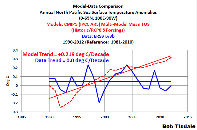
Figure 5
NOTE: If you were to click on the link to the first post, you’d note that using NOAA’s satellite-enhanced sea surface temperature dataset we can extend that period to 24 years. [End note.]
It’s unrealistic to assume the warming of the surfaces of the North Pacific in 2013 and 2014 were caused by manmade greenhouse gases, when they hadn’t warmed in at least 23 years before then.
CLOSING
According to NOAA definitions, global surface temperatures for 2014 were “More Unlikely Than Likely” the highest on record, but they failed to note that on the main page of their State of the Climate report. NOAA used a specific ENSO index to claim that El Niño conditions did not exist in 2014, when at least one other index says El Niño conditions existed. And NOAA failed to discuss the actual causes of the elevated global sea surface temperatures in 2014, while making it appear that there was a general warming of the surfaces of the global oceans.
NOAA never stated specifically that 2014’s record high surface temperatures were a result of human-induced global warming, but they implied it…thus all the hoopla. NOAA has omitted key discussions within that report, which biases it toward human-induced global warming. In other words, the NOAA State of the Climate report was misleading. NOAA has once again shown it is a political entity, not a scientific one. And that’s a damn shame. The public needs openness from NOAA about climate; we do not need to be misled by politically motivated misdirection and misinformation.
# # #
[Oops, I forgot to thank BruceC for noting NOAA’s uncertainties in a comment at WUWT. That comment prompted this post.]


Thanks, Bob, for this analysis.
It’s really a shame how the presentation of climate science is influenced by politics. During my study of Physics I learned a completely different way how science works.
Thank bob
Hmm, would you have a link to the nasa report; I saw on someone blog tha nasa’s probability was on .38 but no link to their report
Thanks, Bob. Very good analysis!
I think this a case of “sour grapes” as a response to a super El Niño that would have resolved the stoppage of global warming into a continuation of it.
Though luck!
Bob,
I think NOAAs point about El Nino is that 2014 is not an ‘El Nino year’ as 1998 and 2010 were. If indeed we had El Nino beginning in 2014 and ending in 2015, then 2015 would be an ‘El Nino year’. And 2015 would be the year to expect a new record, as happened in 1998 and 2010. So I think you are misleading in your discussion of this point.
I agree that records are not as important as trends-but the general public and the media seem to think records are a big deal and have a harder time understanding trends.
I think skeptics like just as much to highlight records- record cold spells-even when they only occur regionally-like last year in the central U.S.
Nate says: “I think NOAAs point about El Nino is that 2014 is not an ‘El Nino year’ as 1998 and 2010 were. If indeed we had El Nino beginning in 2014 and ending in 2015, then 2015 would be an ‘El Nino year’ And 2015 would be the year to expect a new record, as happened in 1998 and 2010. So I think you are misleading in your discussion of this point….”
Nate, your misunderstandings about ENSO are quite remarkable. I believe you should look at the ONI webpage before you try to misinterpret what NOAA meant. Here’s a link.
http://www.cpc.ncep.noaa.gov/products/analysis_monitoring/ensostuff/ensoyears.shtml
Goodbye, Nate.
What is really going on is that EVERYTHING, ocean surface, surface thermometers, lower troposphere warmed from 1976 to 1997. Nobody with a clue disagrees with this. And then in 1997, very possibly because the Nino grossly overshot the trend and overcooled the Pacific, lower tropospheric warming stopped. The 1997 Nino was nearly a full decade before the PDO was scheduled to shift.
Since 1997 TLT has been flat but at a rather high absolute and relative temperature. These arguments about whether 2010 or 1997 or 2014 was the “highest” are like arguing about how many angels dance on the head of a pin. ANY year in the last 18 is guaranteed to be one of the top 18 and all are way within measurement uncertainty.
An interesting discussion would be where does it go from here? The Indian, South Atlantic, and recently the NE Pacific oceans have continued to warm. TLT by Roy Spencer’s measure has continued a roughly proportionate rise.
If only we knew why THOSE oceans were warming…
Pingback: Actualización a “2014 es el año más caliente”: Probablemente mentira, según sus propios números | PlazaMoyua.com
Pingback: December 2014 Global Surface (Land+Ocean) and Lower Troposphere Temperature Anomaly & Model-Data Difference Update | Bob Tisdale – Climate Observations
Bob,
Your link makes my point very clearly which is a very simple one. El nino began in mid 1997 and ended in spring 1998. In 1998 there was a new record warm year. Similarly El nino 2004-2005 produced a record in 2005 and El nino 2009-2010 gave record in 2010. A 2014-15 El nino could potentially produce a record in 2015. This is not remarkable at all.
Nick, here’s the quote from NOAA again:
“This is the first time since 1990 the high temperature record was broken in the absence of El Niño conditions at any time during the year in the central and eastern equatorial Pacific Ocean, as indicated by NOAA’s CPC Oceanic Niño Index….”
What part of “at any time during the year in the central and eastern equatorial Pacific Ocean, as indicated by NOAA’s CPC Oceanic Niño Index” didn’t you understand?
I did not misinterpret what they had written. You, on the other hand, have misrepresented their statement.
Good-bye. You’re wasting my time.
Pingback: 2014, el año más caliente. Breve cuento de cómo te miente la NASA | Desde el exilio
Bob, I was fascinated by the fact that NOAA, a government science organization, could make a claim “hottest year” that is clearly not supported by their data “unlikely to be hottest.” This is a clear misrepresentation of the science. The claim is unscientific and NOAA knew it was. They hid the truth under Supplemental Information, which is further evidence of bad faith because information that disproves a claim is not “supplemental.” The media pick up on this lie, as NOAA knew they would, can further twisted it. The NY Times reported that the new information called into question skeptical claims that there has been no warming for almost two decades. But the new numbers for 2014 do not change the fact that there as been no statistically significant warming for nearly 20 years. NOAA used to publish temperature series with error bars but if you look on their site now you have to go back to 2008 to find such a graph. I found a 2012 graph with error bars that was published by NOAA by doing a good search of images but that graph seems to have been removed from their website or hidden. I think your discovery here is extremely important because it shows intentional manipulation of data, apparently in an attempt to show what NOAAs paymasters want them to show. It’s propaganda, not science. Congress should call the head of NOAA and NCAR to testify about this matter and they should use their power to force NOAA to reinstate graphs showing error bars.
Bob,
For what it’s worth, I emailed the following to NCAR:
NCAR recently made the claim that 2014 was the hottest year on record.
http://www.ncdc.noaa.gov/sotc/global/2014/13
Under supplemental Information there is a link that takes on to this page:
http://www.ncdc.noaa.gov/sotc/global/2014/13/supplemental/page-1
The page shows that there is only a 48% certainty that 2014 was the hottest year on record. And 48% is defined as “more unlikely than likely.”
NOAA should correct their public statement and admit that “It is unlikely that 2014 was the hottest year on record.” If you do not change your statement I would like to know how you justify making such and unscientific claim. I would also like to know how to file a formal complaint against NOAA and NCAR
Thomas Mee, I assume you meant to write that you sent an email to NOAA, not NCAR. They are two separate entities. Has NCAR also made a statement? You didn’t link it.
Pingback: NASA GISS & NOAA NCDC Need to Be More Open with the Public when Making Proclamations about Global Warming Records | Bob Tisdale – Climate Observations
I conflated NCDC with NCAR. So, yeah, I sent it to the wrong people. I just sent a similar email, with typos corrected and with the “formal complaint” language removed to NCDC. I hope NCAR won’t be too upset with me. They’re a customer of mine. We supplied humidification equipment for their new super computer.
Thanks for correcting my error and for all your good work. I always enjoy your posts on WUWT and will visit your blog more often.
Pingback: GISS & NCDC Need to Be More Open with the Public when Making Proclamations about Global Warming Records | Watts Up With That?
I am rather puzzled by all these probability arguments. Compare the probabilities given for NOAA data to the probabilities of winning a horse race by various horses. It is perfectly reasonable to bet for a horse with 48 % chance of winning, compared to all other horses that has far lower probability of winning (even the combined probability of any horse other than the horse with 48 % chance willing this race is 52%, only 4% more). In this context, 48 % is an excellent bet. I am not where this > 90 % rule and all coming from.
Rob G says: “I am not where this > 90 % rule and all coming from.”
Who’s saying >90% and what rule?
Of course, NOAA. It is in their table >99 means “almost certain”, and 33.3 % to 50 % means “more unlikely than likely”, etc. It is a mistake. So I am just disagreeing with the analysis here, although the real source is NOAA.
Let me see if I understand this. An “anomaly” is the difference between the reading and the average, or do I have that wrong? If right then what we are saying here, then, is the difference between the “global average” and the “average of global averages” is what this reading is about? If that were to be the case, then all I have to do is adjust the earlier temperatures down a little and in a heart beat, I have lowered the average of averages, so now my current “global average” is in a different play pen. Or am I misunderstanding something?
Rob G, why is it a mistake?
Tom O, global surface temperatures are the latitude-weighted average of the temperatures in 5×5 deg (latitude x longitude) grid boxes. Let’s say the average January global surface temperature for a 30-year reference period (1981-2010) was x deg C, and the January 2015 surface temperature was x+0.05 deg C, then the global temperature anomaly would be +0.05 deg C.
If you were to lower an earlier temperature, for it to impact the value in January 2015, it would have to occur during reference period. If you lowered a value before the reference period, let’s say in January 1950, it would not impact the January 2015 value; it would simply increase the long-term trend.
Bob Tisdale, Why is it a mistake. Well, let us take NASA data. The probability for 2014 to have the highest surface temperature is only 38 %. If 2014 is not that year, the question would be which year had the highest surface temp? 2010 with 23 % or 2005 with 17 %, etc. One of them has to be the year with the highest surface temperature. So if 2014 is not the one, because it does not have high probability associated with it, then which is the correct year, given that the probabilities for other years are significantly lower? The same argument of low probability that applies to 2014 to make it less probable also applies to other years with even lower probabilities. By the classification we have, none of those years are likely to be the year with the max surface temperature. But we know there has to be a year with max surface temperature.
Rob G says: “By the classification we have, none of those years are likely to be the year with the max surface temperature. But we know there has to be a year with max surface temperature.”
That’s correct, but they don’t know with any certainty which year it was….and that is the whole point of the classifications.
Bob, I’m still confused. I thought an anomaly was the difference between a measured amount and a long term average of what you are measuring. So if I am taking this year’s “global average temperature,” which I was expecting to be derived from a calculation process, and comparing it to a long term world average, let’s say a 100 year average of this figure, if I cool earlier years by data manipulation, I have lowered those calculated values, and those lowered calculated averages would, in turn, lower the “long term average” of global average temperature, thus the anomaly for this calculation would be increased. All the charts are in anomalies, not temperatures, so how does one arrive at this being the warmest year – in calculated temperature – versus the year that has the greatest difference from the average which may have been lowered by cooling the earlier data record? I am guessing that we aren’t really talking about an average global temperature at all then when we are reporting “global average temperature?”
Tom O, NOAA fits your example. They use the base years of 1901 to 2000. So, yes, you’re correct. If they were to lower the temperature of the data during the reference period, that would lower the reference temperature and raise the recent anomaly.
My example applies to the GISS data (which uses 1951-1980 as base years) and the UKMO data (which uses 1961-1990 for references).
Let’s try to look at the anomalies in a different light.
To determine the anomalies, you subtract the average temperature for the reference period from temperature for a given year. Because the average temperatures during the reference periods are higher than the annual temperatures in the early 20th century, the anomalies are negative. And because the average temperatures during the reference periods are lower than the annual temperatures in the late 20th century, the anomalies are positive.
Pingback: January 2015 Global Surface (Land+Ocean) and Lower Troposphere Temperature Anomaly & Model-Data Difference Update | Bob Tisdale – Climate Observations
Pingback: January 2015 Global Surface (Land+Ocean) and Lower Troposphere Temperature Anomaly & Model-Data Difference Update | Watts Up With That?
Pingback: February 2015 Global Surface (Land+Ocean) and Lower Troposphere Temperature Anomaly & Model-Data Difference Update | Bob Tisdale – Climate Observations
Pingback: February 2015 Global Surface (Land+Ocean) and Lower Troposphere Temperature Anomaly & Model-Data Difference Update | Watts Up With That?
Pingback: February 2015 Global Surface (Land+Ocean) and Lower Troposphere Temperature Anomaly & Model-Data Difference Update | US Issues
Pingback: March 2015 Global Surface (Land+Ocean) and Lower Troposphere Temperature Anomaly & Model-Data Difference Update | Bob Tisdale – Climate Observations
Pingback: March 2015 Global Surface (Land+Ocean) and Lower Troposphere Temperature Anomaly & Model-Data Difference Update | Watts Up With That?
Pingback: April 2015 Global Surface (Land+Ocean) and Lower Troposphere Temperature Anomaly & Model-Data Difference Update | Bob Tisdale – Climate Observations
Pingback: April 2015 Global Surface (Land+Ocean) and Lower Troposphere Temperature Anomaly & Model-Data Difference Update | Watts Up With That?
Pingback: May 2015 Global Surface (Land+Ocean) and Lower Troposphere Temperature Anomaly & Model-Data Difference Update | Bob Tisdale – Climate Observations
Pingback: May 2015 Global Surface (Land+Ocean) and Lower Troposphere Temperature Anomaly & Model-Data Difference Update | Watts Up With That?
Pingback: Both NOAA and GISS Have Switched to NOAA’s Unjustifiably Overcooked “Pause-Busting” Sea Surface Temperature Data for Their Global Temperature Products | Bob Tisdale – Climate Observations
Pingback: Both NOAA and GISS Have Switched to NOAA’s Overcooked “Pause-Busting” Sea Surface Temperature Data for Their Global Temperature Products | Watts Up With That?
Pingback: The Three Faces of the GISS Land Ocean Temperature Index (LOTI) | Bob Tisdale – Climate Observations
Pingback: The Three Faces of the GISS Land-Ocean Temperature Index (LOTI) | Watts Up With That?
Pingback: July 2015 Global Surface (Land+Ocean) and Lower Troposphere Temperature Anomaly & Model-Data Difference Update | Bob Tisdale – Climate Observations
Pingback: July 2015 Global Surface (Land+Ocean) and Lower Troposphere Temperature Anomaly & Model-Data Difference Update | Watts Up With That?
Pingback: July 2015 Global Surface (Land+Ocean) and Lower Troposphere Temperature Anomaly & Model-Data Difference Update | US Issues
Pingback: August 2015 Global Surface (Land+Ocean) and Lower Troposphere Temperature Anomaly & Model-Data Difference Update | Bob Tisdale – Climate Observations
Pingback: August 2015 Global Surface (Land+Ocean) and Lower Troposphere Temperature Anomaly & Model-Data Difference Update | Watts Up With That?
Pingback: September 2015 Global Surface (Land+Ocean) and Lower Troposphere Temperature Anomaly & Model-Data Difference Update | Bob Tisdale – Climate Observations
Pingback: September 2015 Global Surface (Land+Ocean) and Lower Troposphere Temperature Anomaly & Model-Data Difference Update | Watts Up With That?
Pingback: October 2015 Global Surface (Land+Ocean) and Lower Troposphere Temperature Anomaly & Model-Data Difference Update | Bob Tisdale – Climate Observations
Pingback: October 2015 Global Surface (Land+Ocean) and Lower Troposphere Temperature Anomaly & Model-Data Difference Update | Watts Up With That?
Pingback: November 2015 Global Surface (Land+Ocean) and Lower Troposphere Temperature Anomaly & Model-Data Difference Update. | Bob Tisdale – Climate Observations
Pingback: November 2015 Global Surface (Land+Ocean) and Lower Troposphere Temperature Anomaly & Model-Data Difference Update | Watts Up With That?
Pingback: January 2016 Global Surface (Land+Ocean) and Lower Troposphere Temperature Anomaly Update | Bob Tisdale – Climate Observations
Pingback: January 2016 Global Surface (Land+Ocean) and Lower Troposphere Temperature Anomaly Update | Watts Up With That?
Pingback: February 2016 Global Surface (Land+Ocean) and Lower Troposphere Temperature Anomaly Update | Bob Tisdale – Climate Observations
Pingback: February 2016 Global Surface (Land+Ocean) and Lower Troposphere Temperature Anomaly Update | Watts Up With That?
Pingback: March 2016 Global Surface (Land+Ocean) and Lower Troposphere Temperature Anomaly Update | Bob Tisdale – Climate Observations
Pingback: March 2016 Global Surface (Land+Ocean) and Lower Troposphere Temperature Anomaly Update | Watts Up With That?
Pingback: April 2016 Global Surface (Land+Ocean) and Lower Troposphere Temperature Anomaly Update | Bob Tisdale – Climate Observations
Pingback: April 2016 Global Surface (Land+Ocean) and Lower Troposphere Temperature Anomaly Update | Watts Up With That?
Pingback: May 2016 Global Surface (Land+Ocean) and Lower Troposphere Temperature Anomaly Update | Bob Tisdale – Climate Observations
Pingback: May 2016 Global Surface (Land+Ocean) and Lower Troposphere Temperature Anomaly Update | Watts Up With That?
Pingback: June 2016 Global Surface (Land+Ocean) and Lower Troposphere Temperature Anomaly Update | Bob Tisdale – Climate Observations
Pingback: June 2016 Global Surface (Land+Ocean) and Lower Troposphere Temperature Anomaly Update | Watts Up With That?
Pingback: July 2016 Global Surface (Land+Ocean) and Lower Troposphere Temperature Anomaly Update | Bob Tisdale – Climate Observations
Pingback: July 2016 Global Surface (Land+Ocean) and Lower Troposphere Temperature Anomaly Update | Watts Up With That?
Pingback: August 2016 Global Surface (Land+Ocean) and Lower Troposphere Temperature Anomaly Update | Bob Tisdale – Climate Observations
Pingback: August 2016 Global Surface (Land+Ocean) and Lower Troposphere Temperature Anomaly Update | Watts Up With That?
Pingback: September 2016 Global Surface (Land+Ocean) and Lower Troposphere Temperature Anomaly Update | Bob Tisdale – Climate Observations
Pingback: September 2016 Global Surface (Land+Ocean) and Lower Troposphere Temperature Anomaly Update | Watts Up With That?
Pingback: October 2016 Global Surface (Land+Ocean) and Lower Troposphere Temperature Anomaly Update | Watts Up With That?
Pingback: October 2016 Global Surface (Land+Ocean) and Lower Troposphere Temperature Anomaly Update | Bob Tisdale – Climate Observations
Pingback: November 2016 Global Surface (Land+Ocean) and Lower Troposphere Temperature Anomaly Update | Bob Tisdale – Climate Observations
Pingback: November 2016 Global Surface (Land+Ocean) and Lower Troposphere Temperature Anomaly Update | Watts Up With That?
Pingback: December 2016 Global Surface (Land+Ocean) and Lower Troposphere Temperature Anomaly Update – With a Look at the Year-End Annual Results | Bob Tisdale – Climate Observations
Pingback: December 2016 Global Surface (Land+Ocean) and Lower Troposphere Temperature Anomaly Update – With a Look at the Year-End Annual Results | Watts Up With That?