
…and their recent interviews gave me fodder for a blog post that should be educational for many people.
There were numerous oddities in a recent interview with Axel Timmerman and Kevin Trenberth. Those are the primary topics of this post. Let’s see what we can learn.
Then, looking at the subsurface temperature data for the extratropical North Pacific, there’s a possible explanation for the unusual warming of the surface of the eastern extratropical North Pacific, a.k.a. the “blob”.
But first…
PREFACE: AN INTERVIEW WITH AXEL TIMMERMANN
A press release from the University of Hawaiʻi at Mānoa got a lot of attention last week. It was Ocean warming picks up speed, hits warmest temperatures ever recorded. The press release was not about a scientific study. It was an interview with oceanography professor Axel Timmermann, in which Timmermann noted what every sea surface temperature dataset has been saying for months: global sea surfaces warmed this year to “record high” temperatures and that an unusual warming event in the North Pacific was the basis for those record highs. That interview with Timmermann received lots of comments on the Claim: Warmest oceans ever recorded thread at WattsUpWithThat.
For those who frequent ClimateObservations and WattsUpWithThat, the elevated sea surface temperatures in 2014 are old news. We first discussed them back in the June sea surface temperature update published four months ago. Then we discussed the basic reasons for the high global sea surface temperatures in the August 2014 post On The Recent Record-High Global Sea Surface Temperatures – The Wheres and Whys.
Important Note: As discussed in the above-linked “Wheres and Whys” post, there was also an unusual warming in the extratropical North Pacific in 2013. That’s something that’s often overlooked. The unusual warming of the surface of North Pacific in 2014 occurred on top of a similar event in 2013. See Animation 1. Also see the August 2013 post About the Unusual Warming Event in Extratropical North Pacific Sea Surface Temperature Anomalies and the February 2014 post The Hotspot in the North Pacific.

Animation 1
So it was the back-to-back, compounding, warmings in the North Pacific in 2013 and 2014 that caused the record high North Pacific and global sea surface temperatures in 2014. The events of 2014 in the North Pacific did not stand alone.
INTERVIEWS WITH TIMMERMANN AND TRENBERTH
Close on the heels of the University of Hawaii press release came a ReportingClimateScience.com article, which included interviews with Timmermann and Kevin Trenberth. Authored by Leon Clifford, that article has the very appropriate title Warming Pacific Drives Global Temperatures. As you read the article, you’ll note that much of it is speculation. The use of the words and phrases “could”, “may”, “whether or not”, and “still uncertain” broadcasted the fact that Timmermann and Trenberth were speculating about the end of the hiatus. The subtitle explains the content of the ReportingClimateScience.com article (my boldface):
Major warming in the Pacific Ocean has driven up global temperatures, impacted El Niño, affected weather systems and could signal the end of the so called global warming pause, say two leading climate scientists.
GOING UNSAID BUT OBVIOUS
The second thing to note about the article is that, while it goes unsaid, it’s blatantly obvious that Timmermann and Trenberth are noting that the annual, decadal, and multidecadal processes taking place in the Pacific can enhance global warming (cause global warming) or suppress it (stop it).
Do the climate models used by the IPCC for their alarmist predictions consider those processes?
Of course not. In fact, the models were aligned with the naturally enhanced warming from the mid-1970s to the turn of the century, without taking into consideration the other half of the Pacific processes that can suppress that warming. (Same thing with the North Atlantic processes that drive the Atlantic Multidecadal Oscillation or AMO.) This, of course, is one of the reasons for the hiatus and for all of those climate scientists scrambling for explanations. Someday the climate science community is going to admit their long-term projections of global warming are at least two times too high, because they failed to consider the natural enhancement of the warming from the 1970s to about 2000. Will I see that admission in my lifetime? Not likely.
WERE THE CHANGES UNPRECEDENTED?
The author of the ReportingClimateScience article used the word “unprecedented” a couple of times. In fact, the first word of his article is unprecedented. I’ve read the article a few times and I can find no reference to the 2013 warming in the North Pacific that preceded this year’s warming. In other words, the ReportingClimateScience article was about the events of 2014, not about an unusual warming in the North Pacific that also took place in 2013.
Figure 1 shows the change in the annual sea surface temperatures for the North Pacific (0-65N, 100E-90W), where the surface temperatures of the preceding year are subtracted from the current year. Because we only have 10 months of data this year, the annual data are only for the months of January to October. The dataset is NOAA’s ERSST.v3b, which is used by NCDC and GISS in their global land-plus-ocean surface temperature products. Keep in mind, when looking at sea surface temperature data subsets, the data before 1950 is suspect, and before 1900 it’s really questionable. There’s just too little source data. With that in mind, there is obviously nothing unprecedented about the change in North Pacific temperatures so far this year. There were at least 3 annual changes since 1950 that were comparable to the change in 2014.

Figure 1
Note: The 2013 change is difficult to see on the graph. It was +0.16 deg C.
Two of the previous comparable spikes occurred during the year between back-to-back El Niños. That is, one of the large one-year changes in North Pacific sea surface temperatures occurred in 1957 between the 1956/57 and 1957/58 El Niños, while another happened in 1977 between the 1976/77 and 1977/78 El Niños. The third spike prior to 2014 occurred in 1972, which was the evolution year of the 1972/73 El Niño.
It’s only when we look at the 2-year change in North Pacific sea surface temperature that the most-recent change (2014 minus 2012) becomes unusual. This indicates that it was the back-to-back unusual warming events in 2013 and 2014 that were freakish.

Figure 2
But the recent warming was most evident in the extratropical North Pacific, so let’s look at the data for that region as well to see what story it tells.
Figure 3 is similar to Figure 1, but in Figure 3 we’re looking at the annual changes in the sea surface temperatures of the extratropical North Pacific (20N-65N, 100E-100W). (And again, we’re only looking at the months of January to October.) That region covers the latitudes stretching from about the big island of Hawaii north to the Bering Strait, and stretches east and west from the coasts of North America to Asia. If we look at the recent annual changes in January to October sea surface temperatures of the extratropical North Pacific, we notice the small downtick from 2013 to 2014. That indicates the warming in 2013 was greater than the warming in 2014.

Figure 3
Figure 4 presents the 2-year change in the sea surface temperatures of the extratropical North Pacific. While there was a large 2-year change, there was nothing unusual about it.

Figure 4
Let’s carry it one step farther. Someone was bound to ask anyway. Let’s look at the changes in the sea surface temperatures for the region of the hotspot (a.k.a. the blob) in the eastern extratropical North Pacific, where it existed in 2014. See the map here. Based on it, we’re using the coordinates of 30N-55N, 160W-130W. For a region this small, we would be better off using a satellite-enhanced sea surface temperature dataset like Reynolds OI.v2, but it starts in 1981, which isn’t useful when looking at the long term. With that in mind, looking at the long-term NOAA data, once again, there have been comparable annual changes in the past. Note also the little uptick between 2013 and 2014. The rise in the sea surface temperatures of the blob was a little bit larger in 2014 than it was in 2013. Otherwise there’s nothing unusual about the warming that took place.

Figure 5
And looking at the 2-year change in the surface temperature of the blob region, Figure 6, we can see that the really unusual recent warming occurred over the two years of 2013 and 2014, not in 2014 alone.

Figure 6
BUT TIMMERMAN AND TRENBERTH ONLY TALK ABOUT THE 2014 CHANGES IN THE NORTH PACIFIC
One of the curiosities about the interviews in the ReportingClimateScience article: Axel Timmermann and Kevin Trenberth are treating the warming and associated events as if they were standalone happenings in 2014. That is, there’s not even a peep about the warming that took place in the North Pacific the year before. Who knows? Maybe they mentioned the warming of 2013 to the author of the article but the author elected not to mention it. Then again, maybe Timmermann and Trenberth overlooked it.
AN ODDITY
The following statement by Axel Timmermann is very odd. It’s about the period from the late 1990s through, assumedly, 2013. The article reads:
“These cooling equatorial trade winds were so strong that they sucked up water from the eastern equatorial Pacific and moved it west,” said Timmermann.
Why is it odd? That’s the normal state of affairs along the equatorial Pacific, regardless of whether the trade winds are strong or weak, but Timmermann is making it sound as though it’s a freak occurrence. Here, let me explain:
The north and south equatorial currents (flowing east to west), driven by the trade winds (blowing east to west), cause subsurface waters to be drawn to the surface along the equator in a process called upwelling (Timmermann’s “sucked up water”). Because the north and south equatorial currents flow from east to west, that upwelled water is logically moved to the west. (And it is warmed by the tropical sun so that it’s warmer in the west than it is in the east.) Weaker trade winds yield less upwelling, and stronger trade winds yield more upwelling. Nothing magical about it. ENSO basics. As a result, there is a greater temperature gradient between the eastern (cool) and western (warm) equatorial Pacific when the trade winds are stronger, and less of a temperature difference when the trade winds are weaker.
(But keep in mind, it’s the temperature difference between the east and west equatorial Pacific that helps to strengthen or weaken the equatorial trade winds. The equatorial trade winds and temperature difference between the eastern and western equatorial Pacific are coupled and they provide positive feedback to one another…Bjerknes feedback.)
YES, THE TRADE WINDS WERE STRONGER AFTER THE 1997/98 EL NIÑO
The article continues with another quote from Axel Timmermann, who is still discussing the period of the late 1990s through last year:
“So the trade winds intensified, the equatorial Pacific cooled, sea levels in the west rose and this all goes together with the global warming hiatus,” explained Timmermann.
With stronger trade winds, there would be an extra “piling up” of warm water in the western tropical Pacific.
Were the trade winds stronger than normal after the 1997/98 El Niño? Yup. See Figure 7. It shows the merger (weighted average) of the three trade wind indices for the equatorial Pacific from 1979 to 2014 that are available from the NOAA/CPC Monthly Atmospheric and SST Indices webpage, which are based on a reanalysis. West Pacific (5S-5N, 135E-180) index is here. Central Pacific (5S-5N, 175W-140W) is here. And Eastern Pacific (5S-5N, 135W-120W) reanalysis output is here. Again, because we only have 10-complete months this year, “annual” is for the months of January through October. The downward spike in 1997/98 was caused by the 1997/98 El Niño. I’ve highlighted two periods when there were a series of weak-to-moderate El Niño events (which were likely secondary events to the 1986/87/88 and 1997/98 El Niños). The trade winds were obviously stronger during the 2000s than in the 1990s. Now the question is: which is unusual? Maybe the period before the 1997/98 El Niño was unusual, and the period after it is a return to a more normal state. That is, it’s possible that using the period before 1997 as a reference for the period afterwards skews our perspective. For example, using the period before 1997 as a reference, we would have expected there to have been a greater weakening of the trade winds during the 2009/10 El Niño, but that El Niño was still a moderately strong El Niño according to sea surface temperature-based indices.

Figure 7
WERE EQUATORIAL PACIFIC SEA SURFACE TEMPERATURES COOLER THAN NORMAL RECENTLY?
In the last quote, Axel Timmermann stated that equatorial Pacific cooled over the past 15 or so years. He may be correct about the equatorial Pacific being cooler after the 1997/98 El Nino…it depends on what two periods we compare.
Referring to the Reynolds OI.v2 data, the surface of the equatorial Pacific was cooler from January 2009 to Dec 2013 than it was from November 1981 to December 1996. (We’re looking at the equatorial sea surface temperature anomalies before and after the 1997/98 El Niño.) The latter period was 0.08 deg C cooler. That’s 8 one-hundredths of a deg C. See Figure 8.

Figure 8
But those results are obviously skewed by the 1982/83 “super El Niño”. So if we start the first period in January 1984, Figure 9, we discover that the tropical Pacific sea surface temperature anomalies for the two periods are identical.

Figure 9
THE LARGE VARIATIONS IN TRADE WIND STRENGTH ALONG THE EQUATORIAL PACIFIC ARE CAUSED BY WEATHER EVENTS
Those of you who followed along with the numerous discussions of the development of the El Niño conditions in 2014 know that the weaker trade winds along the equatorial Pacific during the development of an El Niño are actually caused by weather events…weather events that cause westerly wind bursts. (In the post ENSO Basics: Westerly Wind Bursts Initiate an El Niño, we discussed the numerous causes of westerly wind bursts along the equator in the Pacific. See the heading 4.15 Further Discussion on What Initiates an ENSO Event.)
Figure 10 includes a pair of Hovmoller diagrams from the NOAA GODAS website. This is an updated version of the one included in the July update. The Hovmoller diagrams show the wind stress along the equator during the development of the 1997/98 El Niño and the El Niño conditions this year. Looking at each Hovmoller, the y-axis (vertical axis) is time in months, January at the top. The x-axis (horizontal axis) is longitude. The equatorial Indian Ocean is to the left, the equatorial Pacific in the middle and the equatorial Atlantic to the right of each Hovmoller. We’re interested in the center portion for the equatorial Pacific. The different shades of blue indicate strong trade winds, and the yellows and reds are westerly wind bursts. Note how in 1997 there was a series of westerly wind bursts, while in 2014 there were only a few. That’s one of the primary reasons why conditions in 1997 developed into a super El Niño, while the El Niño conditions fizzled in 2014.

Figure 10
So some persons might believe that the strengthening of the trade winds after the 1997/98 may simply have been the result of fewer weather events that cause westerly wind bursts…though I’ve never seen a study presenting that.
Referring back to Figure 7, the Hovmoller diagrams in Figure 10 help to put that 1997 dip in trade wind strength into perspective.
ANOTHER ODDITY
Once again, it’s from Axel Timmermann. The article reads (my boldface):
“Over the last 15 years or so – the period of the global warming hiatus – the Pacific has been anomalously cold and there has been a very strong negative IPO,” explained Timmermann. “This has now stopped. The negative IPO has stopped. This is the same as saying the global warming hiatus has stopped.”
The “Pacific has been anomalously cold”? Data contradict that statement. Even the graph provided with the press release contradicts that statement. My Figure 11 is a graph of monthly sea surface temperature anomalies for the Pacific Ocean (60S-65N, 120E-80W), using the standard NOAA reference period of 1901-2000 for anomalies. The horizontal red line represents the average sea surface temperature anomalies for the period of January 1999 through December 2013. As shown, the average sea surface temperature anomaly for the entire Pacific Ocean was +0.37 deg C. There’s nothing “anomalously cold” about that.

Figure 11
And there had been nothing anomalously cold in the tropical Pacific during that time period. See Figure 12. Using periods before and after the 1997/98 El Niño, like those in Figures 8 and 9, we see the tropical Pacific was about the same temperature before and after that major event. Nothing “anomalously cold” about the tropical Pacific either.

Figure 12
NOTE: Notice the strong rise in tropical Pacific sea surface temperature anomalies in 2014. That rise is comparable to a moderately strong El Niño…what we would have expected from the size of the Kelvin wave that traveled along the equator earlier this year in the Pacific. All of that warm water had to have gone somewhere.
By using classic definitions of an El Niño are we’re overlooking a moderately strong event taking place in tropical Pacific this year, where the water was spread out over the tropical Pacific and not concentrated along the equator?
A QUICK INTRODUCTION TO THE INTERDECADAL PACIFIC OSCILLATION (IPO) AND PACIFIC DECADAL OSCILLATION (PDO) INDICES
The Interdecadal Pacific Oscillation (IPO) and Pacific Decadal Oscillation (PDO) indices are commonly referred to by climate scientists, including Timmermann and Trenberth in their recent interviews. Their discussions of them, though, in the interviews may confuse some persons who aren’t familiar with those indices. So here’s a quick overview.
The IPO and PDO indices are prepared similarly. They both rely on statistical analyses of the sea surface temperature anomalies of the Pacific Ocean. The PDO is limited to the extratropical North Pacific, while the IPO reaches into the mid latitudes of the South Pacific. See the map in Figure 13. The statistical analyses are called Empirical Orthogonal Function (EOF) analysis and the related Principal Component (PC) analysis. See the NOAA Analysis Tools and Methods webpage here.
Basically, the Empirical Orthogonal Function (EOF) analysis determines the dominant spatial pattern (for example, warmer in the eastern North Pacific than in the central and western portion) from the respective portions of the Pacific Ocean. And the dominant spatial pattern of sea surface temperature anomalies in the Pacific is the one created by strong East Pacific El Niño events, which is also shown in Figure 13.

Figure 13
The Interdecadal Pacific Oscillation (IPO) and Pacific Decadal Oscillation (PDO) indices are numerical representations of how closely the spatial pattern of sea surface temperature anomalies at any time resembles the dominant pattern created by El Niños. A high positive IPO or PDO index value one month, for example, indicates the spatial pattern closely resembles the one created by strong El Niños. Conversely, negative values indicate an opposite pattern, one created by La Niñas.
It’s very important to understand that the IPO and PDO indices do not represent the sea surface temperatures of the Pacific or North Pacific; they only represent how closely the patterns of sea surface temperature anomalies resemble those created by El Niño and La Niña events.
If you were to compare the IPO or PDO indices to an ENSO index such as NINO3.4 sea surface temperature anomalies, you’d note that they do not track one another at all times. The reason: the wind patterns (and related sea level pressures) in the Pacific (IPO) and North Pacific (PDO) also influence the spatial patterns of sea surface temperature anomalies.
TIMMERMANN AND TRENBERTH’S REACTIONS TO THE SWITCH TO POSITIVE IPO AND PDO VALUES
In the interviews, Timmermann and Trenberth both seem ecstatic that the IPO and PDO indices switched from negative to positive values. Timmermann makes additional curious statements. The article reads under the heading of “End of the global warming pause” (my boldface):
Timmermann is very clear about what this means for global warming. “Over the last 15 years or so – the period of the global warming hiatus – the Pacific has been anomalously cold and there has been a very strong negative IPO,” explained Timmermann. “This has now stopped. The negative IPO has stopped. This is the same as saying the global warming hiatus has stopped.”
How odd! The IPO represents the spatial pattern of the sea surface temperature anomalies in the Pacific Ocean, not the sea surface temperature anomalies themselves. A switch to a positive IPO could also have been caused by an unusual cooling of the Kiroshio-Oyashio Extension east of Japan and of the South Pacific Convergence Zone east of Australia and New Zealand.
The 2-year unusual regional warming in the North Pacific caused the increase in global sea surface temperatures, and, this year, caused the IPO to switch from negative to positive.
Trenberth is more cautious than Timmermann. The article reads:
Trenberth believes that the end of the pause “very much relates to whether or not the PDO has indeed switched” adding that the kind of change that has been seen this year is “exactly, the sort of thing we would be looking for” to indicate that the pause had ended. He pointed out that the data shows that the PDO has moved from a negative (cooling) state to a positive (warming) state but it is still uncertain as to whether this is just a blip or whether it represents a more long-term flip. The PDO index in October was high and positive.
The PDO index data from JISAO is here. The PDO index value in October 2014 was about +1.5, so it was, in fact, positive.
And the author of the article expresses his misunderstandings of the PDO by adding the parenthetical (warming) and (cooling) to his sentence. It’s El Niños that cause long-term global warming and La Niñas that suppress it, not the mode of the PDO. The PDO and IPO (the spatial patterns) are simply aftereffects. But as we’ve also learned this year, two years of consecutive, compounding, warming events in the extratropical North Pacific (the blob) can also cause global sea surface temperatures to reach record highs—AND—cause the IPO and PDO to switch to positive values.
One would guess that Trenberth was more cautious because he understands (1) the blob might not return next year and (2) a La Niña could form next year. If those things were to happen, the PDO and IPO would likely switch back to negative values.
A FEW MAPS TO HELP YOU VISUALIZE WHY THE PDO AND IPO SWITCHED TO POSITIVE THIS YEAR
Animation 2 includes sea surface temperature anomaly maps for the IPO region of the Pacific. One is the average sea surface temperature anomalies for January to October 2013, and the other is for January to October 2014. In 2013, the blob was more centrally located in the extratropical North Pacific. By 2014, the blob had moved to the east and intensified. And along with a slight cooling in the western and central extratropical North Pacific, they provided a more classic PDO spatial pattern in the North Pacific. Thus the switch from negative to positive PDO.

Animation 2
One more introductory discussion for those wondering about something presented in the Timmermann and Trenberth interviews…
COASTALLY TRAPPED KELVIN WAVES
The ReportingClimateScience article also includes:
This period of strong equatorial trade winds came to an end at the beginning of 2014 resulting in a warming in the northern Pacific and especially along Alaskan coastal waters.
Next, a series of waves of warm water – known as Kelvin waves – moved across the Pacific from the west near Indonesia to the east and these were interpreted as signs that an El Nino Pacific Ocean warming event may be about to take place. Trenberth explained to reportingclimatescience.com that, as a result of this movement of water, sea levels rose in the central and eastern Pacific and fell back in the western Pacific. However, this warm water did not trigger the expected full blown El Nino.
Using animations of maps from the NOAA GODAS website, we’ve illustrated the equatorial Kelvin waves in the 2014/15 El Niño series. Animation 3 is the animation from the November update with the pentadal (5-day) maps sea level anomalies on the left and the average temperature anomalies to the depths of 300 meters on the right.

Animation 3
The article continues (my boldface):
Instead, the warm water moved across the Pacific until it hit the western coast of the Americas and moved north and south – warming coastal waters along the west coast of North America as far north as Oregon and causing a warming of the north eastern Pacific Ocean waters from April through to September.
Now, we know the blob existed long before the equatorial Kelvin wave reached the west coast of the Americas. In fact, we discussed the blob this year in the February 2014 post The Hotspot in the North Pacific. But…
The highlighted portion of the above quote refers to phenomena called coastally trapped Kelvin waves. And as described, after the downwelling (warm) equatorial Kelvin wave slams into the west coast of the Americas, the warm water travels north and south in coastally trapped Kelvin waves. Unfortunately, they’re difficult if not impossible to see in Animation 3.
They are, however, visible in an animation of sea level residuals that used to be available from JPL called “tpglobal.mpeg”. JPL has since removed it from their website, but I uploaded it to YouTube. See the full animation here on YouTube. It runs from 1992 to 2002. Animation 4 is a gif animation of the 1997 portion of that video. Two downwelling equatorial Kelvin waves, streaking west to east, are visible. The first Kelvin wave didn’t kick-start the El Niño, but the second one definitely did. And the coastally trapped Kelvin waves can be seen in the animation as well traveling poleward along the west coasts of the Americas, after the second equatorial Kelvin wave slams into Ecuador.

Animation 4
On the flip side of the coin, there are ENSO-related coastally trapped Rossby waves along the east coast of Asia. Animation 5 is a continuation of Animation 4. At the end of the 1997/98 El Niño, a downwelling Rossby wave forms at about 5N-10N off the coast of Central America. The leftover warm water from the 1997/98 El Niño is then carried back to the west, where it slams into the Philippines. While not as clear as the coastally trapped Kelvin waves along the coasts of the Americas, there are a number of papers about ENSO-related coastally trapped Rossby waves along the coast of Asia. And if memory serves, there was a paper written in the 1990s about the coastally trapped Rossby wave from the 1982/83 El Niño that remained along the Asian coast for a decade, where it altered weather patterns during that time. In other words, leftover warm water from strong El Niños can impact climate for a long time.

Animation 5
A POSSIBLE CAUSE OF THE 2-YEAR SPIKE IN THE SEA SURFACE TEMPERATURES OF THE EASTERN EXTRATROPICAL NORTH PACIFIC
We divided the sea surface temperature data of the North Pacific into quadrants in the “Wheres and Whys” post. Nothing stood out to say that the warming in the eastern extratropical North Pacific was simply caused by a pocket of warm water relocating from one region to another.
But the same cannot be said of the subsurface temperature anomalies of the eastern and western extratropical North Pacific for the depths of 0-700 meters. See Figure 14, which compares the NODC vertically averaged temperature anomalies for the eastern and western extratropical North Pacific, split at the dateline. The subsurface temperatures (0-700 meters) of the western extratropical North Pacific dropped abruptly in the second half of 2012 and at the same time the subsurface temperatures of the eastern portion of those extratropical latitudes warmed abruptly.

Figure 14
I suspect a pocket of warm water migrated below the surface in 2012 from the western to the eastern extratropical North Pacific…a subsurface weather event. The warm water then rose to the surface in 2013 and 2014, creating and becoming coupled with the “ridiculously resilient ridge” of high pressure in the same location, and in turn those two phenomena exacerbated the California drought.
I suspect in a year or two—after the alarmists are done extolling the imaginary calamities being caused by the elevated sea surface temperatures—that a group of climate scientists will include that shift of subsurface waters in their explanation of the blob. But will they remember to show the subsurface waters of the extratropical Pacific have cooled to the depths of 0-700 meters and 0-2000 meters during the ARGO era? See Figure 15.

Figure 15
CLOSING
There are always things to learn from press releases and interviews…interviews that some people might find alarming or might use as alarmist propaganda. We covered many in this post.
The biggest oddity about the interviews with Timmermann and Trenberth is their beliefs that global warming ceases during IPO and PDO “cool” periods and global warming occurs during their “warm” modes. While the IPO and PDO are aftereffects of the actual driving mechanism, which is ENSO, that’s not what’s odd about their beliefs. The oddity is that skeptics have been presenting that same argument for more than a decade.
Oh, we can’t forget…
There was something that Timmermann and Trenberth forgot to mention in their interviews. It was, the recent upticks in the extratropical North Pacific sea surface temperatures, and in North Pacific sea surface temperatures, and in global sea surface temperatures did little to erase the monumental differences between observed warming rates and those simulated by the models used by the IPCC. See Figure 16.
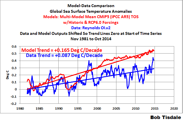
Figure 16
The surfaces of the global oceans are still warming at a rate that’s about half as fast as hindcast by climate models. Think about that for a moment. The modelers knew the actual warming rate for most of that time period, and the models still doubled the observed warming rate. That’s a failure in anyone’s book, or should be.
SOURCE
Sea surface temperature data and maps and the outputs of the CMIP5 climate models are available through the KNMI Climate Explorer. The sources of other data are linked in the post.


That temperature uptick in the northern Pacific blob could actually cause colder temperatures, not warmer temperatures due to large pressure systems triggered by that warm pool and allowing Arctic cold jet stream loops to slide down the East side of the pressure systems and deep into lower latitudes across North America.
Agreed in part, Pamela. While the blob and ridiculously resilient ridge of high pressure have been redirecting the jet stream so that there are colder temperatures over North America, logic has it that it is also causing opposite effect somewhere else.
Cheers.
As always, you present a clearly written and comprehensive explanation. A question: do you have any thoughts on how rapidly and how much of the heat in the north Pacific warm pool will dissipate into the atmosphere?
Sorry, Gary, there’s no way for me to estimate that.
Thanks, Bob. I can see ENSO beginning to get a more important place in climate perceptions, even Dr. T!
Pingback: Quicky Mid-November 2014 ENSO Update | Watts Up With That?
Pingback: Researchers Find Northeast Pacific Surface Warming (1900-2012) Caused By Changes in Atmospheric Circulation, NOT Manmade Forcings | Bob Tisdale – Climate Observations
Pingback: Researchers Find Northeast Pacific Surface Warming (1900-2012) Caused By Changes in Atmospheric Circulation, NOT Manmade Forcings | Watts Up With That?
Pingback: Researchers Find Northeast Pacific Surface Warming (1900-2012) Caused By Changes in Atmospheric Circulation, NOT Manmade Forcings * The New World
Pingback: Many Thanks to Kevin Trenberth for Being Open-Minded | Bob Tisdale – Climate Observations
Pingback: Alarmists Bizarrely Claim “Just what AGW predicts” about the Record High Global Sea Surface Temperatures | Bob Tisdale – Climate Observations
Pingback: Alarmists Bizarrely Claim “Just what AGW predicts” about the Record High Global Sea Surface Temperatures in 2014 * The New World
Pingback: Does the Uptick in Global Surface Temperatures in 2014 Help the Growing Difference between Climate Models and Reality? | Bob Tisdale – Climate Observations
Pingback: On the Biases Caused by Omissions in the 2014 NOAA State of the Climate Report | Bob Tisdale – Climate Observations
Pingback: North Pacific Update: The Blob’s Strengthening Suggests It’s Not Ready to Depart | Bob Tisdale – Climate Observations
Pingback: North Pacific Update: The Blob’s Strengthening Suggests It’s Not Ready to Depart | Watts Up With That?
Pingback: The 2014/15 El Niño Was Not Focused on the Region Used By NOAA for their Oceanic NINO Index | Bob Tisdale – Climate Observations
Pingback: The 2014/15 El Niño Was Not Focused on the Region Used By NOAA for their Oceanic NINO Index | Watts Up With That?
Pingback: Did ENSO and the “Monster” Kelvin Wave Contribute to the Record High Global Sea Surface Temperatures in 2014? | Bob Tisdale – Climate Observations
Pingback: An August 2015 Update on The Blob | Bob Tisdale – Climate Observations
Pingback: August 2015 Update for The Blob | Watts Up With That?
Pingback: Tired of the Claims of “Warmest Ever” Month and Year? They Will Likely Continue Next Year | Bob Tisdale – Climate Observations
Pingback: Tired of the Claims of “Warmest Ever” Month and Year? They Will Likely Continue Next Year | Watts Up With That?
Pingback: THE BLOB Seems to Be Disappearing at the Surface – But Will It Reemerge? | Bob Tisdale – Climate Observations
Pingback: THE BLOB Seems to Be Disappearing at the Surface – But Will It Reemerge? | Watts Up With That?