
Sad to say, I suspect it may reemerge at the surface…maybe not as strong as in the past, but I don’t think it’s going to disappear completely in 2016. I hope my suspicions are wrong, though.
NOTE: This post includes two gif animations so it may take a while to load on your browser.
INTRODUCTION (BOILERPLATE)
We first discussed an unusual hotspot in the sea surface temperature anomalies of the eastern extratropical North Pacific two and a half years ago in the August 2013 post appropriately titled About the Unusual Warming Event in the Extratropical North Pacific Sea Surface Temperature Anomalies. That large pocket of elevated sea surface temperatures was later given the nickname “The Blob” by Nick Bond of JISAO. Since that first post, we’ve discussed it numerous times, along with its impacts on global surface temperatures:
- The Hotspot in the North Pacific (February 2014)
- On The Recent Record-High Global Sea Surface Temperatures – The Wheres and Whys (August 2014)
- Axel Timmermann and Kevin Trenberth Highlight the Importance of Natural Variability in Global Warming… (November 2014)
- Researchers Find Northeast Pacific Surface Warming (1900-2012) Caused By Changes in Atmospheric Circulation, NOT Manmade Forcings (December 2014)
- Did ENSO and the “Monster” Kelvin Wave Contribute to the Record High Global Sea Surface Temperatures in 2014? (December 2014)
- Alarmists Bizarrely Claim “Just what AGW predicts” about the Record High Global Sea Surface Temperatures in 2014 (January 2015)
- North Pacific Update: The Blob’s Strengthening Suggests It’s Not Ready to Depart (April 2015)
- August 2015 Update for The Blob
WHAT CAUSED THE BLOB? (BOILERPLATE)
According to Bond et al. (2015) Causes and impacts of the 2014 warm anomaly in the NE Pacific, a persistent ridge of high pressure in the mid-to-high latitudes of the eastern North Pacific (known as the Ridiculously Resilient Ridge) prevented the sea surfaces there from cooling normally. The Ridiculously Resilient Ridge is also responsible for the high temperatures and drought conditions along the west coast of the U.S. in recent years. See Anthony Watts’s April 2015 post “Warm blob” in Pacific Ocean not caused by climate change, affects U.S. weather at WattsUpWithThat. It includes the press release for two papers: Bond et al. (2015) Causes and Impacts of the 2014 Warm Anomaly in the NE Pacific and Hartmann (2015) Pacific sea surface temperature and the winter of 2014.
HOWEVER
Let’s examine the animation of sea surface temperature anomalies for the North Pacific, starting in 2007. Animation 1 is an update and expansion of the animation here from the post North Pacific Update: The Blob’s Strengthening Suggests It’s Not Ready to Depart. (My thanks to blogger Bill Illis for suggesting I extend the animation back in time.)
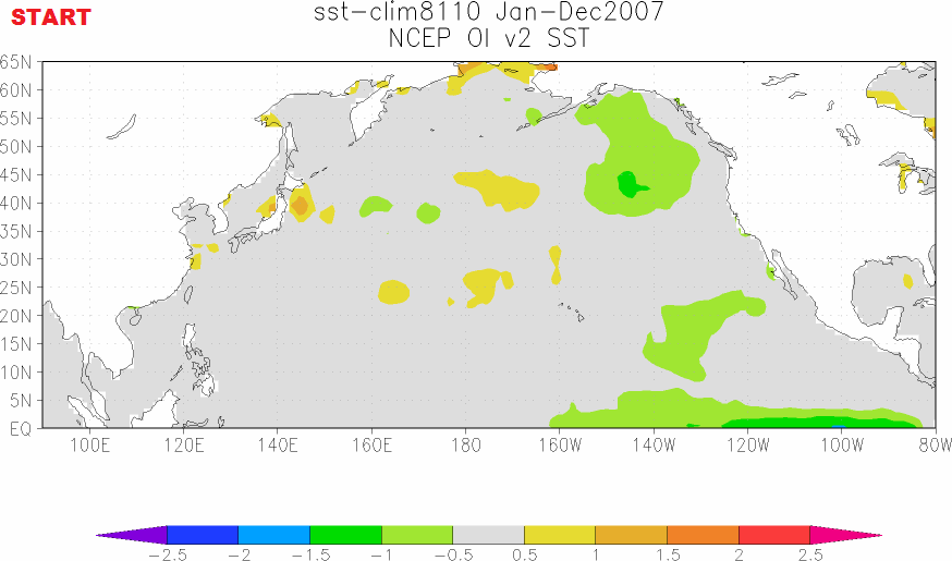
Animation 1 (You may need to click start it.)
Animations of maps of monthly and weekly sea surface temperature anomalies can be very volatile, with weather effects and seasonal components creating a lot of visual noise. To minimize the monthly volatility and seasonal components, each of the maps in Animation 1 presents the average sea surface temperature anomalies for a full year. The annual maps then advance on a monthly basis. That is, the first map covers the 12-month period of January 2007 to December 2007. The second map is for February 2007 to January 2008. The third map: March 2007 to February 2008. And so on through the last map for January 2015 to December 2015. This is similar to smoothing time-series data with a 12-month running-mean filter. I’ve paused the animation and added notes of the timing of El Niño and La Niña events.
We can see that the warm water for The Blob appears to form during the 2010/11 La Niña and that it is then enhanced during the 2011/12 La Niña. That suggests a couple of things: (1) The warm water for The Blob may have first been released by the 2009/10 El Niño and then spun up east of Japan into the Kuroshio-Oyashio Extension (KOE) during the trailing 2010/11 La Niña. Or (2) changes in atmospheric circulation caused by the 2010/11 La Niña caused the warm surface waters to build up along the KOE, which was then enhanced during the 2011/12 La Niña.
When did it that warm pocket of water couple with the ridge of high pressure ? Dunno.
We can also see another Blob-like pocket of warm surface waters forming during what used to be called the 2008/09 La Niña…before NOAA switched to the ERSST.v4 “pause-buster” sea surface temperature data. Maybe a prerequisite for The Blob is a double-dip La Niña…but with a moderately strong El Niño preceding it.
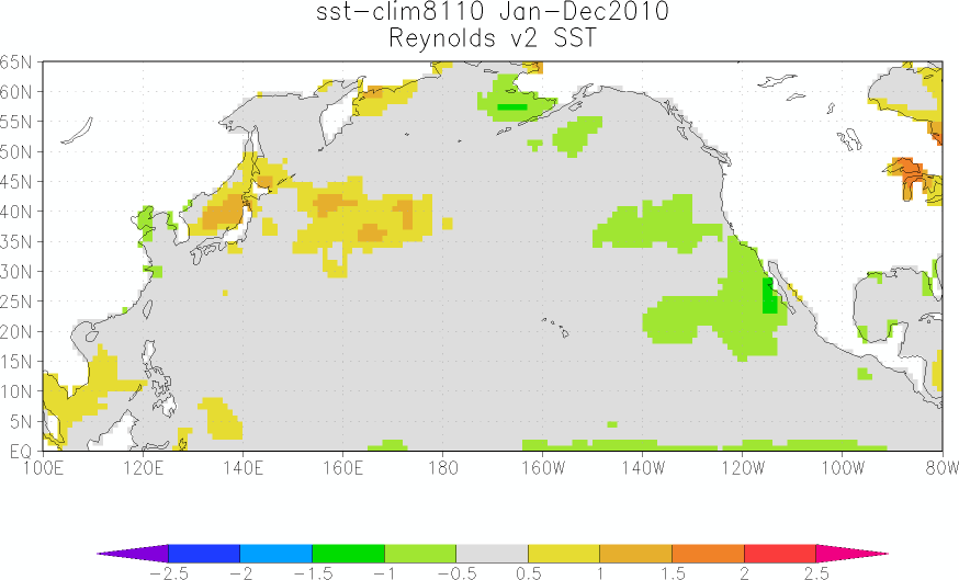
THE BLOB APPEARS TO BE DISAPPEARING AT THE SURFACE
Let’s look at another animation. We can see The Blob in the eastern extratropical North Pacific appearing to be dissipate in recent months.

Animation 2 (You may need to click start it.)
For Animation 2, I’ve borrowed and annotated the maps from Saturday’s 52-week animation of sea surface temperature anomalies from the NOAA ESRL PSD Map Room Climate Products – Sea Surface Temperature (SST) website, specifically the webpage here. I’ve noted on the first frame the location and coordinates that NOAA uses for The Blob in their GODAS Monthly Ocean Briefing.
We can see that the focus of The Blob shifts location and that it seems to strengthen and weaken over 2015…and that it appears to be dissipating/disappearing in recent weeks.
WHY WOULD THE BLOB REEMERGE AT THE SURFACE?
Mother Nature has once again shown that she can cause ocean heat uptake to depth. That is, The Blob, a naturally occurring event, created a lot of warm water to depth in that location. We can still see evidence of this in the most recent NOAA GODAS depth-averaged temperature reanalysis for the depths of 300 meters (a.k.a. T300 anomalies). See Figure 1. (Map available here.)

Figure 1
An even better illustration: Figure 2 is page 25 from the NOAA/GODAS Monthly Ocean Briefing. It includes two Hovmoller diagrams in the upper left-hand side that show the temperature anomalies to depths of 300 meters: one from 1979 to present and the other for the past 4 years. The temperature scale is difficult to read, but I believe the numbers range from -1.8 deg C to +1.8 deg C.

Figure 2 (Page 25 from NOAA/GODAS Monthly Ocean Briefing)
Even though surface temperatures in The Blob region have dropped in recent months, there is still a chunk of warm water below the surface…and it should eventually reemerge at the surface.
The third note on page 25 from the GODAS Monthly Ocean Briefing reads:
The development of the enhanced warming in late 2013 seems associated with the switch to positive PDO phase.
But the “enhanced warming in late 2013” precedes the “switch to positive PDO phase”, which didn’t occur until early 2014. In that case, wouldn’t it be clearer if it were written as, The switch to positive PDO phase seems to be a lagged response to the enhanced warming of The Blob in late 2013?
A COUPLE OF TIME-SERIES GRAPHS
I have switched to the coordinates used in the NOAA/GODAS Monthly Ocean Briefing for The Blob, which are 40N-50N, 150W-130W. I had been using a larger region: 35N-55N, 150W-125W. The sea surface temperature anomalies of NOAA’s smaller region are a little more volatile than my former region. See Figure 3.

Figure 3
And Figure 4 includes the time-series and annual evolutions of the sea surface temperatures for the coordinates used by NOAA for The Blob. Based on the weekly maps shown in Animation 2, I suspect we’ll see an even further decline (an anomaly below 1.0 deg C) in the January 2016 sea surface temperature anomalies for that region. Check back here on the second Monday or Tuesday in February for the January 2016 sea surface temperature update. The Blob update is near the bottom. While you’re at it, please add my website to your favorites. The sea surface temperature updates are not cross-posted at WattsUpWithThat.

Figure 4
MODEL FORECASTS FOR THE BLOB
Figure 5 is page 38 from the latest NOAA/GODAS Monthly Ocean Briefing (with my highlight) for your info.

Figure 5 (Page 38 from NOAA/GODAS Monthly Ocean Briefing)
The second note is discussing the forecasts for the sea surface temperatures of the North Atlantic in response to the 2015/16 El Niño, which usually begins in the early part of the decay year of a strong El Niño.
FURTHER READING
For more information about The Blob, see the posts linked at the beginning of this post.
I also discussed and illustrated the blatantly obvious impacts of The Blob on 2014 and 2015 global sea surface temperatures in my free ebook On Global Warming and the Illusion of Control – Part 1 (25MB .pdf). See General Discussions 2 and 3. Simply click on those general discussions in the ebook’s Table of Contents. Of course, global sea surface temperatures in 2015 were also strongly impacted by the 2015/16 El Niño, as they will in 2016 with the lagged effects of the El Niño.
UPDATE – SOURCE
Oops. Forgot to state what sea surface temperature datasets were presented in Figures 3 and 4 and for Animation 1. It’s Reynolds OI.v2 sea surface temperature data from the KNMI Climate Explorer, where the maps for Animation 1 were created.


Reblogged this on Climate Collections.
Excellent review!!! Looks like Blob and Son of Blob have finally ended up in Davy Jones’ Locker without evidence of the Equatorial Countercurrent feeding them any dessert!!!
Thanks, Bob. This is a very good article. Animation 1 is most revealing.
This is sunlight-created warm water traveling in the Pacific Ocean, just like ENSO. The route is different, so is the timing. The possibility of ENSO feeding The Blob looks good to me.
Pingback: une explication du record de température en 2015 | climat-evolution
In the ‘NEWS’:
25 January 2016
US east coast snowstorms linked to slowdown of Atlantic current
The record snowfall that paralysed much of the east coast of the US on the weekend could be partly due to a slowing of the Atlantic currents that transport heat northwards towards Greenland and Europe…..
Ocean temperatures just off the east coast have been warming even faster than global temperatures, Stefan Rahmstorf of Potsdam University in Germany pointed out in a blog post on Sunday….
https://www.newscientist.com/article/2075131-us-east-coast-snowstorms-linked-to-slowdown-of-atlantic-current/
This reminded me of:
Change in North Atlantic Circulation [NASA, July 18, 2001]
A NASA satellite confirms that overturning in the North Atlantic Ocean—a process where surface water sinks and deep water rises due to varying water densities—speeds up and slows down by 20 to 30 percent over 12- to 14-year cycles. Scientists previously believed that a change of this magnitude would take hundreds of years, rather than close to a decade….
http://earthobservatory.nasa.gov/IOTD/view.php?id=1599
Thanks, Alec.
Pingback: January 2016 Sea Surface Temperature (SST) Anomaly Update | Bob Tisdale – Climate Observations
Pingback: March 2016 Update of Global Temperature Responses to 1997/98 and 2015/16 El Niño Events | Bob Tisdale – Climate Observations
Pingback: March 2016 Update of Global Temperature Responses to 1997/98 and 2015/16 El Niño Events | Watts Up With That?
Pingback: February 2016 Sea Surface Temperature (SST) Anomaly Update | Bob Tisdale – Climate Observations
Pingback: March 2016 Sea Surface Temperature (SST) Anomaly Update | Bob Tisdale – Climate Observations
Pingback: April 2016 Sea Surface Temperature (SST) Anomaly Update | Bob Tisdale – Climate Observations
Pingback: June 2016 Sea Surface Temperature (SST) Anomaly Update | Bob Tisdale – Climate Observations
Pingback: July 2016 Sea Surface Temperature (SST) Anomaly Update | Bob Tisdale – Climate Observations
Pingback: August 2016 Sea Surface Temperature (SST) Anomaly Update | Bob Tisdale – Climate Observations
Pingback: September 2016 Sea Surface Temperature (SST) Anomaly Update | Bob Tisdale – Climate Observations
Pingback: Deep Ocean Warming in Degrees C | Bob Tisdale – Climate Observations
Pingback: Deep Ocean Warming in Degrees C |