
In this post, we’re going to present monthly TMIN and TMAX Near-Land Surface Air Temperature data for the Northern and Southern Hemispheres (not in anomaly form) in an effort to add a little perspective to global warming. And at the end of this post, I’m asking for your assistance in preparing a post especially for you, the visitors to this blog.
INTRODUCTION FOR THE “GLOBAL WARMING IN PERSPECTIVE” SERIES
A small group of international unelected bureaucrats who serve the United Nations now wants to limit the rise of global land+ocean surface temperatures to no more 1.5 deg C from pre-industrial times…even though we’ve already seen about 1.0 deg C of global warming since then. So we’re going to put that 1.0 deg C change in global surface temperatures in perspective by examining the ranges of surface temperatures “we’ve been used to” on our lovely shared home Earth.
The source of the quote in the title of this post is Gavin Schmidt, who is the Director of the NASA GISS (Goddard Institute of Space Studies). It is from a 2014 post at the blog RealClimate, and, specifically, that quote comes from the post Absolute temperatures and relative anomalies (Archived here.). The topic of discussion for that post at RealClimate was the wide span of absolute global mean temperatures [GMT, in the following quote] found in climate models. Gavin wrote (my boldface):
Most scientific discussions implicitly assume that these differences aren’t important i.e. the changes in temperature are robust to errors in the base GMT value, which is true, and perhaps more importantly, are focussed on the change of temperature anyway, since that is what impacts will be tied to. To be clear, no particular absolute global temperature provides a risk to society, it is the change in temperature compared to what we’ve been used to that matters.
Anyone with the slightest bit of common sense knows that, annually, the local ambient temperatures where they live vary much more than the 1-deg C change in global surface temperatures that data show Earth has experienced since preindustrial times and way much more than the 0.5-deg C additional change in global mean surface temperatures the UN has set its sights on trying to prevent in the near future.
Please keep that 0.5-deg C in mind as you view the graphs and read the text that follow.
BTW, there were two posts at WattsUpWithThat about global mean surface temperatures in absolute form that preceded Dr. Schmidt’s post, and they may have prompted his post. The posts I’m referring to at WattsUpWithThat were Willis Eschenbach’s post CMIP5 Model Temperature Results in Excel and my post On the Elusive Absolute Global Mean Surface Temperature – A Model-Data Comparison. (WattsUpWithThat cross post is here.)
DATA SOURCE
The source of the data presented in this post is Berkeley Earth. WHY Berkeley Earth? In addition to furnishing their datasets in anomaly form, Berkeley Earth also provides monthly period-average surface temperatures in absolute form for the base period (1951-1980) they use for the anomalies. So with those monthly absolute values, it’s easy to convert the monthly long-term temperature anomaly data into absolute temperature values, which is what we want for this presentation. (And before someone complains about my use of the term absolute, it is commonly used by the climate science industry when describing temperatures in their observed, not anomaly, form.)
Near-land surface air temperature data for the Northern Hemisphere are found here, and for the Southern Hemisphere, they’re here.
Specifically, for this post, data for TMIN (Mean of Daily Low Temperatures) for the Northern Hemisphere are here, and for the Southern Hemisphere here. And for TMAX (Mean of Daily High Temperatures), the data for the Northern Hemisphere are here, and for the Southern Hemisphere here.
As a reference for a couple of graphs in this post, I’ve also included the curves of the monthly Berkeley Earth land+ocean surface temperature anomalies data…found here. There are two versions found on that webpage, I’ve used the data with air temperatures above sea ice.
AVERAGE ANNUAL CYCLES IN MONTHLY HEMISPHERIC TMAX AND TMIN
For the reference period of 1951-1980 used by Berkeley Earth, the average annual cycles in TMIN and TMAX for the Southern Hemisphere (90S-0) are shown in Figure 1. As noted below the graph, for the Southern Hemisphere and this time period, the difference between the highest TMAX and the lowest TMIN is 22.4 Deg C.

Figure 1
The average annual cycles in TMIN and TMAX for the Northern Hemisphere (0-83.5N), again for the reference period of 1951-1980, are shown in Figure 2. For the Northern Hemisphere and this time period, the difference between the highest TMAX and the lowest TMIN is 34.9 Deg C.
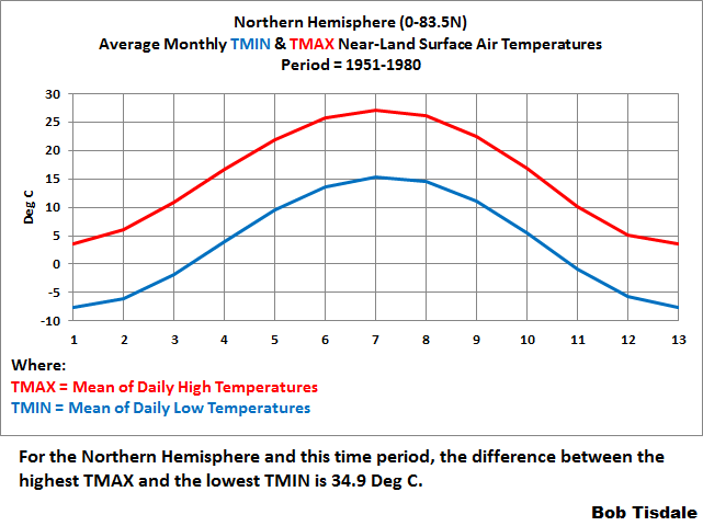
Figure 2
HOW SURFACE TEMPERATURE DATA ARE NORMALLY PRESENTED
Normally, global land+ocean surface temperature anomaly data are presented in anomaly form, with the scaling of the y-axis as tight as possible to make the long-term and short-term variations appear large, when, in reality, they’re very small…so small you’d never notice them if it wasn’t for the constant browbeating from politicians, the mainstream media, and members of the publically funded climate data and modeling businesses, which have to keep their funding alive.
AND NOW FOR SOMETHING COMPLETELY DIFFERENT (Thank you, Monty Python)
With that in mind, Figures 3 and 4 compare (First) the monthly global mean land+ocean surface temperature data in anomaly form (black curve straddling zero degrees C) with (Second) the monthly TMIN (Mean of Daily Low Temperatures) and TMAX (Mean of Daily High Temperatures) data in absolute form for the Southern Hemisphere (Figure 3) and the Northern Hemisphere (Figure 4). The TMAX curves are in red and the TMIN curves are in blue.
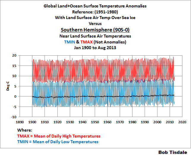
Figure 3
# # #

Figure 4
But, Bob, I can hardly see the long-term and short-term variations in the global mean surface temperature anomaly data.
Bingo! That’s precisely the reason I went to all the trouble to prepare and present these comparisons.
Important Note: The hemispheric data from Berkeley Earth end in 2013, while their global temperature datasets continue to be updated monthly. I’m not trying to hide anything by ending the graphs in 2013 as some of you were thinking.
The data in the graphs begin in 1900, because the year 1900 is the last year of the IPCC’s new definition of pre-industrial times, which runs from 1850-1900. See the IPCC’s Changes to the Underlying Scientific-Technical Assessment to ensure consistency with the approved Summary for Policymakers from their 2018 Special Report (SR15). [End note.]
That’s it for the primary content of this post.
A LITTLE HELP, PLEASE!
I’m planning to continue this series of posts with graphs like the ones in Figures 3 and 4, but providing them for individual countries. See the example for Canada in Figure 5. (Brrr.)

Figure 5
I’d like to begin with the countries that visitors to this blog call home. I believe most visitors are from Australia, Canada, France, Germany, India, Ireland, Japan, New Zealand, Nordic countries, South Africa, and, of course, the UK and USA, because, if memory serves, you’ve mentioned them all in comments at one time or another. (Sorry if I missed your country.) And many of the posts are written about The UK, USA, Germany, France, and so on. Please advise me in comments so I can include them in the upcoming post (or posts, if need be). Please do, because we should be able to have some fun with this, especially those of you who use social media. (Imagine all of the tired old arguments you’d see.) If the list gets long, beyond 22 countries for the sake of a number, we’ll spread them out over a couple of posts.
And I assume many of you less-verbose visitors may be from many other countries. Maybe this will be the first post on which you’ll offer a comment. If so, welcome aboard.
That’s all, folks. Have fun in the comments and enjoy the rest of your day.
STANDARD CLOSING REQUEST
Please purchase my recently published ebooks. As many of you know, this year I published 2 ebooks that are available through Amazon in Kindle format:
- Dad, Why Are You A Global Warming Denier? (For an overview, the blog post that introduced it is here.)
- Dad, Is Climate Getting Worse in the United States? (See the blog post here for an overview.)
And please purchase Anthony Watts’s et al. Climate Change: The Facts – 2017.
To those of you who have purchased them, thank you. To those of you who will purchase them, thank you, too.
Regards,


And Now For Something Completely Different – Thank you, Monty Python!
Enjoy the “fish slapping dance” skit. It always makes me smile.
Cheers,
Bob
Reblogged this on Climate Collections.
There are reasons why it is the anomaly that matters:
– big masses like glaciers or permafrost can smooth away the daily variation of temperature
– if you discard some measuring stations (e.g. because you find they are anomalous) the overall mean temperature changes but the anomaly may be little affected
Hmm, a bit of wave action on the Canada lows graph.
Continental US likely boring… all the lows will likely either be from Frostbite Falls or Moosington

udoli, I haven’t illustrated the “…daily variation of temperature…”! The graphs illustrate the monthly averages of daily highs and lows.
Regardless, the changes to the monthly TMAX and TMIN values in absolute terms would also be reflected in the monthly anomalies for TMIN and TMAX. And the same answer to your comment applies to stations coming and going.
Good-bye,
Bob
Thanks, Alec. Made me laugh.
Speaking of cartoons, maybe all the recent snow is caused by Simon Bar Sinister and his weather gun. We need to call Underdog!!!
Cheers,
Bob
Bob I’m looking forward to the Aussie data/graphs and hope you have time for NZ as well. I just wish I had half your ability and perseverance.
Striking resemblance to the temperature change on the alcohol thermometer in F. circulated a while back.
More seriously, interesting the lack of overlap between tmin and tmax in the southern hemisphere. A forty year period of small overlap began about 1960 and ended about 2000, with maximum overlap about 1980. The SH mins have more amplitude than the maxes.
In the northern hemisphere the maxes show more amplitude than the mins, and the overlap results from greater amplitude in both mins and maxes. Less ocean moderation.
Still, it seems peculiar that the SH min peaks should so closely match the max troughs…