
In this post, we’re going to present graphs that show the annual lowest TMIN and highest TMAX Near-Land Surface Air Temperatures (not in anomaly form) for ten (10) Countries in an effort to add some perspective to global warming. The list of countries, which follows, includes the countries with the highest populations.
And, as always with my posts, as part of the text, there are hyperlinks to the data that were used to prepare the graphs. Just click on the links if you’re looking for the data.
INITIAL NOTES
First of all, TMIN is described by Berkeley Earth as the “Mean of Daily Low Temperatures”, while TMAX is described as the “Mean of Daily High Temperatures”. Berkeley Earth provides monthly TMIN and TMAX data until partway through 2013. The start month for these individual-country datasets at Berkeley Earth depends on data availability from the individual country. Sometimes they start in the early 1800s, maybe even the mid-to-late 1700s for countries to be included in future posts (like the United Kingdom), and other times they start in the mid-to-late 1800s, so I’ve chosen 1900 as the start year for this post. The year 1900 is the end year of the IPCC’s new definition of “pre-industrial” times, so starting the graphs in 1900 is also appropriate in that respect.
The illustrations in this post are intended to show the difference in magnitude between (1) the rise in global mean land+ocean surface temperature anomalies, which is how “global warming” is normally presented, and (2) the range of the lowest annual TMIN and highest annual TMAX temperatures (not anomalies) for each country. Rephrased, we’re going to illustrate, and confirm something you already know, that the magnitude of the changes every year from the lowest TMIN to the highest TMAX for each country—that is, the wide range in the annual variations in surface temperatures—dwarf the 1-deg C rise in global mean surface temperatures that has been experienced since the end of pre-industrial times (per the IPCC’s new definition of pre-industrial time). These are being presented because the United Nations has recently established a goal of limiting global warming to 0.5-deg C above the 1.0-deg C rise already seen, when in reality a 0.5-deg C change in global mean surface temperatures would hardly be perceptible to anyone or anything on our lovely planet Earth, especially when we consider the wide variations in ambient outdoor temperatures we experience locally every year, every month, every week, every day.
COUNTRIES PRESENTED IN THIS POST
The countries for which data are presented in this post are the Top-Ten Most-Populated Countries, According to the website World Population Review (Source archived here because population estimates change often, daily at some websites). We’re presenting near-surface land air temperature extreme data. (The hyperlinks are to their data pages at Berkeley Earth, the source of data for this post):
COUNTRY: (Population in Millions)
-
- China: 1,415
- India: 1,354
- United States: 327
- Indonesia: 267
- Brazil: 211
- Pakistan: 201
- Nigeria: 196
- Bangladesh: 166
- Russia: 144
- Mexico: 131
- TOTAL Population of these Countries: 4,412
And if we assume a total global population of 7.6 billion, the countries included in this post are home to almost 60% of Earth’s human residents.
Let’s also take a look at the ranking of “Action on Climate Change” in the UN’s My World 2015 poll, where there were 16 topics the UN wanted ranked as priorities:
COUNTRY: (Ranking of “Action on Climate Change” Out of 16 choices)
- China: 4th
- India: 15th
- United States: 10th
- Indonesia: 13th
- Brazil: 12th
- Pakistan: 16th
- Nigeria: 16th
- Bangladesh: 12th
- Russia: 15th
- Mexico: 12th
Considering that “Action on Climate Change” ranked dead last globally (see the MyWorldAnalytics webpage here), having it rank 4th in China was not what I expected.
STANDARD INTRODUCTION FOR THE “GLOBAL WARMING IN PERSPECTIVE” SERIES
A small group of international unelected bureaucrats who serve the United Nations, of environmental activists, and of businesses with financial interests climate change laws, now want to limit the rise of global land+ocean surface temperatures to no more 1.5 deg C from pre-industrial times…even though we’ve already seen about 1.0 deg C of global warming since then. So we’re going to put that 1.0 deg C change in global surface temperatures in perspective by examining the ranges of surface temperatures “we’ve been used to” on our lovely shared home Earth.
The source of the quote in the title of this post is Gavin Schmidt, who is the Director of the NASA GISS (Goddard Institute of Space Studies). It is from a 2014 post at the blog RealClimate, and, specifically, that quote comes from the post Absolute temperatures and relative anomalies (Archived here.). The topic of discussion for that post at RealClimate was the wide span of absolute global mean temperatures [GMT, in the following quote] found in climate models. Gavin wrote (my boldface):
Most scientific discussions implicitly assume that these differences aren’t important i.e. the changes in temperature are robust to errors in the base GMT value, which is true, and perhaps more importantly, are focussed on the change of temperature anyway, since that is what impacts will be tied to. To be clear, no particular absolute global temperature provides a risk to society, it is the change in temperature compared to what we’ve been used to that matters.
Anyone with the slightest grasp of reality knows that, annually, the local ambient temperatures where they live vary much more than the 1-deg C change in global surface temperatures that data show Earth has experienced since preindustrial times and way much more than the 0.5-deg C additional change in global mean surface temperatures the UN has set its sights on trying to prevent in the near future.
Please keep that 0.5-deg C in mind as you view the graphs and read the text that follow.
BTW, there were two posts at WattsUpWithThat about global mean surface temperatures in absolute form that preceded Dr. Schmidt’s post, and they may have prompted his post. The posts I’m referring to at WattsUpWithThat were Willis Eschenbach’s post CMIP5 Model Temperature Results in Excel and my post On the Elusive Absolute Global Mean Surface Temperature – A Model-Data Comparison. (WattsUpWithThat cross post is here.)
DATA SOURCE
The source of the data presented in this post is Berkeley Earth. Why Berkeley Earth? In addition to furnishing their datasets in anomaly form, Berkeley Earth also provides monthly period-average surface temperatures in absolute form for the base period (1951-1980) they use for the anomalies. So with those monthly absolute values, it’s easy to convert the monthly long-term temperature anomaly data into absolute temperature values, which is what we want for this presentation. (And before someone complains about my use of the term absolute, it is commonly used by the climate science industry when describing temperatures in their observed, not anomaly, form.)
Mean near-land surface air temperature data for individual countries can be found here at Berkeley Earth. Specifically, for each of the countries this post, we’re presenting data for the TMIN (which are described as “Mean of Daily Low Temperatures”) and data for the TMAX (which are described as “Mean of Daily High Temperatures”).
As references for the lowest TMIN and highest TMAX time series graphs in this post, I’ve also included the curve of the monthly Berkeley Earth global mean land+ocean surface temperature anomalies data…found here. There are two versions on that webpage, I’ve used the data with air temperatures above sea ice, because it has a slightly higher long term linear trend. With a linear trend of 0.084 deg C/decade, over the 113+ year term of the graph, and based on that linear trend, the data show the average temperature of the Earth’s surface has risen about 1.0 deg C.
HOW SURFACE TEMPERATURE DATA ARE NORMALLY PRESENTED
Normally, global land+ocean surface temperature anomaly data are presented in anomaly form, with the scaling of the y-axis as tight as possible to make the long-term and short-term variations appear large, when, in reality, they’re very small…so small you’d never notice them if it wasn’t for the constant browbeating with alarmist propaganda we’re receiving daily from politicians, from the mainstream media, from businesses whose profits depend on the climate change scare, and from members of the publically funded climate data and modeling businesses, which have to keep their funding alive. An example of a normal presentation of global mean surface temperature (GMST) data can be seen in Reference Figure 1. It is a graph created by NASA GISS (Goddard Institute of Space Studies) and is available at their website here in .png form.
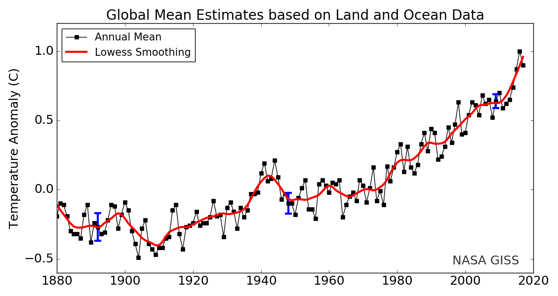
Reference Figure 1
When viewing the following time-series graphs, the black curves in my graphs are the Berkeley Earth-based monthly global mean land-ocean surface temperature anomalies equivalent of the curve above in Reference Figure 1.
AN EXAMPLE OF WHAT’S BEING PRESENTED
Reference Figure 2 is an example of what’s being presented in this post, but instead of TMIN and TMAX data for individual countries, the data in Reference Figure 2 is derived from the global mean data for near-surface land air temperatures. The Berkeley Earth global TMAX data for land surfaces are here and the global TMIN data are here. The blue curve toward the bottom includes the data for the annual lowest TMIN temperatures and red curve toward the top includes the data for the annual highest TMAX Near-Land Surface Air Temperatures (not in anomaly form). As noted above, the black curve toward the middle is for the Berkeley Earth annual global mean land+ocean surface temperature anomaly data, referred to on the graph as GMST for Global Mean Surface Temperature. For illustration purposes, and depending on the data for the individual country, I shift the curve of the GMST data so that it remains between the curves of the TMIN and TMAX data. With some countries, it’s not necessary and the GMST curve hugs 0.0 deg C. Also included on the graphs for each country are the trends—the warming rates as calculated by MS EXCEL—for the highest annual TMAX temperatures and the lowest annual TMIN temperatures.
Now notice how small the short- and long-term variations in global mean surface temperature (GMST) look. That’s because they are small, but you wouldn’t know that looking at a graph like the one prepared by NASA GISS in Reference Figure 1, above.

Reference Figure 2
As you can see, the trend of the highest annual global mean TMAX temperatures for land surfaces is slightly lower than the trend of the GMST data, which includes the surfaces of lands and oceans. On the other hand, the trend of the lowest annual global mean TMIN temperatures for land surfaces is noticeably higher than the trend of the GMST data, roughly twice as high. That is, globally, Earth’s daily high temperatures are warming much slower than Earth’s daily low temperatures. But data for the Earth’s countries hold surprises and the warming rates of the highest TMAX and lowest TMIN will differ with each country as you shall see. In one example in this post (for Mexico in Figure 10), the warming rate of the highest annual TMAX was slightly more than the lowest annual TMIN, though both were comparable to or lower than the trend for the annual GMST (land+ocean surface) data.
So there’s lots of information provided in each graph.
To aid in your understanding of what’s being presented in this post, see Reference Figure 3. It shows the monthly global TMIN and TMAX temperatures (not anomalies) for the global land surfaces with their wide annual variations. From the data used to create the graph in Reference Figure 3, I’ve extracted the highest annual values of the TMAX data and the lowest annual values of the TMIN data for Reference Figure 2. In other words looking at Reference Figure 3, I’ve gathered the annual extreme highest (peak) values of the red curve and the annual extreme lowest (valley) values of the blue curve to create Reference Figure 2. That way, as noted above, we can have the spreadsheet software calculate the linear trends of the high temperature extremes and low temperature extremes for the air temperatures near to the surfaces in each of the countries. And we can compare those to the warming rate of global mean surface temperatures, which is how global warming is normally presented.

Reference Figure 3
IMPORTANT NOTE: For the individual countries, if you were to attempt to extract the highest annual TMAX temperature and lowest annual TMIN temperature curves from anomaly data you will likely wind up with decidedly different results, as discussed and presented in the post here. (The WattsUpWithThat cross post is here.)
There seemed to be some disagreement about the use of actual temperatures (not anomalies) versus temperature anomalies in the comments at WattsUpWithThat for that post, so, as they say, a picture’s worth a thousand words.
In Reference Figure 4, I’ve plotted the mean TMAX temperatures for the Contiguous United States for two years (1958 in dark blue and 1959 in red). Also included is the respective average TMAX temperatures for the period 1951-1980 (black dotted curve), which is the 30-year period that Berkeley Earth uses when calculating temperature anomalies. As you can see, in 1959 (red curve), the highest TMAX temperature occurred in July, same month as the base-year average. But, in 1958 (blue curve), highest TMAX temperature occurred in August. For a time-series graph of the highest TMAX temperatures for the contiguous USA (Figure 3), the curve includes the July 1959 and August 1958 values, because they were the highest TMAX temperatures in those years.

Reference Figure 4
Now let’s take a look at the TMAX temperature anomalies for those two years. See Reference Figure 5. As you know, temperature anomalies are calculated as the difference between the actual temperature for a given month and the average temperature for that month base on a reference period, which is 1951-1980 for Berkeley Earth. If I were to plot the highest of the TMAX temperature anomalies in this post, they would likely have little to do with the highest actual TMAX temperatures, because the highest anomalies may occur randomly based on the local weather for a given month. In 1958, the highest TMAX anomaly happened in May, which was not the warmest TMAX month that year. Likewise, in 1959, the highest TMAX anomaly occurred in December, which was not the warmest TMAX month in 1959.

Reference Figure 5
[End note.]
I hope the preceding discussion and illustrations help you understand what’s being presented in Figures 1 to 10.
THE FOLLOWING TIMES SERIES GRAPHS HELP TO PUT INTO PERSPECTIVE THE 1-DEG C RISE IN GLOBAL MEAN SURFACE TEMPERATURES WE’VE ALREADY SEEN SINCE 1900
The initial 10 time-series graphs that follow (Figures 1 to 10) are provided for one simple reason: They compare the silly little 1-deg C rise in global mean surface temperature anomalies to the magnitude of the temperatures differences in the annual extremes we deal with every year, in terms of TMAX and TMIN surface temperatures (not anomalies) for individual countries. This allows viewers to the put into perspective the 1.0 deg C rise in global mean surface temperatures. In fact, there is even a note in dark blue in each graph that lists the difference in temperature between the Lowest Average TMIN and the Highest Average TMAX for the commonly used and WMO-recommended “climatological-standard normals” period of 1981-2010. (See the post here for a discussion of the WMO’s two sets of “normal” periods. The WattsUpWithThat cross post is here.) As you shall see, those differences can be many, many times greater than the 1 deg C rise in average surface temperatures the Earth has experienced since pre-industrial times.
In other words, with reference to the above quote by Dr. Schmidt, every year, we, the residents of the countries presented in this post, are “used to” much greater variations in the surface temperatures of the countries where we live than the teeny little 1-deg C rise in global mean surface temperatures over a past period of 100+ years. How great? The following are those differences for the countries presented in this post:
Country: Average Temperature Difference Between Average Annual TMAX High and Average Annual TMIN Low for the Reference Period of 1981-2010
- China: 39.1 deg C
- India: 26.5 deg C
- United States: 37.3 deg C
- Indonesia: 9.8 deg C
- Brazil: 13.6 deg C
- Pakistan: 34.6 deg C
- Nigeria: 19.8 deg C
- Bangladesh: 21.5
- Russia: 50.9 deg C
- Mexico: 24.8
And to extend that range a bit more, of the countries presented in this post, Indonesia had the highest average TMAX high temperature for the period of 1981-2010 at 31.2 deg C (88 deg F) and Russia had the lowest average TMIN low temperature for that 30-year period at -29.5 deg C (-21 deg F). Now consider, in our hometowns, local ambient temperatures can easily change more than 20 deg F (11 Deg C) in one day, on top of the slower monthly variations. See Reference Figure 6 below. It is a graph of actual and average temperatures in Washington D.C.—where politicians propose goofy stuff like taxing U.S. citizens to reduce U.S. carbon emissions 90% by 2050 (Thanks, Willis). It’s for the month of November 2018, available from Accuweather, specifically their webpage here. The inhabitants of this planet are quite adaptable, obviously.

Reference Figure 6
All of those are good numbers to recall when you hear some goofy politician talking nonsense about raising our utility costs or taxing us to provide a “stable climate”. Oy vey!
And now the much-awaited time-series graphs for the ten countries with the highest populations:

Figure 1
# # #

Figure 2
# # #

Figure 3
# # #

Figure 4
# # #
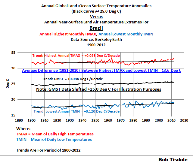
Figure 5
# # #

Figure 6
# # #

Figure 7
# # #

Figure 8
# # #

Figure 9
# # #

Figure 10
A FEW THINGS STOOD OUT TO ME
And the things that stood out were the very low warming rates of the annual highest TMAX temperatures for the United States, China, India, and Pakistan. I’ve plotted the TMAX data separately for those countries and presented them in Figures 11 through 14 for your viewing pleasure and comment.
Figure 15 was added as an afterthought, because of the record high blips in the 1930s and 1950s. Sorry, the TMAX data end part way through 2013, so we have no way to know what happened more recently.

Figure 11
# # #

Figure 12
# # #
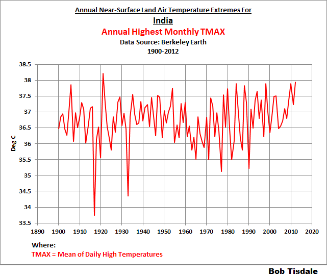
Figure 13
# # #

Figure 14
# # #

Figure 15
If you want to search for the possible sources of the tremendous downward spikes in the highest TMAX temperatures for two of the countries, they occurred in 1915, 1950 and 1992 in the Contiguous U.S. data, and for India, they occurred in 1917 and 1932.
The rest of the annual wiggles appear to be normal variations attributable to weather events.
TRENDS: SURFACE AREA-WEIGHTED AVERAGES VERSUS POPULATION-WEIGHTED AVERAGES
I took two approaches when determining the weighted averages of trends for the highest annual TMAX temperatures and the lowest annual TMIN temperatures. See Tables 1 and 2. I weighted the averages based on surface areas of the countries included in this post, Table 1. And for Table 2, I weighted the averages based on populations of the countries. The trends of the population-weighted averages are noticeably less than those of the area-weighted averages. In fact, the population-weighted trend for the highest annual TMAX temperatures for those ten countries, where almost 60% of Earth’s population reside, is only 0.035 deg C per decade.

Tables 1 & 2 (CLICK TO ENLARGE.)
And as noted below the tables, the trends listed in Tables 1 and 2 are for the highest annual TMAX temperatures (not anomalies) and the lowest annual TMIN temperatures (not anomalies).
CLOSING COMMENTS
Yes, I understand there can be wide differences in ambient temperatures within a country. The average annual surface temperatures in Chicago, IL and New York City, New York are roughly 12-deg C (22-deg F) cooler than they are in Tampa, Florida.
Further to this end, globally, in locations where humans, animals and plants reside, there can be very wide differences in the TMIN and TMAX temperatures as illustrated in Reference Figure 7a (Celsius) and 7b (Fahrenheit), which show the average annual cycle of TMAX temperatures for a “hot” country Oman (data here) and the average annual cycle of TMIN temperatures for a “cold” country Russia (data here), where the period used for the averages is the Berkeley Earth standard reference period of 1951-1980. Specifically, there’s a 70-deg C (126 deg F) temperature difference between the highest average TMAX in Oman and the lowest average TMIN in Russia. Obviously, the residents of this planet—animals, plants, and humans—are “used to” a very wide range of temperature extremes.

Reference Figure 7a
# # #

Reference Figure 7b
But as alarmists would like us to believe, we’re all going to roast in our self-imposed, fossil-fuel-burning, CO2-emitting hells if global mean land+ocean surface temperatures rise another 0.5 deg C (0.9 deg F). And then they get all huffy when people disagree with them. Go figure.
NEXT POST IN THIS SERIES
The next post with time-series graphs of highest annual TMAX temperatures and lowest annual TMIN temperatures like the one in Figures 1 through 10 will include data for countries where I believe most of the visitors to WattsUpWithThat reside. They include (with links to the respective data webpages at Berkeley Earth):
- United States (Again)
- United Kingdom (Europe)
- Canada
- Australia
- Germany
- Norway
- India (Again)
And because they were requested at WattsUpWithThat in the thread of the preceding post in this series:
That’s it for this post. Thanks for taking time out of your day to read the text and examine the graphs.
Have fun in the comments below, and enjoy rest of your day.
[Occasionally I mistype the last phrase as “enjoy the rest of your days”, and it makes me laugh because it sounds so threatening.]
STANDARD CLOSING REQUEST
Please purchase my recently published ebooks. As many of you know, this year I published 2 ebooks that are available through Amazon in Kindle format:
- Dad, Why Are You A Global Warming Denier? (For an overview, the blog post that introduced it is here.)
- Dad, Is Climate Getting Worse in the United States? (See the blog post here for an overview.)
And please purchase Anthony Watts’s et al. Climate Change: The Facts – 2017.
To those of you who have purchased them, thank you. To those of you who will purchase them, thank you, too.
Regards,


Thank you, Bob, for these interesting postings!
I’m looking forward to the graphs of Germany.
Greetings
Werner
Reblogged this on Climate Collections.
Off topic… hi bob, I curious about the subsurface Pacific cold water stripe just north of the equator.
First image is the 150m subsurface temp anomaly; (the cold stripe is also at 400m).
That got me curious about sea surface height… the cold stripe looks very significant:
That made me more curious and I looked for historical images; November 2014 at the beginning of the El Niño
The historical SSH images only go back to sept 2010 so 2014 was the only time I thought comparable.
So my first question is that cold area thermohialine upwelling? If not, what is it?
I don’t know what my second question should be
Alec, that’s interesting. At first I was thinking off-equatorial Rossby wave, but there wasn’t a strong La Nina recently. So I’m stymied. In the old days, I would have found a series of data-based maps that would allow me to work back in time to see if I could spot the source, and then animate them as a .gif file but, at present, I don’t have the time for such an adventure.
Thanks for letting me know, and HAPPY HOLIDAYS TO YOU!
Regards,
Bob
[sarc on] Whatever it is, humankind caused it through our CO2 emissions. [sarc off.]