
UPDATE: I’ve added graphs of the difference between the observations and the models at the end of the post, under the heading of DIFFERENCE.
####
We’ve shown in numerous posts how poorly climate models simulate observed changes in temperature and precipitation. The models prepared for the upcoming Intergovernmental Panel on Climate Change (IPCC) 5th Assessment Report (AR5) can’t simulate observed trends in:
1. satellite-era sea surface temperatures globally or on ocean-basin bases,
2. global satellite-era precipitation,
3. global, hemispheric and regional land surface air temperatures, and
In this post, we’ll compare the multi-model ensemble mean of the CMIP5-archived models, which were prepared for the IPCC’s upcoming AR5, and the new GISS Land-Ocean Temperature Index (LOTI) data. As you’ll recall, GISS recently switched sea surface temperature datasets for their LOTI product.
We have not presented trend maps in earlier comparisons of observed and modeled global land plus sea surface temperature anomalies, so, for the sake of discussion, we’ll provide them with this post. A comparison is shown in Figure 1 for the period of 1880 to 2012. 
Figure 1
The maps in Figure 1 show the modeled and observed linear trends for the full term of the GISS data, from 1880 to 2012. The CMIP5-archived simulations indicate stronger-than-observed polar-amplified warming at high latitudes in the Northern Hemisphere. The models also show a more uniform warming of the tropical Pacific, while the observations show little warming. There are a number of other regional modeling problems.
Presenting the trends over the full term of the GISS data actually tends to make the models look as though they perform reasonably well. But when we break the observations and model outputs into the 4 periods shown in Figure 2, the models do not fare as well. In fact, the trend maps will help to show how poorly the models simulate observed temperature trends during the early cooling period (1880 to 1917), the early warming period (1917 to 1944), the mid-20th century flat temperature period (1944 to 1976) and the late warming period (1976 to 2012).
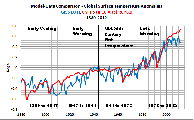
Figure 2
To head off complaints by global warming enthusiasts, the IPCC acknowledges those warming and cooling (flat temperature) periods in their 4th Assessment Report. As a reference, see Chapter 3 Observations: Surface and Atmospheric Climate Change of the IPCC’s AR4. Under the heading of “3.2.2.5 Consistency between Land and Ocean Surface Temperature Changes”, the IPCC states with respect to the surface temperature variations over the period of 1901 to 2005 (page 235):
Clearly, the changes are not linear and can also be characterized as level prior to about 1915, a warming to about 1945, leveling out or even a slight decrease until the 1970s, and a fairly linear upward trend since then (Figure 3.6 and FAQ 3.1).
You’ll notice by extending the data back to 1880, the data shows a cooling trend before 1917.
A NOTE ABOUT THE USE OF THE MODEL MEAN
The following discussion is a reprint from the post Blog Memo to John Hockenberry Regarding PBS Report “Climate of Doubt”.
The model mean provides the best representation of the manmade greenhouse gas-driven scenario—not the individual model runs, which contain noise created by the models. For this, I’ll provide two references:
The first is a comment made by Gavin Schmidt (climatologist and climate modeler at the NASA Goddard Institute for Space Studies—GISS). He is one of the contributors to the website RealClimate. The following quotes are from the thread of the RealClimate post Decadal predictions. At comment 49, dated 30 Sep 2009 at 6:18 AM, a blogger posed this question:
If a single simulation is not a good predictor of reality how can the average of many simulations, each of which is a poor predictor of reality, be a better predictor, or indeed claim to have any residual of reality?
Gavin Schmidt replied with a general discussion of models:
Any single realisation can be thought of as being made up of two components – a forced signal and a random realisation of the internal variability (‘noise’). By definition the random component will uncorrelated across different realisations and when you average together many examples you get the forced component (i.e. the ensemble mean).
To paraphrase Gavin Schmidt, we’re not interested in the random component (noise) inherent in the individual simulations; we’re interested in the forced component, which represents the modeler’s best guess of the effects of manmade greenhouse gases on the variable being simulated.
The quote by Gavin Schmidt is supported by a similar statement from the National Center for Atmospheric Research (NCAR). I’ve quoted the following in numerous blog posts and in my recently published ebook. Sometime over the past few months, NCAR elected to remove that educational webpage from its website. Luckily the Wayback Machine has a copy. NCAR wrote on that FAQ webpage that had been part of an introductory discussion about climate models (my boldface):
Averaging over a multi-member ensemble of model climate runs gives a measure of the average model response to the forcings imposed on the model. Unless you are interested in a particular ensemble member where the initial conditions make a difference in your work, averaging of several ensemble members will give you best representation of a scenario.
In summary, we are definitely not interested in the models’ internally created noise, and we are not interested in the results of individual responses of ensemble members to initial conditions. So, in the graphs, we exclude the visual noise of the individual ensemble members and present only the model mean, because the model mean is the best representation of how the models are programmed and tuned to respond to manmade greenhouse gases.
In other words, IF (big if) global surface temperatures were warmed by manmade greenhouse gases, the model mean presents how those surface temperatures would have warmed.
Let’s start with the time period when the models perform best, the recent warming period. And we’ll work our way back in time.
NOTES: For the trend maps in Figures 4, 6, 8 and 10, I’ve used a different range for the contour levels than those used in Figure 1. The contour range is now -0.05 to +0.05 deg C/year to accommodate the higher short-term trends. And for the temperature anomaly comparisons, I used the base period of 1961-1990 for anomalies. Those are the base years used by the IPCC in their model-data comparisons in Figure 10.1 from the Second Order Draft of AR5.
RECENT WARMING PERIOD – 1976 TO 2012
Figure 3 compares the observed and modeled linear trends in global land plus sea surface temperature anomalies for the period of 1976 to 2012. The models have overestimated the warming by about 28%. The divergence between the models and the data in recent years is evident. It’s no wonder James Hansen, now retired from GISS, used to hope for another super El Niño.

Figure 3
Figure 4 compares the modeled and observed surface temperature trend maps for 1976 to 2012. The models show warming for all of the East Pacific, while the data indicates little warming to cooling there. For the western and central longitudes of the Pacific, the models fail to show the ENSO-related warming of the Kuroshio-Oyashio Extension (KOE) east of Japan and the warming in the South Pacific Convergence Zone (SPCZ) east of Australia. The models also underestimate the warming in the mid-to-high latitudes of the North Atlantic. Modeled land surface temperature anomaly trends also show very limited abilities on regional bases, but that’s not surprising since the models simulate the sea surface temperature trends so poorly.

Figure 4
MID-20th CENTURY FLAT TEMPERATURE PERIOD
If we were to look only at the linear trends in the time-series graph, Figure 5, the modeled trend is not too far from the observed trend, only 0.026 deg C/decade.

Figure 5
However, as discussed in the post Polar Amplification: Observations versus IPCC Climate Models, the climate models fail to present the polar amplified cooling that existed during this period. See Figure 6. (Yes, polar-amplified cooling exists in the Arctic during cooling periods, too.) The climate models failed to simulate the cooling at high latitudes of the North Pacific and in the mid-to-high latitudes of the North Atlantic. The climate models also failed to simulate the warming of sea surface temperatures in the Southern Hemisphere, and they missed the warming of Antarctica.

Figure 6
EARLY WARMING PERIOD – 1917 TO 1944
Atrocious, horrible and horrendous are words that could be used to describe the performance of the CMIP5-archived climate models during the early warming period of 1917 to 1944. See Figure 7. According to the models, if greenhouse gases were responsible for global warming, global surface temperatures should only have warmed at a rate of about +0.049 deg C/decade. BUT according to the new and improved GISS Land-Ocean Temperature Index (LOTI) data, global surface temperatures warmed at a rate that was approximately 3.4 times faster or about 0.166 deg C/decade. That difference presents a number of problems for the hypothesis of human-induced, greenhouse gas-driven global warming, which we’ll discuss later in this post.

Figure 7
Looking at the maps of modeled and observed trends, the models failed to simulate the general warming of sea surface temperatures from 1917 to 1944 and they failed to capture the polar amplified warming at high latitudes of the Northern Hemisphere. As discussed in the post about polar amplification that was linked earlier, the observed warming rates at high latitudes of the Northern Hemisphere were comparable during the early and late warming periods (See the graph here).

Figure 8
Note: Areas in white in the GISS map have no data or they don’t have sufficient data to perform the trend analyses, which I believe is a threshold of 50% in the KNMI Climate Explorer.
EARLY COOLING PERIOD – 1880 TO 1917
If the data back this far in time is to be believed (that’s for you to decide), surface temperatures cooled, Figure 9, but the model simulations show they should have warmed slightly.

Figure 9
The observations-based map in Figure 10 shows land and sea surface temperature trends seeming to be out of synch during this period—sea surface temperatures show cooling while land surface temperatures show warming in many areas.

Figure 10
If GISS had kept HADISST as their sea surface temperature dataset for this period, the disparity between land and ocean trends would not have been as great. That is, the HADISST data they formerly used does not show that much cooling during this period.
A MAJOR FLAW IN THE HYPOTHESIS ON HUMAN-INDUCED GLOBAL WARMING
The observed warming rate during the early warming period is comparable to the trend during the recent warming period. See Figure 11.

Figure 11
But according to the models, Figure 12, if global temperatures were warmed by greenhouse gases, global surface temperatures during the recent warming period should have warmed at a rate that’s more than 4 times faster than the early warming period—or, more realistically, the early warming period should have warmed at a rate that’s 22% of the rate of the late warming period—yet the observed warming rates are comparable.

Figure 12
That’s one of the inconsistencies with the hypothesis that anthropogenic forcings are the dominant cause of the warming of global surface temperatures over the 20th Century. The failure of the models to hindcast the early rise in global surface temperatures illustrates that global surface temperatures are capable of warming without the natural and anthropogenic forcings used as inputs to the climate models.
Another way to look at it: the data also indicate that the much higher anthropogenic forcings during the latter later warming period compared to the early warming period had little to no impact on the rate at which observed temperatures warmed. In other words, the climate models do not support the hypothesis of anthropogenic forcing-driven global warming; they contradict it.
THE OTHER MAJOR FLAW IN THE HYPOTHESIS ON HUMAN-INDUCED GLOBAL WARMING
Ocean heat content data since 1955 and the satellite-era sea surface temperatures indicate the oceans warmed naturally. Refer to the illustrated essay “The Manmade Global Warming Challenge” (42mb).
CLOSING
Climate models cannot simulate the observed rate of warming of global land air plus sea surface temperatures during the early warming period (1917-1944), which warmed at about the same rate as the recent warming period (1976-2012). The fact that the models simulate the warming better during the recent warming period does not indicate that manmade greenhouse gases were responsible for the warming—it only indicates the models were tuned to perform better during the recent warming period.
The public should have little confidence in climate models, yet we are bombarded by the mainstream media almost daily with climate model-based conjecture and weather-related fairytales. Climate models have shown little to no ability to reproduce observed rates of warming and cooling of global temperatures over the term of the GISS Land Ocean Temperature Index. The IPCC clearly overstates its confidence in model simulations of the climate variable most commonly used to present the supposition of human-induced global warming (e.g., surface temperature). After several decades of development, models continue to show no skill at establishing that global warming is a response to increasing greenhouse gases. No skill whatsoever.
SOURCE
The GISS LOTI data and the outputs of the CMIP5-archived models are available through the KNMI Climate Explorer.
UPDATE 1
DIFFERENCE
The difference between the GISS land-ocean temperature index data and the CMIP5 multi-model mean (Data Minus Model) is shown in Figure Supplement 1. The recent divergence of the models from observations has not yet reached the maximum differences that exist toward the beginning of the data—maybe in a few more years.

Figure Supplement 1
The differences do of course depend on the base years used for anomalies. As noted in the post, I’ve used the base years of 1961-1990 to be consistent with the base period used by the IPCC in their model-data comparison in Figure 10.1 from the Second Order Draft of AR5. Using the base years of 1880 to 2012 (the entire term of the GISS data) does not help the models too much. Refer to Figure Supplement 2. The recent divergence is still considerable compared to those of the past.

Figure Supplement 2.


Pretty damning analysis of model skill, made even worse if the recent standstill continues for even a year or two
Pingback: These items caught my eye – 21 April 2013 | grumpydenier
Pingback: Model-Data Difference – Global Surface Temperature Anomalies – GISS, HADCRUT4 & NCDC | Bob Tisdale – Climate Observations
Pingback: Model-Data Difference – Global Surface Temperature Anomalies – GISS, HADCRUT4 & NCDC | Watts Up With That?
Pingback: 73 CO2 AGW Climate Models Are An Epic Fail! | Power To The People
Pingback: Model-Data Comparison: Hemispheric Sea Ice Area | Bob Tisdale – Climate Observations
Pingback: Model-Data Comparison: Hemispheric Sea Ice Area | Watts Up With That?
I would make the boundary between the early cooling period and the early warming period 1909, not 1917. Smoothed global surface temperature according to GISS and HadCRUT3 was lower in 1909. This makes the length of the early warming period closer to that of the modern warming period, but decreases the slope of the early warming period.
Pingback: Ten Reasons Why the Man-Made Global Warming Theory is Wrong. | Sovereign Independent UK
Pingback: Model-Data Comparison: Daily Maximum and Minimum Temperatures and Diurnal Temperature Range (DTR) | Bob Tisdale – Climate Observations
Pingback: Model-Data Comparison: Daily Maximum and Minimum Temperatures and Diurnal Temperature Range (DTR) | Watts Up With That?
Pingback: Meehl et al (2013) Are Also Looking for Trenberth’s Missing Heat | Bob Tisdale – Climate Observations
Pingback: Meehl et al (2013) Are Also Looking for Trenberth’s Missing Heat | Watts Up With That?
Pingback: Model-Data Comparison: Alaska Land Surface Air Temperatures | Bob Tisdale – Climate Observations
Pingback: Model-Data Comparison: Alaska Land Surface Air Temperature Anomaliess | Watts Up With That?
Pingback: Model-Data Comparison: Australia Land Surface Air Temperatures & Anomalies | Bob Tisdale – Climate Observations
Pingback: Model-Data Comparison: Australia Land Surface Air Temperatures & Anomalies | Watts Up With That?
Pingback: Models Fail: Scandinavian Land Surface Air Temperature Anomalies | Bob Tisdale – Climate Observations
Pingback: Models Fail: Scandinavian Land Surface Air Temperature Anomalies | Watts Up With That?
Pingback: Models Fail: Greenland and Iceland Land Surface Air Temperature Anomalies | Bob Tisdale – Climate Observations
Pingback: Models Fail: Global Land Precipitation & Global Ocean Precipitation | Bob Tisdale – Climate Observations
Pingback: Models Fail: Global Land Precipitation & Global Ocean Precipitation | Watts Up With That?
Pingback: Part 1 – Comments on the UKMO Report about “The Recent Pause in Global Warming” | Bob Tisdale – Climate Observations
Pingback: Part 1 – Comments on the UKMO Report about “The Recent Pause in Global Warming” | Watts Up With That?
Pingback: IPCC Still Delusional about Carbon Dioxide | Bob Tisdale – Climate Observations
Pingback: IPCC Still Delusional about Carbon Dioxide | Watts Up With That?
Pingback: Open Letter to Lewis Black and George Clooney | Bob Tisdale – Climate Observations
Pingback: Open Letter to Lewis Black and George Clooney | Watts Up With That?
Pingback: November 2013 Global Surface (Land+Ocean) Temperature Anomaly Update | Bob Tisdale – Climate Observations
Pingback: November 2013 Global Surface (Land+Ocean) Temperature Anomaly Update | Watts Up With That?
Pingback: Open Letter to Jon Stewart – The Daily Show | Bob Tisdale – Climate Observations
Pingback: Open Letter to Jon Stewart – The Daily Show | Watts Up With That?
Pingback: Cowtan and Way (2013) Adjustments Exaggerate Climate Model Failings at the Poles and Do Little to Explain the Hiatus | Bob Tisdale – Climate Observations
Pingback: Cowtan and Way (2013) Adjustments Exaggerate Climate Model Failings at the Poles and Do Little to Explain the Hiatus | Watts Up With That?
Pingback: Socialism and Electric Cars: Failures for Five Generations and Sponsored by Democrats Everywhere
Pingback: A Different Perspective of Global Warming | Bob Tisdale – Climate Observations
Pingback: A Different Perspective of Global Warming | Watts Up With That?
Pingback: A Different Perspective of Global Warming | Watts Up With That?
Pingback: A Lead Author of IPCC AR5 Downplays Importance of Climate Models | Bob Tisdale – Climate Observations
Pingback: A Lead Author of IPCC AR5 Downplays Importance of Climate Models | Watts Up With That?
Pingback: California Drought – A Novel Statistical Analysis of Unrealistic Climate Models and of a Reanalysis That Should Not Be Equated with Reality | Bob Tisdale – Climate Observations
Pingback: California Drought – A Novel Statistical Analysis of Unrealistic Climate Models and of a Reanalysis That Should Not Be Equated with Reality | Watts Up With That?
Pingback: On the Elusive Absolute Global Mean Surface Temperature – A Model-Data Comparison | Bob Tisdale – Climate Observations
Pingback: On the Elusive Absolute Global Mean Surface Temperature – A Model-Data Comparison | Watts Up With That?
Pingback: Climate Propaganda from the Australian Academy of Science | Bob Tisdale – Climate Observations
Pingback: Climate Propaganda from the Australian Academy of Science | Watts Up With That?
Pingback: Open Letter to U.S. Senators Ted Cruz, James Inhofe and Marco Rubio | Bob Tisdale – Climate Observations
Pingback: Open Letter to U.S. Senators Ted Cruz, James Inhofe and Marco Rubio | Watts Up With That?
Pingback: The Paris Paradigm: The What is your ‘Skeptic Score’? | Watts Up With That?
Pingback: What Animals Are Likely to Go Extinct First Due to Climate Change? | Bob Tisdale – Climate Observations
Pingback: What Animals Are Likely to Go Extinct First Due to Climate Change? | Watts Up With That?