
This post provides an update of many of the ENSO-related variables we presented as part of the 2014-15 El Niño Series. For the posts about the 2015/16 El Niño, we’ve used the evolution years of different El Niños as references to the goings-on in 2015. This month we’re including the 1997/98 El Niño because it was the strongest El Niño in our short instrument temperature record. For the other reference, we’re using 1982, which was the second strongest El Niño.
And we’re going to discuss the pocket of warm water (leftovers from the 2015/16 El Niño) that has formed south of the equator, which should be returned west with a Rossby wave. Will it be drawn back to the equator and suppress a La Niña? Or will it create a weak El Niño for 2016/17? Or will it avoid the equator entirely?
INTRODUCTION – ENSO MODEL FORECASTS
There are conflicting model forecasts for the upcoming ENSO season in NOAA’s Weekly ENSO Update for the week of March 7, 2016. Figure Supplement 1 is an annotated version of Page 24 from that NOAA report. It includes forecasts of NINO3.4 region sea surface temperature anomalies of the dynamical and statistical ENSO models assembled by IRI/CPC. While there are large differences between the forecasts, the mean of both types of models show a transition in 2016 to a weak La Niña for the 2016/17 ENSO season.
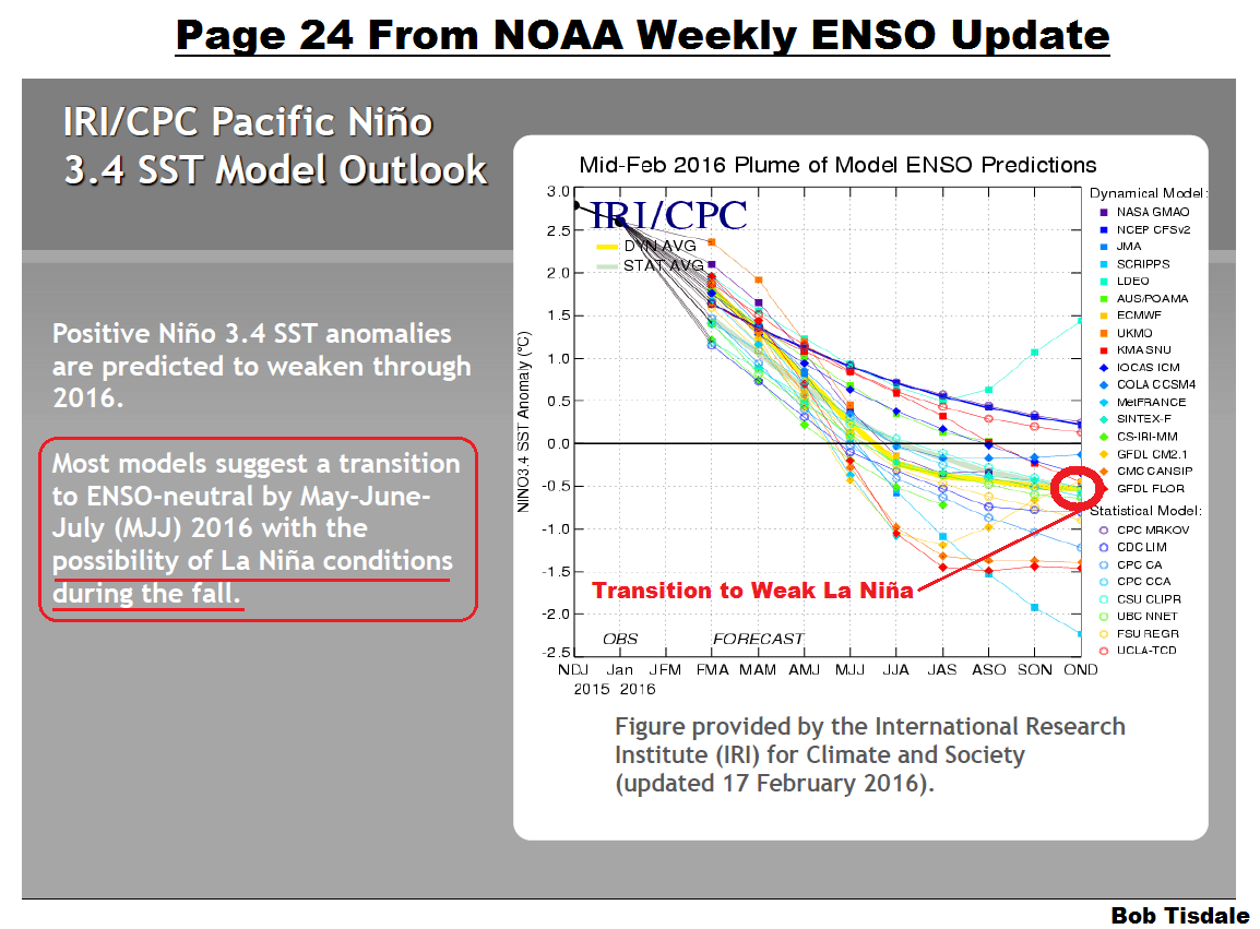
Figure Supplement 1
On the other hand, as shown in Figure Supplement 2 (page 25 from that NOAA update), the mean of the NOAA/NCEP model CFS.v2 forecasts is pointing to a weak El Niño for 2016/17.

Figure Supplement 2
Why is the NOAA/NCEP model CFS.v2 forecasting a weak El Niño for 2016/17 ENSO season? Dunno.
But as noted above, we need to keep an eye on a large pocket of warm water (leftovers from the 2015/16 El Niño) that has formed south of the equator. It should be returned west with a Rossby wave. Will it be drawn back to the equator and suppress the strength of an upcoming La Niña? Or will it supply the warm water needed for a weak El Niño for 2016/17? Or will is simply avoiding the equator altogether? More on that later.
First, the…
ENSO METRIC UPDATES
This post provides an update on the progress of the evolution and decay of the 2015/16 El Niño with monthly data through the end of February 2016, and for the weekly data through early-March, 2016. The post is similar in layout to the updates that were part of the 2014/15 El Niño series of posts here. (The series of posts about the 2015/16 El Niño is here.) The remainder of the post includes a bunch of illustrations and some gif animations, so it might take a few moments to load on your browser. Please click on the illustrations to enlarge them.
Included are updates of the weekly (and monthly) sea surface temperature anomalies for the four most-often-used NINO regions. Also included are a couple of graphs of the monthly BOM Southern-Oscillation Index (SOI) and the NOAA Multivariate ENSO Index (MEI).
For the comparison graphs we’re using the El Niño evolution years of 1997/98 and 1982/83 where possible (the two strongest El Niño events during recent decades) as references for 2015/16.
Also included in this post are evolution comparisons using warm water volume anomalies and depth-averaged temperature anomalies from the NOAA TOA project website.
Then, we’ll take a look at a number of Hovmoller diagrams comparing the progress so far for the 2015/16 El Niño to the El Niños of 1982/83 and 1997/98.
NINO REGION TIME-SERIES GRAPHS
Note: The weekly NINO region sea surface temperature anomaly data for Figure 1 are from the NOAA/CPC Monthly Atmospheric & SST Indices webpage, specifically the data here. The anomalies for the NOAA/CPC data are referenced to the base years of 1981-2010.
Figure 1 includes the weekly sea surface temperature anomalies of the 4 most-often-used NINO regions of the equatorial Pacific. From west to east they include:
- NINO4 (5S-5N, 160E-150W)
- NINO3.4 (5S-5N, 170W-120W)
- NINO3 (5S-5N, 150W-90W)
- NINO1+2 (10S-0, 90W-80W)

Figure 1
Note that the horizontal red lines in the graphs are the present readings, not the trends.
EL NIÑO EVOLUTION COMPARISONS FOR NINO REGION SEA SURFACE TEMPERATURE ANOMALIES
Using weekly sea surface temperature anomalies for the four NINO regions, Figure 2 compares the goings on this year with the 1997/98 event. (That weekly data start in January 1990, so we can’t include the 1982/83 El Niño.) While sea surface temperature anomalies in the NINO4 and NINO3.4 regions peaked higher than in 1997, the NINO1+2 and NINO3 regions lagged well behind the 1997/98 El Niño. In other words, the 1997/98 El Niño was a stronger East Pacific El Niño than the 2015/16 El Niño.
We also showed in the post here that the differences between sea surface temperature datasets and their uncertainties keep us from knowing which El Niño was strongest.
The NINO region sea surface temperature anomalies are continuing to show declines as the El Niño decays. The weekly data are impacted by “weather noise” so we should expect to see another couple of upticks from time to time, but we’ve definitely reached the peak of the 2015/16 El Niño. El Niños are tied to the seasonal cycle and typically peak in November to January. See the post here.

Figure 2
THE MULTIVARIATE ENSO INDEX
The Multivariate ENSO Index (MEI) is another ENSO index published by NOAA. It was created and is maintained by NOAA’s Klaus Wolter. The Multivariate ENSO Index uses the sea surface temperatures of the NINO3 region of the equatorial Pacific, along with a plethora of atmospheric variables…thus “multivariate”.
According to the most recent Multivariate ENSO Index update discussion, strong El Niño conditions exist, but they are lagging behind the events of 1982/83 and 1997/98:
Compared to last month, the updated (January-February) MEI has decreased slightly (by 0.08) to +2.12, continuing at the 3rd highest ranking, but falling further behind 1983 and 1998, compared to earlier this season. However, the August-September 2015 value of +2.53 remains the third highest overall at any time of year since 1950. The evolution of the 2015-16 El Niño is now slightly more similar to 1965-66 than to 1997-98, as monitored by the MEI. This means that the odds of having a second peak in late winter/early spring have collapsed to zero.
There’s something else to consider about the MEI. El Niño and La Niña rankings according to the MEI aren’t based on fixed threshold values such as +0.5 for El Niño and -0.5 for La Niña. The MEI El Niño and La Niña rankings are based on percentiles, top 30% for the weak to strong El Niños and the bottom 30% for the weak to strong La Niñas. This is difficult to track, because, when using the percentile method, the thresholds of El Niño and La Niña conditions vary from one bimonthly period to the next, and they can change from year to year.
The Multivariate ENSO Index update discussion and data for January/February were posted on March 6th. Figure 3 presents a graph of the MEI time series starting in Dec/Jan 1979. And Figure 4 compares the evolution in 2015/16 to the reference El Niños of 1982/83 and 1997/98.

Figure 3
# # #

Figure 4
According to NOAA’s Multivariate ENSO Index, the 2015/16 El Niño was weaker than the 1982/83 and 1997/98 events.
EL NIÑO EVOLUTION COMPARISONS WITH TAO PROJECT SUBSURFACE DATA
IMPORTANT NOTE: The 1982 values of the TAO Project subsurface data have to be taken with a grain of salt. The deployment of the TOA project buoys started in the late 1980s and was not compete until the early 1990s. Also keep in mind that these values are the output of a reanalysis, not observations-only-based data. [End note.]
The NOAA Tropical Atmosphere-Ocean (TAO) Project website includes the outputs of a reanalysis for two temperature-related datasets for the waters below the surface of the equatorial Pacific. See their Upper Ocean Heat Content and ENSO webpage for descriptions of the datasets. The two datasets are Warm Water Volume (above the 20 deg C isotherm) and the Depth-Averaged Temperatures for the top 300 meters (aka T300). Both are available for the:
- Western Equatorial Pacific (5S-5N, 120E-155W)
- Eastern Equatorial Pacific (5S-5N, 155W-80W)
- Total Equatorial Pacific (5S-5N, 120E-80W)
Keep in mind that the longitudes of 120E-80W stretch 160 deg, almost halfway around the globe. For a reminder of width of the equatorial Pacific, see the protractor-based illustration here. Notice also that the eastern and western data are divided at 155W, which means the “western” data extend quite a ways past the dateline into the eastern equatorial Pacific.
In the following three illustrations, we’re comparing reanalysis outputs for the evolution of the 2015/16 El Niño so far (through month-to-date March 2016) with the outputs for the evolutions of the 1982/83 and 1997/98 El Niños. The Warm Water Volume outputs are the top graphs and the depth-averaged temperature outputs are the bottom graphs. As you’ll see, the curves of two datasets are similar, but not necessarily the same.
Let’s start with the Western Equatorial Pacific (5S-5N, 120E-155W), Figure 5. The warm water volume and depth-averaged temperature anomalies show the Western Equatorial Pacific began 2015 with noticeably less warm water than during the opening months of 1997. The western equatorial Pacific supplies the warm water for an El Niño. Claims that El Niños are becoming stronger due to human-induced global warming are obviously not supported by the subsurface data from the western equatorial Pacific. The warm water volume in 1982 was comparable at the start of this year but depth-averaged temperature anomalies started off higher in 2015 than in 1982. Both western equatorial datasets now, though, are higher than in both 1982 and 1997. That is, there was a much greater decline in 1997/98 than 2015/16 and a slightly greater decline in 1982/83 than 2015/16, both indicating that more warm water migrated eastward from the western tropical Pacific during the earlier events than in 2015/16.

Figure 5
Both warm water volume and depth-averaged temperature anomalies in the Eastern equatorial Pacific (5S-5N, 155W-80W) in 2015/16 peaked well lower than the values reached in 1997/98, but have been greater than the 1982/83 values for most of the event. Then again, the 1982/83 event blossomed late. See Figure 6.

Figure 6
Once again, with the noticeable differences between the 1997/98 and 2015/16 events, data contradict claims that the 2015/16 El Niño was stronger that the event of 1997/98.
The total of the TAO project eastern and western equatorial subsurface temperature-related reanalysis outputs, Figure 7, are as one would expect looking at the subsets. They suggest that less heat was released from the equatorial Pacific in 2015/16 than in 1997/98.

Figure 7
SOUTHERN OSCILLATION INDEX (SOI)
The Southern Oscillation Index (SOI) from Australia’s Bureau of Meteorology is another widely used reference for the strength, frequency and duration of El Niño and La Niña events. We discussed the Southern Oscillation Index in Part 8 of the 2014/15 El Niño series. It is derived from the sea level pressures of Tahiti and Darwin, Australia, and as such it reflects the wind patterns off the equator in the southern tropical Pacific. With the Southern Oscillation Index, El Niño events are strong negative values and La Niñas are strong positive values, which is the reverse of what we see with sea surface temperatures. The February Southern Oscillation Index value is -19.7, which is a noticeably greater negative value than the threshold of El Niño conditions. (The BOM threshold for El Niño conditions is an SOI value of -8.0.) Figure 8 presents a time-series graph of the SOI data. The BOM SOI data provide more indications that the 2015/16 event was comparable to or weaker than many El Niño events.

Figure 8
Note that the horizontal red line is the present monthly value, not a trend line.
The graphs in Figure 9 compare the evolution of the SOI values in 2015/16 to those in 1982/83 and 1997/98. The top graph shows the raw data. Because the SOI data are so volatile, I’ve smoothed them with 3-month filters in the bottom graph. Referring to the smoothed data, the Southern Oscillation Index has been weaker in 2015/16 than 1997/98 for most of the event and much weaker than the values in 1982/83.

Figure 9
Also see the BOM Recent (preliminary) Southern Oscillation Index (SOI) values webpage. The current 30-day running average and the 90-day average are still in El Niño conditions. Note, in the daily data, the recent return of ENSO neutral values over the past few days. The daily data are very volatile and can cycle into ENSO neutral conditions even during the evolution of a strong El Niño, so I wouldn’t get excited about that weather-related blip.
COMPARISONS OF HOVMOLLER DIAGRAMS OF THIS EL NIÑO (TO DATE) WITH 1982/83 AND 1997/98
NOTE: The NOAA GODAS website has not yet added 2016 to their drop-down menu for Hovmoller diagrams. For the following illustrations, I’ve extended the Hovmoller diagrams by splicing the 2016 portions of the most recent ones onto 2015 so that we can compare the evolutions and decays of the El Niños. [End note.]
Hovmoller diagrams are a great way to display data. If they’re new to you, there’s no reason to be intimidated by them. Let’s take a look at Figure 10. It presents the Hovmoller diagrams of thermocline depth anomalies (the depth of the isotherm at 20 deg C. Water warmer than 20 deg C is above the 20 deg C isotherm and below it the water is cooler). 2015 is in the center, 1997 on the left and 1982 to the right. (Sorry about the different sizes of the Hovmollers, but somewhere along the line NOAA GODAS changed them, but they are scaled, color-coded, the same.)
The vertical (y) axis in all the Hovmollers shown in this post is time with the Januarys at the top and Decembers at the bottom. The horizontal (x) axis is longitude, so, moving from left to right in each of the three Hovmoller diagrams, we’re going from west to east…with the Indian Ocean in the left-hand portion, the Pacific in the center and the Atlantic in the right-hand portion. We’re interested in the Pacific. The data are color-coded according to the scales below the Hovmollers.

Figure 10
Figure 10 is presenting the depth of the 20 deg C isotherm along a band from 2S to 2N. The positive anomalies, working their way eastward early in 1982, 1997 and 2015, were caused by downwelling Kelvin waves, which push down on the thermocline (the 20 deg C isotherm). You’ll note how the anomalies grew in strength as the Kelvin wave migrated east. That does not mean the Kelvin wave is getting stronger as it traveled east; that simply indicates that the thermocline is normally closer to the surface in the eastern equatorial Pacific than it is in the western portion. In this illustration, we’re looking at anomalies, not absolute values.
Based on thermocline depth anomalies, the El Niño conditions were much stronger in 1997 than they were in 1982 and in 2015. Note, however, that there were greater negative anomalies at the start of 1983 and 1998 than there are currently. How will that impact the strength of the upcoming La Niña if one forms?
Figure 11 presents the Hovmollers for wind stress (not anomalies) along the equator. The simplest way to explain them is that they’re presenting the impacts of the strengths and directions of the trade winds on the surfaces of the equatorial oceans. In this presentation, the effects of the east to west trade winds at various strengths are shown in blues, and the reversals of the trade winds into westerlies are shown in yellows, oranges and reds. To explain the color coding, the trade winds normally blow from east to west; thus the cooler colors for stronger east to west trade winds. The reversals of the trade winds (the yellows, oranges and reds) are the unusual events and they’re associated with El Niños, which are the abnormal state of the tropical Pacific. (A La Niña is simply an exaggerated normal state.)

Figure 11
The two westerly wind bursts shown in red in the western equatorial Pacific in 1997 are associated with the strong downwelling Kelvin wave that formed at the time. (See the post ENSO Basics: Westerly Wind Bursts Initiate an El Niño.) Same thing with the three westerly wind bursts early in 2015, January through March: they initiated the Kelvin wave this year. Throughout 1997, there was a series of westerly wind bursts in the western equatorial Pacific. Same thing occurred in 2015. There were comparatively few westerly wind bursts early in 1982, and the bursts early in 1982 appear to have been weaker than those in 1997 and 2015, according to this GODAS reanalysis. But there was a strong westerly wind burst later in 1982. Returning to 2015/16, the most recent westerly wind burst happened in January 2016.
Figure 12 presents the Hovmollers of wind stress anomalies…just a different perspective. But positive wind stress anomalies, at the low end of the color-coded scale, are actually a weakening of the trade winds, not necessarily a reversal.

Figure 12
NOTE: There are a number of wind stress-related images on meteorological websites. Always check to see if they’re presenting absolute values or anomalies. [End note.]
And Figure 13 presents the Hovmollers of sea surface temperature anomalies along the equator.
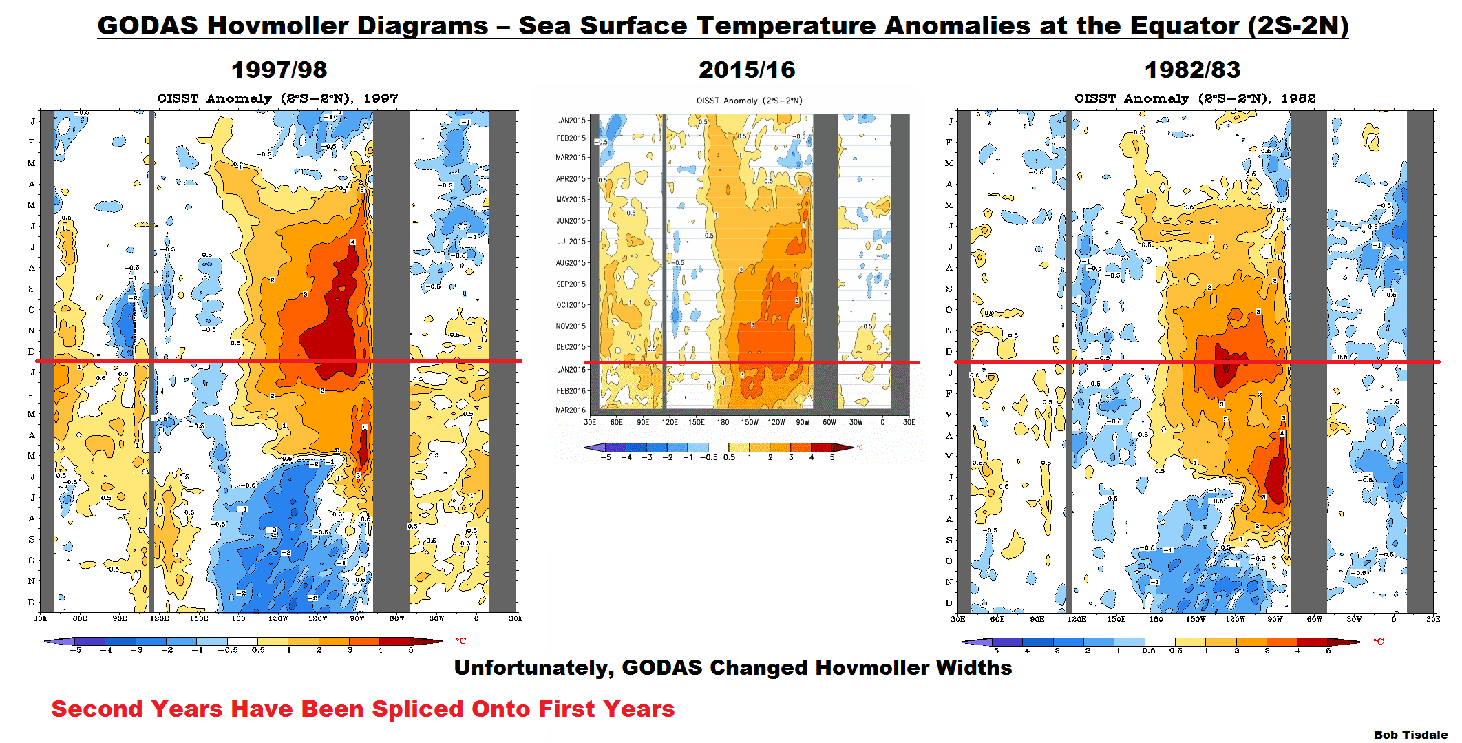
Figure 13
Notice the extremely high sea surface temperature anomalies in the eastern equatorial Pacific got during the peak of the 1997/98 El Niño. While the sea surface temperatures in 2015/16 have reached well above threshold of a strong El Niño, they’re still well behind those of the 1997/98 El Niño…especially east of 120W (to about 90W), where sea surface temperature anomalies were more than 4.0 deg C. In 1982/83, sea surface temperature anomalies also reached 4.0 deg C, but we never reached those values in 2015/16.
That is, as noted earlier, the 1997/98 was a stronger East Pacific El Niño than the 2015/16 event.
ON THE POCKET OF WARM WATER SOUTH OF THE EQUATOR
Animation 1 is Animation 3 from the December update. It shows maps of the depth-averaged temperature anomalies to 300 meters (a.k.a. T300 anomalies), running from the pentads centered on January 3, 2015 to November 29, 2015. We can see the impacts of the Kelvin waves that carried additional warm water along the Cromwell Current from the western tropical Pacific to the eastern equatorial Pacific.

Animation 1
In Animation 2, I’ve included the T300 maps from November 29, 2015 to March 4, 2016, and highlighted and paused on the most recent map.

Animation 2
As you’ll note, a good portion of the warm water that had been below the equator has now migrated south of it. It seems as though the most recent downwelling Kelvin wave (initiated by the January 2016 westerly wind burst) split the warm pocket of water along the equator, sending some north of the equator, but most south.
The relocated subsurface warm waters show up in the Sea Level Anomalies maps from NOAA GODAS, too. See the left-hand map in Figure 14.

Figure 14
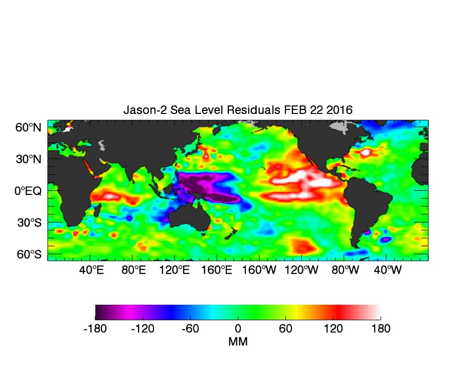
And as shown in Figure 15, it also appears in the most recent map (February 22, 2016) of sea level residuals from the JPL Latest El Niño/La Niña Watch Data Archive webpage, specifically here. I’ve highlighted the equator.

Figure 15
A Reference: After the 1997/98 El Niño, the leftover warm water was focused north of the equator, and a slow moving Rossby wave (at about 10N) carried that leftover warm water west, creating what appeared to be El Niño-like conditions in the northwestern tropical Pacific in late 1998 while the La Niña was taking place along the equator. See Animation 3, which is Animation 3-1 from my ebook Who Turned on the Heat? (Book linked later in the post.)
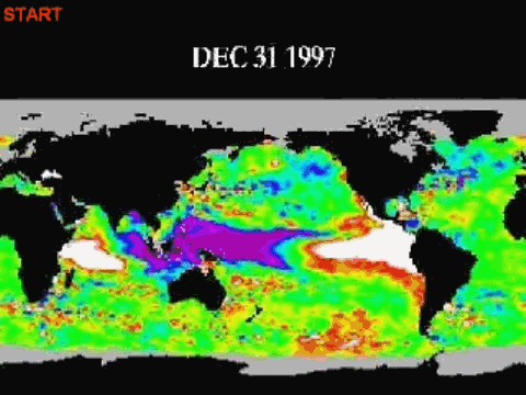
Animation 3
All of that leftover warm subsurface water from the 1997/98 El Nino, along with the leftover warm surface waters, caused the sea surface temperatures of the South Atlantic, Indian and West Pacific oceans to shift upwards at the end of the 1997/98 El Niño. See Figure 16, which is from the most recent sea surface temperature update. That subset covers more than 50% of the surfaces of the global oceans. All of the warm water released by and created by an El Niño doesn’t simply disappear at its end as the climate seance community would like you to believe. It creates what we’ve been calling Trenberth “big jumps” .

Figure 16
I suspect now (don’t know for sure, though), with a good portion of that leftover warm water from the 2015/16 El Niño being located south of the equator, we’ll see it migrate west (slowly), reach the Solomon Islands and then maybe get deflected or drawn back into the eastward-flowing equatorial undercurrent (Cromwell current).
As you’ll recall, we saw something similar during the evolution of the El Niño conditions of 2014. See the posts here and here. Then, a pocket of warm water split off south from the equator near the dateline, migrated west, and then fed back into the equator. That second surge of warm water was then carried east, helping to create the weak El Niño conditions that were reached in 2014/15.
On the other hand, the subsurface western tropical Pacific is much cooler now than it was in mid-2014, but there’s a larger pocket of leftover warm water now.
Will that leftover warm water from the 2015/16 El Niño be drawn back to the equator and suppress a 2016/17 La Niña? Or will there be enough warm water recirculated back to the equator for a weak El Niño to develop for 2016/17…thus making the NOAA CFS..v2 forecast come true? Or will that leftover warm water simply avoid the equator, rising to the surface somewhere else…like the South Pacific Convergence Zone (SPCZ)?
We’ll need to keep an eye on it…and as with all things ENSO, it will take place over many months. So we’ve got lots of time to speculate about what might happen.
EL NIÑO REFERENCE POSTS
For additional introductory discussions of El Niño processes see:
- An Illustrated Introduction to the Basic Processes that Drive El Niño and La Niña Events
- El Niño and La Niña Basics: Introduction to the Pacific Trade Winds
- La Niñas Do NOT Suck Heat from the Atmosphere
- ENSO Basics: Westerly Wind Bursts Initiate an El Niño
Also see the entire 2014-15 El Niño series. We discussed a wide-range of topics in those posts.
WANT TO LEARN MORE ABOUT EL NIÑO EVENTS AND THEIR AFTEREFFECTS?
My ebook Who Turned on the Heat? goes into a tremendous amount of detail to explain El Niño and La Niña processes and the long-term aftereffects of strong El Niño events. Who Turned on the Heat? weighs in at a whopping 550+ pages, about 110,000+ words. It contains somewhere in the neighborhood of 380 color illustrations. In pdf form, it’s about 23MB. It includes links to more than a dozen animations, which allow the reader to view ENSO processes and the interactions between variables.
Last year, I lowered the price of Who Turned on the Heat? from U.S.$8.00 to U.S.$5.00. And the book sold well. It continues to do so this year.
A free preview in pdf format is here. The preview includes the Table of Contents, the Introduction, the first half of section 1 (which was provided complete in the post here), a discussion of the cover, and the Closing. Take a run through the Table of Contents. It is a very-detailed and well-illustrated book—using data from the real world, not models of a virtual world. Who Turned on the Heat? is only available in pdf format…and will only be available in that format. Click here to purchase a copy.
My sincerest thanks to everyone who has purchased a copy of Who Turned on the Heat? as a result of the El Niño posts in 2014 and from this year’s El Nino series.
A NEW BOOK AND IT’S FREE
I also published On Global Warming and the Illusion of Control (25MB .pdf) back in November. The introductory post is here. It also includes detailed discussions of El Niño events and their aftereffects…though not as detailed as in Who Turned on the Heat?


https://www.climate.gov/news-features/blogs/enso/spring-predictability-barrier-we%E2%80%99d-rather-be-spring-break
So yeah, given the predictions presented above not much to be concluded yet, but from now on until the start of summer it will get interesting.
Reblogged this on WeatherAction News.
Pingback: ENSO-Update Februar 2016: El Niño geht – La Niña kommt – wobleibtdieglobaleerwaermung
Thanks bob.
You can see the ‘split’ in the sea surfaces height anamoly

http://sealevel.jpl.nasa.gov/science/datasources/ssha/archive/
Thank you, Alec aka Daffy Duck. That shows a greater split.
PS:
Alec aka Daffy Duck, and according to the NOAA Real Time Multiple Ocean Reanalysis Intercomparison webpage…
http://www.cpc.ncep.noaa.gov/products/GODAS/multiora_body.html
…the “split” shows up only in the Southern Hemisphere to the depths of 150 meters:
Hmm, you made me poke around a bit more: 400m Anomoly seems to have the split

Odd, the link I posted above only appears as a faint little square but it works… It is a bin.gov.au page: http://www.bom.gov.au/cgi-bin/wrap_fwo.pl?IDYOC004.gif
Pingback: Global Sea Surface Temperature Responses to the 1997/98 and 2015/16 El Niño Events | Bob Tisdale – Climate Observations
Pingback: Global Sea Surface Temperature Responses to the 1997/98 and 2015/16 El Niño Events | Watts Up With That?
Bob, have you looked at this paper? It refers to a model that uses a heat reservoir in the North and a long-term rise in Antarctic temperatures that will then drive global temperatures rapidly upward towards the peak of a stadial warm period.
I speculate that the blob and possibly an Antarctic heat reservoir is at work here. They don’t identify the heat source but assume it is of oceanic origin.
http://science.sciencemag.org/content/334/6054/347.full
Thanks, Pamela. I’ll take a look.
Pingback: April 2016 ENSO Update – La Niña Alerts Issued for Later This Year and NINO1+2 SSTa Are Near Zero Deg C | Bob Tisdale – Climate Observations
Pingback: April 2016 ENSO Update – La Niña Alerts Issued for Later This Year and NINO1+2 SSTa Are Near Zero Deg C | Watts Up With That?
Pingback: May 2016 ENSO Update – The 2015/16 El Niño Has Reached Its End | Watts Up With That?
Pingback: May 2016 ENSO Update – The 2015/16 El Niño Has Reached Its End | Bob Tisdale – Climate Observations