
The title of the post, of course, assumes that an El Niño event will form this year and carry over into the next.
This post is intended for persons new to the topic of El Niño events—and for those who are familiar with them. It should help provide a number of different perspectives on the evolution of an El Niño and supplement our earlier post An Illustrated Introduction to the Basic Processes that Drive El Niño and La Niña Events.
For this post, we’ll primarily be discussing animations of data maps and subsurface cross sections from the NOAA Global Ocean Data Assimilation System (GODAS) website. We’ll also be looking at subsurface temperatures and anomalies from a couple of ECMWF reanalyses. Because there are a number of gif animations, the post may take a few moments to download. Also, you may need to click start the animations, especially if you’d like a closer view.
LOTS GOING ON BELOW THE SURFACE OF THE TROPICAL PACIFIC
If we look at an animation of NOAA GODAS sea surface temperature anomaly maps (Reynolds OI.v2 data), starting in January 2014 and produced at 5-day intervals, we’d be hard-pressed to tell that a moderate to strong El Niño event may be evolving. See the left-hand maps in Animation 1. But when we look at the (right-hand) maps of the subsurface temperature anomalies for the depths of 0-300 meters, we can see that something is happening below the surface. That something, traveling eastward along the equator, has caused subsurface temperature anomalies to increase. That something is called a downwelling Kelvin wave. And, yes, that’s Kelvin wave as in Lord Kelvin.

Animation 1
Kelvin waves along the equatorial Pacific come in two flavors: downwelling (warm) Kelvin waves and upwelling (cool) Kelvin waves. The downwelling and upwelling Kelvin waves generally alternate. The “warm” Kelvin waves are called downwelling because they push the thermocline down, and the opposite holds true for “cool” upwelling Kelvin waves. (I’ll discuss the thermocline is a few moments.) Figure 1 is a Hovmoller diagram from the NOAA weekly ENSO update dated March 31, 2014. (See their page 16.) Don’t be intimidated by the Hovmoller. It is a wonderful way to present data. The left-hand (y) axis is time (a year), with the most recent week at the bottom. The bottom (x) axis presents the longitudes of the equatorial Pacific. South America would be to the right and Indonesia to the left. The subsurface temperature anomalies (for the top 300 meters) are color-coded with warm anomalies in red and cool anomalies in blue. The dashed lines highlight the (warm) downwelling Kelvin waves and the dotted lines highlight the (cool) upwelling Kelvin waves. Since August of 2013, there have been 3 (warm) downwelling Kelvin waves and 2 (cool) upwelling Kelvin waves. The first two downwelling Kelvin waves in the Hovmoller were relatively weak, and they occurred a little late in the 2013 season, so they did not result in an El Niño event. The most recent downwelling Kelvin wave is a reasonably strong one, and it’s at the right time of the year, leading to the thoughts that a strong El Niño will form this year.

Figure 1
Cross sections of subsurface temperature anomalies along the equator are presented in Animation 2. From this perspective, it’s as if they sliced the Earth open at the equator and we’re viewing the temperature anomalies of the equator below the surface, looking toward the north. Again, these cross sections are available from the NOAA GODAS website. The Pacific is in the center cross section (with the Indian Ocean to the left, and the Atlantic to the right). The vertical axis is depth. The vast majority of El Niño- and La Niña-related processes take place in the top 300 meters (984 feet). Also keep in mind that the Pacific stretches more than 17,000 km (about 11,000 miles), almost halfway around the globe, at the equator. In other words, the distances and depths are not proportional in those cross sections and can’t be if they’re going to be informative.
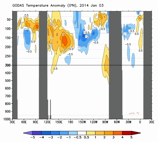
Animation 2
Notice how the subsurface temperature anomalies grow stronger along the equatorial Pacific as the Kelvin wave travels east. That’s because the climatology (the average reference temperatures from which the anomalies are calculated) has cooler temperatures in the eastern equatorial Pacific. As an example, see the annual GODAS climatology for those subsurface temperatures in Figure 2.

Figure 2
I was hoping to animate the Kelvin wave working its way east using absolute temperatures, not anomalies, just to give you a better idea of what’s taking place. Unfortunately, as far as I know, GODAS only has cross sections using anomalies; that is, they do not also present the subsurface temperatures in absolute form. And the latest month of the ECMWF ORA-S4 Reanalysis is February 2014, so that wouldn’t be very helpful to us now.
Luckily, somewhere along the line, I created an animation of subsurface temperature data (anomalies and in absolute form) of the 1997/98 El Niño, using cross sections available from an earlier ECMW reanalysis. Animation 3 presents the ECMWF subsurface cross sections from December 1996 to April 1997 as anomalies (top cell) and in absolute form (bottom cell). This is just a small portion of the original animation.
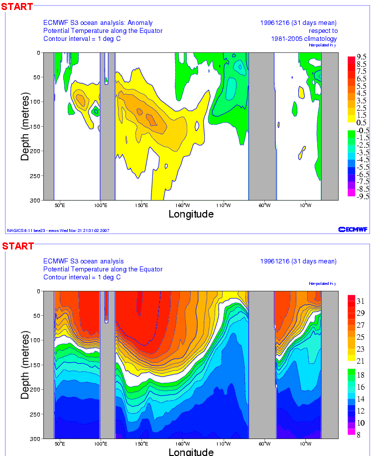
Animation 3
We can see the anomalies working their way eastward in the top cell of Animation 3 as the Kelvin wave(s) travels east. (See the note below.) In the bottom cell of Animation 3, we can see how the Kelvin waves depress the thermocline, as they travel east. I suspect the little rebound we see halfway through in the lower cell occurred between the 2 Kelvin waves.
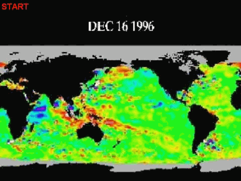
Note: There were actually 2 downwelling Kelvin waves that preceded the 1997/98 El Niño. See the portion of a JPL sea level residual animation here. The first downwelling Kelvin wave that started around Christmas of 1996 appears to have had little effect, but the second one a couple of months later definitely started the ball rolling. [End of Note.]
Recall earlier that we noted that a downwelling (warm) Kelvin wave pushes down on the thermocline. The thermocline is the boundary between the mixed waters (nearer the surface) and deep ocean waters. The thermocline (20 deg C) is highlighted in white in the lower cells of Animation 3.
WHAT INITIATED THE KELVIN WAVE THIS YEAR?
We recently discussed Westerly Wind Bursts in the post ENSO Basics: Westerly Wind Bursts Initiate an El Niño. The start of the 2014/15 El Niño (assuming it continues to form) is another classic example. See Figure 3. Two apparent westerly wind burst-like shifts in the zonal (east to west) winds can be seen in the left-hand Hovmoller diagram from GODAS. That is, the trade winds, which normally blow from east to west, suddenly and temporarily shifted to westerlies, blowing from west to east. I’m sure someone will eventually explain in a paper what weather event caused the westerly wind bursts.

Figure 3
THE KELVIN WAVE ISN’T VERY HIGH BUT IT SURE IS LONG
Without the magic of satellite altimetry, it would be impossible to sense the equatorial Kelvin wave as it traverses the Pacific from west to east. It’s incredibly long, but not very high. In Animation 4, the GODAS maps of sea level anomalies are on the left, and the maps of subsurface temperature anomalies for the top 300 meters are on the right.

Animation 4
As of March 29, the sea level anomalies map (Figure 4) is showing a positive anomaly of between 10 and 15 cm (about 4 to 6 inches) at the greatest contour levels along the Kelvin wave, and based on the 5 cm contour line, it stretches from about 165E to about 95W or about 11000 km (about 6900 miles). (See the NOAA Latitude-Longitude Distance Calculator.)

Figure 4
The processes taking place in the Pacific when an El Niño develops are enormous in scale.
AN INTERESTING PERSPECTIVE FROM ECMWF
The ECMWF ORA-S4 reanalysis also presents cross sections of average subsurface temperatures but on what they call a “YZ” perspective, which is as if they took large slices of the Pacific ocean running south to north and we’re viewing the average temperatures and anomalies facing west. Figure 5 shows the west and east Pacific coordinates they’re illustrating in the YZ plots.

Figure 5
The February 2014 reanalysis of the West Pacific (50S-50N, 130E-160W) subsurface temperature anomalies (left) and subsurface temperatures (right) are shown in Figure 6. South is to the left, north to the right and the equator is in the middle. The vertical axis is depth. The temperature scales are below each plot. The positive subsurface temperature anomalies associated with the downwelling Kelvin wave appear below the equator in the left-hand cell. The pocket of positive anomalies below the surface at about 10N should be the remnants of the downwelling Rossby wave returning the warm water to the west from an earlier downwelling Kelvin wave. I’ve included the plot of absolute temperatures on the right simply to put things in perspective.

Figure 6
The East Pacific (50S-50N, 160W-90W) subsurface temperature anomalies (left) and subsurface temperatures (right) for February 2014 are shown in Figure 7. The Kelvin wave hadn’t made it far enough to the east in February to make its presence known in these plots. In the right-hand cell of Figure 7, note how the warmer water does not reach as deep in the eastern Pacific as it does in the western Pacific shown in Figure 6. The trade winds push the warm water to the west where it “piles up”. The trade winds also help to draw cool water to the surface along the equator in the eastern Pacific in a process called upwelling.

Figure 7
NINO3.4 REGION SEA SURFACE TEMPERATURE UPDATE
The NINO3.4 region is bordered by the coordinates of 5S-5N, 170W-120W. See the illustration here for the location. The sea surface temperature anomalies there are a commonly used index for the strength (how warm or cool), frequency (how often they occur) and duration (how long they last) of El Niño and La Niña events. Based on the weekly Reynolds OI.v2 data for the week centered on April 2, 2014, the NINO3.4 sea surface temperature anomalies are presently at +0.38 deg C, which is below the +0.5 deg C threshold of El Niño conditions. See Figure 8.

Figure 8
Figure 8 is from the (most recent) March 2014 sea surface temperature anomaly update.
Hopefully, this post has helped to show how ridiculous it is to think that an ENSO index represents the processes of ENSO.
FUTURE POSTS
I’ll be updating the animations in future posts. I’ve downloaded the maps and cross sections so that I can add on the new ones to the ends of what has already been presented. (GODAS only animates for 3 months.) That way we can track the warm water, and continue to follow it during the La Niña that’s sure to follow.
I don’t believe I can establish a schedule for these posts. But I will update when something interesting happens that will help confirm the processes of El Niño discussed in An Illustrated Introduction to the Basic Processes that Drive El Niño and La Niña Events. Maybe I’ll prepare the next one when the NINO3.4 sea surface temperature anomalies cross the threshold of an El Niño and reach a reasonably warm value and when the trade winds in the western tropical Pacific reverse and become westerlies. We’ll see what happens.
Please feel free to suggest/request topics for upcoming posts.
ADDITIONAL READING
I went into much more detail to explain ENSO processes and the aftereffects of El Niño and La Niña events in my ebook Who Turned on the Heat? I’ve lowered the price of Who Turned on the Heat? from U.S.$8.00 to U.S.$5.00…with hope of increasing sales a little bit. A free preview in pdf format is here. The preview includes the Table of Contents, the Introduction, the first half of section 1 (which was provided complete in this post), a discussion of the cover, and the Closing. Take a run through the Table of Contents. It is a very-detailed and well-illustrated book—using data from the real world, not models of a virtual world. Who Turned on the Heat? is only available in pdf format…and will only be available in that format. Click here to purchase a copy. Thanks.
CLOSING COMMENT
It is unfortunate that NOAA budget cuts have resulted in reduced operation of the Tropical Ocean-Atmosphere (TOA) Project array of moored El Nino-monitoring buoys. See the Nature editorial Support our buoys. I understand from a follow-up Nature article El Niño tests forecasters that NOAA has “committed” to having most of the system operational by the end of the year, but, unfortunately, by that time, the El Niño will be near or at its peak intensity. I find it quite remarkable that federal budget cuts have caused the partial demise of such an important system. The array should not have been left to decay; it should be expanded to cover the entire tropical Pacific, not just the latitudes of 10S-10N, because El Niño- and La Niña-related processes take place within the tropical Pacific but outside of the latitudes presently being monitored by the TAO project. NOAA should be increasing, not decreasing, the budget of the Pacific Marine Environment Laboratory.


So watch SST change rate at 0 and 90W.
fhhaynie, not much happening in the NINO1+2 region. Sea surface temperature anomalies there are still below normal.

I’ll include NINO1+2 data in the future posts.
Cheers.
Thanks, Bob. Another great article with new techniques and learning opportunities.
This blog has a great view to the ocean!
Thanks Bob.
Agree on the priorities. Would be interesting to know how much they spend on “models”, “papers generated by models” and “papers on papers” compared to data-gathering such as buoys, Argot etc?
Sorry Bob, I think there is a mistake in the title. It must bei 2014/15 instead of 1914/15.
helmutU, thanks. Corrected. I must have been asleep when I wrote it.
Off topic but wanted to make sure you had seen this:
New Michael Mann paper:
“The true AMO signal, instead, appears likely to have been in a cooling phase in recent decades, offsetting some of the anthropogenic warming.”
http://onlinelibrary.wiley.com/doi/10.1002/2014GL059233/abstract
Press release
http://press-news.org/127589-slowdown-of-global-warming-fleeting.html
Alec, aka daffy duck, thanks. Another model-based study with Mann statistics thrown in? Oy vey!
Bob I was surprised how this Kelvin Wave developed. The East Pacific was cool, that gyre was pumping a lot of cold water into the area around the Equator, and the trade winds were active. But, all it took was for the wind to relax in the West and we got a Kelvin Wave. Looking at the Kelvin Wave, I notice something odd. The wave seems to get warmer without a connection to warmer water and without contact with the surface to get heat from the Sun. On the Animation 2 note the wave at 160W, 150 meters, Jan 18 – March 29; also, 90W – 120W at 300 meters, Feb 17 – March 24. I realize that this could be an artifact of how the data is presented, since it is presented as an anomaly, but I think something else is happening. Have you noticed this type of heating before? Do you know what temperatures are present at the bottom of the Kelvin Waves and what type of mixing occurs?
Retired Engineer John, refer to the climatology shown in Figure 2.
Now, back in the animation of the anomalies, notice how the strongest anomalies are occurring at the thermocline (or deeper), where the temperature is 20 Deg C absolute (or cooler). For the anomalies to be +5.0 deg C, that simply means some warm water at 25 deg C (or proportionally cooler) has shifted to where the climatology says it normally is 20 deg C (or cooler).
As a reference, here’s the full animation of the ECMWF cross sections for the 1997/98 El Nino and 1998/01 La Niña (anomalies on top and absolute on thebottom). The color scaling is a little different, but note how in November and December of 1997, the subsurface anomalies in the East Pacific exceeded the 9.5 deg maximum on the scale.

Regards
Pingback: The 2014/15 El Niño – Part 2 – The Alarmist Misinformation (BS) Begins | Bob Tisdale – Climate Observations
Pingback: The 2014/15 El Niño – Part 2 – The Alarmist Misinformation (BS) Begins | Watts Up With That?
Pingback: Peringatan: El-Nino Berpeluang besar terjadi tahun 2014 | Sediapayung's Weblog
Pingback: 2014/15 El Niño – Part 3 – Early Evolution – Comparison with 1982/83 & 1997/98 El Niño Events | Bob Tisdale – Climate Observations
Pingback: 2014/15 El Niño – Part 3 – Early Evolution – Comparison with 1982/83 & 1997/98 El Niño Events | Watts Up With That?
Pingback: El Nino watch | Climate Etc.
Pingback: The 2014/15 El Niño – Part 4 – Early Evolution – Comparison with Other Satellite-Era El Niños | Bob Tisdale – Climate Observations
Pingback: The 2014/15 El Niño – Part 4 – Early Evolution – Comparison with Other Satellite-Era El Niños | Watts Up With That?
Pingback: The 2014/15 El Niño – Part 5 – The Relationship Between the PDO and ENSO | Bob Tisdale – Climate Observations
Pingback: The 2014/15 El Niño – Part 5 – The Relationship Between the PDO and ENSO | Watts Up With That?
Hopefully, this post has helped to show how ridiculous it is to think that an ENSO index represents the processes of ENSO.
( True: It is global; but El Nino was initially limited to Peru Coast. Then came came the Southern Oscillation.
Then came the importance of the Pacific Ocean warm Pool. I do not what next!.)
Closing Comment: (Initially TOA project was called TOGA project. Met. Did not like it. They changed it. No Harm. But Fund cut harms all the world.)
Gopinathan Krishnan is a Scientist in India.
Gopinathan Krishnan says: “True: It is global; but El Nino was initially limited to Peru Coast.”
Man’s understanding of El Nino and our definition of it were initially limited to the Peru coast, but El Nino events existed before then. They are not a new phenomenon.
Regards.
Pingback: The 2014/15 El Niño – Part 6 – What’s All The Hubbub About?… | Bob Tisdale – Climate Observations
Pingback: The 2014/15 El Niño – Part 6 – What’s All The Hubbub About?… | Watts Up With That?
Pingback: The 2014/15 El Niño – Part 7 – May 2014 Update and What Should Happen Next | Bob Tisdale – Climate Observations
Pingback: The 2014/15 El Niño – Part 7 – May 2014 Update and What Should Happen Next | Watts Up With That?
Pingback: The 2014/15 El Niño – Part 8 – The Southern Oscillation Indices | Bob Tisdale – Climate Observations
Pingback: The 2014/15 El Niño – Part 8 – The Southern Oscillation Indices | Watts Up With That?
Pingback: Se pensi che si debba fare qualcosa, fallo! | Climatemonitor
Pingback: The 2014/15 El Niño – Part 9 – Kevin Trenberth is Looking Forward to Another “Big Jump” | Bob Tisdale – Climate Observations
Pingback: The 2014/15 El Niño – Part 9 – Kevin Trenberth is Looking Forward to Another “Big Jump” | Watts Up With That?
Pingback: The 2014/15 El Niño – Part 10 – June 2014 Update – Still Waiting for the Feedbacks | Bob Tisdale – Climate Observations
Pingback: The 2014/15 El Niño – Part 10 – June 2014 Update – Still Waiting for the Feedbacks | Watts Up With That?
Pingback: The 2014/15 El Niño – Part 11 – Is the El Niño Dying? | Bob Tisdale – Climate Observations
Pingback: The 2014/15 El Niño – Part 11 – Is the El Niño Dying? | Watts Up With That?
Pingback: The 2014/15 El Niño – Part 12 – July 2014 Update – The Feedbacks Need to Kick in Soon | Bob Tisdale – Climate Observations
Pingback: The 2014/15 El Niño – Part 12 – July 2014 Update – The Feedbacks Need to Kick in Soon | Watts Up With That?
Pingback: The 2014/15 El Niño – Part 13 – More Mixed Signals | Bob Tisdale – Climate Observations
Pingback: The 2014/15 El Niño – Part 13 – More Mixed Signals | Watts Up With That?
Pingback: The 2014/15 El Niño – Part 14 – Warm Water Recirculated? | Bob Tisdale – Climate Observations
Pingback: The 2014/15 El Niño – Part 14 – Warm Water Recirculated? | Watts Up With That?
I didn’t understand the anomaly gifs until I studied the absolute version you offered here. I was imagining warm submerged red blobs from the series of updates., which didn’t make physical sense to me.
Bob, you do such a great job of explaining this complex topic. I am just noting a human factors issue, that it was not obvious to this occasional reader about the implications of the ‘anomaly ‘ graphs.
Fine work, sir.
AC
Pingback: The 2014/15 El Niño – Part 15 – August 2014 Update – An El Niño Mulligan? | Bob Tisdale – Climate Observations
Pingback: The 2014/15 El Niño – Part 15 – August 2014 Update – An El Niño Mulligan? | Watts Up With That?
Pingback: The 2014 15 El Niño – Part 15 – September 2014 Update – Still Seeing Mixed Signals | Bob Tisdale – Climate Observations
Pingback: The 2014 15 El Niño – Part 15 – September 2014 Update – Still Seeing Mixed Signals | Watts Up With That?
Pingback: The 2014/15 El Niño – Part 18 – October 2014 Update – One Last Chance? | Bob Tisdale – Climate Observations
Pingback: The 2014/15 El Niño – Part 18 – October 2014 Update – One Last Chance? | Watts Up With That?
Pingback: The 2014 15 El Niño – Part 19 – Is an El Niño Already Taking Place? | Bob Tisdale – Climate Observations
Pingback: The 2014/15 El Niño – Part 19 – Is an El Niño Already Taking Place? | Watts Up With That?
Pingback: The 2014/15 El Niño – November Update – The Little El Niño That Shoulda’-Woulda’-Coulda’ | Bob Tisdale – Climate Observations
Pingback: The 2014/15 El Niño – Part 20 – November Update – The Little El Niño That Shoulda’-Woulda’-Coulda’ | Watts Up With That?
Pingback: Did ENSO and the “Monster” Kelvin Wave Contribute to the Record High Global Sea Surface Temperatures in 2014? | Bob Tisdale – Climate Observations