
With the publication of the IPCC 5th Synthesis Report, I thought there might be some interest in a presentation of how well (actually poorly) climate models simulate global mean surface temperatures in absolute terms. That is, most climate model outputs are presented in terms of anomalies, with data shown as deviations from the temperatures of a multi-decadal reference period. See Figure 1.

Figure 1
Rarely, are models and model-data comparisons shown in absolute terms. That’s what’s presented in this post after a discussion of the estimates of Earth’s absolute mean surface temperature from data suppliers: GISS, NCDC and BEST. Afterwards, we return to anomalies.
The following illustrations and most of the text were prepared for my upcoming book. I’ve changed the figure numbers for this post and reworded the introduction (the two paragraphs above). This presentation provides a totally different perspective on the differences between modeled and observed global mean surface temperatures. I think you’ll enjoy it…then again, others of you may not.
This chapter appears later in the book, following (1) the preliminary sections that cover the fundamentals of global warming and climate change, (2) the overview of climate models, (3) the introductory discussions about atmospheric and ocean circulation and natural modes of variability, and (4) the detailed discussions of datasets. It would be one of many model-data comparison chapters.
One last note, you’ll find chapters of the book without chapter numbers referenced as “Chapter ___”. I simply haven’t written those chapters yet, or I’ve written them but haven’t placed them in the final order.
[Start of book section.]
THE ELUSIVE ABSOLUTE GLOBAL MEAN SURFACE TEMPERATURE DISCUSSION AT GISS
Some of you may already know the origin of this chapter’s title. It comes from the GISS Surface Temperature Analysis Q&A webpage The Elusive Absolute Surface Air Temperature (SAT). The initial text on the webpage reads:
The GISTEMP analysis concerns only temperature anomalies, not absolute temperature. Temperature anomalies are computed relative to the base period 1951-1980. The reason to work with anomalies, rather than absolute temperature is that absolute temperature varies markedly in short distances, while monthly or annual temperature anomalies are representative of a much larger region. Indeed, we have shown (Hansen and Lebedeff, 1987) that temperature anomalies are strongly correlated out to distances of the order of 1000 km.
Based on the findings of Hansen and Lebedeff (1987) Global trends of measured surface air temperature, GISS created a dataset that uses land surface air temperature anomalies in place of sea surface temperature data. That is, GISS extended land surface air temperature data out over the oceans. GISS has replaced that older dataset with their GISS Land-Ocean Temperature Index, which uses sea surface temperature data for most parts of the oceans and serves as their primary product. They still use the 1200km extrapolation for infilling land surface areas and areas with sea ice where there are no observations-based data.
Back to the GISS Q&A webpage: After answering a few intermediate questions, GISS closes with (my boldface):
Q: What do I do if I need absolute SATs, not anomalies?
A: In 99.9% of the cases you’ll find that anomalies are exactly what you need, not absolute temperatures. In the remaining cases, you have to pick one of the available climatologies and add the anomalies (with respect to the proper base period) to it. For the global mean, the most trusted models produce a value of roughly 14°C, i.e. 57.2°F, but it may easily be anywhere between 56 and 58°F and regionally, let alone locally, the situation is even worse.
In other words, GISS is basing their understanding of global surface temperatures on climate models, specifically “the most trusted models”. And they are saying, based on those “most trusted” climate models, the average global mean surface temperature during their base period of 1951 to 1980 (their climatology) is roughly 14 deg C +/- 0.6 deg C.
The 14 deg C on that GISS webpage coincides with the value listed at the bottom of the webpage for the GISS Land-Surface Air Temperature Anomalies Only (Meteorological Station Data, dTs) data, which is based on Hansen and Lebedeff (1987). At the bottom of the webpage, they write:
Best estimate for absolute global mean for 1951-1980 is 14.0 deg-C or 57.2 deg-F, so add that to the temperature change if you want to use an absolute scale (this note applies to global annual means only, J-D and D-N!)
That’s the same adjustment for absolute temperatures that GISS recommends for their Land-Ocean Temperature Index. See the bottom of the data webpage here.
NOTE: Some people might think it’s odd that GISS uses of the same adjustment factor for both datasets. One of the GISS datasets (GISS dTs) extends coastal and island land surface air temperatures out over the oceans by 1200 km, while the other GISS dataset (GISS LOTI) uses sea surface temperature data for most of the global oceans. (With the LOTI data, GISS replaces sea surface temperature data with land surface air temperature data only in the polar oceans where sea ice has ever existed.) If we assume the coastal and island land surface temperatures are similar to those of marine air temperature, then the bias is only about 0.2 deg C, maybe a little greater. The average ICOADS absolute global sea surface temperature for the last 30 years (1984 to 2013) is 19.5 deg C (about 67.1 deg F), while their absolute global marine air temperature is 19.3 deg C (about 66.7 deg F). The reason for “maybe a little greater” is, shipboard marine air temperature readings can also be impacted by a “heat island effect”, and the ICOADS data have not been corrected for that heat island effect. [End of note.]
THE NCDC ESTIMATE IS SIMILAR THOUGH DERIVED DIFFERENTLY
NCDC also provides an estimate of absolute global mean temperature. See the Global Analysis webpage from their 2013 State of the Climate (SOTC) report. There they write under the heading of Global Highlights (my boldface):
The year 2013 ties with 2003 as the fourth warmest year globally since records began in 1880. The annual global combined land and ocean surface temperature was 0.62°C (1.12°F) above the 20th century average of 13.9°C (57.0°F).
And not too coincidentally, that 13.9 deg C (57.0 deg F) from NCDC (established from data as, you’ll soon see) agrees with the GISS value of 14.0 deg C (57.2 deg F), which might suggest that GISS’s “most trusted models” were tuned to the data-based value.
The source of that 13.9 deg C estimate of global surface temperature is identified on the NOAA Global Surface Temperature Anomalies webpages, specifically under the heading of Global Long-term Mean Land and Sea Surface Temperatures, which was written in 2000, so it’s 14 years old. Data have changed drastically in 14 years. Also, you may have noticed on that webpage that the absolute temperature averages are for the period of 1880 to 2000, and that NCDC uses the same 13.9 deg C (57 deg F) absolute value for the 20th Century. It’s not a concern. It’s splitting hairs. There is only a 0.03 deg C (0.05 deg F) difference in the average anomalies for those two periods.
Like GISS, NOAA describes problems with estimating an absolute global mean surface temperature:
Absolute estimates of global mean surface temperature are difficult to compile for a number of reasons. Since some regions of the world have few temperature measurement stations (e.g., the Sahara Desert), interpolation must be made over large, data sparse regions. In mountainous areas, most observations come from valleys where the people live so consideration must be given to the effects of elevation on a region’s average as well as to other factors that influence surface temperature. Consequently, the estimates below, while considered the best available, are still approximations and reflect the assumptions inherent in interpolation and data processing. Time series of monthly temperature records are more often expressed as departures from a base period (e.g., 1961-1990, 1880-2000) since these records are more easily interpreted and avoid some of the problems associated with estimating absolute surface temperatures over large regions. For a brief discussion of using temperature anomaly time series see the Climate of 1998 series.
It appears that the NCDC value is based on observations-based data, albeit old data, while the GISS value for a different period, based on climate models, is very similar. Let’s compare them in absolute terms.
COMPARISON OF GISS AND NCDC DATA IN ABSOLUTE FORM
NCDC Global Land + Ocean Surface Temperature data are available by clicking on the “Anomalies and Index Data” link at the top of the NCDC Global Surface Temperature Anomalies webpage. And the GISS LOTI data are available here.
Using the factors described above, Figure 2 presents the GISS and NCDC annual global mean surface temperatures in absolute form from their start year of 1880 to the most recent full year of 2013. The GISS data run a little warmer than the NCDC data, on average about 0.065 deg C (0.12 deg F) warmer, but all in all, they track one another. And they should track one another. They use the same sea surface temperature dataset (NOAA’s ERSST.v3b) and most of the land surface air temperature data is the same (from NOAA’s GHCN database). GISS and NCDC simply infill data differently (especially for the Arctic and Southern Oceans) and GISS uses a few more datasets to supplement regions of the world where GHCN sampling is poor.

Figure 2
ALONG COMES THE BEST GLOBAL LAND+OCEAN SURFACE TEMPERATURE DATASET WITH A DIFFERENT FACTOR
That’s BEST as in Berkeley Earth Surface Temperature, which is the product of Berkeley Earth. The supporting paper for their land surface air temperature data is Rohde et al. (2013) A New Estimate of the Average Earth Surface Land Temperature Spanning 1753 to 2011. In it, you will find they’ve illustrated the BEST land surface air temperature data in absolute form. See Figure 1 from that paper (not presented in this chapter).
Their climatology (reference temperatures for anomalies) was presented in the methods paper Rhode et al. (2013) Berkeley Earth Temperature Process, with the appendix here. Under the heading of Climatology, Rhode et al. write in their “methods” paper:
The global land average from 1900 to 2000 is 9.35 ± 1.45°C, broadly consistent with the estimate of 8.5°C provided by Peterson [29]. This large uncertainty in the normalization is not included in the shaded bands that we put on our Tavg plots, as it only affects the absolute scale and doesn’t affect relative comparisons. In addition, most of this uncertainty is due to the presence of only three GHCN sites in the interior of Antarctica, which leads the algorithm to regard the absolute normalization for much of the Antarctic continent as poorly constrained. Preliminary work with more complete data from Antarctica and elsewhere suggests that additional data can reduce this normalization uncertainty by an order of magnitude without changing the underlying algorithm. The Berkeley Average analysis process is somewhat unique in that it produces a global climatology and estimate of the global mean temperature as part of its natural operations.
It’s interesting that the Berkeley surface temperature averaging process furnishes them with an estimate of global mean land surface air temperatures in absolute form, while GISS and NCDC find it to be a difficult thing to estimate.
The reference to Peterson in the above Rhode et al. quote is Peterson et al. (2011) Observed Changes in Surface Atmospheric Energy over Land. 8.5 deg C (47 deg F) from Peterson et al. for absolute land surface air temperatures is the same value listed in the table under the heading of Global Long-term Mean Land and Sea Surface Temperatures on the NOAA Global Surface Temperature Anomalies webpages.
Berkeley Earth has also released data for two global land+ocean surface temperature products. The existence of sea ice is the reason for two. Land surface air temperature products obviously do not include ocean surfaces where sea ice resides, and sea surface temperatures do not include air temperatures above polar sea ice when and where it exists. Of the 361.9 million km^2 (about 139.7 million miles^2) total surface area of the global oceans, polar sea ice only covered on average about 18.1 million km^2 (about 6.9 million miles^2) annually for the period of 2000 to 2013). While polar sea ice only covers about 5% of the surface of the global oceans and only about 3.5% of the surface of the globe, the climate science community endeavors to determine the surface air temperatures there. That’s especially true in the Arctic where the naturally occurring process of polar amplification causes the Arctic to warm at exaggerated rates during periods when Northern Hemisphere surfaces warm (and cool at amplified rates during periods of cooling in the Northern Hemisphere). See the discussion of polar amplification in Chapter 1.18 and the model-data comparisons in Chapter ___.
[For those reading this blog post, see the posts Notes On Polar Amplification and Polar Amplification: Observations versus IPCC Climate Models.]
As of this writing, there is no supporting paper for the BEST land+ocean surface temperature data available from the Berkeley Earth Papers webpage and there is nothing shown for them on their Posters webpage. There is, however, an introductory discussion on the BEST data page for their combined product. The BEST land+ocean data is their land surface air temperature data merged with a modified version of HADSST3 sea surface temperature data, which they have infilled using a statistical method called Kriging. (See Kriging, written by Geoff Bohling of the Kansas Geological Survey.)
The annual Berkeley land+ocean sea surface temperature anomaly data are here, and their monthly data are here. Their reasoning for providing the two land+ocean products supports my discussion above. Berkeley Earth writes:
Two versions of this average are reported. These differ in how they treat locations with sea ice. In the first version, temperature anomalies in the presence of sea ice are extrapolated from land-surface air temperature anomalies. In the second version, temperature anomalies in the presence of sea ice are extrapolated from sea-surface water temperature anomalies (usually collected from open water areas on the periphery of the sea ice). For most of the ocean, sea-surface temperatures are similar to near-surface air temperatures; however, air temperatures above sea ice can differ substantially from the water below the sea ice. The air temperature version of this average shows larger changes in the recent period, in part this is because water temperature changes are limited by the freezing point of ocean water. We believe that the use of air temperatures above sea ice provides a more natural means of describing changes in Earth’s surface temperature.
The use of air temperatures above sea ice may provide a more realistic representation of Arctic surface temperatures during winter months when sea ice butts up against the land masses and when those land masses are covered with snow, so that the ice and land surfaces have similar albedos. However, during summer months the albedo of the sea ice can be different than those of the land masses (snow melts exposing the land surface surrounding temperature sensors and the albedo of land surfaces are different than those of sea ice). Open ocean also separates land from sea ice in many places, further compounding the problem. There is no easy fix.
Berkeley Earth also lists the estimated absolute surface temperatures during their base period for both products:
Estimated Jan 1951-Dec 1980 global mean temperature I
- Using air temperature above sea ice: 14.774 +/- 0.046
- Using water temperature below sea ice: 15.313 +/- 0.046
The estimated absolute global mean surface temperature using the air temperature above sea ice is about 0.5 deg C (0.9 deg F) cooler than the data where they used sea surface temperature data for sea ice. The models presented later in this chapter present surface air temperatures, so we’ll use the Berkeley data that use land air temperature above sea ice. It also agrees with the GISS LOTI data methods.
The sea surface temperature dataset used by Berkeley Earth (HADSST3) is provided only in anomaly form. And without a supporting paper, there is no documentation of how Berkeley Earth converted those anomalies into absolute values. The source ICOADS data and the HADISST and ERSST.v3b end products are furnished in absolute form, so one of them likely served as a reference.
COMPARISON OF BEST, GISS AND NCDC DATA IN ABSOLUTE FORM
The BEST, GISS and NCDC annual global mean surface temperatures in absolute form from their start year of 1880 to the most recent full year of 2013 are shown in Figure 3. The BEST data run warmer than the other two, but, as one would expect, the curves are similar.
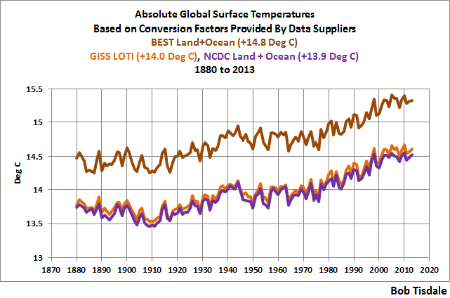
Figure 3
In Figure 4, I’ve subtracted the coolest dataset (NCDC) from the warmest (BEST). The difference has also been smoothed with a 10-year running-average filter (red curve). For most of the term, the BEST data in absolute terms is about 0.8 deg C (about 1.4 deg F) warmer than the NCDC estimate. The hump starting around 1940 and peaking about 1950 should be caused by the adjustments the UKMO has made to the HADSST3 data that have not been made to the NOAA ERSST.v3b data (used by both GISS and NCDC). Those adjustments were discussed in Chapter ____. I suspect the lesser difference at the beginning of the data is also related to the handling of sea surface temperature data, but there’s no way to tell for sure without access to the BEST-modified HADSST3 data. The recent uptick should be caused by the difference between how the two suppliers (BEST and NCDC) handle the Arctic Ocean data. Berkeley Earth extends land surface air temperature data out over the oceans, while NCDC excludes sea surface temperature data in the Arctic Ocean when there is sea ice and does not extend land-based data over the ice at those times.

Figure 4
And now for the models.
CMIP5 MODEL SIMULATIONS OF EARTH’S ABSOLUTE SURFACE AIR TEMPERATURES STARTING IN 1880
As we’ve discussed numerous times throughout this book, the outputs of the climate models used by the IPCC for their 5th Assessment Report are stored in the Climate Model Intercomparison Project Phase 5 archive, and those outputs are publically available to download in easy-to-use formats through the KNMI Climate Explorer. The CMIP5 surface air temperature outputs at the KNMI Climate Explorer can be found at the Monthly CMIP5 scenario runs webpage and are identified as “TAS”.
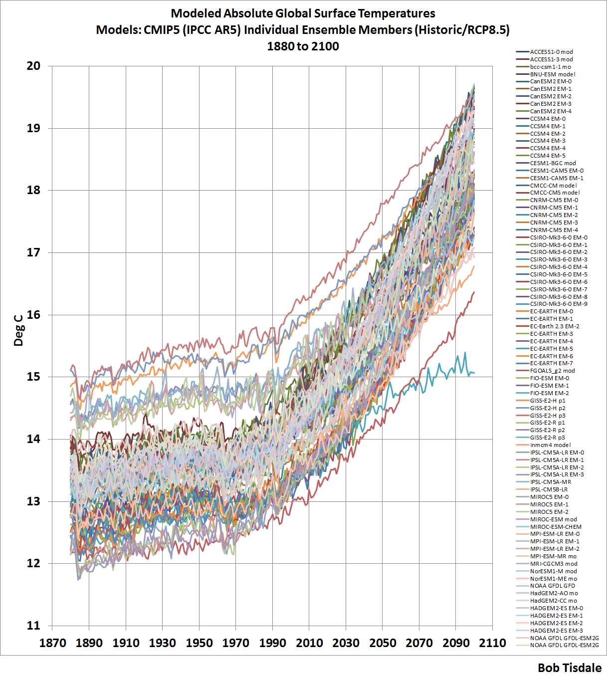
The model outputs at the KNMI Climate Explorer are available for the historic forcings with transitions to the different future RCP scenarios. (See Chapter 2.4 –Emissions Scenarios.) For this chapter, we’re presenting the historic and the worst-case future scenario, RCP8.5. We’re using the worst case scenario solely as a reference for how high surface temperatures could become, according to the models, if emissions of greenhouse gases rise as projected under that scenario. The use of the worst case scenario will have little impact on the model-data comparisons from 1880 to 2013. As you’ll recall, the future scenarios start for most models after 2005, others start later, so there’s very little difference between the model outputs for the different model scenarios in the first few years. Also, for this chapter, I downloaded the outputs separately for all of the individual models and their ensemble members. There are a total of 81 ensemble members from 39 climate models.
Note: The model outputs are available in absolute form in deg C (as well as deg K), so I did not adjust them in any way.
With that as background, Figure 5 is a spaghetti graph showing the CMIP5-archived outputs of the climate model simulations of global surface air temperatures from 1880 to 2100, with historic and RCP8.5 forcings. A larger version of the graph with a listing of all of the ensemble members is available here.

Figure 5
Whatever the global mean surface temperature is now, or was in the past, or might be in the future, the climate models use by the IPCC for their 5th Assessment Report certainly have it surrounded.
Some people might want to argue that absolute temperatures are unimportant—that we’re concerned about the past and future rates of warming. We can counter that argument two ways: First, we’ve already seen in Chapters CMC-1 and -2 that climate models do a very poor job of simulating surface temperatures from 1880 to the 1980s and from the 1980s to present. Additionally, in Section ___, we’ll discuss model failings in a lot more detail. Second, absolute temperatures are important for another reason. Natural and enhanced greenhouse effects depend on the infrared radiation emitted from Earth’s surface, and the amount of infrared radiation emitted to space by our planet is a function of its absolute surface temperature, not anomalies.
As shown above in Figure 5, the majority of the models start off at absolute global mean surface air temperatures that range from near 12.2 deg C (54.0 deg F) to about 14.0 deg C (57.0 deg F). But with the outliers, that range runs from 12.0 deg C (53.5 deg F) to 15.0 deg C (59 deg F). The range of the modeled absolute global mean temperatures is easier to see if we smooth the model outputs with 10-year filters. See Figure 6.

Figure 6
We could reduce the range by deleting outliers, but one problem with deleting outliers is the warm ones are relatively close to the more-recent (better?) estimate of Earth’s absolute temperature from Berkeley Earth. See Figure 7, in which we’ve returned to the annual, not the smoothed, outputs.
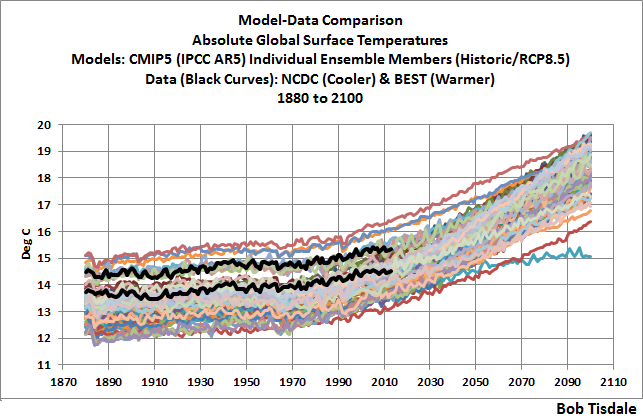
Figure 7
The other problem with deleting outliers is, the IPCC is a political body, not a scientific one. As a result, that political body includes models from agencies around the globe, even those that perform worse than (the bad performance of) the others, further dragging down the group as a whole.
With those two things considered, we’ll retain all of the models in this presentation, even the obvious outliers.
Looking again at the broad range of model simulations of global mean surface temperatures in Figure 5 above, there appears to be at least a 3 deg C (5.4 deg F) span between the coolest and the warmest. Let’s confirm that.
For Figure 8, I’ve subtracted the coolest modeled global mean temperature from the warmest in each year, from 1880 to 2100. For most of the period between 1880 and 2030, the span from coolest to warmest modeled surface temperature is greater than 3 deg C (5.4 deg F).

Figure 8
That span helps to highlight something we’ve discussed a number of times in this book: the use of the multi-model ensemble-member model mean, the average of all of the runs from all of the climate models. There is only one global mean surface temperature, and the estimates of it vary. There are obviously better and worse simulations of it, whatever it is. Does averaging the model simulations provide us with a good answer? No.
But the average, the multi-model mean, does provide us with something of value. It shows us the consensus, the groupthink, behind the modeled global mean surface temperatures and how those temperatures would vary, if (big if) they responded to the forcings used to drive climate models. And as we’ll see, the observed surface temperatures do not respond to those forcings as they are simulated by the models.
MODEL-DATA COMPARISONS
Because of the differences between the newer (BEST) and the older (GISS and NCDC) estimates of absolute global mean temperature, they’ll be presented separately. And because the GISS and NCDC data are so similar, we’ll use their average. Last, for the comparisons, we won’t present all of the ensemble members as a spaghetti graph. We’ll present the maximum, mean and minimums.
With that established, Figure 9 compares the average of the GISS and NCDC estimates of absolute global mean surface temperatures to the maximum, mean and minimum of the modeled temperatures. The model mean is reasonably close to the GISS and NCDC estimates of absolute global mean surface temperatures, with the model mean averaging about 0.37 deg C (0.67 deg F) cooler than the data for the period of 1880 to 2013.

Figure 9
In Figure 10, the BEST (newer = better?) estimate of absolute global mean surface temperatures from 1880 to 2013 is compared to the maximum, mean and minimum of the modeled temperatures. In this case, the BEST estimate is closer to the maximum and farther from the model mean than they were with the GISS and NCDC estimates. The model mean averages about 1.14 deg C (about 2.04 deg F) cooler than the BEST estimate for the period of 1880 to 2013.

Figure 10
MODEL-DATA DIFFERENCE
In the next two graphs, we’ll subtract the data-based estimates of Earth’s absolute global mean surface temperatures from the model mean of the CMIP5 simulations. Consider this when viewing the upcoming two graphs: if the average of the models properly simulated the decadal and multidecadal variations in Earth’s surface temperature, but simply missed the mark on the absolute value, the difference between the models and data would be a flat horizontal line that’s offset by the difference.
Figure 11 presents the difference between the model mean of the simulations of Earth’s surface temperatures and the average of the GISS and NCDC estimates, with the data subtracted from the models. The following discussion keys off the 10-year average, which is also presented in red.

Figure 11
The greatest difference between models and data occurs in the 1880s. The difference decreases drastically from the 1880s to the 1910s. The reason: the models do not properly simulate the observed cooling that takes place at that time. The model-data difference grows once again from the 1910s until about 1940. That indicates, because the models failed to properly simulate the cooling from the 1880s to the 1910s, they also failed to properly simulate the warming that took place from the 1910s until 1940. The difference cycles until the 1990s, with the difference gradually increasing again. And from the 1990s to present, because of the hiatus, the difference has decreased to smallest value since 1880.
In Figure 12, the difference between the BEST estimate of Earth’s surface temperature and the model mean of the simulations of it is shown. The curve is similar to the one above for the GISS and NCDC data. The BEST global temperature data show less cooling from the 1880s to the 1910s, and as a result there is not as great a decrease in the temperature difference between models and data. But there is still a major increase in the difference from the 1910s to about 1940, when the models fail to properly simulate the warming that took place then. And, of course, the recent hiatus has caused there to be another decrease in the temperature difference.

Figure 12
CHAPTER SUMMARY
There is about a 0.8 deg C (about 1.4 deg F) span in the estimates of absolute global mean surface temperatures, with the warmer estimate coming from the more recent estimate based on a more up-to-date global surface temperature databases. In other words, the BEST (Berkeley Earth) estimate seems more likely than the outdated GISS and NCDC values.
There is a much larger span in the climate model simulations of absolute global surface temperatures, averaging about 3.15 deg C (about 5.7 deg F) from 1880 to 2013. To put that into perspective, starting in the 1990s, politicians have been suggesting we limit the warming of global surface temperatures to 2.0 deg C (3.6 deg F). Or another way to put that 3.15 deg C (about 5.7 deg F) model span into perspective, consider that, in the IPCC’s 4th Assessment Report, they basically claimed that all the global warming from 1975 to 2005 was caused by manmade greenhouse gases. That claim was based on climate models that cannot simulate natural variability, so it was a meaningless claim. Regardless, global surface temperatures had only warmed about 0.55 deg C (1.0 deg F) between 1975 and 2005, based on the average of the linear trends of the BEST, GISS and NCDC data.
And the difference between modeled and observed absolute global mean surface temperature was yet another way to show how poorly global surface temperatures are simulated by the latest-and-greatest climate models used by the IPCC for their 5th Assessment Report.
BUT
Sometimes we can learn something else by presenting data as anomalies. For Figures 13 and 14, I’ve offset the model-data differences by their respective 1880-2013 averages. That converts the absolute differences to anomalies. We use average of the full term of the data as a reference to assure that we’re not biasing the results by the choice of the time period. In other words, no one can complain that we’ve cherry-picked the reference years. Keying off the 10-year averages (red curves) helps to put the impact of the recent hiatus into perspective.
Keep in mind, if the models properly simulated the decadal and multidecadal variations in Earths surface temperatures, the difference would be a flat line, and in the following two cases, those flat lines would be at zero anomaly.
For the average of the GISS and NCDC data, Figure 13, because of the recent hiatus in surface warming, the divergence between models and data today is the worst it has been since about 1890.

Figure 13
And looking at the difference between the model simulations of global mean temperature and the BEST data, Figure 14, as a result of the hiatus, the model performance during the most recent 10-year period is worst it has ever been at simulating global surface temperatures.

Figure 14
[End of book chapter.]
If you were to scroll back up to Figure 7, you’d note that there is a small subset of model runs that underlie the Berkeley Earth estimate of absolute global mean temperature. They’re so close it would seem very likely that those models were tuned to those temperatures.
Well, I thought you might be interested in knowing whose models they were. See Figure 15. They’re the 3 ensemble members of the MIROC5 model from the International Centre for Earth Simulation (ICES Foundation), and the 3 ensemble members of the GISS ModelE2 with Russell Ocean (GISS-E2-R).

Figure 15
That doesn’t mean the MIROC5 and GISS-E2-R are any better than the other models. As far as I know, like all the other models, the MIROC5 and GISS-E2-R still cannot simulate the coupled ocean-atmosphere processes that can cause global surface temperatures to warm over multidecadal periods or stop that warming, like the AMO and ENSO. As noted above, their being closer to the updated estimate of Earth’s absolute temperature simply suggests those two models were tuned to it. Maybe GISS should consider updating their 14.0 deg C estimate of absolute global surface temperatures for their base period.
Last, we’ve presented climate model failings in numerous ways over the past few years. Topics discussed included:
- Global Precipitation
- Satellite-Era Sea Surface Temperatures
- Global Surface Temperatures (Land+Ocean) Since 1880
- Global Land Precipitation & Global Ocean Precipitation
Those posts were also cross posted at WattsUpWithThat.
Just in case you want to know a whole lot more about climate model failings and can’t wait for my upcoming book, which I don’t anticipate finishing for at least 5 or 6 months, I expanded on that series and presented the model faults in my last book Climate Models Fail.


Reblogged this on leclinton and commented:
Thank you Bob for all you do ;>)
Reblogged this on CraigM350 and commented:
Thanks Bob.
Mr. Tisdale, looking at figure 10 (models versus berkeley earth) we can see the models run slightly cooler. The cooler models must have a slower water cycle, lower humidity, and lower water vapor fraction in the lower atmosphere…so here’s a question I was pondering: does the lower amount of water vapor lead to less model cloud formation and/or a more positive cloud feedback?
I bring this up because running a cooler model seems to be a nifty method to lower water vapor concentration, which in turn allows tricking cloud feedback, which in turn ought to yield a higher climate sensitivity. Or am I looking at this wrong?
Fernando Leanme, sorry, I can’t answer your questions. The only persons who know for sure what happens inside the models are the people who wrote the programs.
Thanks, Bob, for this very wide look at the arts of measuring and modeling global temperatures.
I especially liked your “Whatever the global mean surface temperature is now, or was in the past, or might be in the future, the climate models use by the IPCC for their 5th Assessment Report certainly have it surrounded.”
“Surrounded”, Bob, would imply that that value is enclosed by the values of their estimates, projections, predictions, etc. In reality, they’re not even in the same Universe 😉
Thanks again, Bob.
I now have an article on the Berkeley Earth Land + Ocean Data anomaly dataset (with graphic).
Actually the title would more appropriately be a model versus data based model comparison.
Pingback: Seven Years Ago, An IPCC Lead Author Exposed the Critical Weakness of the IPCC Foretelling Tools | Bob Tisdale – Climate Observations
Pingback: Seven Years Ago, An IPCC Lead Author Exposed Critical Weaknesses of the IPCC Foretelling Tools | Watts Up With That?
Pingback: October 2014 Global Surface (Land+Ocean) and Lower Troposphere Temperature Anomaly & Model-Data Difference Update | Bob Tisdale – Climate Observations
Pingback: Quando clima e tempo sono in un mare di byte | Climatemonitor
Pingback: Interesting Post at RealClimate about Modeled Absolute Global Surface Temperatures | Bob Tisdale – Climate Observations
Pingback: Interesting Post at RealClimate about Modeled Absolute Global Surface Temperatures | Watts Up With That?
Pingback: Interesting Post at RealClimate about Modeled Absolute Global Surface Temperatures * The New World
Pingback: January 2015 Global Surface (Land+Ocean) and Lower Troposphere Temperature Anomaly & Model-Data Difference Update | Watts Up With That?
Pingback: Climate Propaganda from the Australian Academy of Science | Bob Tisdale – Climate Observations
Pingback: Climate Propaganda from the Australian Academy of Science | Watts Up With That?
Pingback: February 2015 Global Surface (Land+Ocean) and Lower Troposphere Temperature Anomaly & Model-Data Difference Update | Watts Up With That?
Pingback: February 2015 Global Surface (Land+Ocean) and Lower Troposphere Temperature Anomaly & Model-Data Difference Update | US Issues
Pingback: Open Letter to U.S. Senators Ted Cruz, James Inhofe and Marco Rubio | Bob Tisdale – Climate Observations
Pingback: Open Letter to U.S. Senators Ted Cruz, James Inhofe and Marco Rubio | Watts Up With That?
Pingback: March 2015 Global Surface (Land+Ocean) and Lower Troposphere Temperature Anomaly & Model-Data Difference Update | Watts Up With That?
Pingback: What Animals Are Likely to Go Extinct First Due to Climate Change? | Bob Tisdale – Climate Observations
Pingback: What Animals Are Likely to Go Extinct First Due to Climate Change? | Watts Up With That?
Pingback: April 2015 Global Surface (Land+Ocean) and Lower Troposphere Temperature Anomaly & Model-Data Difference Update | Watts Up With That?
Pingback: May 2015 Global Surface (Land+Ocean) and Lower Troposphere Temperature Anomaly & Model-Data Difference Update | Watts Up With That?
Pingback: Both NOAA and GISS Have Switched to NOAA’s Overcooked “Pause-Busting” Sea Surface Temperature Data for Their Global Temperature Products | Watts Up With That?
Pingback: No Consensus: Earth’s Top of Atmosphere Energy Imbalance in CMIP5-Archived (IPCC AR5) Climate Models | Bob Tisdale – Climate Observations
Pingback: No Consensus: Earth’s Top of Atmosphere Energy Imbalance in CMIP5-Archived (IPCC AR5) Climate Models | Watts Up With That?
Pingback: July 2015 Global Surface (Land+Ocean) and Lower Troposphere Temperature Anomaly & Model-Data Difference Update | Watts Up With That?
Pingback: July 2015 Global Surface (Land+Ocean) and Lower Troposphere Temperature Anomaly & Model-Data Difference Update | US Issues
Pingback: August 2015 Global Surface (Land+Ocean) and Lower Troposphere Temperature Anomaly & Model-Data Difference Update | Watts Up With That?
Pingback: September 2015 Global Surface (Land+Ocean) and Lower Troposphere Temperature Anomaly & Model-Data Difference Update | Watts Up With That?
Pingback: October 2015 Global Surface (Land+Ocean) and Lower Troposphere Temperature Anomaly & Model-Data Difference Update | Watts Up With That?
Pingback: November 2015 Global Surface (Land+Ocean) and Lower Troposphere Temperature Anomaly & Model-Data Difference Update | Watts Up With That?
Pingback: Los modelos climáticos son muy peculiares | PlazaMoyua.com
Pingback: January 2016 Global Surface (Land+Ocean) and Lower Troposphere Temperature Anomaly Update | Watts Up With That?
Pingback: February 2016 Global Surface (Land+Ocean) and Lower Troposphere Temperature Anomaly Update | Watts Up With That?
Pingback: March 2016 Global Surface (Land+Ocean) and Lower Troposphere Temperature Anomaly Update | Watts Up With That?
Pingback: April 2016 Global Surface (Land+Ocean) and Lower Troposphere Temperature Anomaly Update | Watts Up With That?
Pingback: May 2016 Global Surface (Land+Ocean) and Lower Troposphere Temperature Anomaly Update | Watts Up With That?
Pingback: In Honor of Secretary of State John Kerry’s Global Warming Publicity-Founded Visit to Greenland… | Bob Tisdale – Climate Observations
Pingback: In Honor of Secretary of State John Kerry’s Global Warming Publicity-Founded Visit to Greenland… | Watts Up With That?
Pingback: In Honor of the 4th of July, A Few Model-Data Comparisons of Contiguous U.S. Surface Air Temperatures | Bob Tisdale – Climate Observations
Pingback: In Honor of the 4th of July, A Few Model-Data Comparisons of Contiguous U.S. Surface Air Temperatures | Watts Up With That?
Very interesting work, but please compare your figure 15 with the figure of the IPCC-report 2007, SPM, look here: https://www.klimamanifest-von-heiligenroth.de/wp/wp-content/uploads/2016/07/IPCC_GlobaleMitteltemperatur_2007_4.jpg
Klimamanifest_2007 (@Klima_Manifest), the graph you’ve shown is more in line with the NCDC/GISS values.
Pingback: June 2016 Global Surface (Land+Ocean) and Lower Troposphere Temperature Anomaly Update | Bob Tisdale – Climate Observations
Pingback: June 2016 Global Surface (Land+Ocean) and Lower Troposphere Temperature Anomaly Update | Watts Up With That?
Pingback: July 2016 Global Surface (Land+Ocean) and Lower Troposphere Temperature Anomaly Update | Bob Tisdale – Climate Observations
Pingback: July 2016 Global Surface (Land+Ocean) and Lower Troposphere Temperature Anomaly Update | Watts Up With That?
Pingback: NOAA’s New Climate Explorer – NOAA Needs to Provide a Disclaimer for Their Climate Model Presentations | Bob Tisdale – Climate Observations
Pingback: NOAA’s New Climate Explorer – NOAA Needs to Provide a Disclaimer for Their Climate Model Presentations | Watts Up With That?
Pingback: August 2016 Global Surface (Land+Ocean) and Lower Troposphere Temperature Anomaly Update | Bob Tisdale – Climate Observations
Pingback: August 2016 Global Surface (Land+Ocean) and Lower Troposphere Temperature Anomaly Update | Watts Up With That?
Pingback: September 2016 Global Surface (Land+Ocean) and Lower Troposphere Temperature Anomaly Update | Bob Tisdale – Climate Observations
Pingback: September 2016 Global Surface (Land+Ocean) and Lower Troposphere Temperature Anomaly Update | Watts Up With That?
Pingback: October 2016 Global Surface (Land+Ocean) and Lower Troposphere Temperature Anomaly Update | Watts Up With That?
Pingback: October 2016 Global Surface (Land+Ocean) and Lower Troposphere Temperature Anomaly Update | Bob Tisdale – Climate Observations
Pingback: November 2016 Global Surface (Land+Ocean) and Lower Troposphere Temperature Anomaly Update | Bob Tisdale – Climate Observations
Pingback: November 2016 Global Surface (Land+Ocean) and Lower Troposphere Temperature Anomaly Update | Watts Up With That?
Pingback: December 2016 Global Surface (Land+Ocean) and Lower Troposphere Temperature Anomaly Update – With a Look at the Year-End Annual Results | Bob Tisdale – Climate Observations
Pingback: What Was Earth’s Preindustrial Global Mean Surface Temperature, In Absolute Terms Not Anomalies, Supposed to Be? | Watts Up With That?
Pingback: What Was Earth’s Preindustrial Global Mean Surface Temperature, In Absolute Terms Not Anomalies, Supposed to Be? | Bob Tisdale – Climate Observations
Pingback: What Was Earth’s Preindustrial Global Mean Surface Temperature, In Absolute Terms Not Anomalies, Supposed to Be? |
Pingback: So What Was The Perfect Pre-Industrial Global Temperature? | New Life Narrabri
Pingback: “…it is the change in temperature compared to what we’ve been used to that matters.” – Part 1 | Watts Up With That?
Pingback: “…it is the change in temperature compared to what we’ve been used to that matters.” – Part 1 | Bob Tisdale – Climate Observations
Pingback: “…it is the change in temperature compared to what we’ve been used to that matters.” – Part 1 |
Pingback: "…it's the change in temperature in comparison with what we've been used to that issues." – Half 1 | Tech News
Pingback: “…it is the change in temperature compared to what we’ve been used to that matters.” – Part 2 | Watts Up With That?
Pingback: “…it is the change in temperature compared to what we’ve been used to that matters.” – Part 2 | Bob Tisdale – Climate Observations
Pingback: “…it is the change in temperature compared to what we’ve been used to that matters.” – Part 2 |
There are a few chapter and section numbers missing.
Pingback: “…it is the change in temperature compared to what we’ve been used to that matters.” – Part 3 | Watts Up With That?
Pingback: “…it is the change in temperature compared to what we’ve been used to that matters.” – Part 3 | Bob Tisdale – Climate Observations
Pingback: “…it is the change in temperature compared to what we’ve been used to that matters.” – Part 3 |
It’s easy to criticize, but actually the models are rather good, for what they are. One can punch and kick them and they remain robust at reproducing things we observe – like declining arctic ice, for example. (Rainfall is a whole different story – that’s an issue with cloud microphysics affecting weather models, too.)
https://orcid.org/0000-0002-6722-3677
PattiMichelle, you claim that climate models “remain robust at reproducing things we observe – like declining arctic ice, for example”.
Robust at reproducing declining sea ice? Obviously, your memory is as short as your grasp of reality. Don’t you recall the alarmist claims that Arctic sea ice was disappearing faster than projected by climate models? Then it was pointed out to the alarmists that they were promoting a climate model failing, and the alarmists grew quiet on that topic. Later skeptical bloggers uncovered one of the reasons for the Arctic-sea-ice failing in climate models, which was that the models improperly simulated polar amplification. Don’t you recall that either?
Don’t bother to comment here again, PattiMichelle. You waste my time, so future comments here by you will be deleted unread.
Adios,
Bob
Pingback: Wie ist das 1.5 Grad Ziel eigentlich definiert und wie wird gemessen? | Freie Abgeordnete